At Google I/O, the company announced a slew of new updates to its range of apps and services, including a wider rollout for more detailed Google Maps, and some interesting AI-based features on the Google Photos app. However, the big thing we were all waiting for, of course, was the reveal of Google’s smartphone OS: Android 12.
Granted, this is just a beta release, rather than an actual full rollout, but this is also the first beta build that is open to the public. Prior to this, Android 12 was going through various developer betas—the first public beta should be a lot more stable, and you’ll be able to get a good idea on what to expect from the full update in the future.
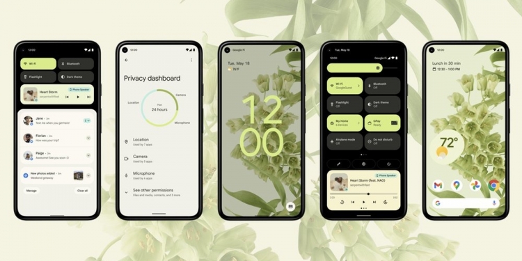
In any case, there are a number of new features and functionalities, but Android 12 just… looks very, very different. Every new Android OS version comes with a redesign of sorts, of course, but this year, things just look particularly different. And that’s not a bad thing at all, in my opinion.
Google calls this the “biggest design change in Android’s history”, and it’s hard to disagree. For example, users with Pixel deices running on Android 12 will be able to personalise the UI with a custom colour palette, as well as tweaked widgets. Something that’s interesting here is how the UI will automatically pick “dominant” and “complementary” colours based on your wallpaper—to match across the entire interface.
All of which combines to form a new, single design language: Material You.

Other changes such as how UI elements interact when you tap, swipe, and scroll; these updates are designed to make it easier to focus on the things that matter. The idea is to offer more fluidity and efficiency, and Google even says that CPU time needed for core system services has been reduced by up to 22 percent—which should help with battery life.

They’ve also added Google Pay and Smart Home Controls into a Quick Settings menu, while you can now access Google Assistant by long-pressing the power button (sound familiar?). Plus, they’ve also offered more transparency-focused features to give users a better idea of what data apps are accessing, along with controls to moderate all of that.

You’ll be able to access these settings via the new Privacy Dashboard, while there is also a new icon that’ll appear whenever apps use your microphone or camera. Plus, location permissions can now be set to offer approximate geographical data, rather than precise information. These transparency/privacy focused approach is a similar one that has been taken by Apple, Google’s main rivals in the smartphone space, and it’s certainly promising to see the big guys pay more attention to data practices (or at least, be held more accountable).
That’s just the gist of it, and there are plenty more within the Android 12 beta. The good news is that you can try it out on your own device—the only requirement is that you have a Pixel or a Made by Google device. To sign up for the Android 12 beta, click here.
[ SOURCE ]


