Why did it have to be Apple? We’ll never hear the end of it will we? In its time as a tech company, Apple has done a lot of cool new things, and also a lot of cooler versions of existing things. I’d say that they’re among the best at innovating especially when it comes to the more nuanced features or experiences we have with our devices.
But they’re also the best at doing some absolutely wack things while masking it as doing something cool. Like, remember the “courage” it took them to remove the headphone jack? And when you couple that with a die-hard fan base…you get the idea.
Which is why I’m not someone who doesn’t like it when Apple does something truly cool or innovative, rather I’m someone who will dread the overenthusiastic fan response that typically follows. But I’m also not the type of person who won’t give credit where it’s due. So that’s what this is about. Let’s talk about one of the most interesting new features on the iPhone 14 Pro.
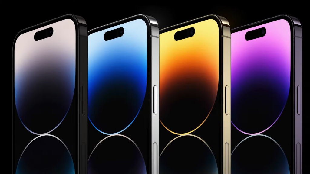
When I first saw images of the iPhone 14 Pro’s new punch hole, I was shocked because it looked like it was even more obtrusive than the existing notch. I was so ready to start laughing at Apple’s pathetic attempts when my jaw hit the floor. Apple somehow managed to friggin Uno Reverse my ass and turn this ugly thing turn it into a FEATURE.
Obviously when Apple comes up with a new feature, they’ve got to give it a ridiculous name…which, well, this time it’s called the Dynamic Island.
Seriously?? I could not have come up with a more pretentious name even if I tried. I just don’t have enough Starbucks running through my veins. But what I hate more than the name is just how well it seems to work. How have they managed to turn their massive eyesore in the middle of the screen into a feature I simply must have?
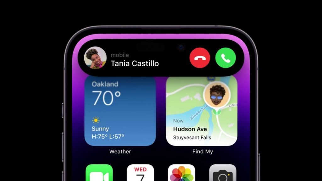
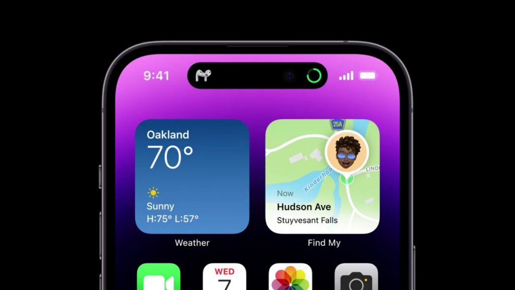
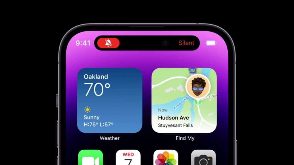
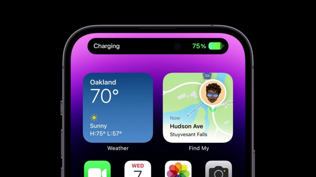
Just look at how it looks almost alive as it morphs into different shapes and sizes depending on what you’re doing with it. It’ll expand when you have music playing in the background, or if you switch between alert modes. It’ll even push the other elements in your notifications shade to the side to accommodate the new sizes.
You can even interact with it by tapping on it to expand whatever app is occupying the space. And the fact that it subtly blurs the background and adds a shadow so it looks like it’s floating? Cool.
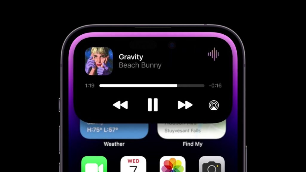
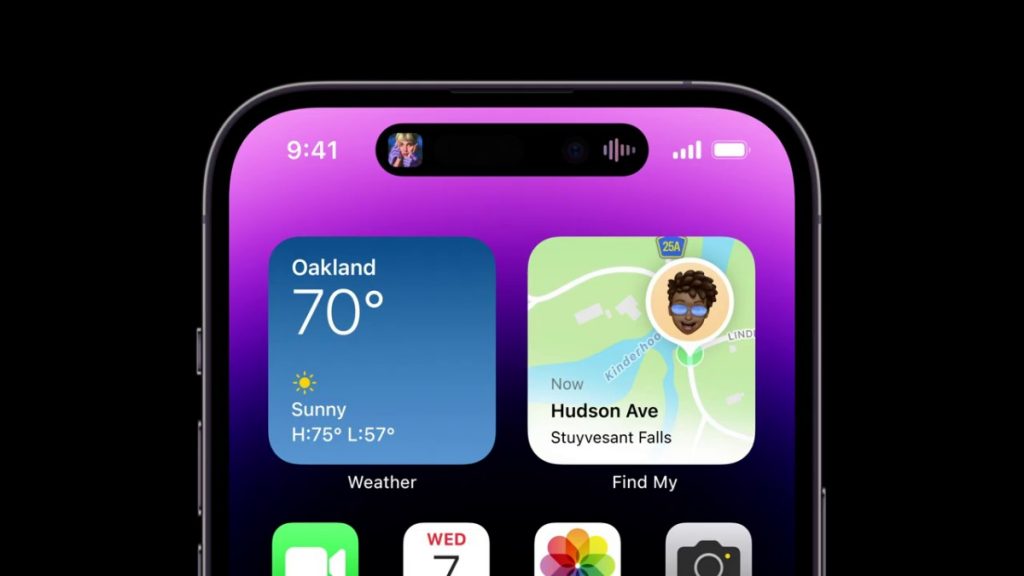
Currently it looks like it supports a bunch of Apple apps plus a handful of third party applications. Apple also says that they’re opening this up to third party app developers so more should come.
One thing I’ve always found annoying about the iPhone is how little support it has for multitasking. There’s no split-screen, for example, and I’ve always found it a bit of a pain to switch between multiple apps really quickly. But with this Dynamic Island, it looks like you’re getting at least a little bit of quick switching between active apps.
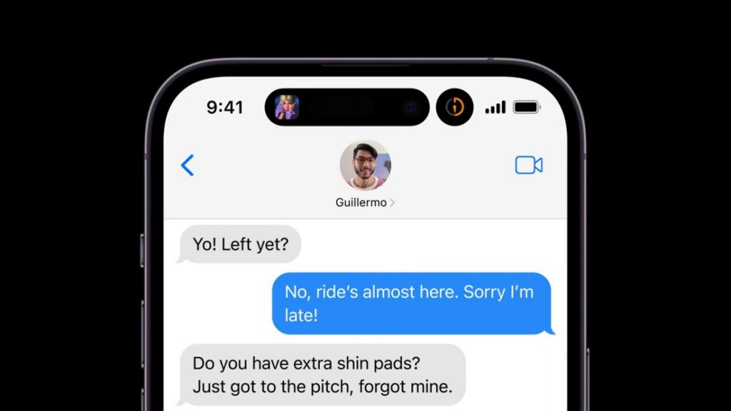
When more than one app occupies the Island, they’ll split off and you can quickly tap on them to swap between the apps. I’m not 100% convinced on how well this works in the real world, but it looks like a step in the right direction to make the Pro iPhone actually suitable for Pro users.
Don’t get me wrong though, I would like to point out a couple of potential issues. The first being how long until we see actual useful third-party apps for Malaysians taking advantage of this feature. Y’know stuff like Spotify, or Grab, or Waze, or Google Maps.
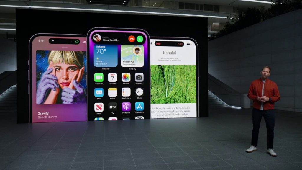
Then there’s also the question of how interacting with this Dynamic Island would feel if you have a tempered glass screen protector on it. Obviously, it’s going to have a cutout for the camera, so will that affect the responsiveness of the feature? And, let’s not mistake me liking what Apple has done here to me thinking this isn’t yet another super obtrusive screen element. In fact, I think it’s even more in the way than something like a regular notch.
Have you seen what the phone looks like when you’re watching full-screen videos? Even Apple couldn’t hide it.
But, above all, I hate how much I am liking the Dynamic Island but I will give props because this is just super smart UI design. We all saw what happened when Android phone makers tried to hide their notch right?
Related
- Apple’s latest act of courage: Killing physical SIM cards on the iPhone 14
- Apple iPhone 14 and iPhone 14 Plus: A new large screen option, and not much else
- iPhone 14 Malaysia: Here’s the official price for the iPhone 14 and 14 Pro, pre-order starts on Malaysia Day
- iPhone SE 2022 gets a price hike in Malaysia, costs up to RM200 more than before
- Apple iPhone 14 Pro and Pro Max: a 48MP camera, A16 Bionic and ‘Dynamic Island’ replaces the notch
- Apple Watch Ultra is the biggest and toughest Apple Watch yet, priced at RM3,799
- Apple Watch Series 8, Ultra, SE 2022: Here’s the official Malaysian pricing
- Apple Watch Series 8: Car crash detection, Low Power Mode, improved menstrual cycle tracking
- Apple Watch SE 2022 gets the Series 8’s guts and starts at RM1,199
- Apple AirPods Pro 2 deliver better sound, ANC, battery life and swipe controls for RM1,099

