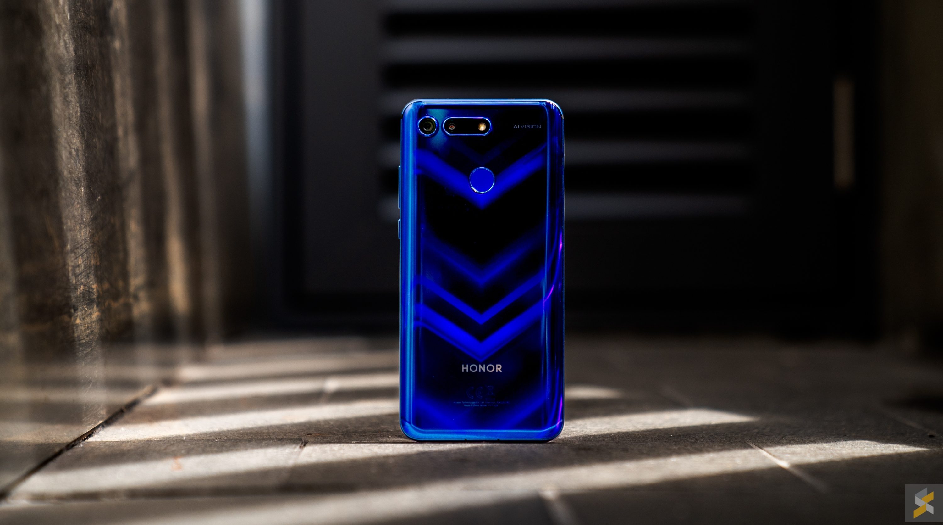
The Honor View 20 is a surprising smartphone. Unlike the V series in the Huawei sub-brand’s past, I believe this device turned more heads than the flagship smartphone it was based on. Why? Well, it’s one of the first smartphones in the market to feature the new age in-display selfie camera system, something we haven’t officially seen before 2019. But, with innovation, what usually follows is a big question mark.
It’s easy to assume that when a smartphone launches with a new – seemingly impractical – feature that’s there purely for aesthetic purposes, that it would also be an impractical smartphone. After all, function usually comes over form. Take the Xiaomi Mi MIX 3, for example. That’s a device that – although is plenty practical as it is – would have definitely been more practical if it had fatter bezels and no fancy sliding mechanism.
That’s partly why I was a little apprehensive when a new fad started taking over the industry: The punch-hole display. Or Hole Punch. Or Punch FullView. Whatever it is you want to call it. I prefer the punch-hole because I think it sounds the least silly. And, also why I was a little apprehensive when I got my hands on the first device of its kind, the Honor View 20.
For those who are unfamiliar, here’s a little backstory
Honor is a sub-brand of the world’s top three smartphone maker Huawei, and their devices tend to be the ones that offer killer specs for a ridiculously low price. No matter the segment of the market they go for – entry-level, mid-range or flagship – their goal is to be as bang for buck as possible. In their flagship repertoire, it’s easy to predict which flagship will come with what features because all you need to do is look at the corresponding Huawei device.
For example, the Honor 8 was based on the P9, the Honor 9 was based on the P10 and the Honor 10 was based on the P20. On the large-screen side of things (I refuse to use the word “phablet” anymore) the formula is pretty similar as the Honor V series (or “View” in Malaysia) is largely based on the Huawei Mate series.
However, while these Honor flagships are known for their value-for-money, they aren’t particularly well known for their “innovation”, choosing instead to flex their sense of identity in the eye-catching design of their handsets. The Honor 8’s Aurora glass, is a prime example, something that continued to define the brand of smartphones to this day.
That’s why it’s so interesting to see a device like the Honor View 20 because it packs something no Huawei flagship does – unless you want to call the Nova 4 a flagship, which I don’t.
OK enough with the history lesson, is the View 20 any good?
In one word? Yes. I think the Honor View 20 has a lot going for it, both as a value buy, and even if you compare it to the big boys. Its performance, for example, doesn’t feel like it’s lagging behind anyone. At its core, you’ll find a top-of-the-line Kirin 980 processor that’s mated to either 6GB or 8GB of RAM plus either 128GB or 256GB of internal storage.
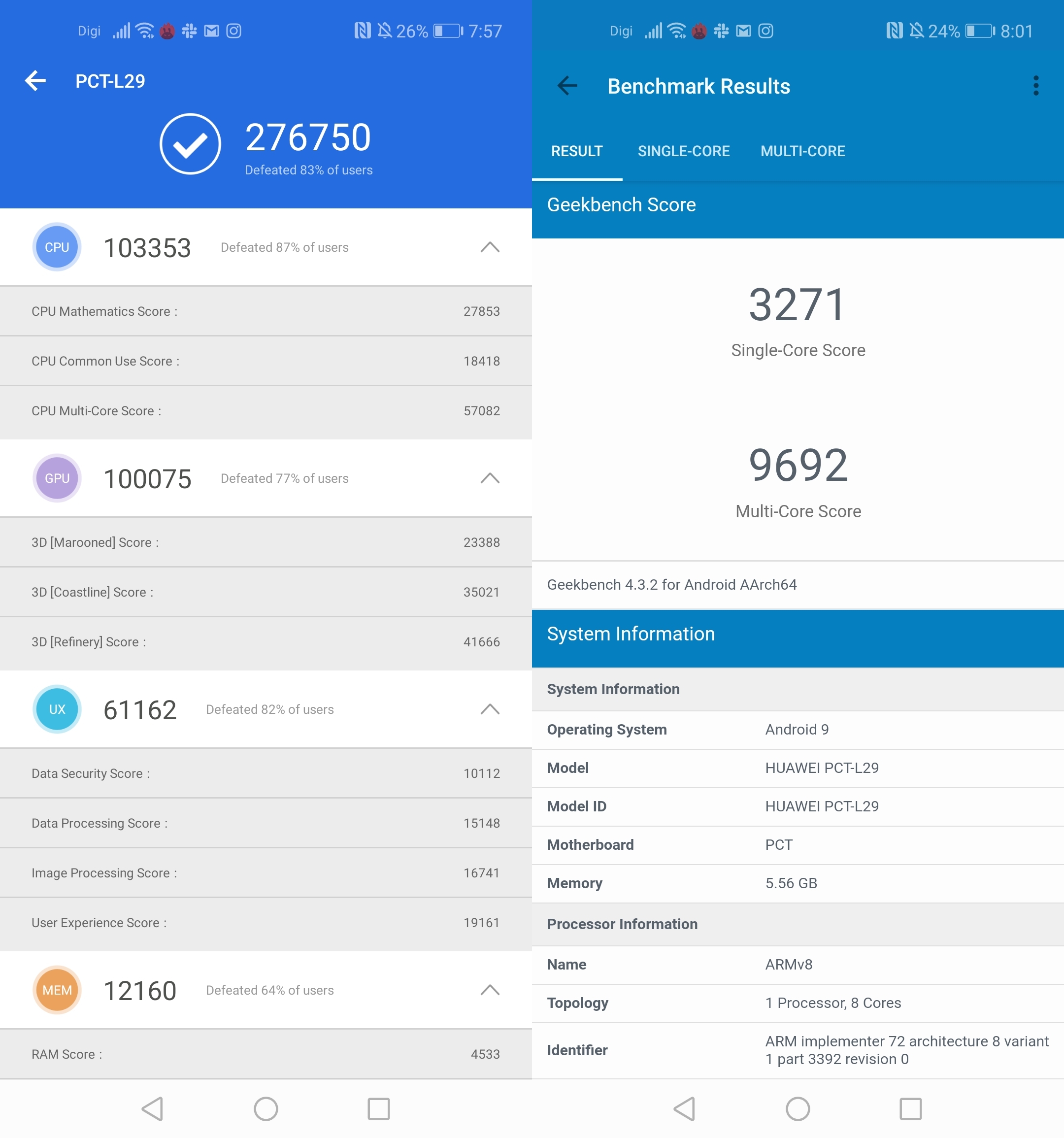
Those are as flagship as you get if you want a Huawei or Honor device. Even on my base model device with just 6GB of RAM and 128GB of storage, I didn’t encounter any performance issues throughout my usage. Everything ran like a proper flagship should, which means it’s excellent. While I’m not much of a mobile gamer, my colleague also reports that this device performs very well even in demanding games like PUBG Mobile.
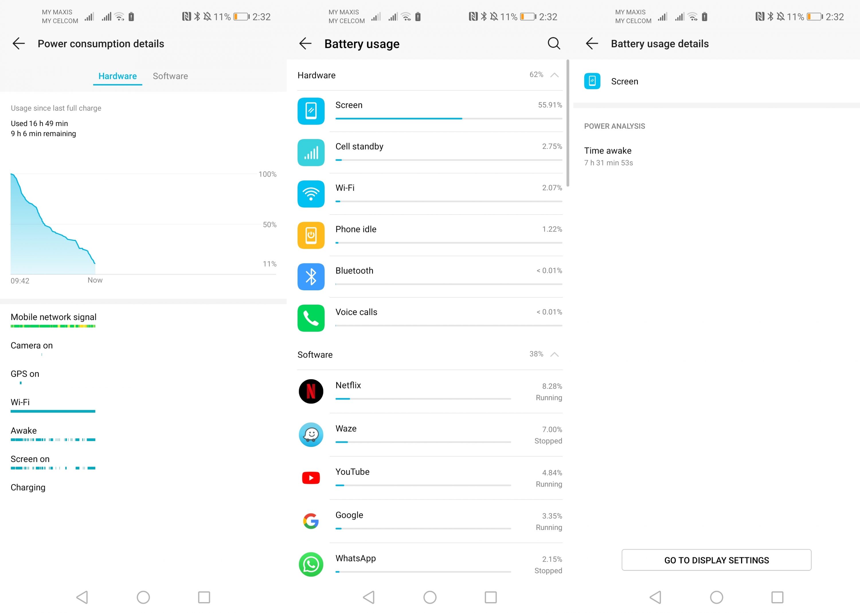
What was astounding for me, was the device’s battery life. The Honor View 20’s battery life is nothing short of stellar. I’ve used smartphones with 4,000 mAh batteries before, but those usually top out at about 6 hours of screen-on time. With the View 20, I’m getting about 7 hours of screen-on time even with my normal usage pattern (lots of Netflix, YouTube, some camera, some GPS navigation). On moderate to light days, it’ll even last me a day and a half before I reach my 5% charge threshold and need to recharge it. Definitely an A+ battery life by modern flagship standards.
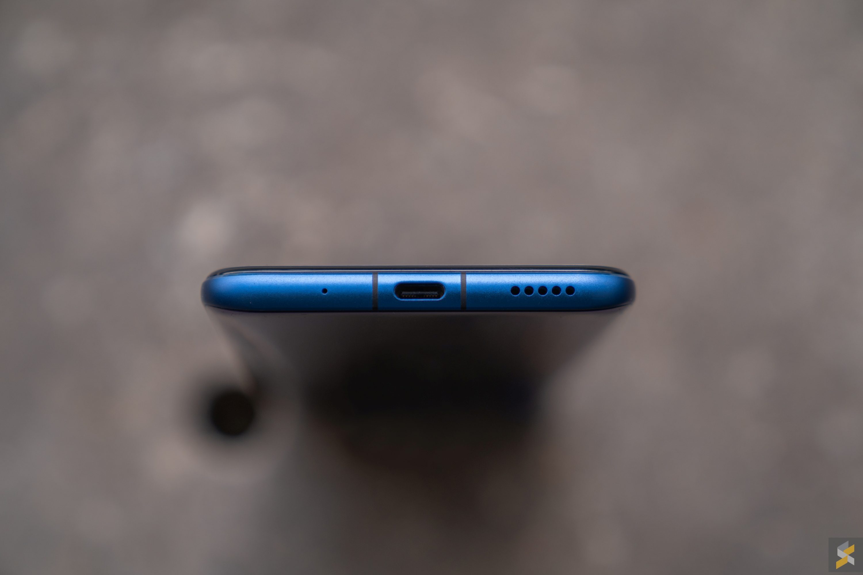
Couple that with the awesome speed in which this phone recharges that massive battery cell, and you’ve got a killer combination. Honor’s View 20 supports the same kind of SuperCharge fast-charging you’d find on a Huawei flagship smartphone. This means that if you use the charger and cable that came with your smartphone, you’ll be able to top up your device in about one and a half hours. That, however, isn’t the awesome part. The best part is that you can get almost a 70% charge in just 30 minutes. 70% in 30 minutes. Sometimes you have to love SuperCharge.
That said, I believe a lot of the View 20’s battery life excellence stems from the smartphone’s aggressive battery management in the software. Now, I know when you hear “aggressive battery management”, you immediately think about those scenarios where you never get notifications from your apps and updates from your social media because the smartphone is constantly closing them in the background. Let me assure you here that that’s only partly true. Yes, the Honor View 20 does push notifications from messaging apps like Slack and WhatsApp a little slower than your usual smartphone, but it’s not like you’re going an entire day without push notifications. In my experience, it’s only a little bit delayed (less than a minute) most of the time so I don’t notice it unless I’m comparing it directly to my iPhone X. And, if something like this can give me over an hour of extra screen-on time, I’m fine with this trade-off.
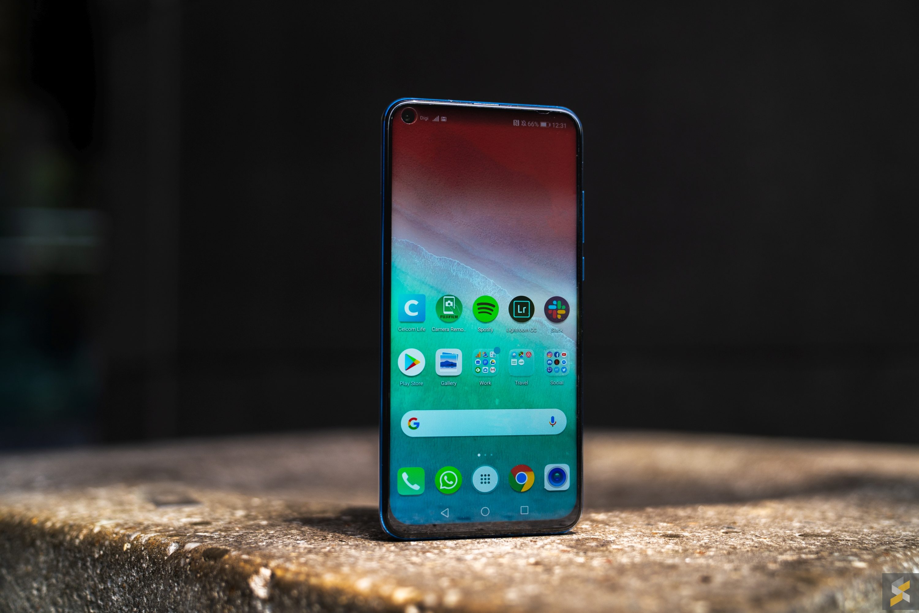
However, I wasn’t very impressed with the Honor View 20’s software experience as a whole. This device runs on Honor’s Magic UI 2.0.1 that’s built on top of Android 9 Pie. Although “Magic UI” sounds like a sexy new operating system skin, it’s really just what Honor’s calling their take on Huawei’s EMUI Android skin…which is, as far as I can tell, exactly the same as EMUI on something like the Mate 20 Pro.
That means, it also comes with all the things I didn’t like about EMUI too. Call me a fanboy, but I’m a huge fan of the way Android 9 Pie handles navigation. It’s an intuitive take on the growing popularity of gesture-based UI navigation, without sacrificing on the back or home buttons. Honor’s View 20, despite being on Android Pie, doesn’t adopt this system at all. Instead, they’ve got their own gesture navigation — that’s very similar to MIUI and iOS — and I’m not a fan of that at all. Because of that, I reverted back to the standard back-home-recents method instead. Then, when you add that to the plethora of pre-installed third-party apps, I was immediately reminded of why it’s so difficult to fall in love with a Huawei/Honor device. However, I will acknowledge that software preference is very personal, and there’s really nothing objectively wrong with the View 20’s software (it was refreshingly bug-free), so your mileage may vary.
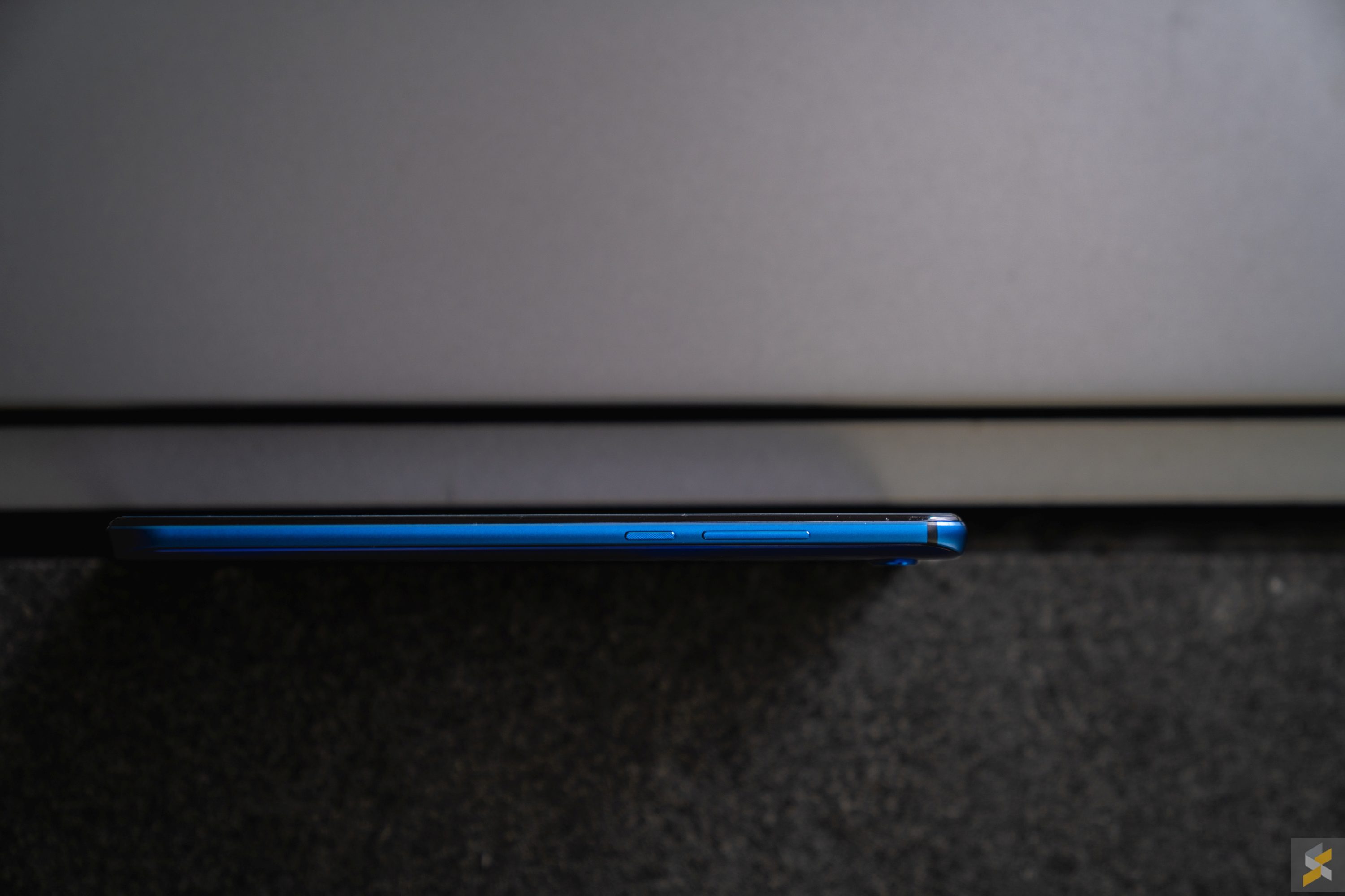
While I’m not a fan of the Honor View 20’s software, I have to admit that this is a very well-built smartphone. Everything is put together the way a proper flagship smartphone should be, with no huge seams or big flexing in the chassis to be found. The back is also well tapered so the device fits comfortably and securely in your hand. If I had to nitpick, I will say that the matte metal frame and lack of a “premium heft” makes the phone feel less expensive than a high-end flagship should, but this is really me grasping at straws here.
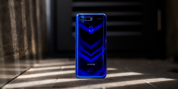
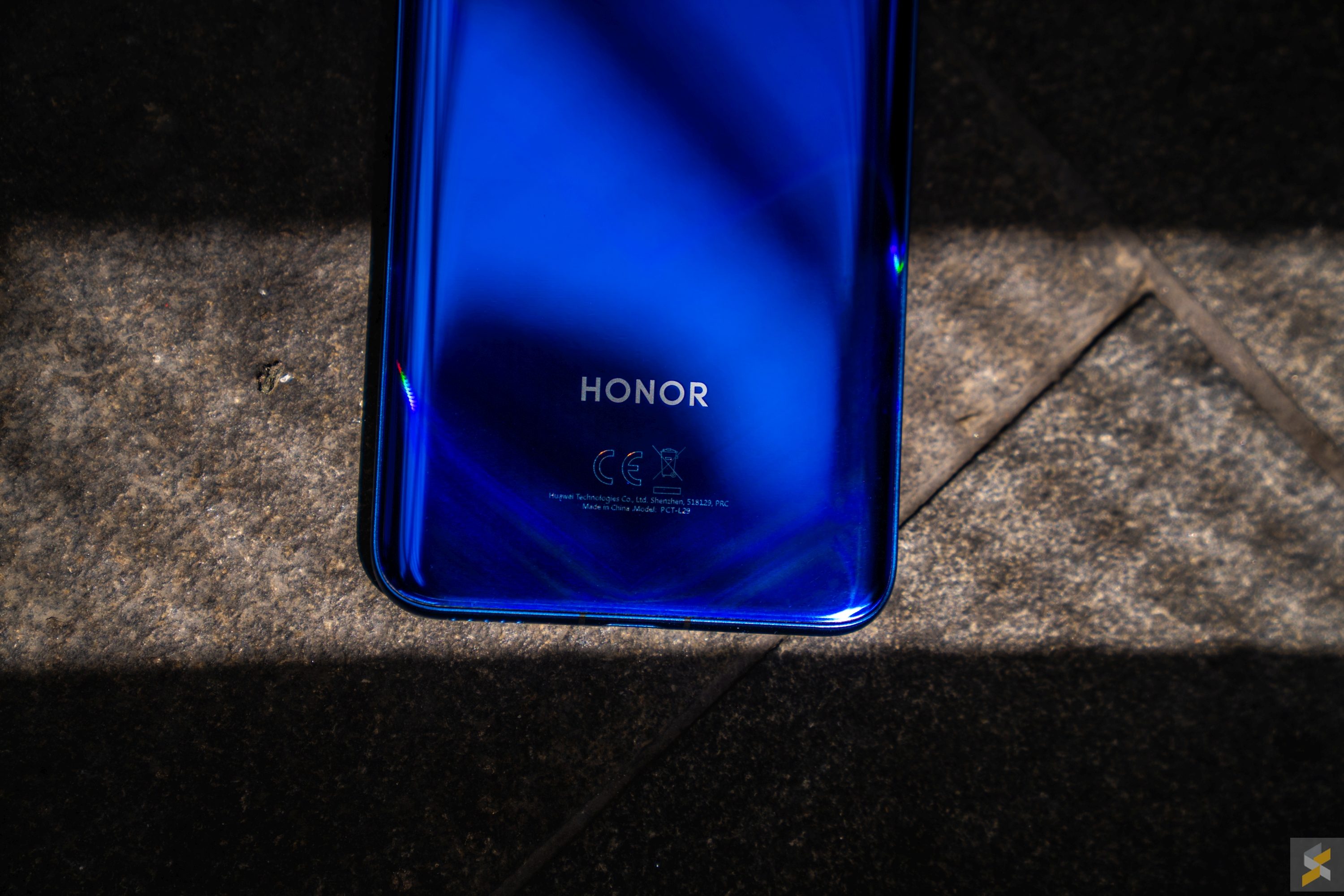
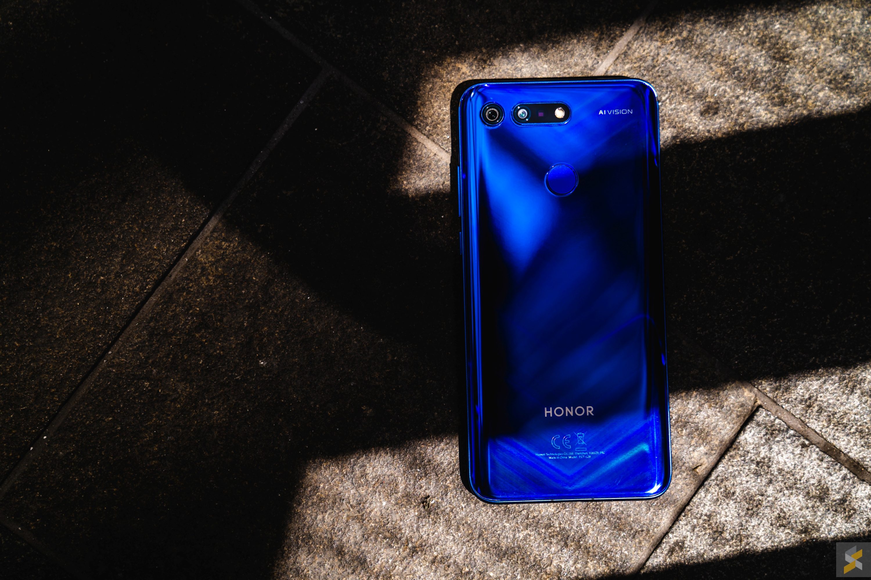
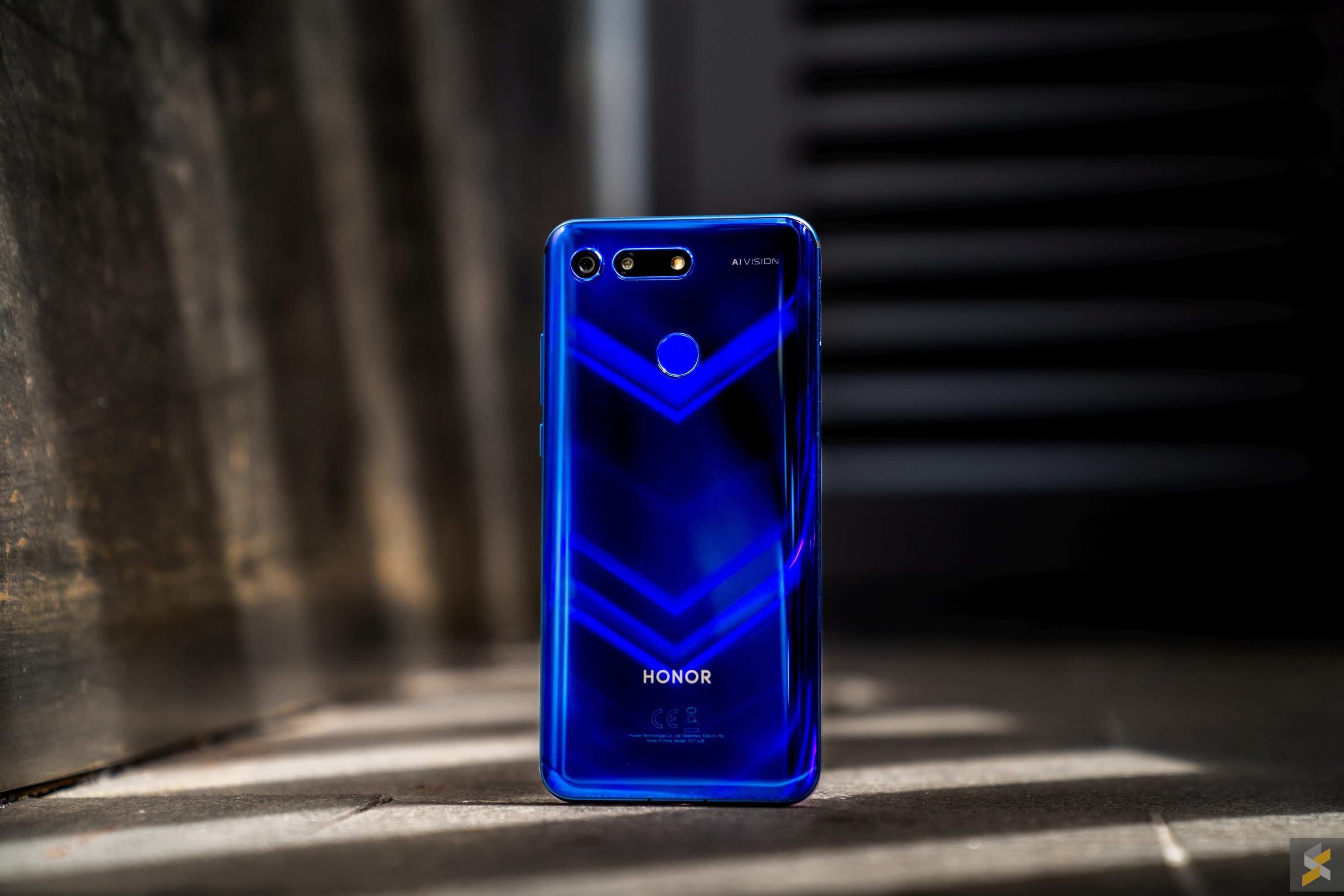
What I was a little on the fence about was the device’s aesthetic. When I first saw that striking blue colourway Honor calls Sapphire Blue, I immediately wrote it off as being way too garish for me. But, although a part of me still feels like they could have gone with a different shade of blue, this device’s looks have grown on me a little. That iconic V shape that appears on the back of the device under certain lighting conditions, does look kinda cool and a little mesmerising, though I can’t decide if I like it more or less than the Aurora pattern of Honor devices past. It is definitely a head turner and there won’t be any mistaking this smartphone with another from the back.
That’s neat and all, but why haven’t you talked about the two big features of the View 20?
I know, I know. Everyone’s really just here for two things: The 48MP camera and the Punch FullView display. But there’s a reason why I didn’t include it in what I’d like to call the “good” section of this review, and that’s because I wouldn’t classify these as major Pros that you should base your purchasing decisions on. Here’s why.
Let me start with the latter, that punch-hole display or — as Honor calls it — the Punch FullView display. Silly name aside, this was heralded as the “solution” to the notch that apparently plagued everyone’s being. I personally never had a problem with the notch. If well-optimised, it never interfered with my viewing experience. Case in point, even the Google Pixel 3 XL’s “bathtub” notch stopped bothering me after a couple of hours, because of how well optimised the software was.
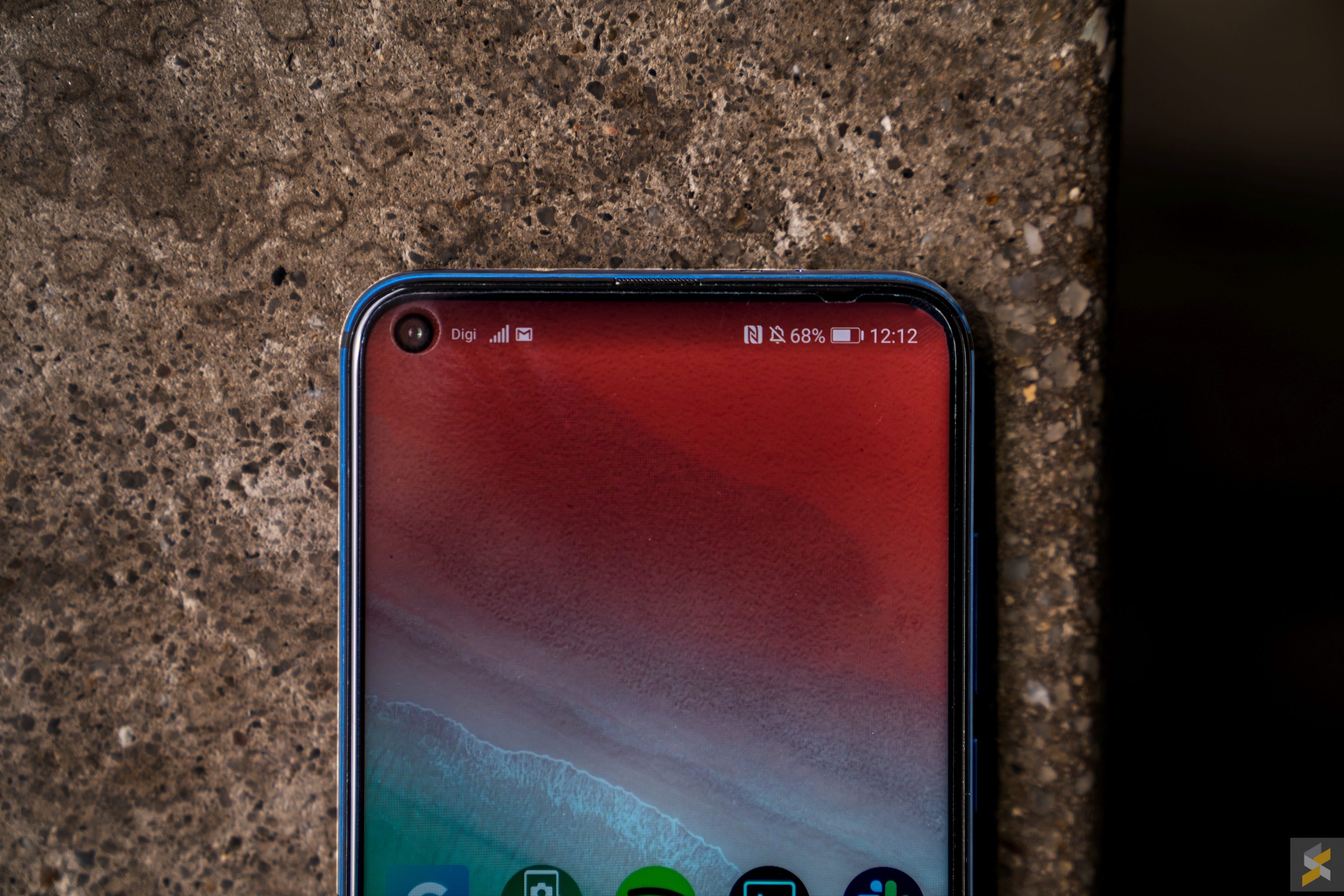
And the same thing applies to the punch-hole display we see here on the View 20. At first, it looked like a cluster of dead pixels that were a little larger than a notification icon, but after awhile, it just disappeared from the list of things I noticed just like the notch did. The only time I really notice it is when I take a screenshot, and all the elements on my notification bar are shifted a little to the right, with an awkward space on the left. But even this wasn’t a big deal, since you had the same kind of problem with a notch, where you had a big centre gap whenever you took a screenshot.
However, the difference between the notch and the punch-hole is that with a solution like this, Honor had to make changes elsewhere because they didn’t have the same kind of space a notch provided. So, while the 25MP selfie shooter lived in that little cut out at the top left corner of the screen, they had to fit the other elements elsewhere. The light sensor was moved to the top of the device, on the metal frame, so it’s easier to accidentally block with your palm, while the notification LED was turned into a tiny speck that’s buried in the miniscule slit Honor calls an earpiece.
With this lack of space, Honor wasn’t able to fit any kind of stereo speaker setup on the View 20 (disappointing) nor were they able to fit like a 3D or IR facial unlocking system that’s more reliable than the standard photo face unlock. Thankfully, the View 20 has an excellent rear-mounted fingerprint scanner — so none of that slow first-gen in-display nonsense — that’s as accurate and quick as a fingerprint scanner gets.

Also good news is that the 6.4-inch Full HD+ IPS display is a solid smartphone screen. You get good viewing angles without noticeable colour shifting (it does look darker off axis), is crisp enough, and the fact that the selfie camera now occupies a much smaller space far away in a corner means you’re also getting more immersion when viewing content. That being said, coming from something like the Mi MIX 3, I have to say that I definitely prefer the slider to this — arguably more practical — punch-hole solution. But that’s coming from me, Rory “Impractical is OK as long as it looks cool as heck” Lee.
Oh, and since we’re on the topic of impractical, I’ve seen a couple of concerned comments regarding the punch-hole selfie camera and whether its angle was weird for selfie taking. Well, I’m not much of a selfie expert, but the camera position felt fine to me. Both portrait and landscape selfies felt perfectly natural for me to take, and it sure isn’t as awkward as taking selfies with the Mi MIX (and MIX 2/2S). I wasn’t a big fan of the beautification, however, and even after I turned it off, it still looked like it wasn’t fully off.
Of course, if you’re someone who likes Honor’s selfies, you’d probably already know this by now. In any case, here’s a bonus selfie of me, my colleague and a plane:

Now, let’s get into that 48MP main camera. Traditionally, when it comes to affordable flagship smartphones, the camera is the first thing manufacturers compromise on. It was the case with the OnePlus One, it was the case with Xiaomi flagships for a long time, and it was also the case for Honor’s crop of smartphones. With the Honor View 20 though, the company decided that it would give the handset a different dual-camera setup to hopefully up its photography game.
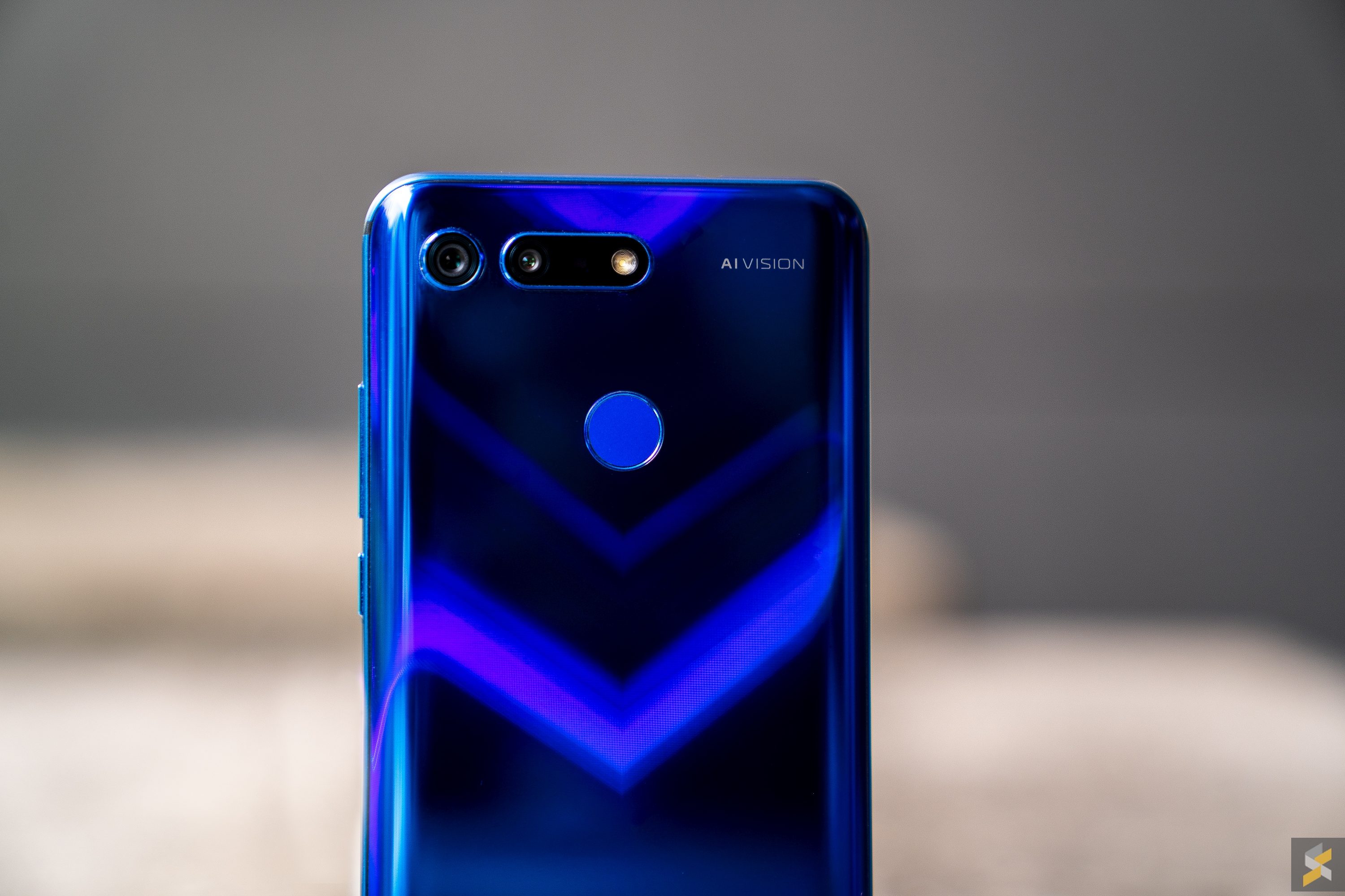
As a result, the View 20 features a 48MP main sensor with an f/1.8 aperture lens that’s paired with a secondary Time of Flight camera (ToF). While the main sensor is there to capture the actual images, the ToF camera is there for 3D depth information. But it’s not just your usual depth sensor because it will help the smartphone capture things in 3D which unlocks a whole bunch of possibilities from Microsoft Kinect-like applications, to better subject beautification. Honestly, this is heavily dependent on the apps that support it, and much like the ASUS ZenFone AR, I haven’t really seen anything that blew my mind just yet.
So, I’ll stick to talking about the main 48MP sensor. Is it amazing? Well, amazing isn’t really the word I’d use to describe the View 20’s camera performance. If you want amazing, I’d put my money on something like a Pixel 3 XL or Mate 20 Pro. But, the View 20’s camera is definitely serviceable, and I’d say that it is good enough for its price range.
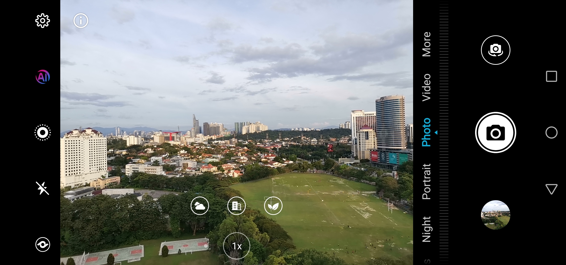
For the most part, the phone can take some pretty solid images with or without AI. The AI mode (enabled by default, so I shot primarily with it on) is as aggressive as a Huawei smartphone usually is, but doesn’t seem quite as aggressive as the Honor 10. It does retain the multi-scene recognition that allows the View 20 to recognise multiple elements in a scene, but I don’t know exactly how much that impacts the image as a whole.
One issue that I have with the phone’s daylight photos is that it doesn’t have the great HDR performance you’ve come to expect from a flagship smartphone. Just look at these two photos, taken in pretty much identical conditions, one captured with the iPhone X and one with the View 20.
The iPhone X’s ability to properly expose across the entire photo with HDR Auto is just so much more impressive.
That said, the View 20 does have one trick up its sleeve, and that trick is detail. By default, this phone takes 12MP photos, but you can head into settings and switch the resolution to 48MP instead. In theory, the 48MP photos should way more detail than the 12MP ones, but in practice, I honestly struggled to tell the difference at a glance. The easiest way for me to differentiate it was to look at the size of the files because the regular 12MP ones would be about 4MB while the larger ones were about 15MB. Maybe my eyesight isn’t as good as yours, but here’s a quick comparison for you to see for yourself:
Does this matter when you consider the way we share images today? No, I don’t think so. Especially not if social media applications continue to compress the images we upload. What matters more is exposure, colour and contrast, all of which you don’t need this 48MP camera to do.
Since we’re on the topic of lighting, I would also like to add that the View 20’s low-light performance is serviceable at best. Don’t expect a Huawei Mate 20/Google Pixel 3 XL performance here even if the View 20 has a dedicated Night Mode. What I found was a lot of noise reduction and reasonable exposure that looks good enough if you don’t punch in too much. But again, bringing things back to the whole sharing on social media approach, I’m not really going to complain too much here. Hence, the solid score of serviceable out of 10.
So, while these two standout features hogged the limelight during this handset’s launch, I really didn’t find them to be particularly game-changing in the grand scheme of the View 20’s role as a flagship smartphone. In my experience, these “game-changing” innovations really didn’t change the game that much — at least, not in the way you probably expected it to. And, definitely not in a way that you should be basing your purchasing decisions on. But, the Honor View 20 as a whole, should definitely change your perception of what a flagship smartphone should be.
Let me put it this way: If the Honor View 20 came with just a regular 18:9 screen, or even one with a notch, and just a run of the mill 12MP main camera from something like the Pocophone F1, or Mi A2, my conclusion for this review wouldn’t change.
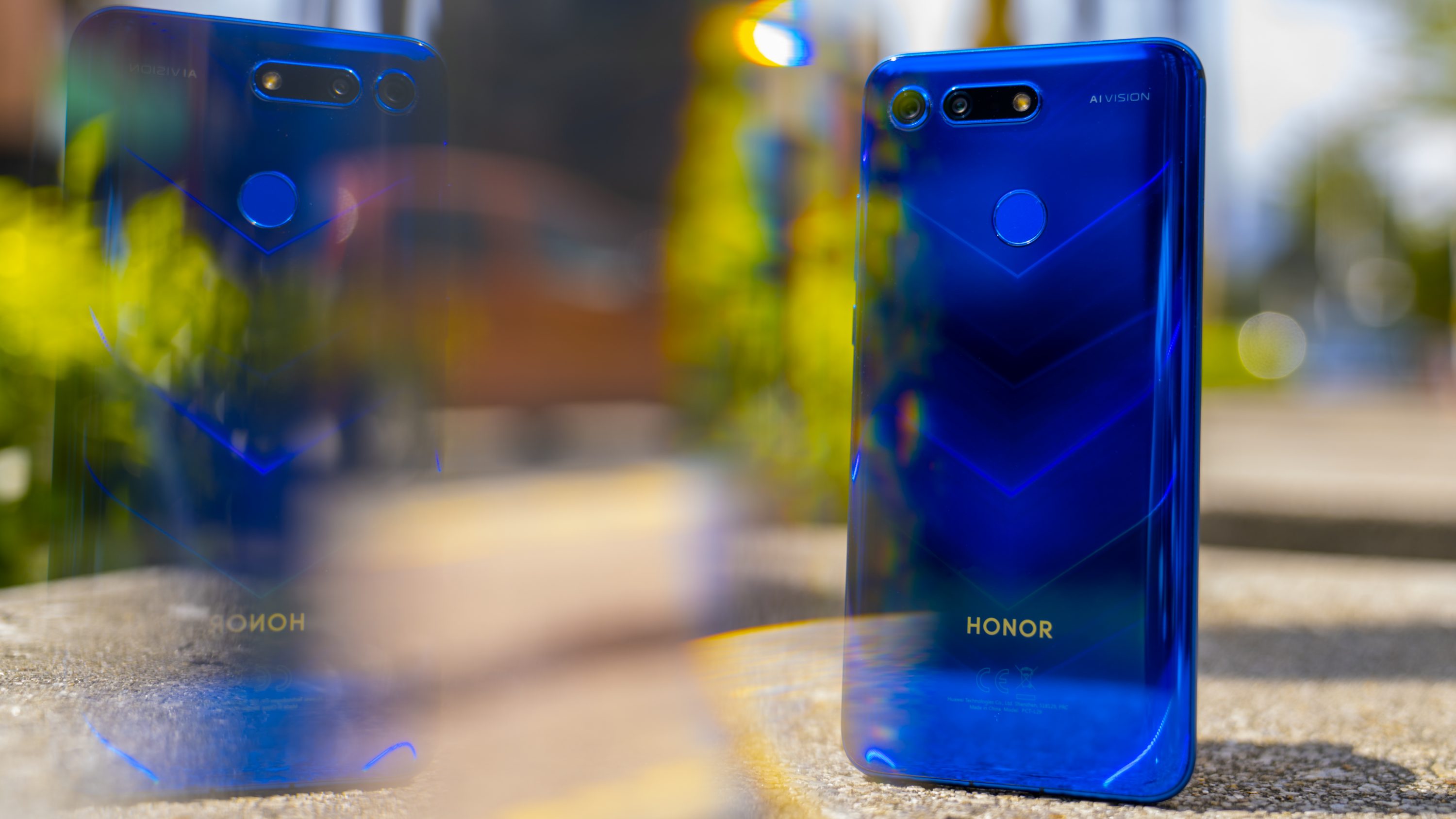
…what?
You see, if you were to judge the Honor View 20 purely based on those two big features that dominate the handset’s marketing material, then you’d be sorely disappointed. I mean, that punch-hole display? Yeah, it looks cool in the first few days I spent with it, but after a day or two, I became disillusioned with it, and it lost whatever little magic it had in the first place. It became a means to an end, something that’s there purely to offer an alternative to the notch. It didn’t give me a new dimension to use my smartphone the way something like the Mi MIX 3’s slider did.
And that 48MP camera? Well, it takes photos about as well as a smartphone in this price bracket should. You’ll be able to get just as good (if not a little better) from the likes of the Mi MIX 2S or Mi 8, so there’s really nothing super outstanding here.
But, the moment I looked past that marketing hype, the thing that kept me continually impressed with the View 20 was how well it fit the role of a reliable, practical flagship smartphone.
In my opinion, the View 20 does an excellent job as a flagship smartphone. The phone has a number of outstanding features — battery, charging, performance — and rounds out the rest of its spec roster with solid A- and above performances across the board. Good build, good screen, decent camera, good speaker (for a mono unit), fast fingerprint scanner, solid software, a 3.5mm headphone jack, and even an IR blaster to boot.
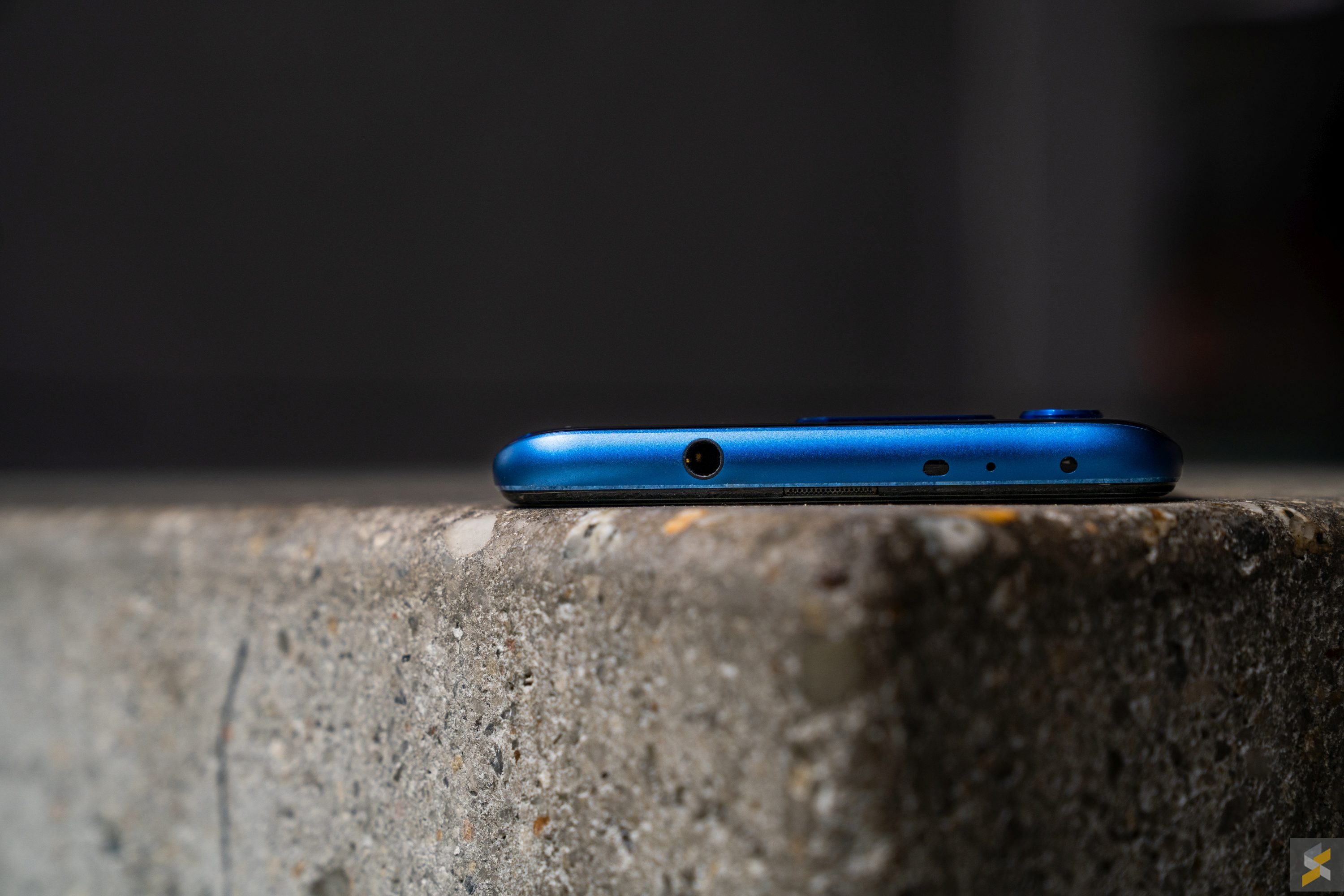
If I had to nitpick, you’re only really missing IP67/68 water resistance and wireless charging, but these are features that are still pretty rare at this price point.
Then, you couple all of those excellent features with the fact that to pick up this handset that I reviewed, you would only need to pay RM1,999. I’ll be honest, I’m struggling to come up with a brand new phone you can get at just under RM2,000 that I can say convincingly outclasses the View 20 in every aspect.
Despite all the initial apprehension I had with Honor potentially ruining their image of producing reliable, quality smartphones (with a dash of design pizzazz), I’m happy to say that none of those fears were warranted. In the end, the biggest reason you would buy an Honor View 20 is exactly the same reason why you’d buy any other Honor flagship: Outstanding value for money.
Photography by Zachary Yoong with the Sony A7 III.

