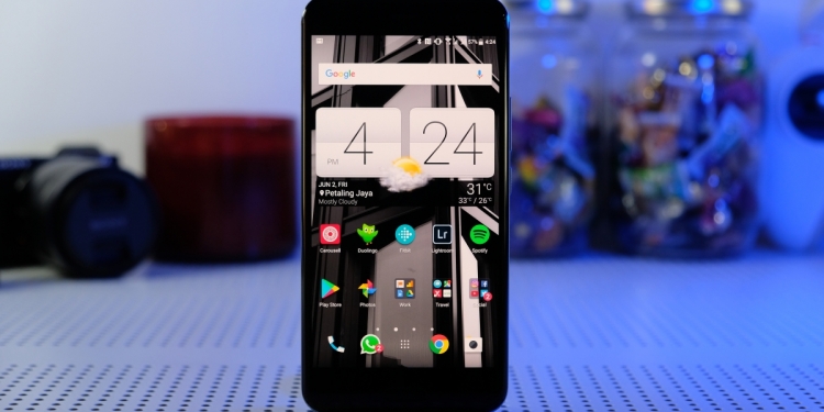
“What were you thinking, HTC?!” was the first thought that ran through my head when I saw the Taiwanese company announce the U Ultra and U Play smartphones. HTC, the manufacturer that set the gold standard for the metal bodied smartphone, was ditching the one thing they did better than anyone else.
I thought they had lost their minds. I was certainly disappointed to find out that HTC would also be sticking with the glass design for their 2017 flagship, especially since they made such a comeback with last year’s almost perfect 10.
So, clearly, I was going into this review with a little more disdain than usual. By the end of this review, I was confident that all I would get was confirmation that HTC had completely lost the plot. HTC wasn’t going to win me over, not after they killed what I loved so much about their flagships.
But here’s the thing, after spending some time with the HTC U11, it did win me over even if it was only a little bit. It impressed me just enough that I might recommend this to people looking for a flagship Android device.
The Good+ Build quality is solid |
The Bad– Screen and design feel dated |
[nextpage title=”If you can look past the design…”]
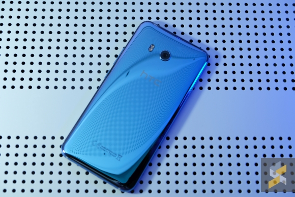
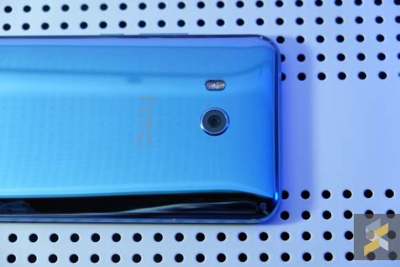
I can’t write a review about the HTC U11 and not start with the elephant in the room: Its design. Like the U Ultra, HTC has gone for the liquid-whatever-U-want-to-call-it glass back because they wanted to stand out and turn heads a little more. Clearly, they didn’t get the memo because have you seen the other flagship Snapdragon 835 smartphones?
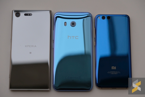
They’re. All. Shiny. And. Glass.
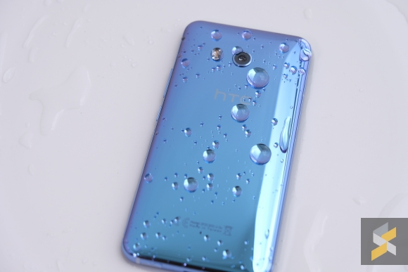
But if we put that aside for awhile and actually hold it, HTC’s pedigree of knowing how to make a robust phone shines through. Unlike the U Ultra, the U11 feels much more substantial thanks to that rounded metal frame that separates the front from the back. It’s an ergonomically sound phone, and despite how much I dislike the way it looks, even I have to admit it feels like a well-built handset.
Still, I feel like this design has been done to death at this point and that makes the U11 look a little dated compared to phones like the Galaxy S8 and LG G6. In a way, it suffers from the same problem as the Sony Xperia XZ Premium – HTC isn’t doing anything super wrong with the design, they’re just not doing much of anything to it.
Well, except make the outside really bling and shiny, of course. Goes a long way to making the phone look super garish, but if that’s the look they were going for, then mission accomplished.
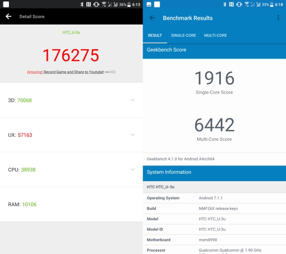
Inside, HTC has stocked up on specs. This variant I’m reviewing comes with a Snapdragon 835 octa-core processor, 4GB of RAM and 64GB of internal storage. For the Malaysian market, we’re getting the variant that has 6GB of RAM and 128GB of internal storage.
The phone is snappy and I have no complaints about performance as it chews through anything I throw at it. I did run into some issues with apps like Facebook and YouTube freezing or crashing, but that’s something I’ve seen happening quite often these days so I suspect that has more to do with the app than the phone.
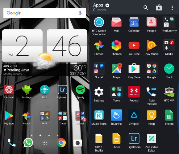
Thankfully HTC has continued to keep the Sense skin rather light so it looks and feels very stock. I wasn’t happy that HTC preinstalled a bunch of bloatware, but the good news is that most of it can be uninstalled.
If you were keeping up with the U11’s announcement, you would have noticed that the U11 comes with three different assistants – Amazon’s Alexa, Google’s Assistant, and HTC’s own Sense Companion. When reviewing this phone I stuck primarily to the Google Assistant (because I pretty much live on Google) and didn’t really care about the others since they all perform similar functions. If you want me to do a comparison, drop a comment below and I’ll see what I can do.
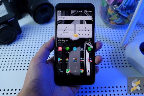
On the display front, HTC seems to have stuck with the same Quad HD Super LCD5 panel as they did on the 10, only this time it’s larger, measuring 5.5 inches diagonally. It’s not a bad screen, per se, because I certainly didn’t have a big problem with using it daily.
However, when you compare it with the 4K Triluminos display on the Sony Xperia XZ Premium or even the 2K Super AMOLED dual-curved panel on the Galaxy S8, the U11 falls quite flat across the board.
That said, there is a silver lining here. Despite the fairly average screen, the HTC U11 beats pretty much all of this year’s crop of Android flagships when it comes to its speakers. These new BoomSound Hi-Fi Edition speakers are awesome. They get really loud (so there’s no need for cupping) and have very even L-R volume.
As far as audio quality goes, I think it sounds really good for smartphone speakers, but my ears aren’t audiophile-ready. I did have a quick listening session with one of my audiophile colleagues and he notes that the mids are a little lacking.
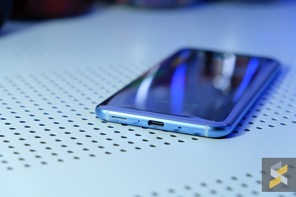
One unfortunate thing everyone probably saw coming though was the exclusion of the 3.5mm headphone jack. The good news is that HTC does include a rather nice pair of in-ear headphones out of the box. They’re called the USonic headphones and although they don’t sound super duper good, I think they sound better than most included headphones. What makes them special is the fact that they’ve got active noise cancellation (ANC) – and they work well.
From my testing, they also work on the Xiaomi Mi 6, but because the ANC is done in the U11 itself, you lose that perk when plugged into another device. For the staunch 3.5mm fans, HTC has also included a dongle in the box and it comes with a built-in digital to analogue converter (DAC). Spoiler alert: They also work on the Mi 6 which is great.
Because of the included dongle with DAC, I won’t list the exclusion of a 3.5mm headphone jack as a con. Why? Well, it’s because I’m all about tech companies pushing us forward in meaningful ways and building a dongle that is more than just a dongle to let your headphones work is exactly that. We’re finally getting an incentive to use the dongle and USB-C port over the 3.5mm jack because it’s now a meaningful advantage rather than an annoyance. And that’s great. Good on you HTC, good on you.
I also have to give HTC props for their work on the U11’s camera. Last year’s 10 was pretty good already, but this year’s 12MP UltraPixel 3 camera is awesome. I was sceptical at first when I saw the DxOMark score, but I mean, the pictures speak for themselves.



Good auto HDR (which processes in the background so there’s no delay between shots), great colours, good detail preservation and decent low-light performance too.



If I had one complaint about the shooting experience, it’s that the camera can sometimes choke and stutter when you launch it, forcing you to wait a few seconds before you can shoot. It’s a real pain when it happens because sometimes you only have a few seconds to get the shot, but it doesn’t happen very often so I suspect it could be a problem that HTC can fix with a quick software update.


Most of the time, though, it works really well as a smartphone camera because it has a snappy shutter with quick and accurate autofocusing. Pair this with good image quality and you’ve got a shooter that can rival even the best.
Is it better than the S8? I can’t say for sure without doing a picture-by-picture camera comparison, but I’ll say this for now: I think it’s just as good.
OK, now that you know what’s good about the U11, it’s time to talk about the not-so-good, and we’ll start with the squeezing. When HTC introduced the U11, they also introduced HTC Edge Sense. Essentially, HTC built the U11 with pressure sensors built into the bottom third of the phone’s frame. These sensors can detect when the bottom half of the phone is being squeezed and registers it as an input. Users can then map functions and apps to either a short squeeze or a long squeeze.
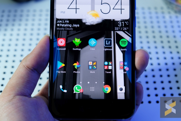
While it can be useful sometimes, I still think it’s more of a gimmick than anything else. I have mine mapped to taking a screenshot with a short squeeze and turning on the flashlight with a long squeeze because those make the most sense to me. You can also map the camera to Edge Sense but I found that the squeezing causes unnecessary handshake when taking images.
Unless you’re someone who often has their phone in their hand when doing other stuff (like me) Edge Sense is actually not that easy to trigger. It’s certainly less easy to accidentally trigger compared to the S8’s Bixby button because you can adjust the squeeze pressure to your liking. It also won’t accidentally trigger in your pocket unless you’re trying to pull it out of really tight jeans.
Definitely not something you should be basing your purchasing decision on.
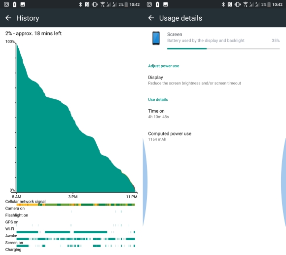
Next, on the list of not-so-good-things: Battery life. Come on, 3,000 mAh battery in a phone like this? You’re not going to be breaking any battery endurance records. On average, I managed to get close to 4 hours of screen on time (with about 14 hours on battery). If I need to use the camera a lot, then that number goes down to below 3.5 hours of SOT. With light usage, that number goes up to 4.5 hours of SOT.
Decidedly average, but it is better than what I got out of the Samsung Galaxy S8 which also features a 3,000 mAh cell. The silver lining is that the U11 charges quickly. With a battery logger on, the app recorded a charge time from 5% to 100% of about 1 hour and 45 minutes. 30 minutes gave it about 50%.
And that’s pretty much all the major complaints I have with HTC’s U11.
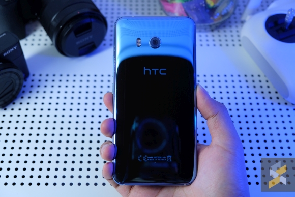
Despite my initial apprehensions with the smartphone and HTC losing their way, I actually enjoyed my time with the U11. If you peel back the awful colour, the obscenely shiny back, three AI assistants and the gimmicky features, you will find what is essentially an upgraded HTC 10. It echoes a lot of what I liked about the 10 with several improvements.
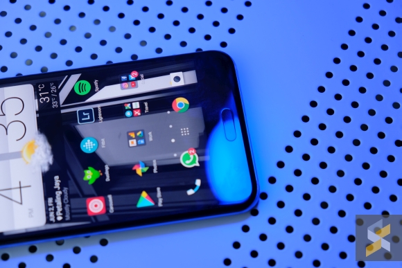
Of course, there are major ones like the new camera, but there are also a bunch of small updates that really add up. The fingerprint scanner, for example, feels faster and more accurate. There’s also IP67 water resistance, a slightly smaller camera hump, more storage as standard and of course better performance.
That said, these improvements do come at a slight premium here in Malaysia. Since HTC is only bringing in the high-spec 6GB RAM/128GB storage version, the HTC 10’s successor will launch at RM3,099 — RM300 more than the 10’s RM2,799 price tag. Although I think the price hike is justified, it does put the U11 right in the crosshairs of the other big guns in the industry.
Yep, we’re talking about phones like the Samsung Galaxy S8 (RM3,299), LG G6 (RM2,999), Sony Xperia XZ Premium (RM3,399)and Huawei P10 Plus (RM3,099).
And the U11 does very well holding its own despite the flaws I’ve mentioned earlier. In fact, I think it also holds distinct advantages over every one of those phones in certain aspects. Being able to do so without being more expensive than them puts the U11 in a pretty good spot.
I’m not saying the U11 is the best Android flagship now, I’m just saying that the difference between these flagships are so small that it’s almost negligible. In the end, it really boils down to personal preference and overall experience. And if we’re talking about giving you a good Android smartphone experience, I think the U11 definitely hits most of the right notes.
It turns out HTC did know what it was doing after all.
[nextpage title=”Gallery”]
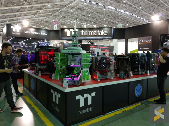
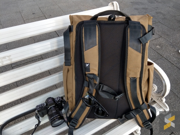
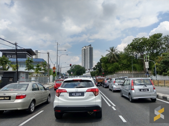
Here are more photos captured with the HTC U11’s camera. Click on each image to view its full resolution.
If you zoom in, you can even read the text on the sunglasses’ arms and the numbers on the camera’s dials with ease.
This was a really challenging scene but I think the U11 did quite well here. Just add a little bit of tweaking to the shadows and you’ll have a great image.
Low light
Bonus selfie

