Like it or not, Apple is often seen as the benchmark in every product line. The iPhone revolutionised how touch screen smart phones work while the iPad turned out to be the fastest selling consumer product in history.
The truth is Apple never created anything new. They were not the first to create a smart phone, a tablet or even a music player. But somehow they managed to take an existing product and turned it into something new, prompting you to ask yourself “why didn’t anyone think of that?”
As wearables are seen as the next hot category, Apple has finally jumped onto the bandwagon with the Apple Watch. Its competitors especially from the Pebble and Android Wear camp had an early start and this should give Apple some insights on what to do, and what not to do.
Can Apple emulate the same success with the Smart Watch? Or is it all just for looks? Find out in our review.
The Apple Watch Range
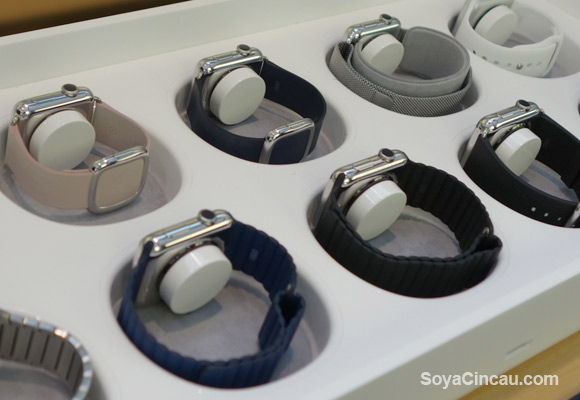
First up, let’s go through the entire range of the Apple Watch. Unlike any smart watch or Apple products released so far, the watch has the most customisation you can buy right from the store. There are 3 main models, the entry-level Apple Watch Sport, the mid-tier Apple Watch and the cream of the crop Apple Watch Edition. To fit different wrist sizes, it is available in 38mm and 42mm editions, where the dimensions represent the height of the watch.
The Apple Watch Sport gets an aluminium case in either silver or space grey. It feels similar to the iPhone 6 and the front is toughen with strengthen Ion-X class. Being a base model, it comes only with a choice of multi-colour rubber bands. The strap mechanism is the same as the rest of its models which allows you buy the more premium bands separately.
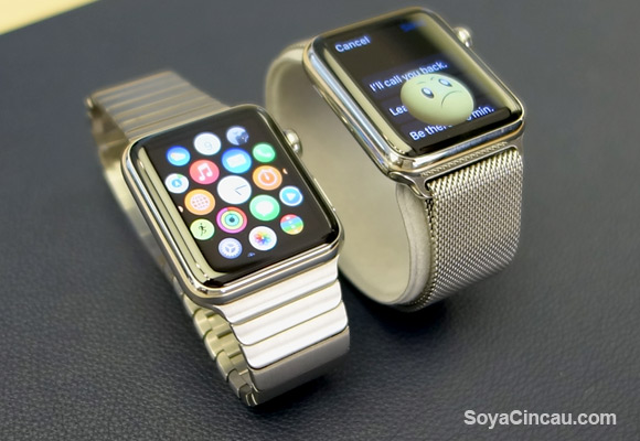
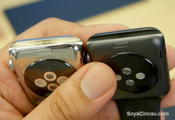
Moving up a notch is the Apple Watch which gets a stainless steel case with a shiny chrome finish or space black. For those who consider money as no object, the Apple Watch edition can be yours in either 18 carat yellow or rose gold bodies. The front glass for the Apple Watch and Apple Watch Edition is more durable with the use of Sapphire Glass, while the back uses ceramic for better scuff resistance compared to the standard Sport version.
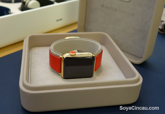
Unlike the Sport, the higher Apple Watch and Watch Editions get a wider choice of bands which includes leather and metal. As you go up a notch, you can feel the weight difference on your wrist. For example the 42mm Apple Watch Sport with the rubber sport band weighs just 30 grams and it gets heavier at 50 grams with the stainless steel body Apple Watch. Meanwhile the rose gold Apple Watch Edition weighs 67 grams while the yellow gold option is heavier at 69 grams, and this is with the base rubber sport band. That’s more than double the weight of its entry-level aluminium version.
Regardless of which Watch you pick, you get the same internals inside except for its screen and battery. The 38mm and 42mm versions have a slightly different screen size with a resolution of 272×340 and 312×390 pixels respectively. Despite the variation on paper, both OLED displays shouldn’t differ much in clarity as they push the same pixel density of 326ppi (pixels per inch).
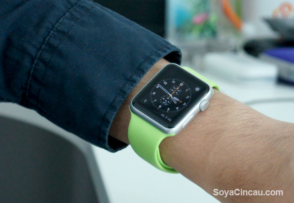
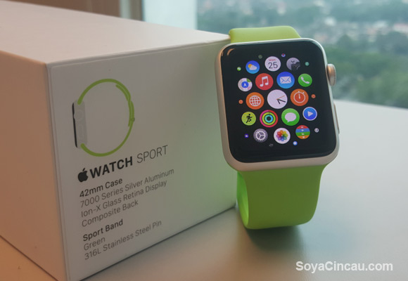
On-board it gets 8GB of storage and it uses Bluetooth 4.0 and WiFi for connectivity. Apart from the display, the battery of the 42mm version is said to be slightly bigger but its battery life shouldn’t differ much in real life usage compared to the smaller 38mm unit. For this review, we’ve gotten ourselves a 42mm Apple Watch Sport with a green sport band.
[nextpage title=”Design and Aesthetics”]

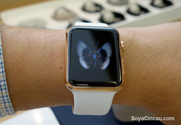
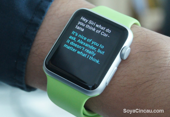
The Apple Watch goes for a squarish design as opposed to having a round watch appearance that’s being pursued by most of its rivals. Standing out from the crowd is the digital crown placed on the right which lets you scroll and pressing it returns you back to the home screen. Long pressing the crown will bring up Siri, which this time she doesn’t speak but it will display its response on screen.
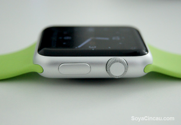
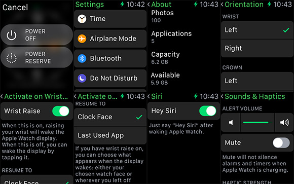
There’s a side button right underneath it which works primarily as a shortcut to your favourite 12 contacts. Long pressing this will bring up the power settings to shut down or enable its own power saving mode.
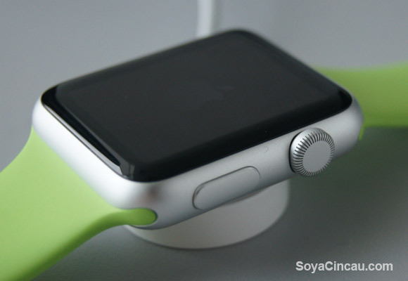
In terms of looks, Apple is quite clever with the way it conceals the bezels. With an all-black glass dominating the front, it hides the edges of the display and this is possible with the use of a black background throughout the Watch’s interface. If you look from the front, it gives you an illusion of a near edge to edge display as the frame of watch as the glass slopes seamlessly towards the sides. The smooth edges of the glass makes it more effortless to swipe, similar to its current iPhone 6 and iPhone 6 Plus.
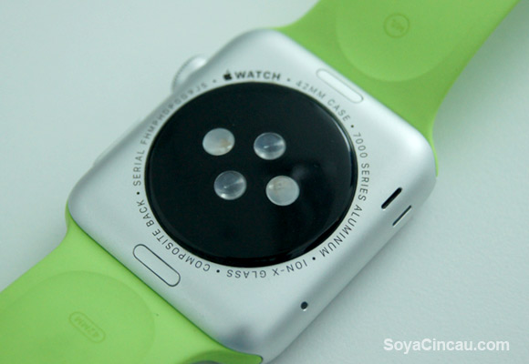
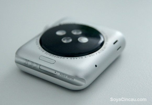
Moving towards the back, it still looks aesthetically pleasing. Unlike other smart watches that often design it as an afterthought, the back of the Watch has a nice circular element that houses its vital sensors and inductive charging point. Mimicking a traditional watch, you get a line of inscribed text that wraps around the element containing the serial number, model and type of material used.
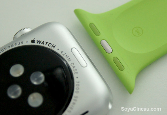
Also visible underneath are 2 push buttons which allows easy removal of the bands on each side. Apple has designed their bands in such a way that you won’t need tools to swap or to adjust your bands to fit. Its metal link bracelet band for example boasts 100 over components and you can remove each removable link pieces by hand by pushing its individual buttons on the underside.
Designed for any situation, the Apple Watch is water resistant with IPX7 rating but they warned that it is more of being splashed proof than a submergible device. While it is safe to be used under the rain or doing the dishes, the Watch isn’t designed for swimming or diving.
Getting Started
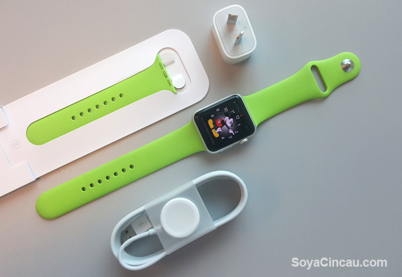
The Watch only works with the iPhone 5 and above, running at least iOS 8.2. Connecting the device for the first time is done through the Apple Watch app which comes pre-installed with the latest iOS update. The pairing process is pretty easy as you use the app to scan a dynamic code that’s being displayed onto the watch. This is as easy as scanning a QR code. If you haven’t seen it yet, you can check out our Apple Watch Sport unboxing.
By default, the Apple Watch automatically locks itself when you remove the watch from your wrist. This secures the device from being accessed by anyone else but it can be bypassed by tapping your passcode. From time to time, it does try to detect from its scanners if the watch is being worn, hence some reports of users having problems with tattooed wrists. There’s also the option to disable the passcode if required.
[nextpage title=”User Interface and Interaction”]

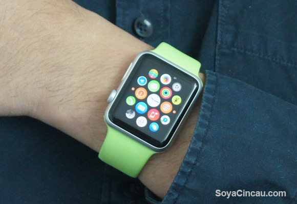
Being a smaller device, Apple has to think differently from its usual iOS based interaction. With just 1.5” of display real estate, this is where its digital crown comes into play on its watchOS. While you still use your finger to tap and drag round the interface, most of the selection work is made easier by scrolling the crown. As mentioned in our first impressions, the digital crown feels too loose and we prefer if they have added some steps or friction for a more tactile feel.
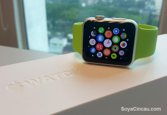
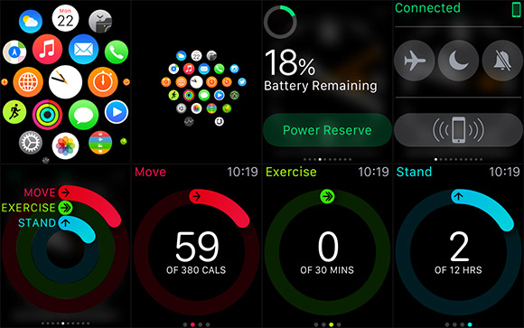
The home of the Watch has an interesting honeycomb layout of icons, with the main watch face sitting right in the middle. As opposed to having a list or grid format, this layout makes more sense especially when you have lots of apps installed. To navigate around, you slide through with your finger as if you’re rotating a virtual globe. You can zoom in and out using the crown but this is where it gets a little clunky especially for those with fat fingers.
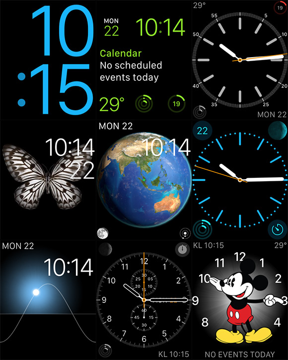
Most of the time, you’ll be staring at the watch face of your choice, which is customised with an array of layouts and designs. No, you can’t add custom design watch faces just yet but the current ones do allow some personalisation where you can change the colours, elements, and add additional info such as current date, battery level, sunrise/sunset time, weather or even a stopwatch. One of the fancy watch faces include a Mickey Mouse face which is nice to look at but the hour and minute hands can be hard to notice at first.
From the watch face screen, you can view notifications by swiping downwards from the top. Swiping upwards bring up glances, which are basically widgets that you can add and customise. Some of the things you can view from glances include weather, your current location on the map, calendar, battery level, heart rate, fitness status and much more. Depending on your watch apps, you can add them into glances if they are supported.
What’s probably the most magical thing about the watch is its force touch feature. To change watch faces or to bring up options, you can force touch by tapping with extra pressure. With its Taptic Engine, it gives you a sensation of pressing deeply into the watch instead of the typical vibrating buzz. At first it took a while to get use to as you would intuitively try to perform a long press.
In addition, the taptic engine does wonders on the interaction side of things especially for notifications. When you receive a message or an alert, it feels like a subtle tap on your wrist. This makes notification more discreet without letting everyone in the room know your watch is craving for attention.
The Watch isn’t an always on device and the screen only switches on when it thinks you’re using it. When it is on your wrist, it switches on when you lift your hand towards you and it quickly switches off when you put your hand down. It is pretty clever but occasionally it doesn’t switch on when you needed it to be. However you can always wake the screen manually by tapping on the glass.
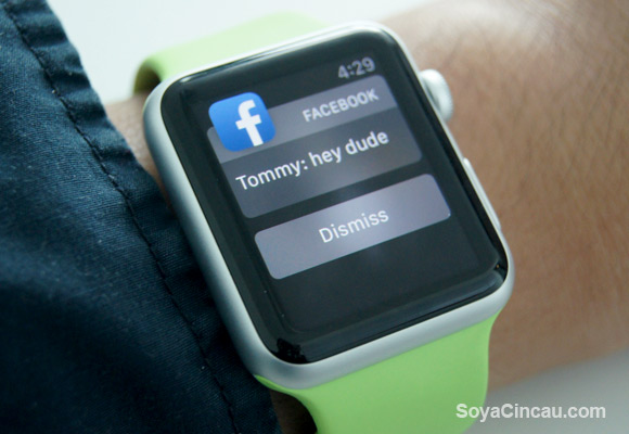
By default, the Watch mirrors the notifications from your iPhone and it knows if you’ve read it so there’s no duplication on either side. When a message comes in for example, WhatsApp, it knows when you lift your wrist and it will automatically display the message without having you to press or tap anything. This is quite useful if you’re stealing a glance while your hands are full. This however won’t work if you have more than 1 unread WhatsApp messages pending, and you would need to view them individually from notifications.
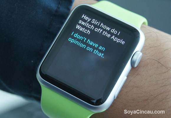
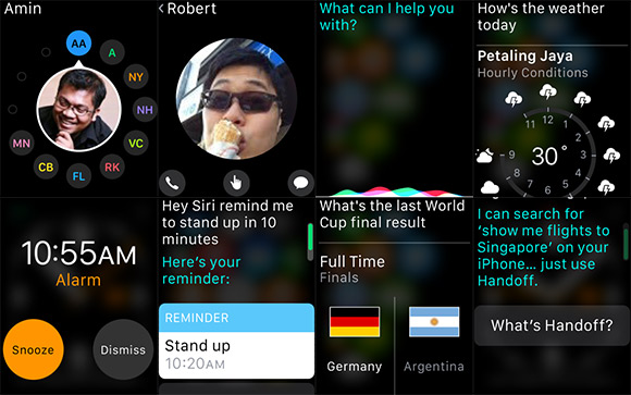
For a hands-free way of calling Siri, you can do so by saying “Hey Siri” the moment you wake the screen. Some of the useful things you can do is to ask Siri to set an alarm or to remind you of your next appointment. You could also ask Siri to set a timer for 10 minutes or to create quick reminders on the fly.
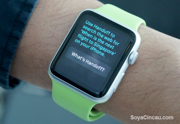
For notifications that can’t be viewed on the Watch, they are pushed to the iPhone via Handoff. This would appear as an icon on the iPhone lock screen. To view it, just swipe from the left bottom corner similar to quick launching the camera.
[nextpage title=”Health and Fitness”]

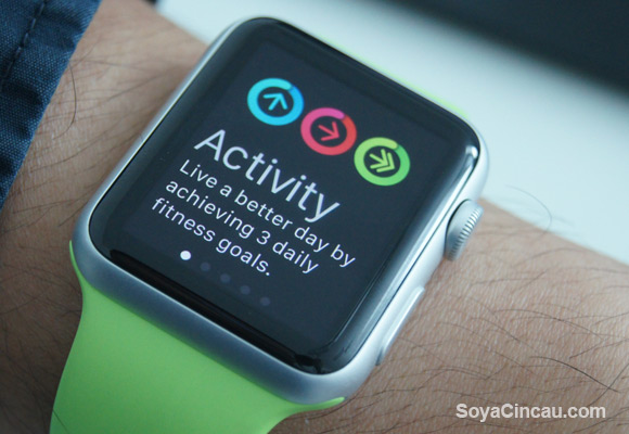
For fitness tracking, Apple has a built-in activity app which keeps track of 3 things – Move, Exercise and Stand. Depending on your profile and type of active lifestyle, it sets daily goals and displays them in a circular display with 3 coloured rings. Your aim is to hit 3 full circles for the different categories.
The stand tracking is probably a good thing for office workers where we tend to slouch in front of the computer for too long. During a 12 hour office hour period, the Watch will constantly remind you to stand up if you haven’t do so in the past 1 hour. It can be annoying but it is a good reminder to stretch out every now and then.
Probably the only thing it lacks is sleep tracking, which we feel is crucial for a fitness tracker. Apple probably omits this knowing that its Watch would need charging every night. Until they improve their battery life, it makes sense for them to omit sleep tracking for now.
Strangely Apple omits from displaying steps which is usually the main denominator for most activity tracker. This is probably done for simplicity as your progress is shown in rings instead of numbers. If you really need to know how many steps you’ve taken, it is actually hidden in the Activity App along with estimated distance taken.
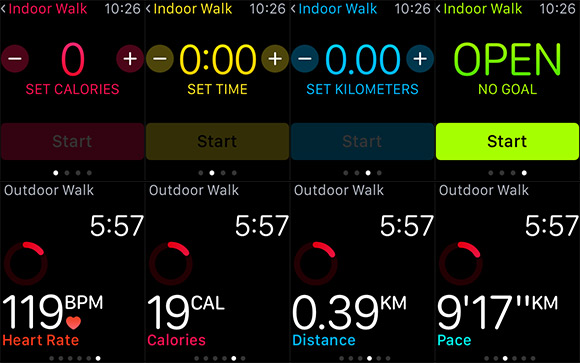
When you’re about to embark on some fitness activity, the Workout app does all the tracking. Just select the type of exercise from indoor walking to outdoor cycling, and the type of goal, be it calorie burn, time, distance or an open workout. As you progress, it tracks your pace, time taken, distance and heart rate. This will be logged into the activity app and it rewards you with badges for every new achievement.
[nextpage title=”Communication and Messaging”]

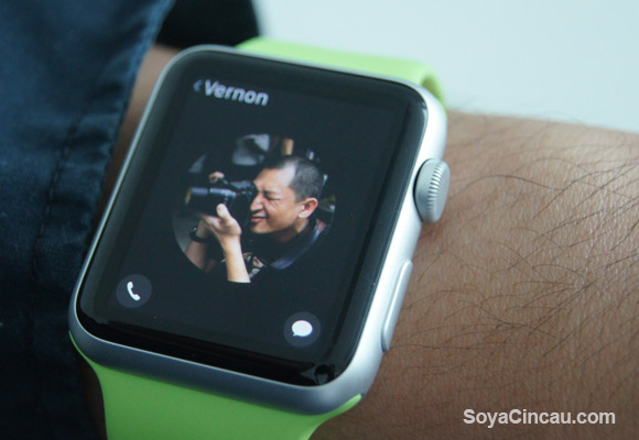
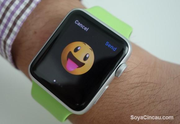
On the Apple Watch, you can preset 12 of your favourite contacts which gives you direct access to Call and Message. However if your contact is using an Apple Watch, you can reach out to them using Digital Touch that’s represented by a finger icon. From here, you can sketch using your finger with different colours and it will be sent over as an animation.
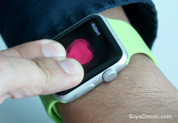
If you’re feeling a bit spy-ish, you can send taps of morse code which can be felt like a physical tap on the other side. For a more intimate experience, you can virtually send a heart beat by long pressing the display with two fingers. It actually records using the Watch’s heart rate sensor and it gets sent over with equivalent pulsating beat rate. On top of that, you also get a wide range of emoticons as well.
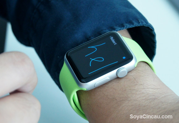
While these are cool at first, it is actually quite gimmicky and you can only use it with friends that actually owns the Apple Watch. Plus with a screen this small, it is hard to draw anything that makes sense and you’re better off communicating with your phone.
Just so you know, the Watch comes with a mic and speakerphone which allows you to make and receive voice calls. The speaker could be a little better and you’ll end up using the iPhone for better audio clarity. If you’re unable to pick up the call, you can easily mute the alert by placing your palm onto the screen.
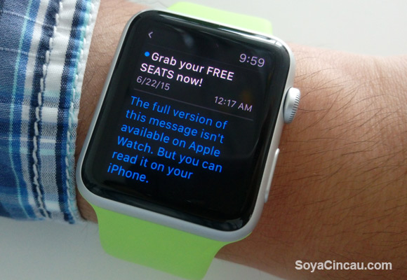
It does support Email but with most messages being sent in HTML or RichText format, the Watch often prompts you to read it on your iPhone. It only works with emails that are sent in plain text.
For normal text messages, you are able to perform quick replies from a number of pre-set messages or you can type via voice. From our test, the dictation recognition works impressively well but it will struggle when you mix some Malay and Chinese terms into the mix. With the rise of Instant Messaging, it would useful if the favourite contact view includes shortcuts for WhatsApp, FB messenger and much more.
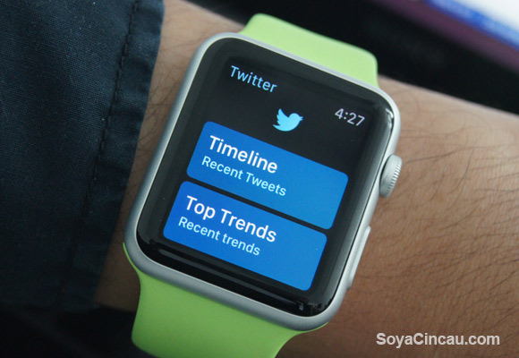
Apart from the standard offering, Apple boasts over 3,000 Watch apps available on their AppStore. Most of the popular apps such as Twitter and Instagram has their Apple Watch extension. Facebook and WhatsApp has yet to provide a Watch app but we reckon they will release one in the near future. Without the app, you still can receive notifications but you’ll need to use your iPhone to respond.
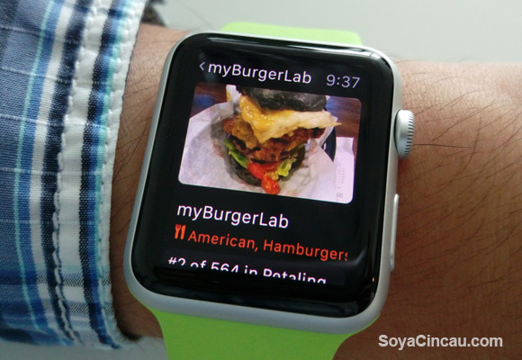
By default, there are essential apps built-in like the music app which sync with your iTunes. This lets you store music on the Apple Watch up to 2GB (default: 1GB) and listen to them directly without having an iPhone with you. Since there’s no headphone jack, you’ll need a pair of supported Bluetooth earphone.
For photos, you get to choose what gets synced to your Watch. You can pick to grab photos that are marked as favourites or have everything mirrored from your iPhone. By default it is set to sync 100 Photos and you can raise this to 500 Photos that occupies about 75MB. In terms of viewing, the Apple Watch display is already quite small for its size and while it is nice to have, you should be sticking to your iPhone for any proper photo viewing.
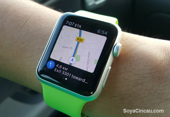
For directions, you can use the Maps app and it can show you your current location and navigate accordingly with voice search. This would require data from your iPhone and the maps navigation isn’t really up to date. For example in Petaling Jaya, it isn’t aware of the new one way road implementation around Jalan Utara to Jalan Timur.
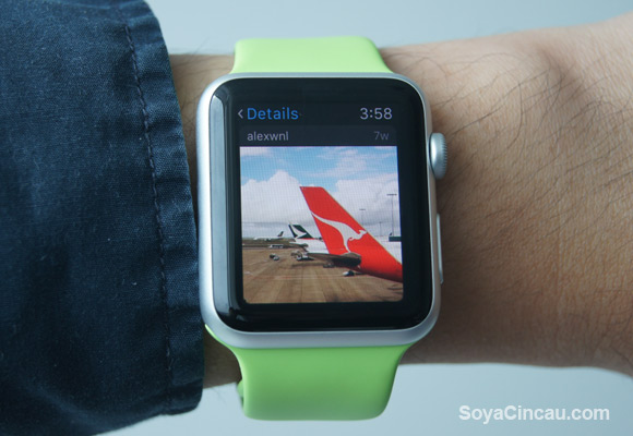
Like any smart watches, the watch apps isn’t supposed to replace your iPhone apps and it gives you a glimpse of what’s going on. For example Instagram, it works well to display your feed and current activities but it is limited to show the latest 9 photos, and it can’t support video playback at the moment. You can tap to view Instagram profiles, it only gives you a peek of the latest 4 photos they have uploaded. For Twitter, it is a similar story as well. It shows 4 of the latest feed but at least it gives you the option to view more by loading extra tweets in 4 increments as you tap to view more. If you really have to, you can tweet from the watch using your voice and you can add emoticons as well.
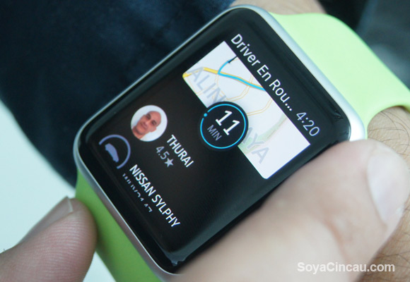
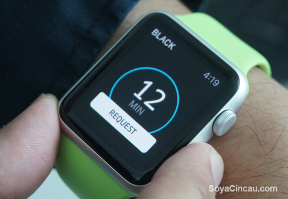
Some of the useful and more practical apps include Uber where you can request for a car directly from your watch. The only problem though, is you can’t select the type of Uber car and there’s no way to view or select your pickup location. All it does is to request for a car that’s nearest to you and if it does get one, it will then display more details of the vehicle including its estimated time of arrival. The Tripadvisor app is pretty neat as well, with its recommendations for restaurants, activities and hotels based on your location.
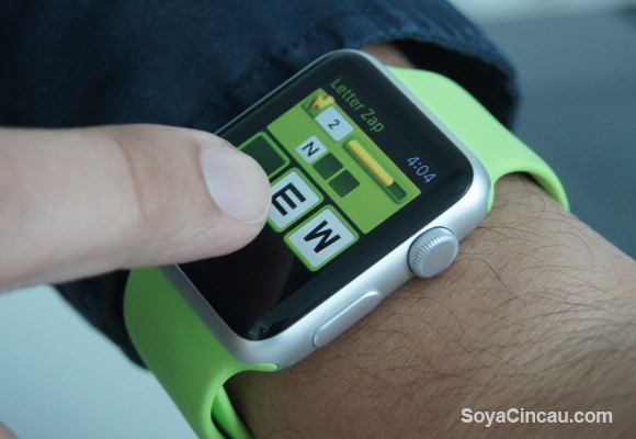
For a bit of fun, there are mini games like letter zap, but why bother when you can play the full game on your iPhone? To quickly view your last opened app, you can double tap on the crown to toggle it back to view. Taking screenshots on the Watch is also possible by quickly pressing both crown and side button simultaneously.
[nextpage title=”Performance and Battery Life”]

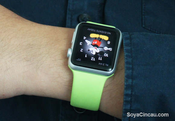
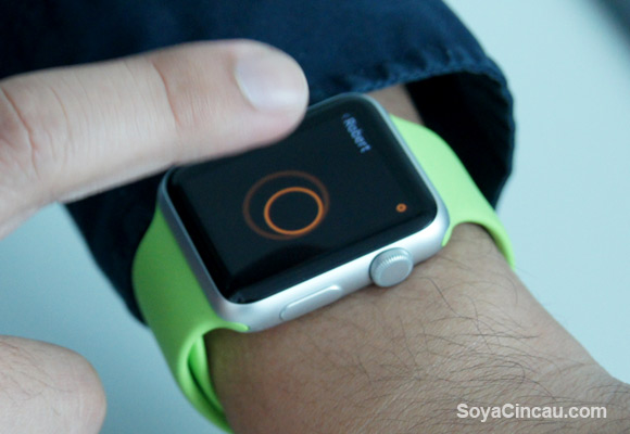
Compared to other smart watches in the market, the Apple Watch interface feels more fluid and refined like its iPhones. The transition effects are just better executed but when you start loading apps, there’s a noticeable lag. Sometimes you get to see the background of the app before the text is being displayed. It feels interrupted at times if the app is internet dependent. That’s where you’ll see a circular loading animation as the app is fetching more info.
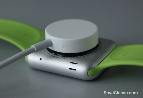
In term of battery life, Apple rates the Watch to last 18 hours and from our usage, it does seem to last from morning at 7AM to midnight without much fuss. This is inclusive of checking on messages and with fitness tracking on all the time. So don’t worry about your watch dying on you in mid-day.
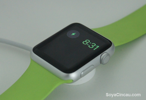
If you are low in battery, there’s a power reserve mode which turns your watch into a basic digital time display. Everything else is disabled and to show the time, you would need to press the side button. To disable it, you just press and hold the side button and the Watch will reboot itself.
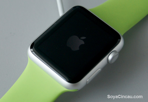
Speaking of rebooting, the Apple Watch is quite slow to start up. It takes about 1 minute and 10 seconds to switch on and as comparison, an iPhone 5 with iOS 8.3 took 50 seconds. To charge, the magnetic cable snaps on effortless at the back. It does about 50% in 40 minutes of charge and it is juiced up fully in under 90 minutes.
The Apple Watch claims to be the most personal device ever and in way it’s true considering you have a wide range of body and strap options at your disposal. Its force touch display, smooth screen transitions and the way its taptic feedback feels are pretty impressive but it isn’t enough to shake up the smart watch segment.
Apple isn’t the first in this game and obviously they tried catching up by putting as many features they could think off including phone calls, fitness tracking, heart rate sensor and an abundance of apps, but is it enough to entice people to finally jump into the smart watch bandwagon?
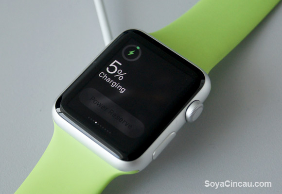
As an existing smart watch user, we find the battery life to be its biggest let down. While it can last a full day of activities, you would definitely need to charge at night to prepare for the next full day. The Power Reserve mode is pretty useless and we hope Apple would add a little more watch face features in their next update.
For the Apple fans, the Watch could be their first step of owning a smart watch. Until recently, the Pebble was the only popular choice but it is very basic in comparison. Like the rest of its product line up, the Watch carries a premium price tag and they are pushing this to be a fashion accessory first, rather than a piece of gadget. With its starting price above RM1,500, it is expensive and the more premium Watch and Watch Edition models will definitely find their demand among the wealthier group especially in China.
As a first gen product, there’s a lot of room to improve before we can call this is the smart watch to rule them all. With the upcoming WatchOS 2, the Watch is expected to get more customisation and independent functions that won’t require an iPhone nearby.
To their credit, the way the Watch handles notifications and the wide options of straps make the Apple Watch more appealing than the rest. However for those who just want a smart watch primarily just to tell the time and get notifications, there are cheaper alternatives out there.
The current Android Wear smart watches like the Moto 360, ASUS ZenWatch ,LG Urbane and Huawei Watch are feature rich with a full touch screen experience but they don’t offer as much body customisation and options as the Apple Watch. As standard, they all have heart rate sensors, music controls, contacts and voice controls, and the battery performs slightly better but not great with about 1-2 days per charge. On the downside, these devices are only compatible with Android smart phones, so that’s totally out for iPhone users.
So what other options do iPhone users have? The Pebble is still among our top pick for a smart watch. It gets up to 7 days per charge and the new Pebble Time now comes with a colour display. For fitness buffs, you could consider the Fitbit Surge which has LCD touch screen display and continuous heart rate tracking which even works while you’re sleeping. It may not look as sexy as the Apple Watch, but it has better activity tracking and also a 7 day rated battery life.
Apple Watch Video
Want an Apple Watch? We are giving one away!
You can be among the first few in Malaysia to own an Apple Watch Sport. Just join our super easy giveaway at our SoyaCincau.com Facebook page.
Apple Watch Photo Gallery
