Flip phones are supposed to be fun, right? Well, they were when Samsung introduced the original Galaxy Z Flip back in 2020. How could they not be? This form factor riffed on some of the coolest phones to come out in the early 2000s (the best era), and more than anything, it’s just so satisfying to be able to snap a big phone in half and slip it in your pocket.
But after two years of sticking with the same old design, the Z Flip series was starting to get a bit…boring. At least with the new Z Flip 5, Samsung is giving us a new cover screen, a new hinge and a new chip. But the rest of the device is exactly the same as last year’s Z Flip 4—you get the same cameras, the same battery and all the rest of it.
So, nothing’s changed, then. It seems Samsung will forever be stuck in this cycle of iterative updates until kingdom come. Doesn’t sound very exciting, does it?
Perhaps. But here’s the thing: I think the Z Flip 5 is more than the sum of its parts. It’s actually fun again—and this new cover screen makes all the difference.
Taking cover
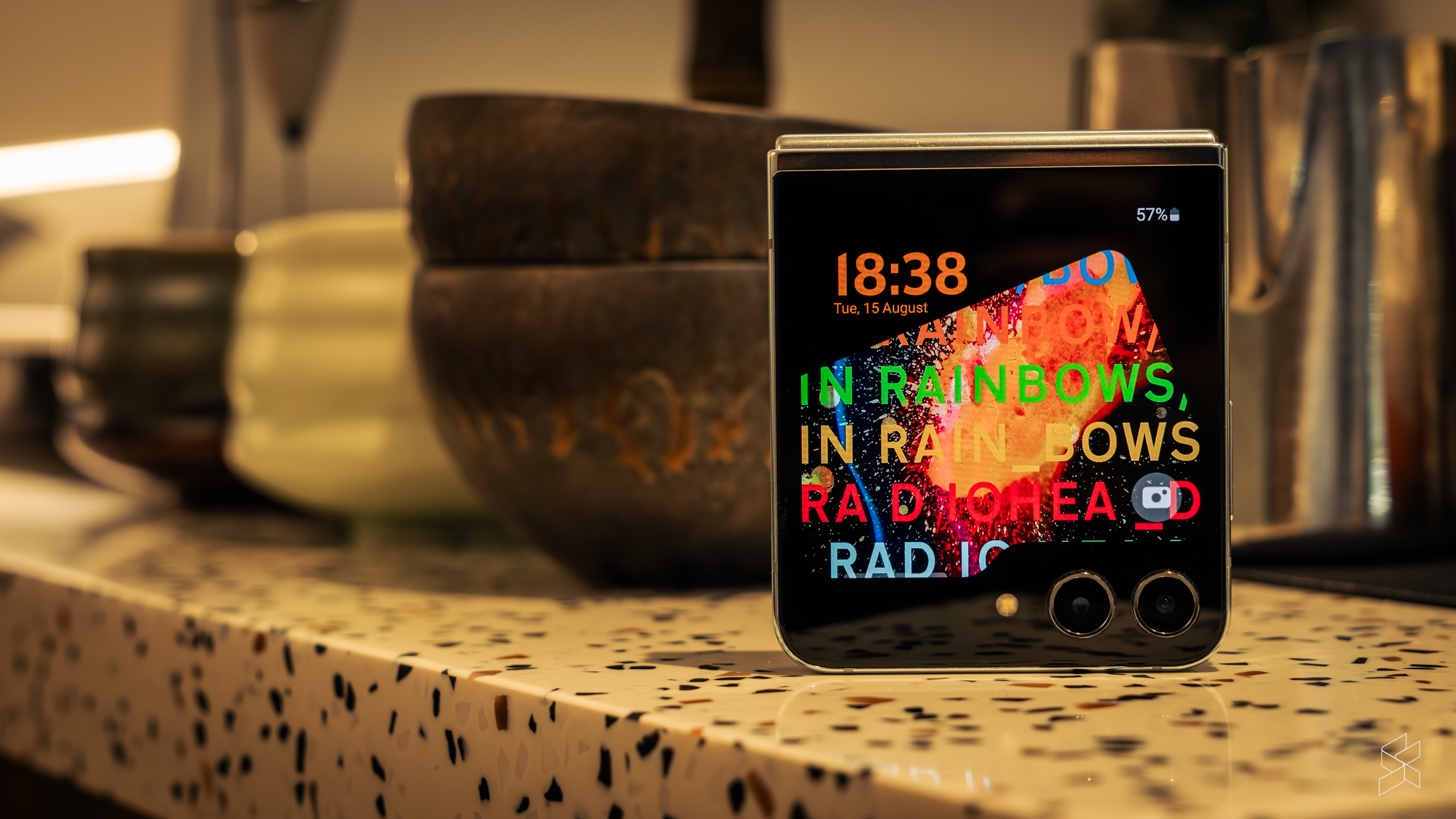
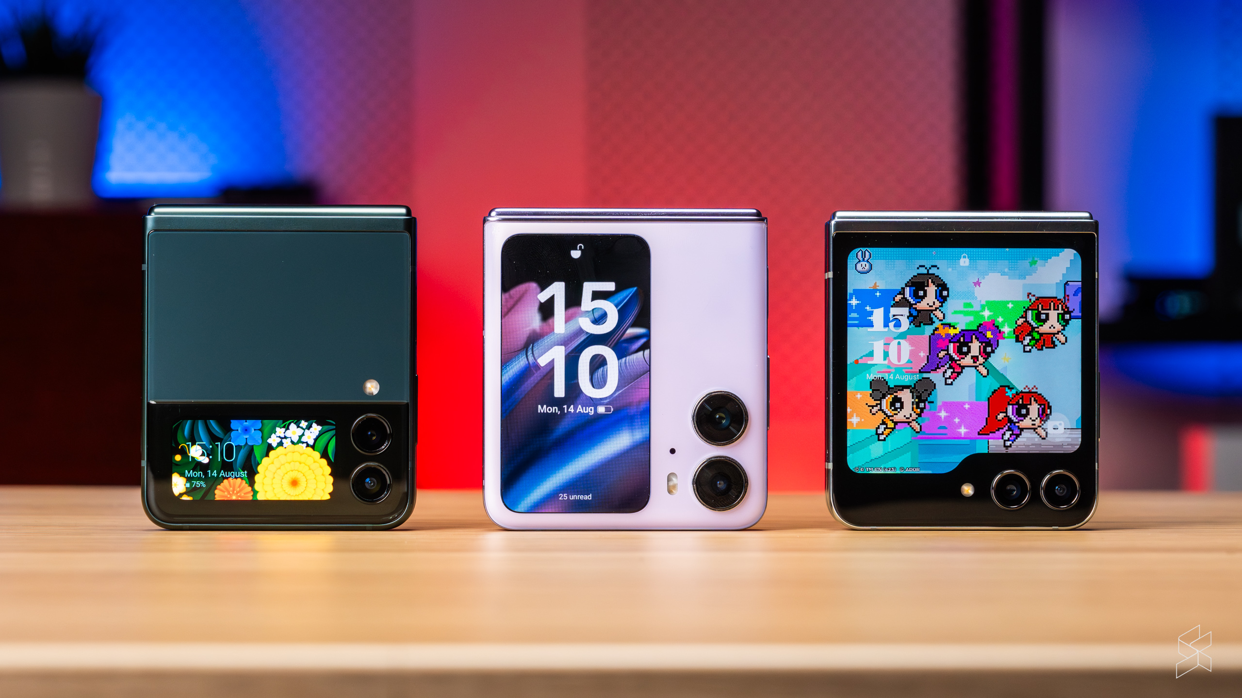
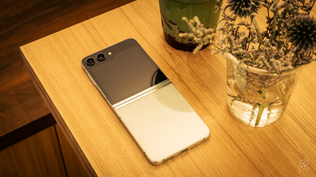
We have to start with the biggest change first. The old Z Flip 4’s 1.9-inch cover screen (itself lifted from the Z Flip 3) was fun for a while, but we quickly outgrew its limited functionality, and taking photos with that thing as a viewfinder was dreadful. And the competition has overtaken Samsung this past year—the Oppo Find N2 Flip has a 3.26-inch vertical display, while the Motorola Razr 40 Ultra’s ginormous 3.6-inch edge-to-edge screen is even bigger than the Z Flip 5’s 3.4-inch panel.
That’s not to say that the Samsung’s new screen is old news. It’s anything but—if the Z Flip 4’s cover screen is a tiny studio apartment, and the Find N2 Flip’s is a three-storey terrace house, the Z Flip 5’s is a mansion. It’s still a 60Hz AMOLED screen, but it now reaches an impressive 1,600 nits of brightness, so it’s perfectly useable outdoors. With a pixel density of 306ppi, it doesn’t exactly have the highest resolution, but it still looks fantastic with great colours and viewing angles.
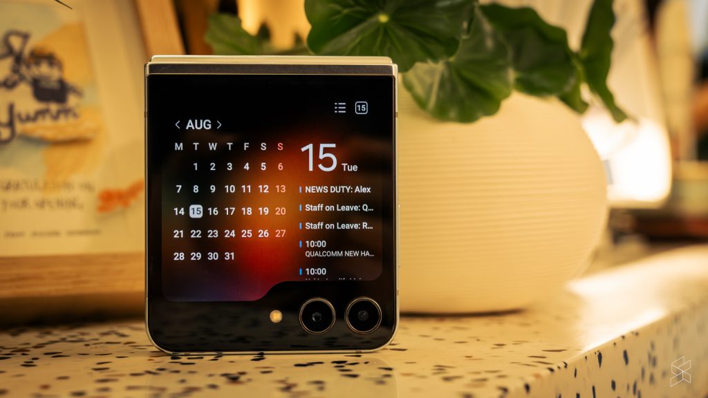
The larger size accomplishes several things. One, the widgets are huge. You can see the calendar next to your schedule, the weather widget shows the weather for multiple days, and you can use the Samsung Wallet for the first time. You also get the ability to mute calls simply using your palm.
And we haven’t even gotten to the apps you can run on the cover screen, like WhatsApp. You can type messages on a full QWERTY keyboard. You can run Google Maps, which is a godsend when you’re navigating through a new city and don’t always want to flip your phone open. You can watch videos on YouTube or full-length movies on Netflix—such a gloriously stupid thing to do on such a small display, but hey, it works.
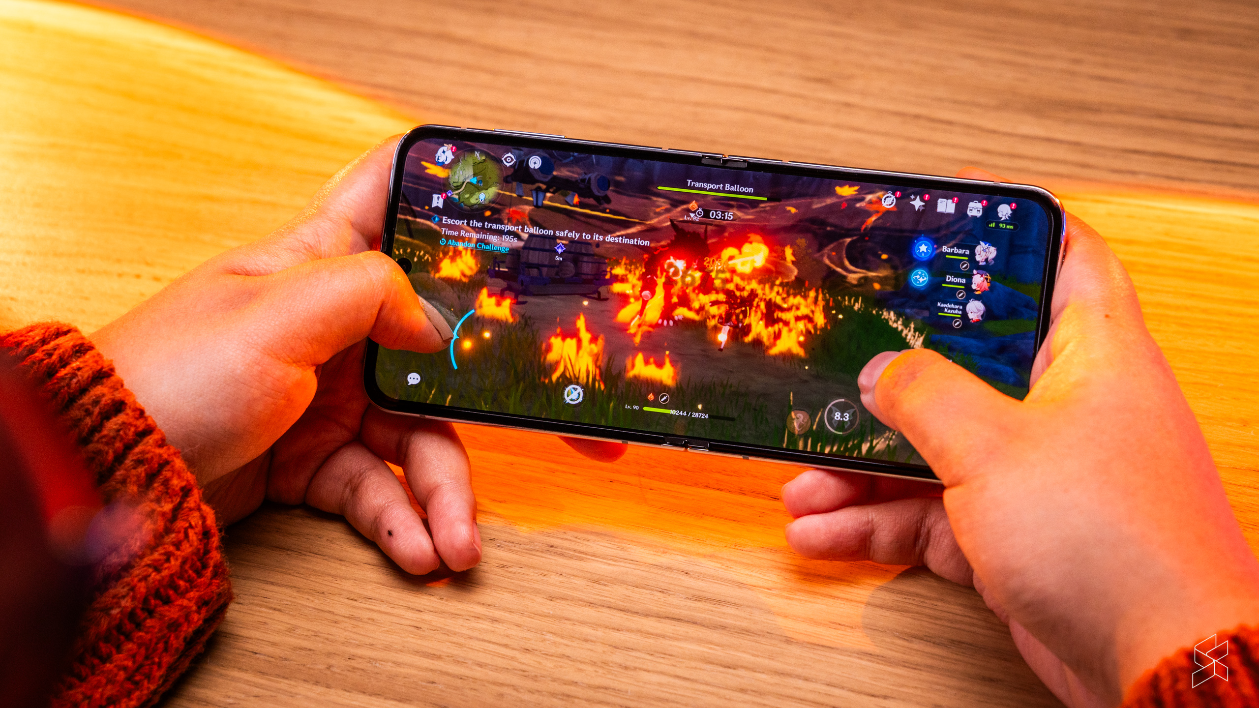
And while the list of officially supported apps is fairly limited, you can run practically any app you can think of using a workaround that involves downloading Samsung’s Good Lock app and then installing the MultiStar module. You can even run Genshin Impact on it. Not that I would recommend ever playing it on such a small screen, but you can, and that’s really all that matters.
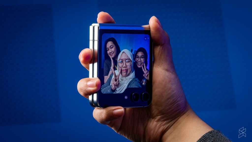
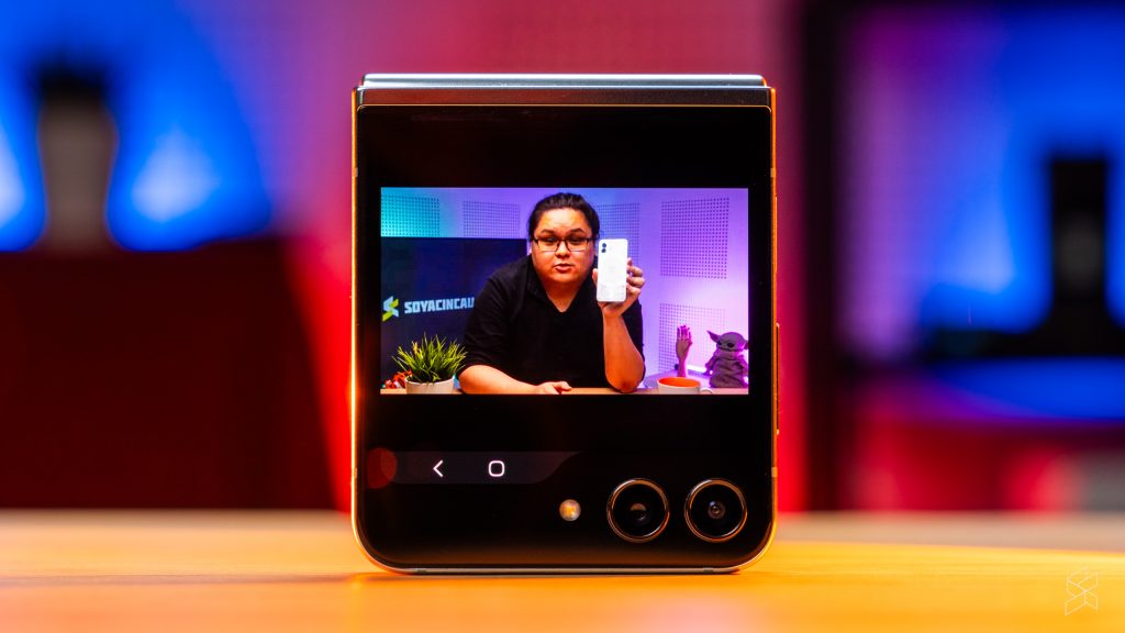
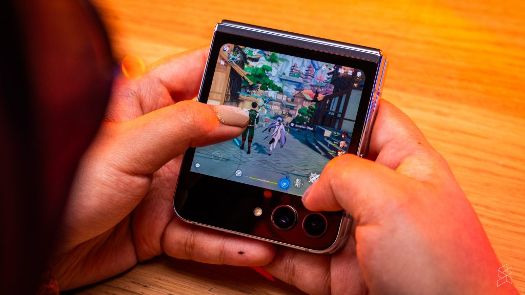
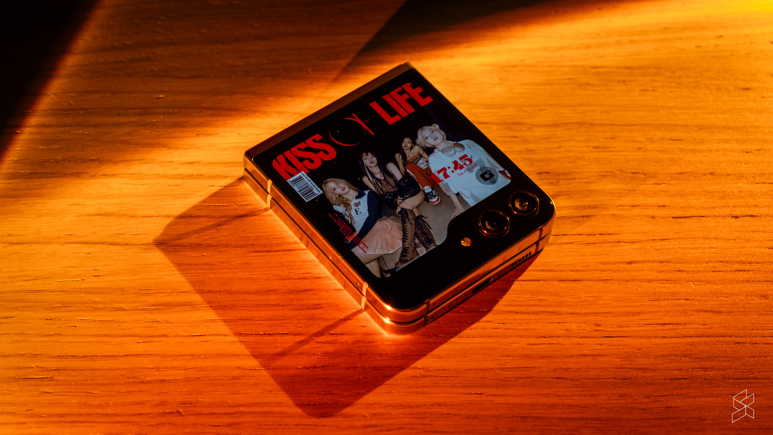
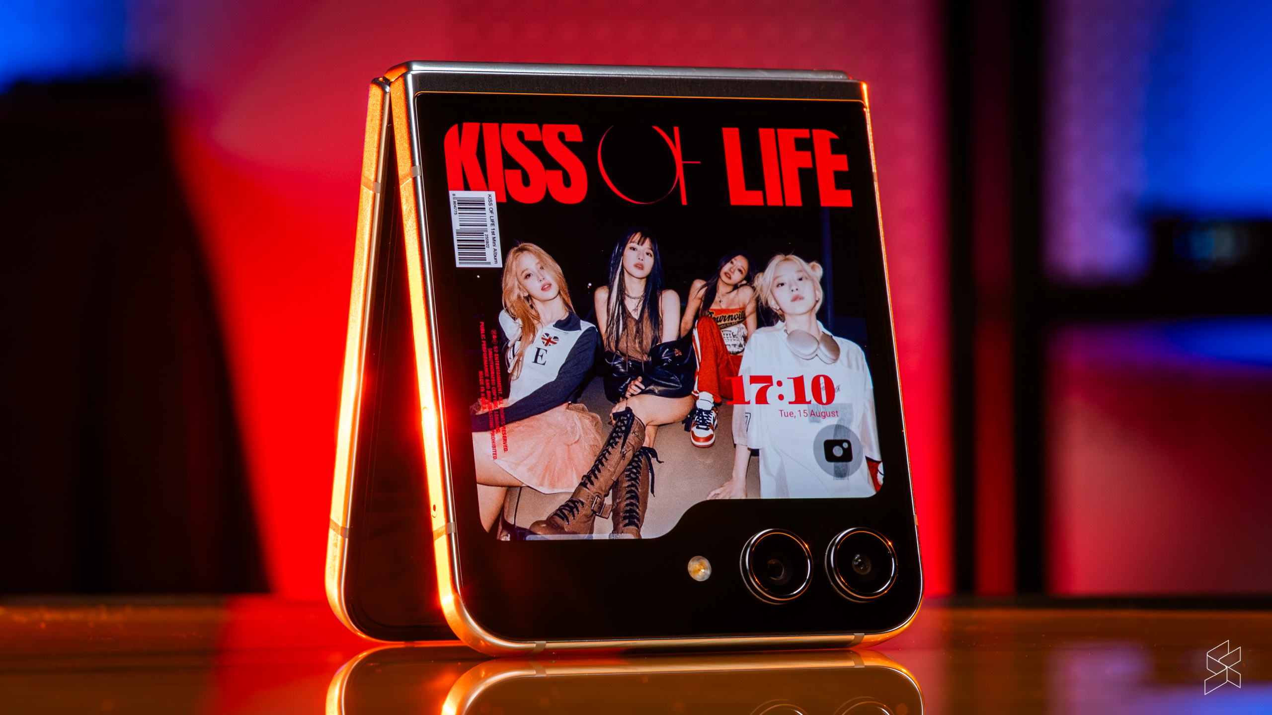
All this is underpinned by a very intuitive interface. You can pinch to zoom out and move around instead of swiping through endless widgets, and you can rearrange the widgets themselves. More than anything, making your own lock screen is just so…fun. You can change the clock and move it around, add all sorts of graphics on it and change the default camera shortcut to literally anything else. I just use the square screen to show some album cover art. So cool.
But the cover screen really comes into its own when you’re taking selfies with the outer cameras. Using the entire front of the Z Flip 5 as a viewfinder is quite simply a game changer. With the Z Flip 4, you had to squint to look at a tiny rectangle the size of a postage stamp, but the Z Flip 5’s big display not only makes it easy to fit everyone in your shot, but you can also now adjust settings like the aspect ratio right from the camera widget. Unfortunately, you can’t enable the flash when shooting in this mode, so low-light selfies are still a challenge.
It all hinges on this
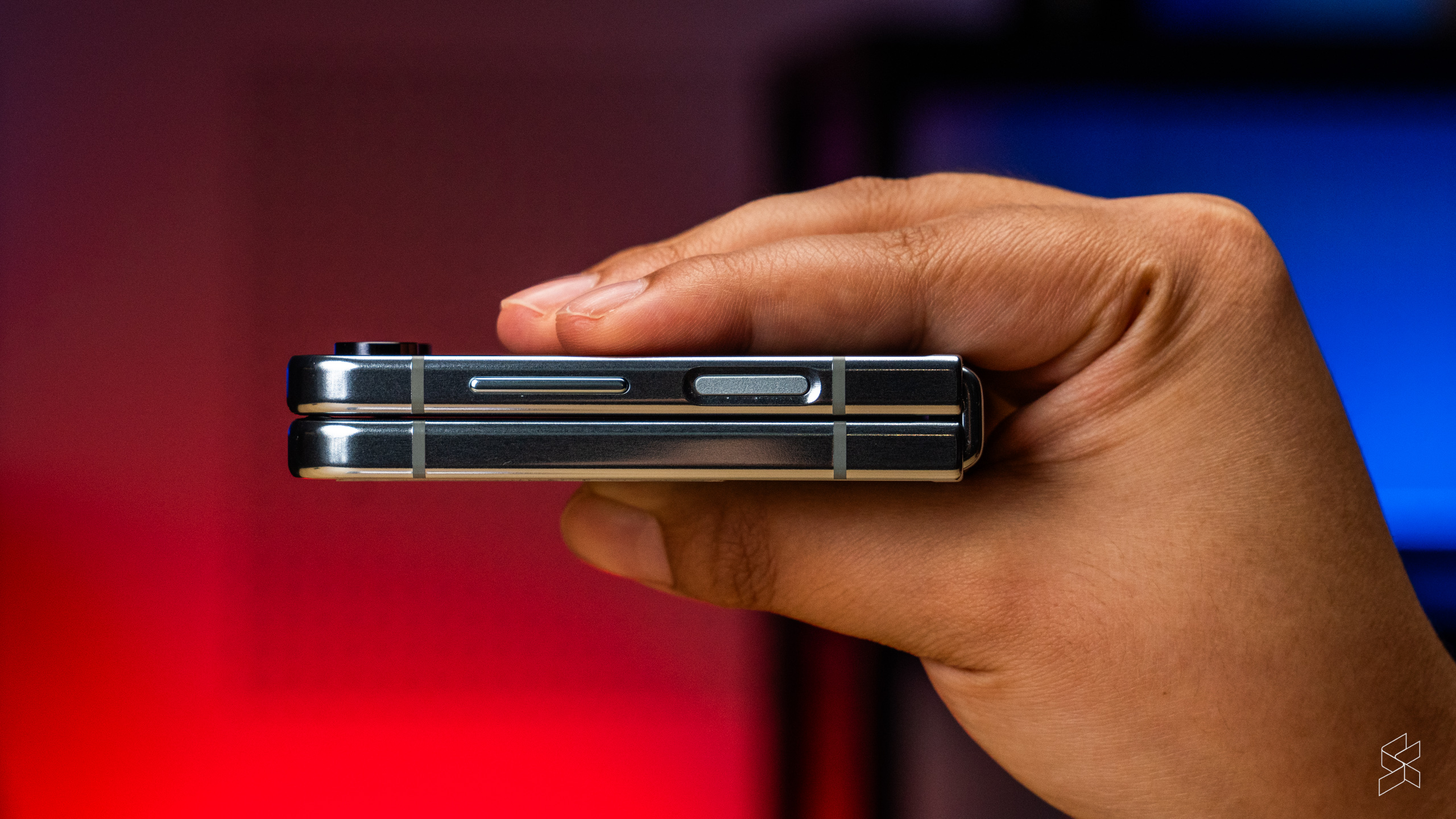
The other big change is the hinge. Samsung has finally adopted the design favoured by literally everyone else in the industry, folding the inner screen in a teardrop shape. At last, this is a Z Flip that folds completely flat, without any gap between the two halves. It also makes for a shallower crease, although the Z Flip 5’s inner display still can’t match the Find N2 Flip’s in terms of being almost completely flat.
It has to be said that the Samsung feels far better built than the Oppo. The hinge is stiffer, so the phone feels less floppy when it’s half open. The only slight issue is that because it’s so stiff, it sometimes doesn’t open completely flat, so you kinda have to straighten it by pulling it open, which just feels wrong.
Better yet, Samsung did all of that while retaining IPX8 water resistance, something that can’t be said about pretty much all of its competitors. The company also claims the dual-rail hinge design is more durable, and the flexible display has a shock dispersion layer to absorb knocks, so hopefully there are fewer warranty claims this time around. You also get Gorilla Glass Victus 2 on the front and back.
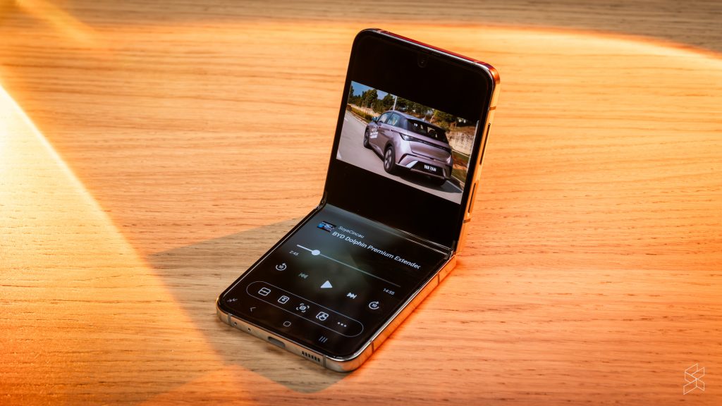
On the inside, however, not much has changed. You still get a 6.7-inch Full HD+ AMOLED display with a 120Hz adaptive refresh rate, which is narrower than the Find N2 Flip’s and means it feels like a skinny-tall phone when it’s opened, rather than a full-sized one. It also runs the same old One UI with all of its quirks, ads, duplicate apps and…Bixby.
One new feature in One UI 5.1.1 is a button to activate the Flex Mode Panel whenever the phone is half-folded. This puts additional controls on the bottom half of the screen, such as a touchpad and a new video playback interface for apps like YouTube, which boggles my mind that it hasn’t been implemented sooner. And in typical Samsung fashion, you can run split-screen apps on this thing. The image of this flip phone essentially running three tiny apps on both its screens is just hilarious to me.
Cameras that punch above their weight
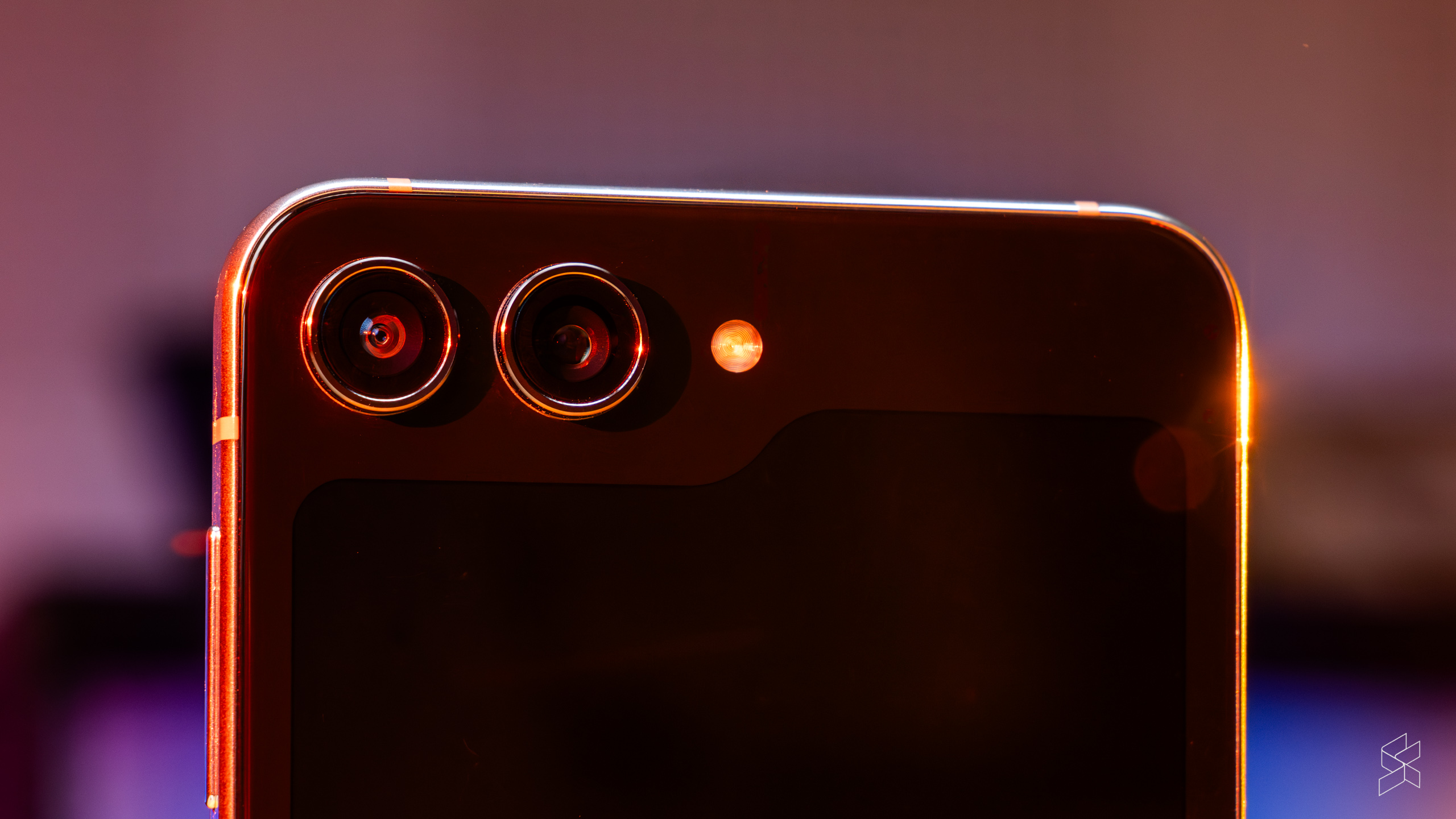
Another area that has been unchanged is the cameras. You still get two of them on the outside, both with 12MP. The main camera has the larger sensor with a pixel size of 1.8µm, an f/1.8 aperture and optical image stabilisation, while the ultra-wide camera has 1.22µm pixels and an f/2.2 aperture. They get new “super clear” lenses, but otherwise it’s the same hardware as the Z Flip 4.
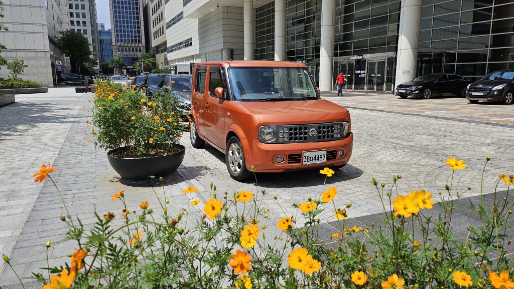
Of course, these cameras do the usual Samsung thing of maxing out the sharpening and saturation, and on something that’s as photography-focused as the S23 Ultra, that can get very annoying very quickly. But the Z Flip 5 is supposed to be a “fun” phone—something you use to take pretty photos to post on Instagram—so that’s less of a problem. What’s more impressive is that the phone is able to use the same old camera hardware to take some fantastic photos.
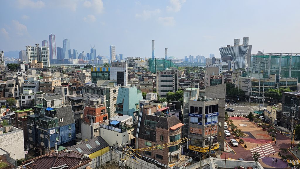
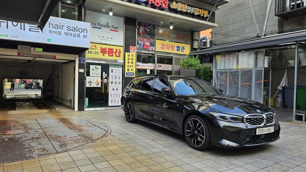
Samsung’s AI algorithms have improved by leaps and bounds over the past few years. We saw them used to great effect with the S23 Ultra, and it’s the same thing here, delivering great detail, dynamic range and colour reproduction across both cameras. It should be noted, however, that the ultra-wide does exhibit the typical softness at the corners.

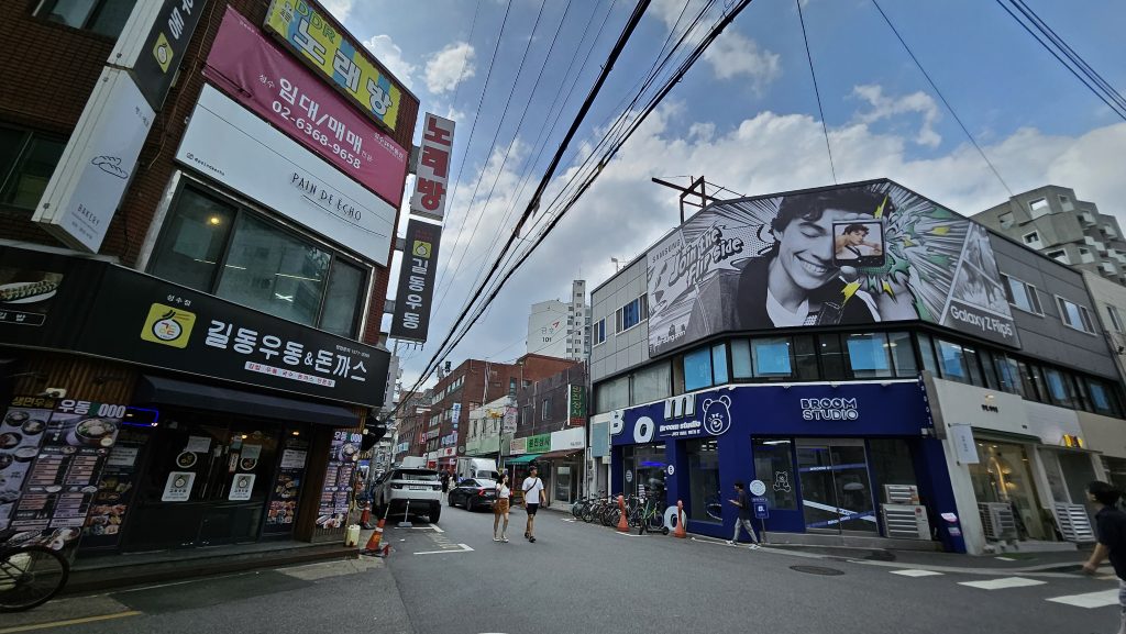
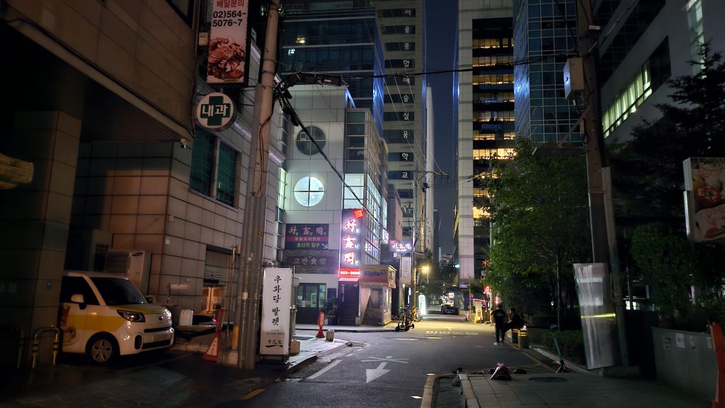

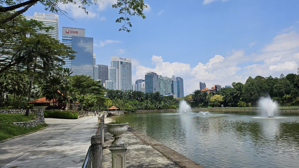
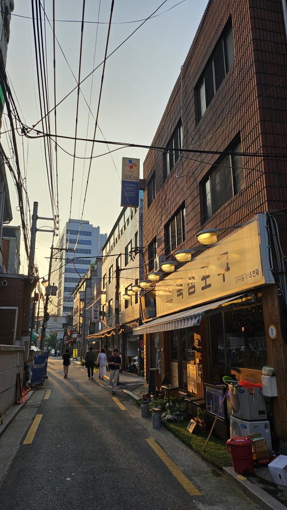
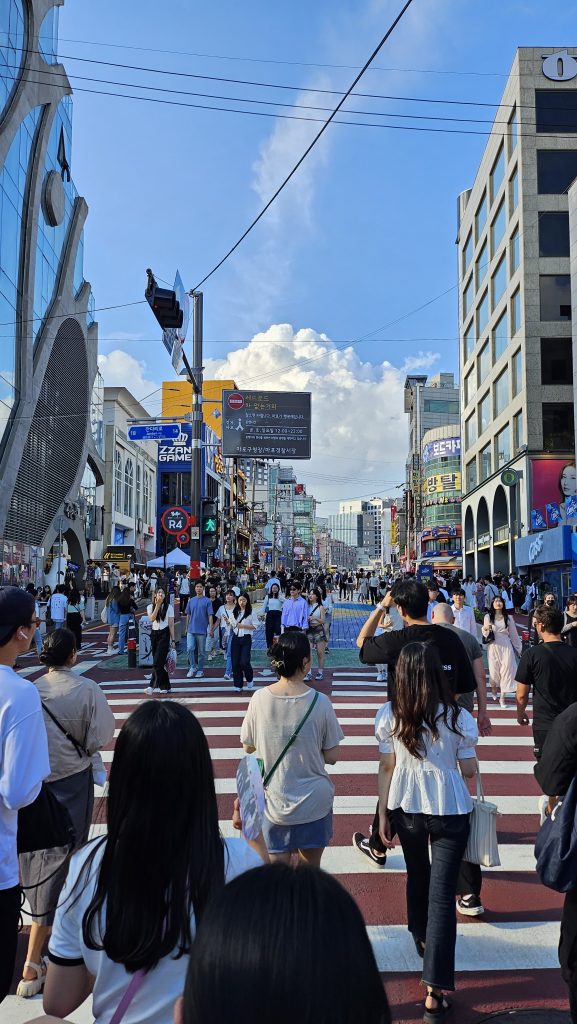
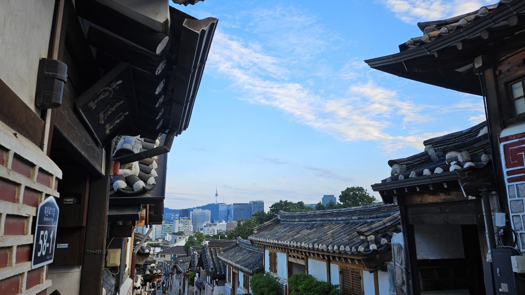

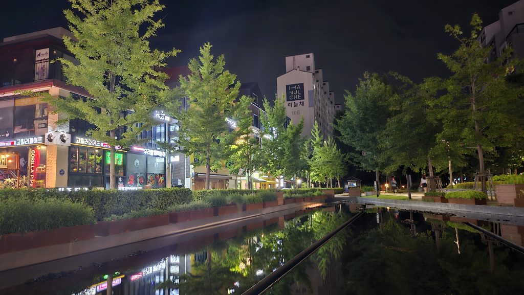

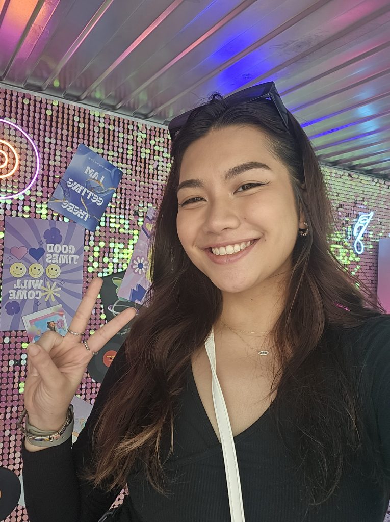
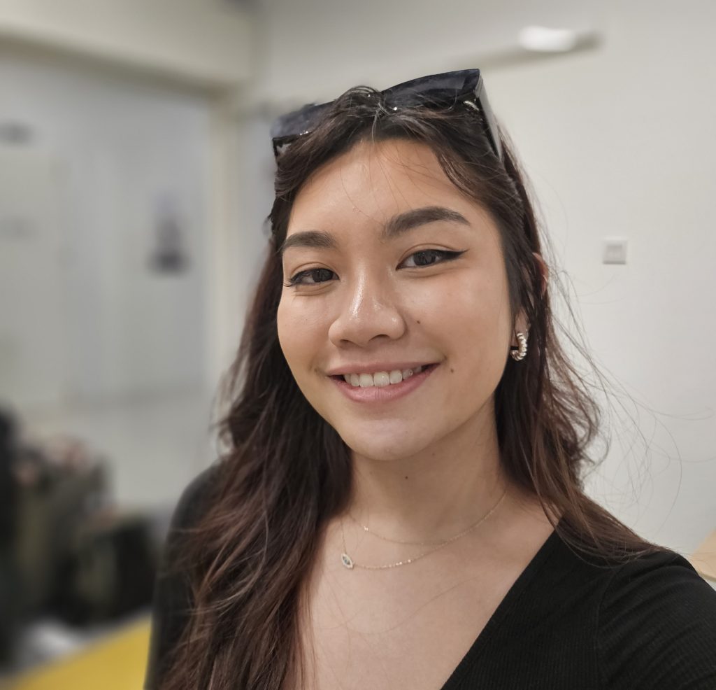
But it’s at night where the Z Flip 5 really works overtime to adjust your photos. The Z Flip 5’s image quality remains remarkably consistent even when the sun goes down. There’s very low noise, and it’s only in very challenging conditions where you’ll see the limitations of the AI processing. And of course, with the Z Flip 5, you can take selfies with the main camera instead of the 10MP inside camera, which does alright in terms of detail but the colours are a little washed out. You’ll also benefit from the shallower depth of field without having to resort to portrait mode.
Speaking of which, the portrait mode on the Z Flip 5 isn’t a patch on something like the S23 Ultra. In particular, it struggles with individual strands of hair, something its bigger brother excelled at. Still, it works in a pinch.
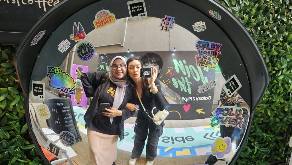




There’s no telephoto camera but Samsung is boasting about a new Space Zoom feature. It offers up to 10x digital zoom, but I wouldn’t bother. This isn’t the same magical system you’ll find on the S23 Ultra. Zooming up to 2x is fine, but anything more than that and you’ll just get a big pile of jumbled, AI-assisted mess.
Video performance is pretty good. The Z Flip 5 uses the same Adaptive VDIS stabilisation technology as the S23 Ultra, so the footage ends up being very smooth, and there aren’t the big exposure jumps you’ll find on some other Android phones. I must say, however, that it can get quite blurry and noisy in low light.
Fast but too furious
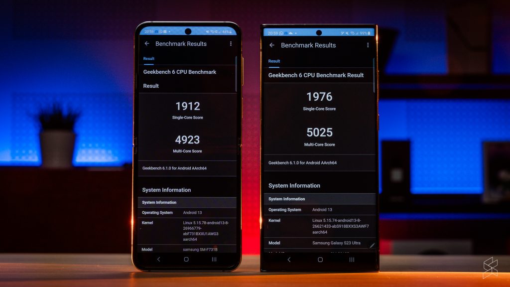
As much as I’ve been enjoying the Z Flip 5, there are a few drawbacks. Sure, it’s powered by the overclocked “for Galaxy” version of the latest and greatest Qualcomm Snapdragon 8 Gen 2 chip, which we already know is very fast, with CPU speeds of up to 3.36GHz. And even though it only has 8GB of RAM, it posts fairly similar Geekbench 6 numbers (over 1,900 for single-core performance, over 4,900 for multi-core) to the S23 Ultra, which has 12GB of RAM.
The Z Flip 5’s problem is cooling. Because the phone is effectively split in half, there’s no space for a large vapour chamber, so it heats up very quickly when you push it to its limits. Thermal throttling is a really big issue when you’re gaming, and while you can max out the graphics settings, you’ll start to see stutters and dropped frames within minutes. Not to mention, it gets unbearably warm to the touch—and only on one side of the device. It’s so bad that you wonder why Samsung even bothered to put the 8 Gen 2 chip in there, because you’re very rarely able to use all that power without running into its thermal ceiling first.
The other issue I have is battery life. I’ve been getting around four hours of screen-on time before reaching 20% charge, which isn’t bad when you have a tiny 3,700mAh battery. But it does mean that on a heavy day, you’ll be looking for a charger before nighttime. Samsung says the Z Flip 5 offers all-day battery life, but that’s only during light use.
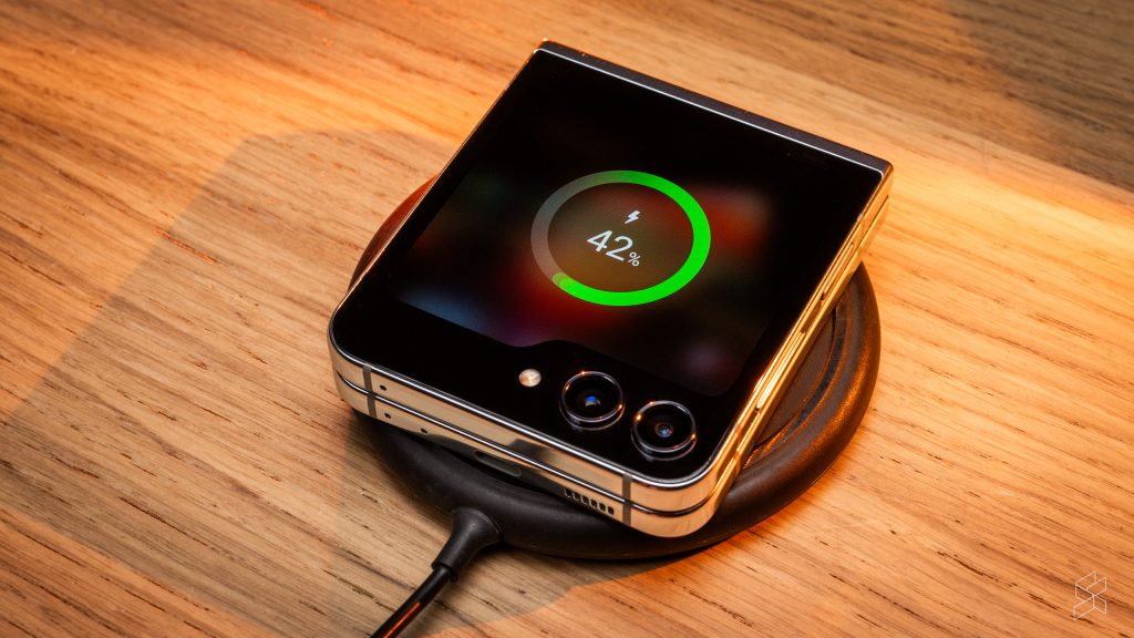
All too often I found myself either scrambling for a plug point or turning on the power saving mode early. And once you run out of battery, it takes a long time to charge back up, because the Z Flip 5 only fast charges up to 25W (15W wirelessly). Even the Find N2 Flip goes up to 45W.
But that’s the thing—I’m only running out of battery so often because I’m using the Z Flip 5 so much. Because I’m in love with it.
A lovable foldable
I’ve used the word “fun” a lot in this review. Companies always try to sell you the idea of a product being exciting, but this is the first phone that’s done it for me.
This is the Z Flip unshackled. Before, you were always butting up against the limits of that tiny cover screen. Those constraints are gone now, and you’re really seeing the true potential of these flip phones. And the rest of the experience is so much better for it. It helps make up for the so-so battery life, the slow charging and the fact that Samsung is using the same hardware yet again.
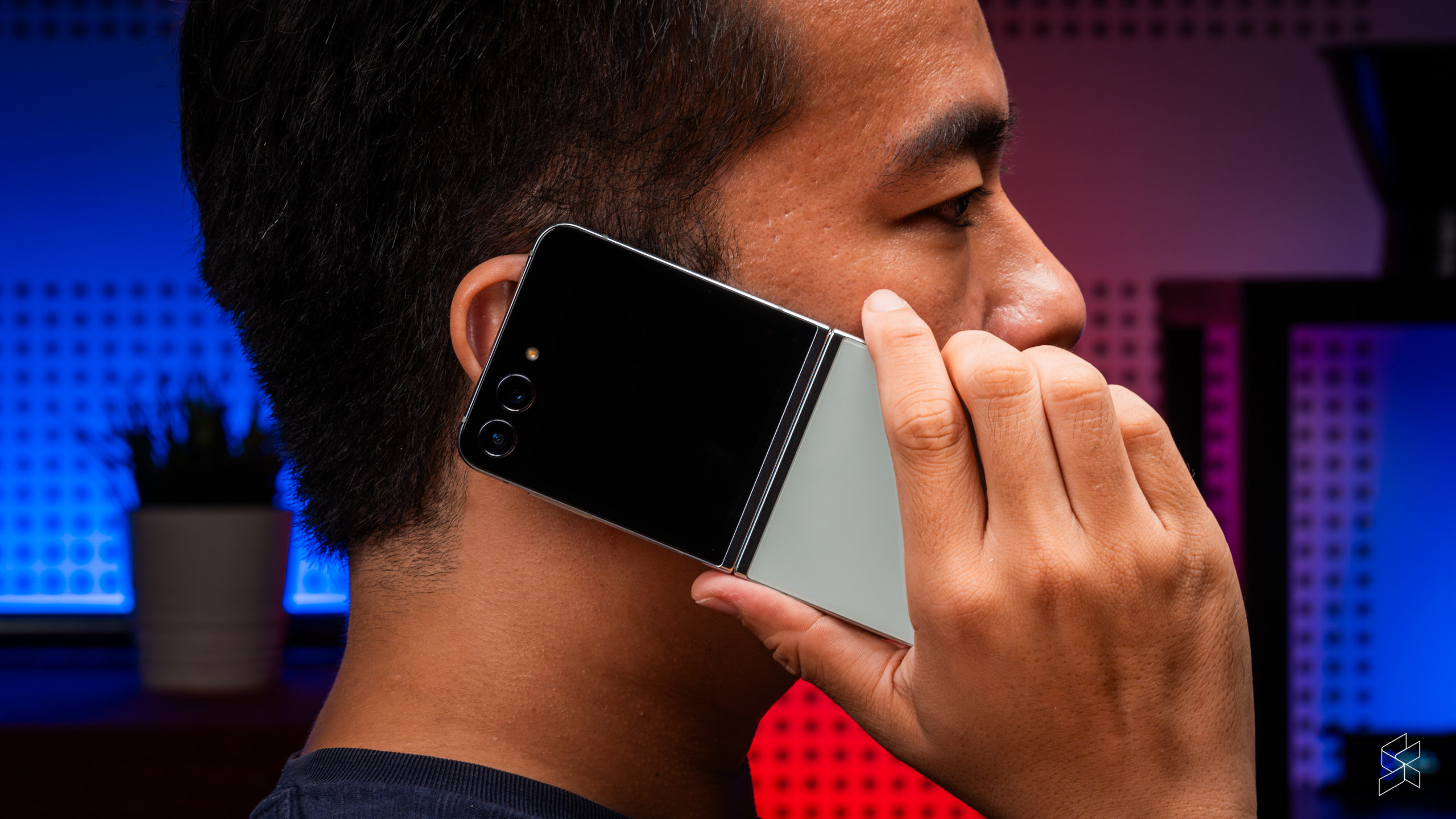
There really is no other word for it, this phone is just…fun. Yes, I know RM4,500 is a lot of money for something “fun”. And honestly, is the Z Flip 5 RM500 better than the Find N2 Flip? No, it’s not. The Oppo is a great flip phone on its own, and it still has a few things going for it, like a larger (and far more useable) battery and a shallower crease.
But the Z Flip 5 does have a bigger cover screen, better cameras, a faster chip, wireless charging and water resistance, so yeah, it kinda is worth it. More than anything, Samsung has made a phone that has made me excited about Android all over again. And I never thought I’d say that.
Certain images shot on location at Too Yumm Seafood, GMBB

