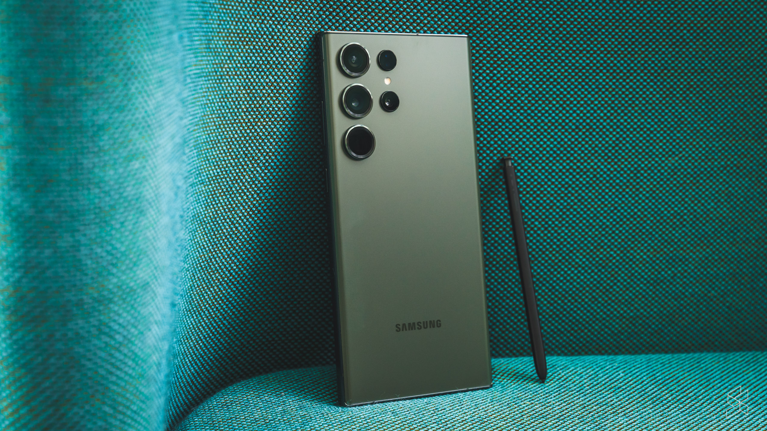
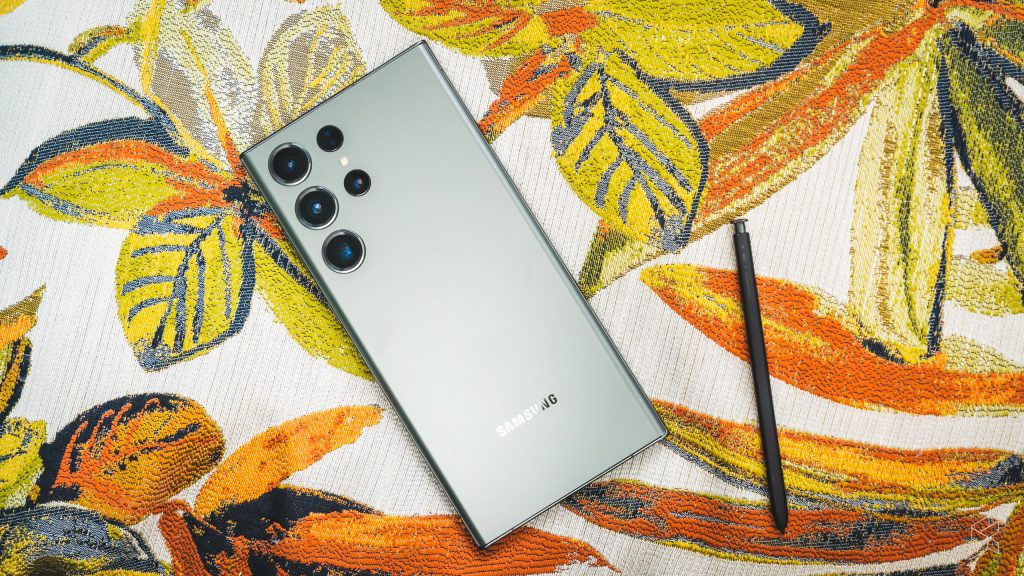
By now, you’ll have already seen the Samsung Galaxy S23 Ultra, and doubtless many of you will have even received your own units. Right from the off, we knew that this would be an iterative update rather than a wholesale revamp, given how similar it looks to the S22 Ultra.
But that’s not to say that Samsung has simply slapped a new chip into its flagship and simply shipped it—there’s some genuinely new stuff here. Of course there’s a different processor this year, the Qualcomm Snapdragon 8 Gen 2 that’s filtering into pretty much every flagship launched this year. But it’s been optimised “for Galaxy” and boasts a few upgrades that are claimed to elevate the phone’s performance above the competition.
And while you’d expect the usual mild camera upgrades, the company has gone the whole hog with an innovative main camera sensor, boasting an absurdly high megapixel count and working simultaneously with other hardware and software changes to deliver markedly improved image quality. Or so Samsung says. But has all this translated to a powerhouse flagship still worthy of the “Ultra” branding? It’s time we found out.
Same same but different
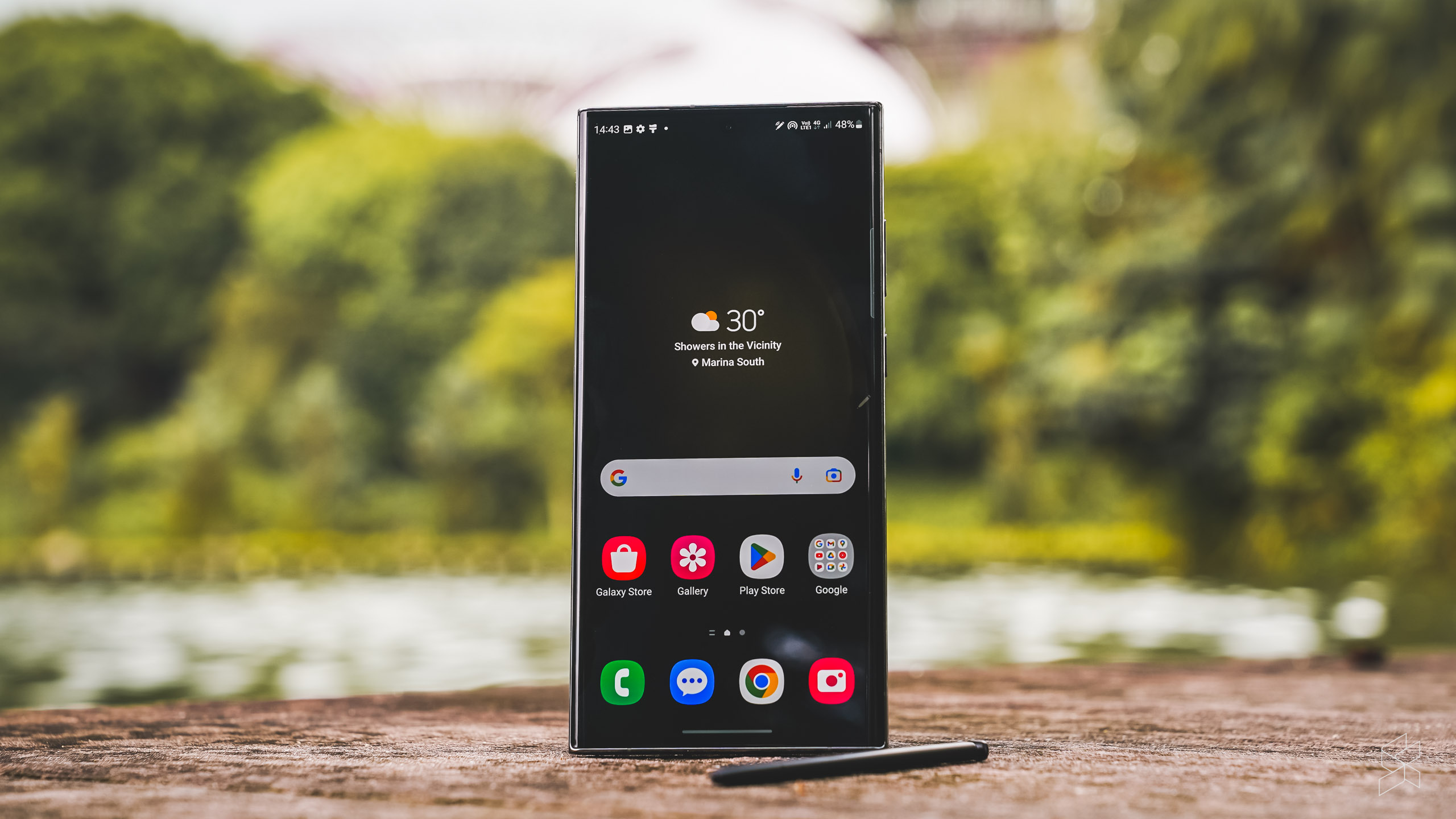
This is not the first time Samsung has reused the same design for its top-of-the-line models. We saw the same thing with the S6 and S7 and the S8 and S9. But the company’s lineup of flagship phones is wider than ever before, and they all haven’t changed. And so, if the S23 Ultra, the Z Fold 4 and the Z Flip 4 look basically like the S22 Ultra, Z Fold 3 and Z Flip 3, you start to wonder if Samsung has lost its way.
But pick up the S23 Ultra and you’ll notice the difference straight away. The edge display is still there, but the flat surface is pushed further outwards, so only the extreme edges are curved. The sides are also flatter—making the phone feel much boxier than before. The S22 may look like the sleeker device, but the S23 actually feels more comfortable in your hand, because it’s easier to grip.
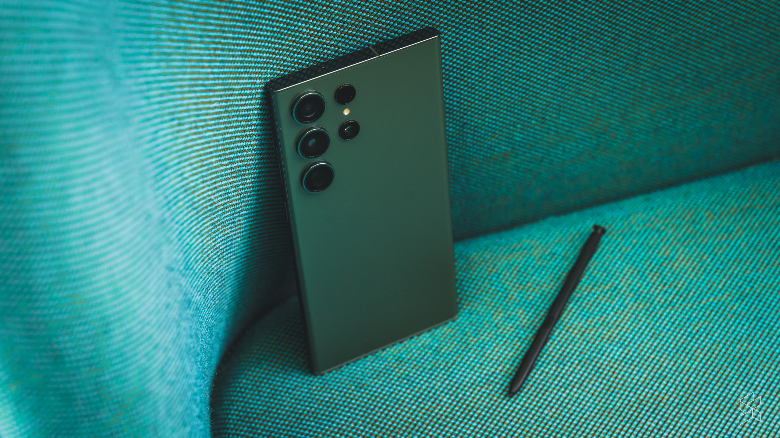
This subtle change would’ve cost Samsung millions, and it means older cases won’t work. Which begs the question—why did Samsung bother with all this effort, only to make the phone look the exact same?
Oh, but just because S23 Ultra is slightly easier to hold doesn’t mean it’s not still a right pain in the arse to use every day. Let’s not forget, this is a big and heavy phone, and the curved screen and polished aluminium frame means it’s still slippery.
Lots of high-end features, but they don’t move the game on
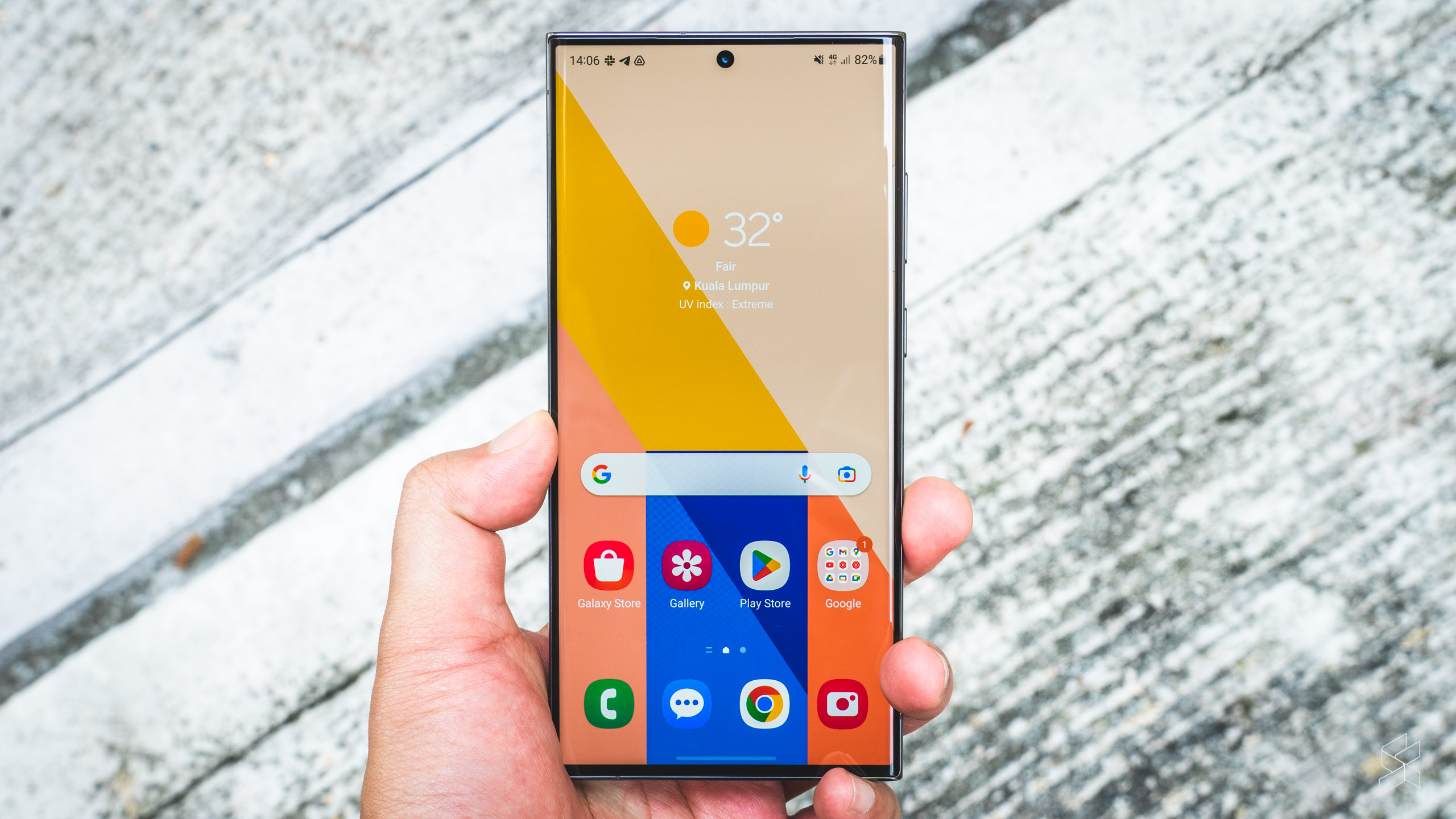
But all that effort is worth it for this display. It’s a ginormous 6.8-inch AMOLED panel with a 1440p resolution, a 120Hz adaptive refresh rate and 1,750 nits of peak brightness and it’s just as sharp and as vivid as before. In other words, it’s basically the same display as the S22 Ultra. But because it curves ever so slightly less, the colours don’t run so much at the edges because the viewing angle doesn’t fall off so dramatically. I will say that I do still get a few false touches at the edges, which is a bit annoying.
One thing new about this display is that it’s the first to come with Gorilla Glass Victus 2, which is not only claimed to be more resistant to drops on rough surfaces like concrete, but also uses up to 22% recycled glass. You should probably still get a case though. You know, just…in case.

But of course, the real reason why you buy an Ultra is the S Pen. This is the second generation of Samsung’s Note replacement, and it works as well as ever. There’s very low latency thanks to excellent prediction and it comes with all the same perks, like screen-off memos, handwriting recognition and Air Commands. It’s the best it’s ever been, but it’s also the same as it was last year. You can say the same thing about a lot of the S23—a 5,000mAh battery, 45W fast charging, 15W wireless charging, reverse charging and IP68 dust and water resistance. All standard high-end flagship stuff.
But after years of continuous improvement, you get the feeling that, like all other manufacturers these days, Samsung is starting to stagnate. You still don’t get extremely high-powered charging like a lot of the Chinese manufacturers, and the fingerprint reader still takes a beat before it unlocks your phone. However, the company has made a big leap in three key areas.
Performance out of this Galaxy
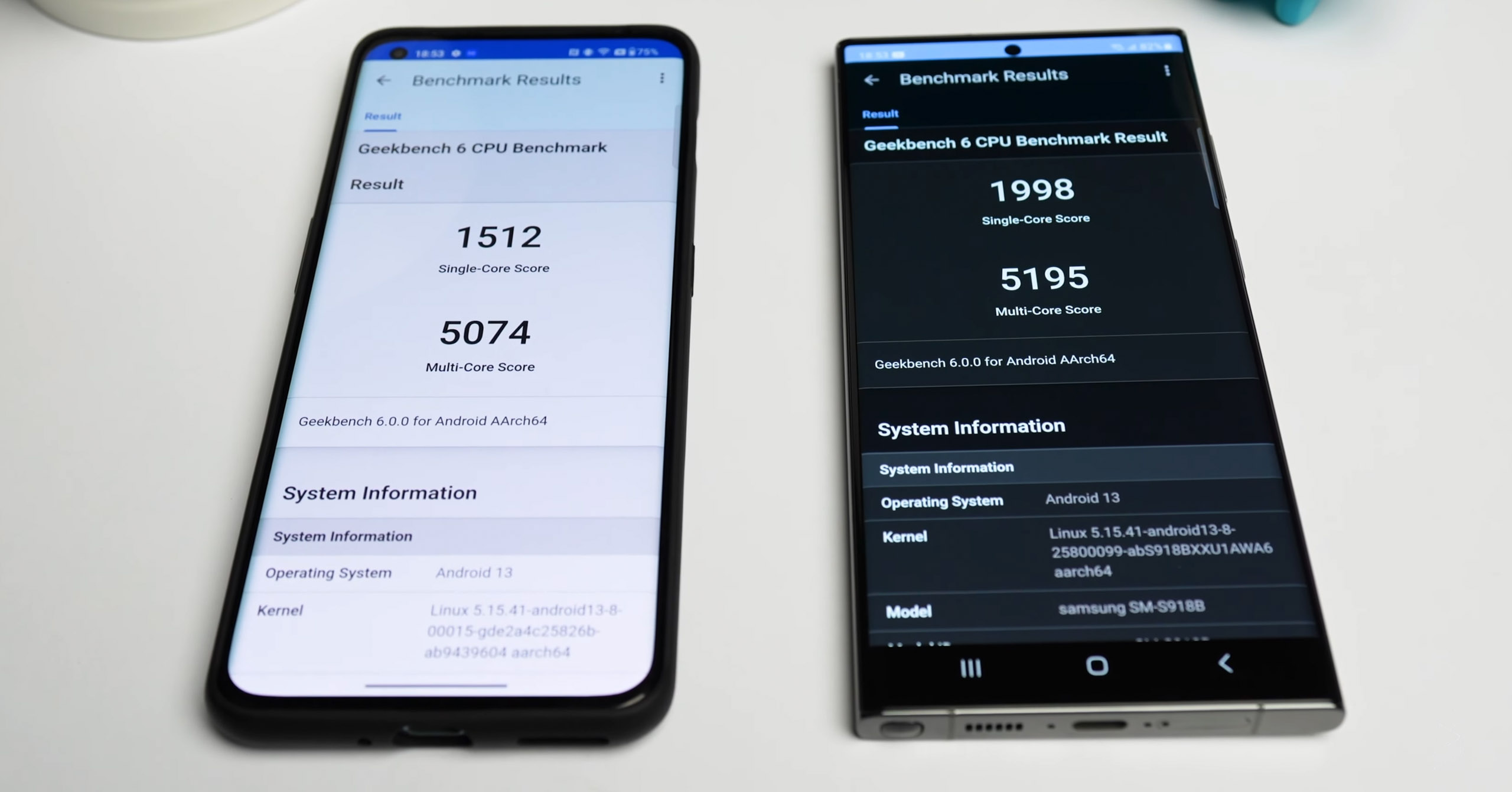
The first is the brand new Qualcomm Snapdragon 8 Gen 2 chip, customised for this application with a higher clock speed of up to 3.36GHz for the prime core and an upgraded Adreno GPU that reaches a clock speed of 719MHz. Samsung officials have told us this is a timed exclusive, which means it will be made more widely available down the line, perhaps as the 8+ Gen 2.
On GeekBench, the S23 Ultra is quite a bit faster than the vanilla 8 Gen 2 in the OnePlus 11, at least when it comes to single-core performance. The difference isn’t so great in multi-core performance, which leads me to believe that the phone is throttling back the CPU a bit if you’re not in a game.
One area where Qualcomm says it has made big gains over the S22’s 8 Gen 1 is power efficiency, and I’ve been pleasantly surprised by the battery life on the S23 Ultra. Even with 1440p resolution, 120Hz refresh rate and the always-on display turned on, I managed to hit about six and a half hours of screen-on time by the time the battery dropped to 20%.
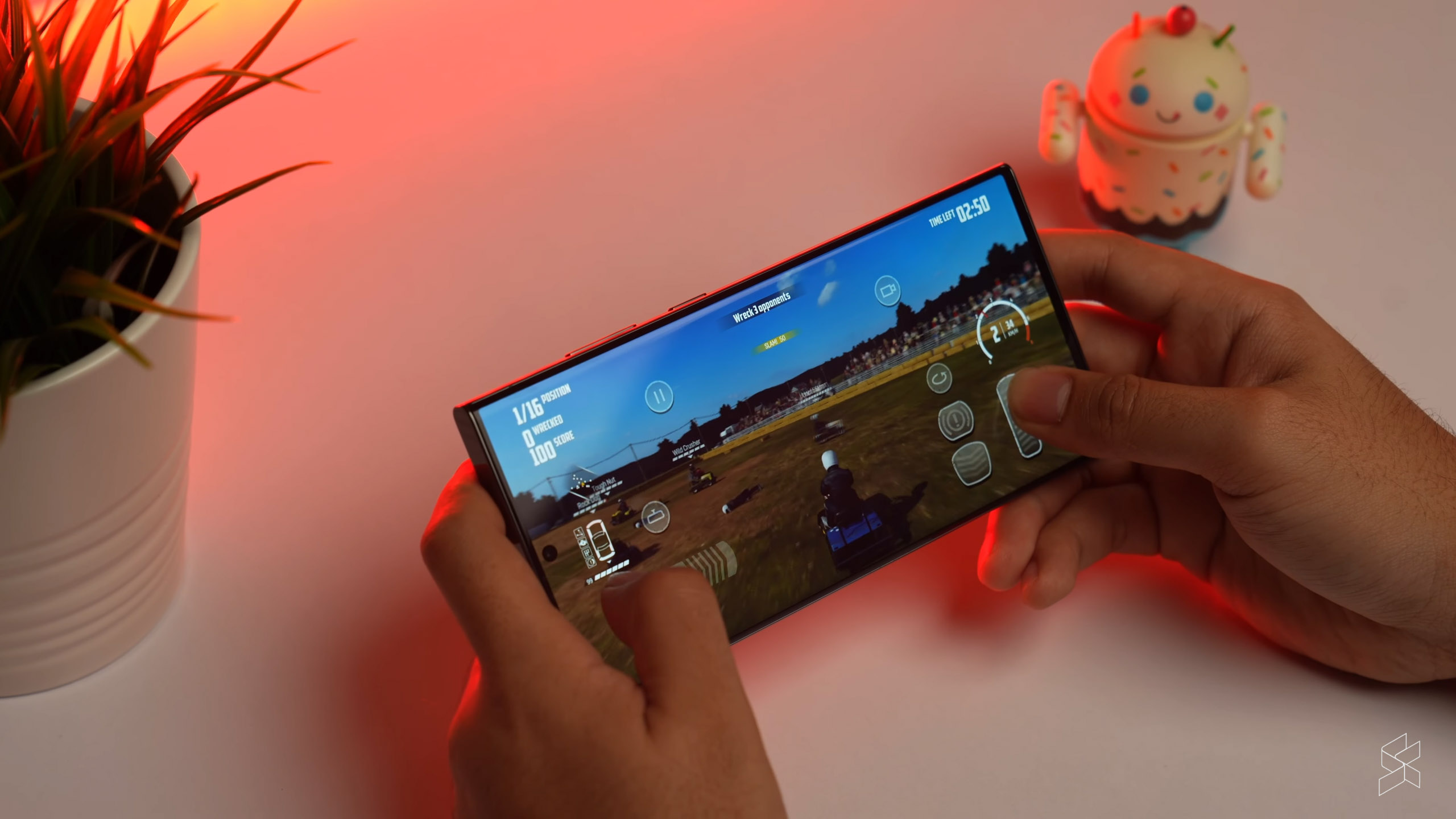
Speaking of which, the S23 Ultra handles games reasonably well. Wreckfest looks and runs amazing, and I saw no slowdowns at the maximum graphics settings—even at 60fps, which even the base PS4 couldn’t run. The title was featured prominently in the S23’s advertising, however, so it’s probably been specially optimised for the device. I still encountered some stutters when I was playing Genshin Impact at max settings, so there’s that.
But what’s most impressive is that the phone remains efficient when gaming. Even while I was playing for a sustained period I was able to hit close to six hours before it finally conked out.
One UI 5.1 cribs Apple’s homework
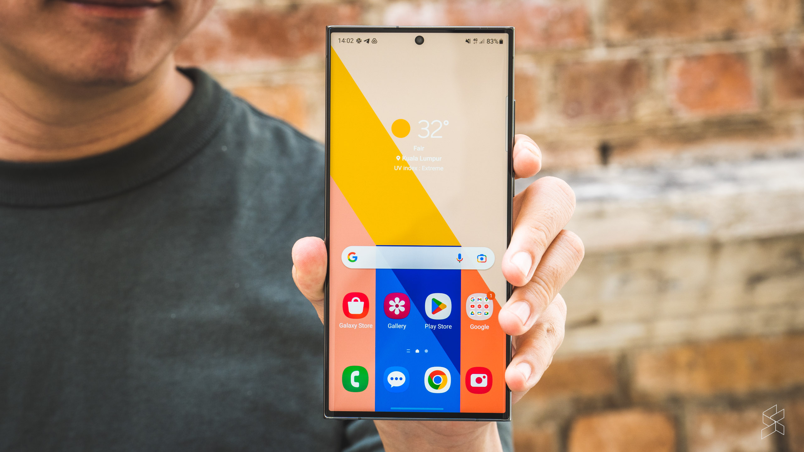
Then there’s One UI 5, which is still one of the best Android skins out there, despite the sheer amount of bloatware duplicate apps present. People talk about how iOS copies features from Android, but this time it’s Samsung that has taken a lot of inspiration from iOS 16, particularly in terms of lock screen customisation.
Just like on Apple’s latest mobile operating system, you hold down on the lock screen itself to the customisation menu. There, you can flip through your various lock screens, change your clock, your wallpaper and even choose the kind of notifications you want. It all feels familiar, especially if you’ve used iOS 16 for any amount of time. But you do at least get the option to add a video wallpaper, which is nice.
There’s also a sleep mode now, and in One UI 5.1, you can hold down on a subject of an image to make stickers. This may all seem like slavish reproductions of iOS features, but they do make living with a Samsung phone better than almost every other Android device out there. Just, Samsung, if you’re listening, can you please, please let me map the long press of the power button to the Google Assistant, and not Bixby? Please?
Finally, that 200MP camera
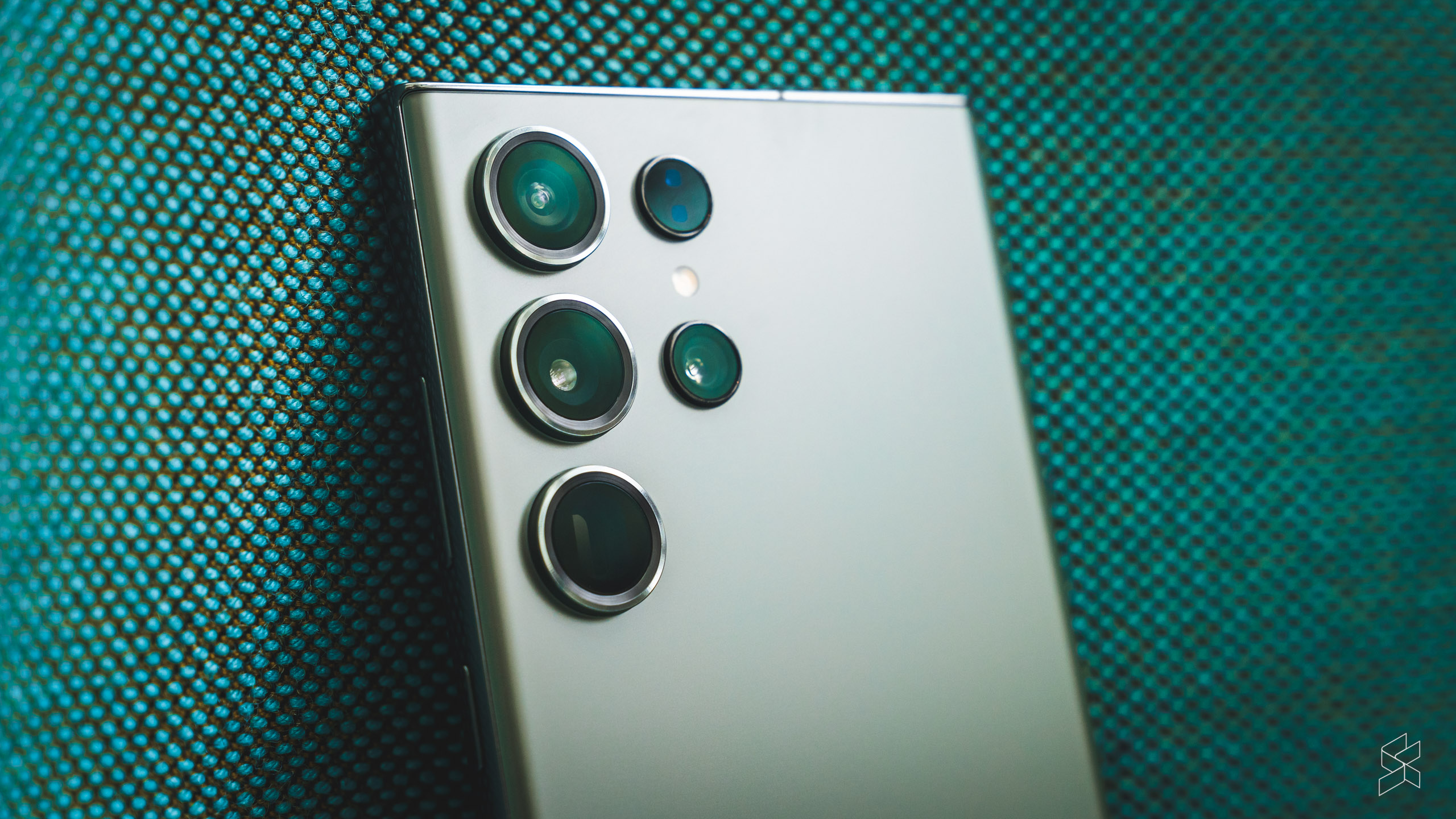
And then, there are the cameras. Yes, you’ve heard about the 200MP main camera, which fits all those pixels into the same 1/1.3-inch sensor size. It still bins down to a 12.5MP image, so the effective pixel size is still the same. But the main benefit is that you get more detail out of this sensor.
There’s also a larger f/1.7 aperture, along with two times wider optical image stabilisation. It also has quad pixel autofocus that’s supposed to be more accurate, as well as a Qualcomm AI-driven image signal processor to improve low-light performance. And the results are insane; obviously, Samsung has gone overboard with the sharpening and the saturation, because it’s Samsung. It’s clear the company is working overtime on the processing.
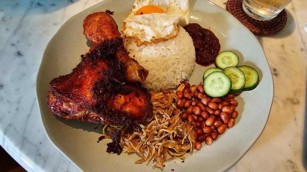

Check out these two photos taken on the S23 Ultra, one with the standard camera app, the other from the Expert RAW app, which applies less processing. Quite apart from the sheer level of sharpening and colour boosting, you can also see that Samsung has corrected the chromatic aberration in the corners.
That’s besides the point. The important thing you need to know is that the S23 Ultra shoots clean photos with vibrant colours and a great amount of detail and contrast. Of course, you can still take 50MP and 200MP images if you want—just look at the detail on this rabbit.


The obvious downside is that you end up with enormous 20MB files. That’s big for what are still JPEG images—it’s not possible to shoot a 200MP RAW photo, which would’ve created some crazy large files. You can at least produce 50MP RAW images, but even those weigh in at well over 100MB each.
Elsewhere, white balance is generally very good, skewing ever so slightly warmer indoors, and colours are remarkably consistent across all five cameras.



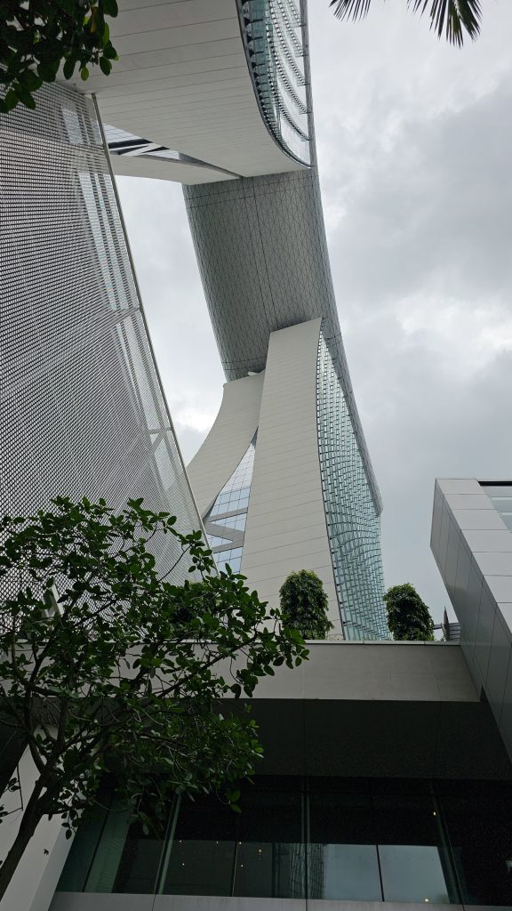

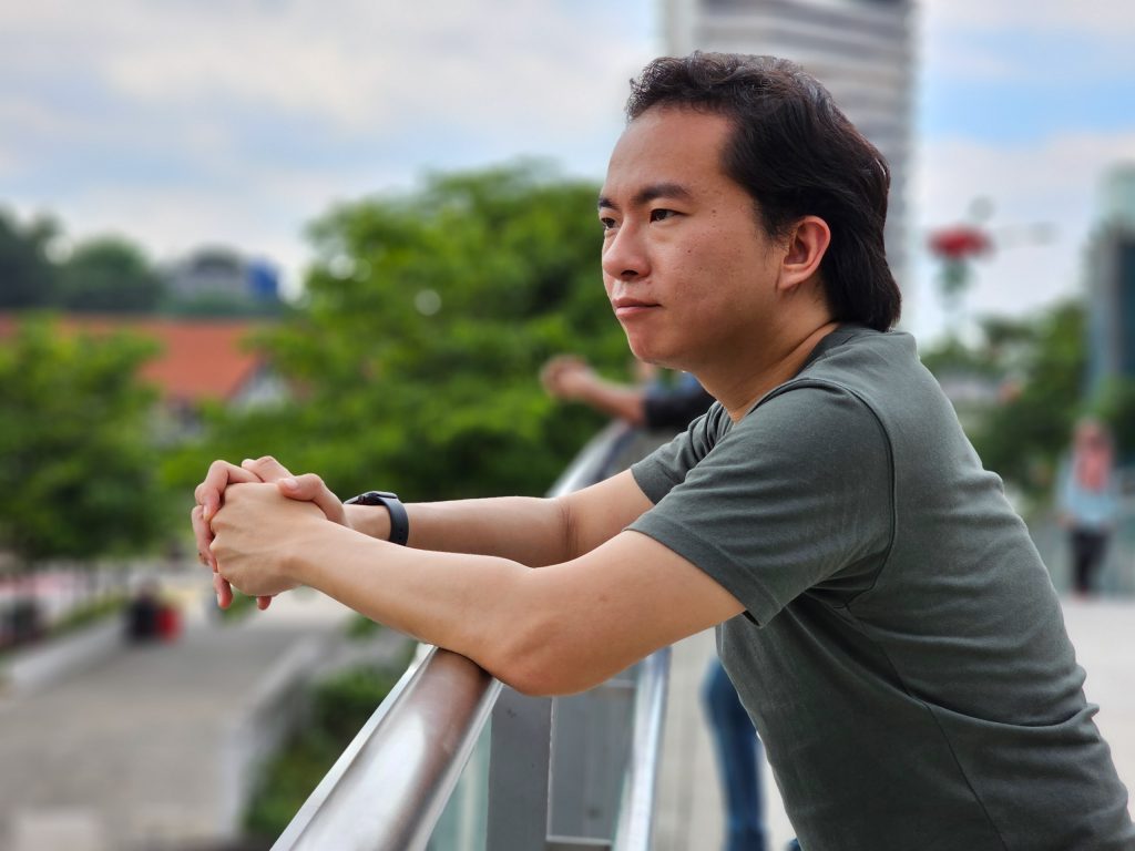
Let’s talk about those other cameras. The 12MP ultra-wide, 10MP 3x telephoto and 10MP 10x telephoto have very similar hardware to before, but computational upgrades mean they deliver slightly more detail compared to the S22 Ultra. The ultra-wide and especially the 10x telephoto are a little soft, but they definitely still take very usable photos.
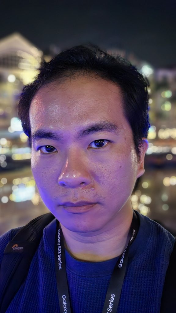
The selfie camera, on the other hand, is now a 12MP unit shared with the rest of the S23 series. That may seem like a downgrade from the 40MP shooter on the S22 Ultra, but trust me, that’s a good thing. It finally offers super HDR now, so there’s more dynamic range—even though you do lose out on some fine detail.
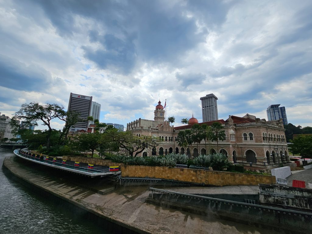
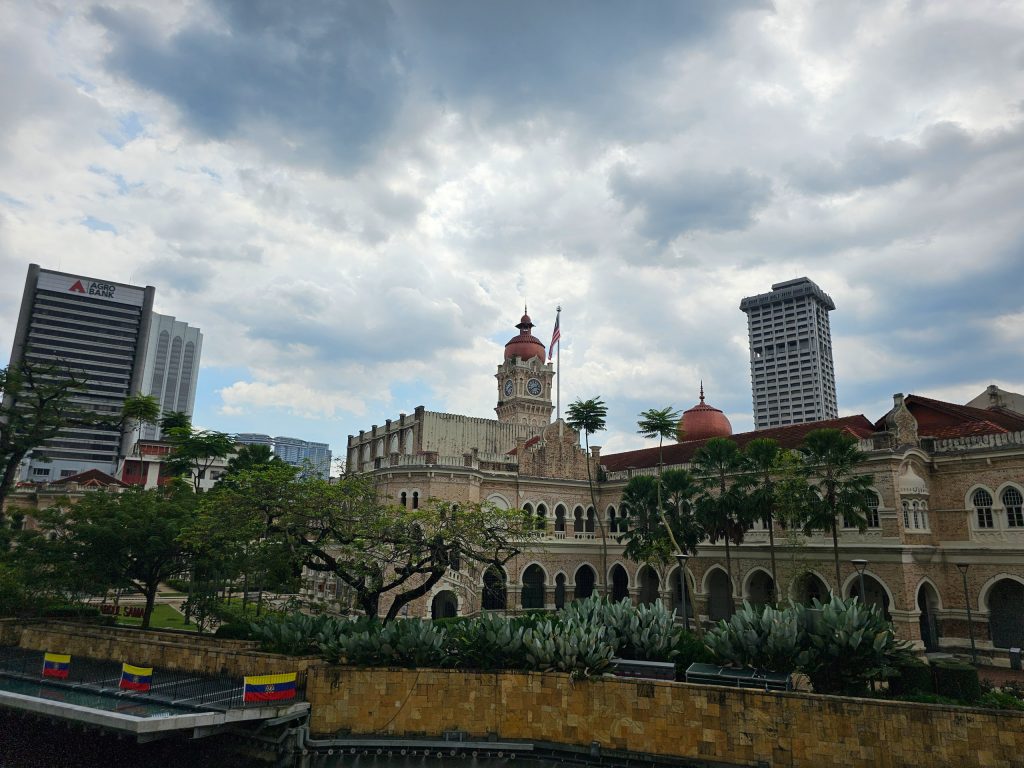

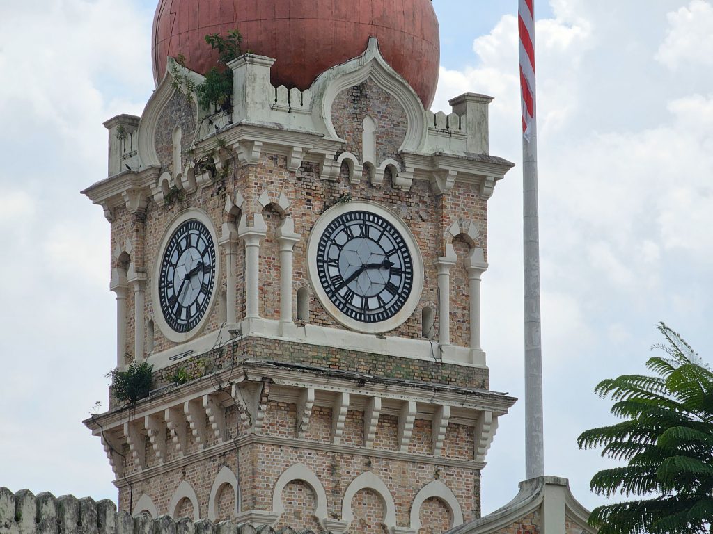

The S23 Ultra also takes decent videos with good detail and exposure control, but they’re definitely still a little bit choppy compared to the iPhone buttery-smooth benchmark. As for 8K video, it’s more usable now thanks to the main camera’s ability to pixel bin down to 50MP. That means the 8K (or 33MP) crop is less zoomed in than before, whereas the S22 Ultra had to take a tiny crop of the massive 108MP output. Samsung’s Super Steady mode is also noticeably improved and actually beats the iPhone 14’s Action Mode that was new last year, resulting in less noticeable vibrations.
But I haven’t even talked about the two biggest improvements over the S22 Ultra. The improvements in image processing and OIS mean that Samsung is able to push its night mode—which, embarrassingly, it still insists on calling Nightography—to greater heights. The S22 Ultra already took bright photos in the dark, but the images from the S23 Ultra are brighter still. I mean, some of these photos could pass off as evening shots.
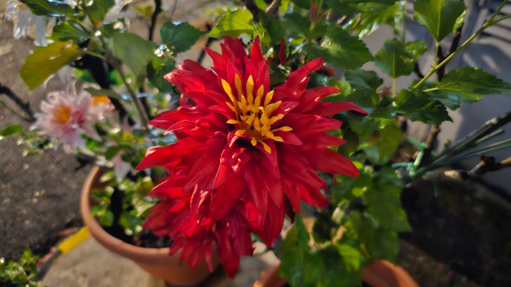
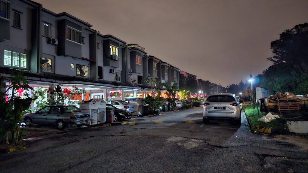
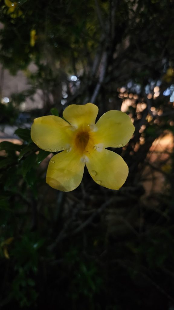
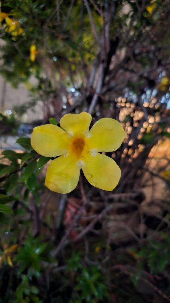
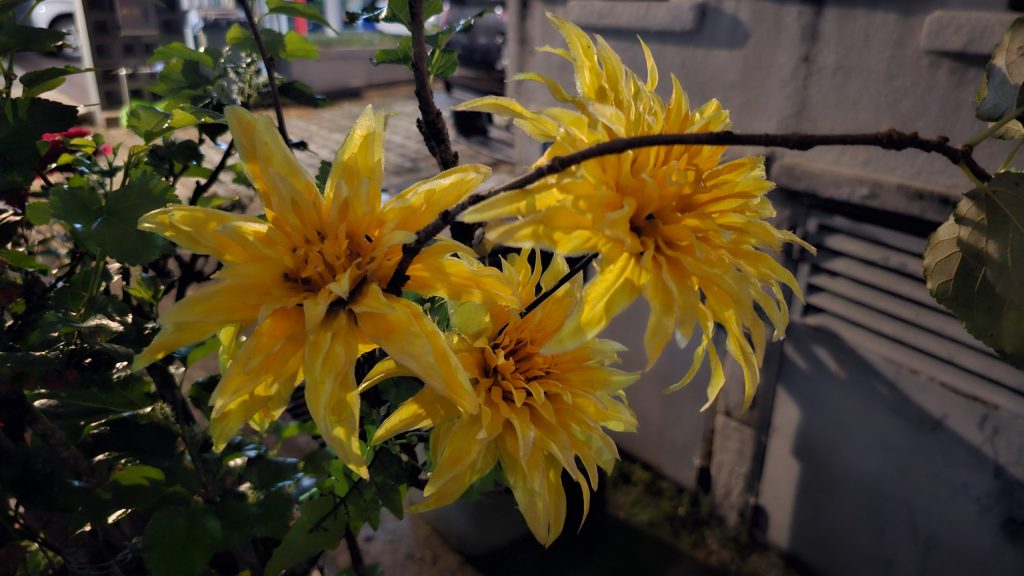
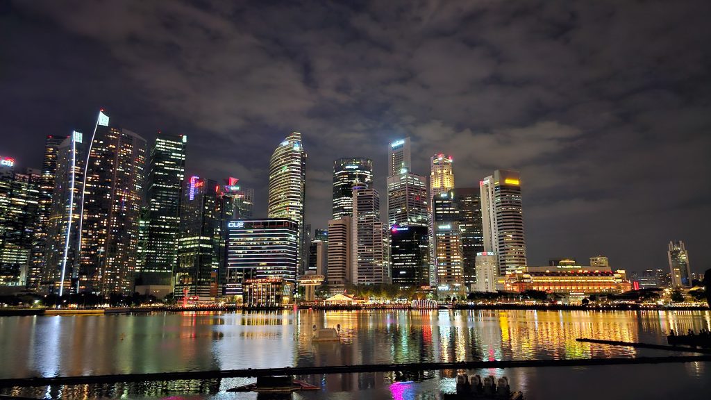
Samsung claims the 200MP sensor can also absorb more light without overexposing the photo, thanks to a new dual vertical transfer gate (D-VTG) system that increasing the amount of electrons—and therefore light information—able to be stored in each pixel before reaching saturation. Even so, I saw quite a lot of bloom in the highlights, which was surprising to say the least.
But if you want to really wow your friends, look no further than the vastly-improved Space Zoom. It still combines both the main camera and the 10x telephoto for digital zoom, but there’s a whole lot more pixels to play with, and there’s extra AI horsepower from that Qualcomm ISP. The net result is far greater detail than before. Just look at these two photos at 30x zoom. The one from the S22 Ultra looks like I fed Duke through Dall-E, whereas the one from the S23 Ultra actually looks good.
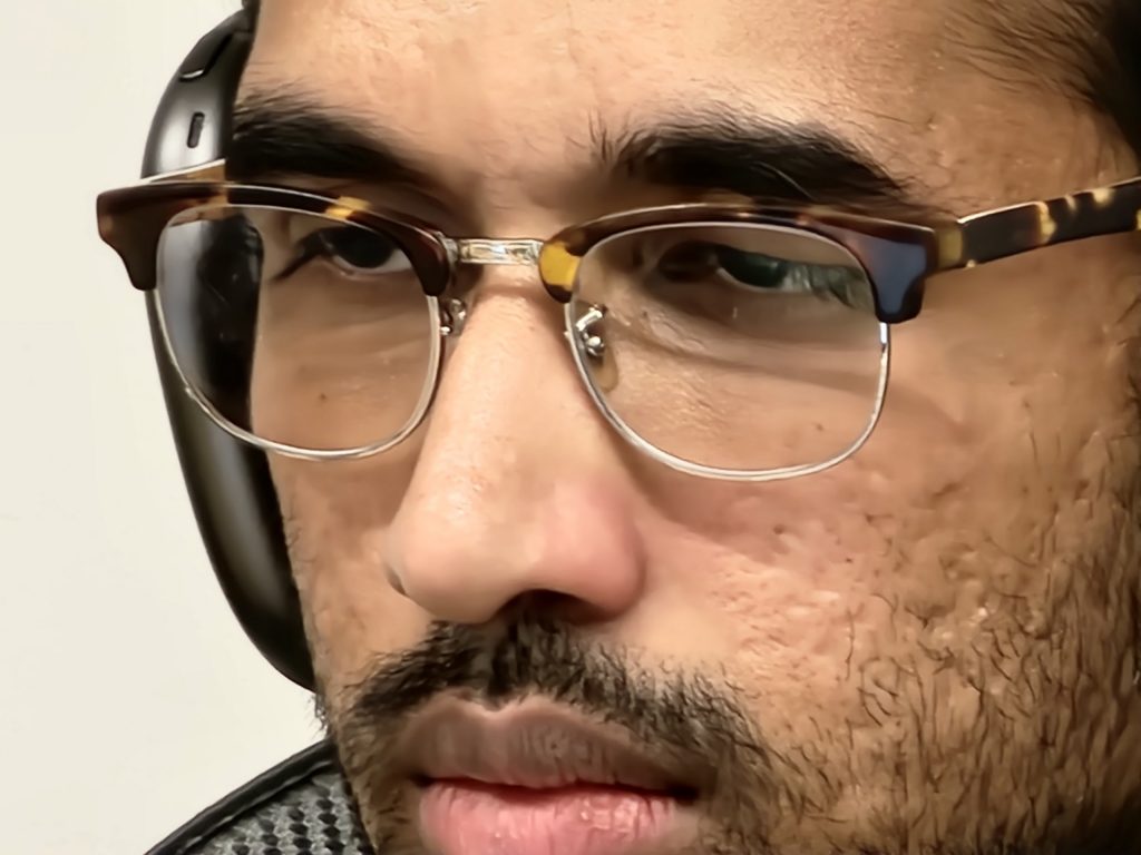
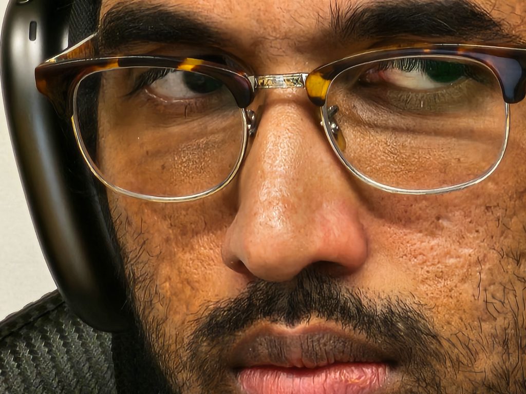
We’re in this weird situation where the 30x digital zoom actually looks better than the 10x optical zoom. Go all the way to up to 100x zoom and the illusion falls away—it’s just way too soft and indistinct. But you can still get some deeply impressive results.
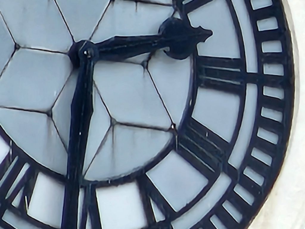
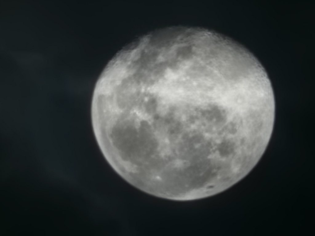
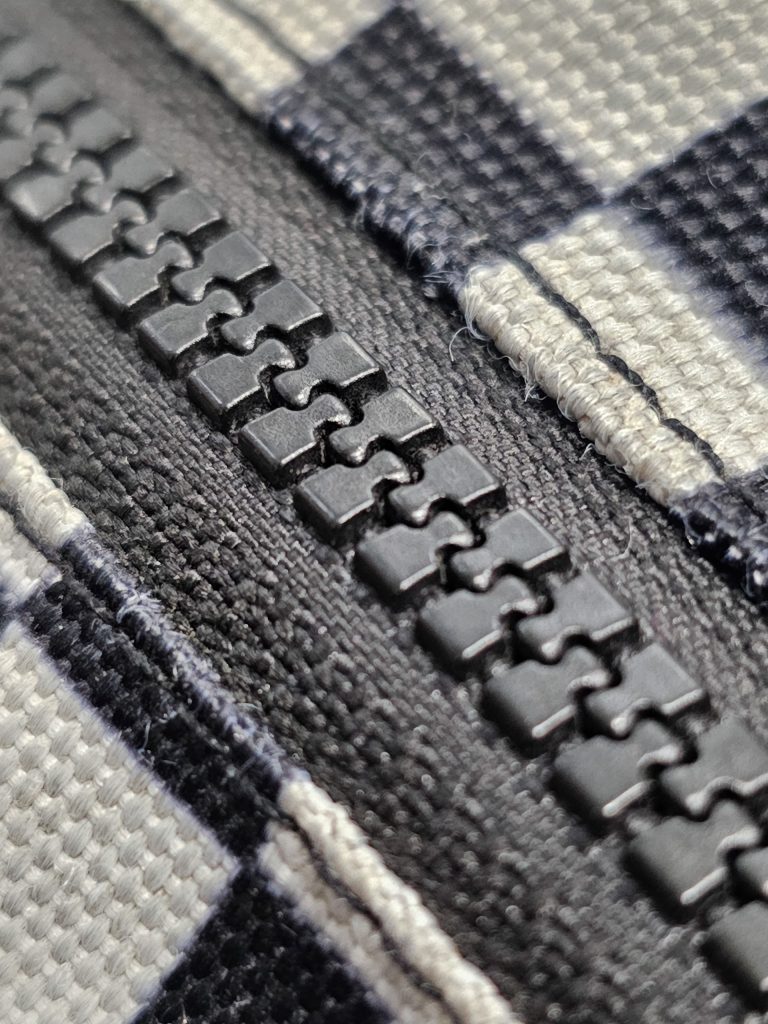
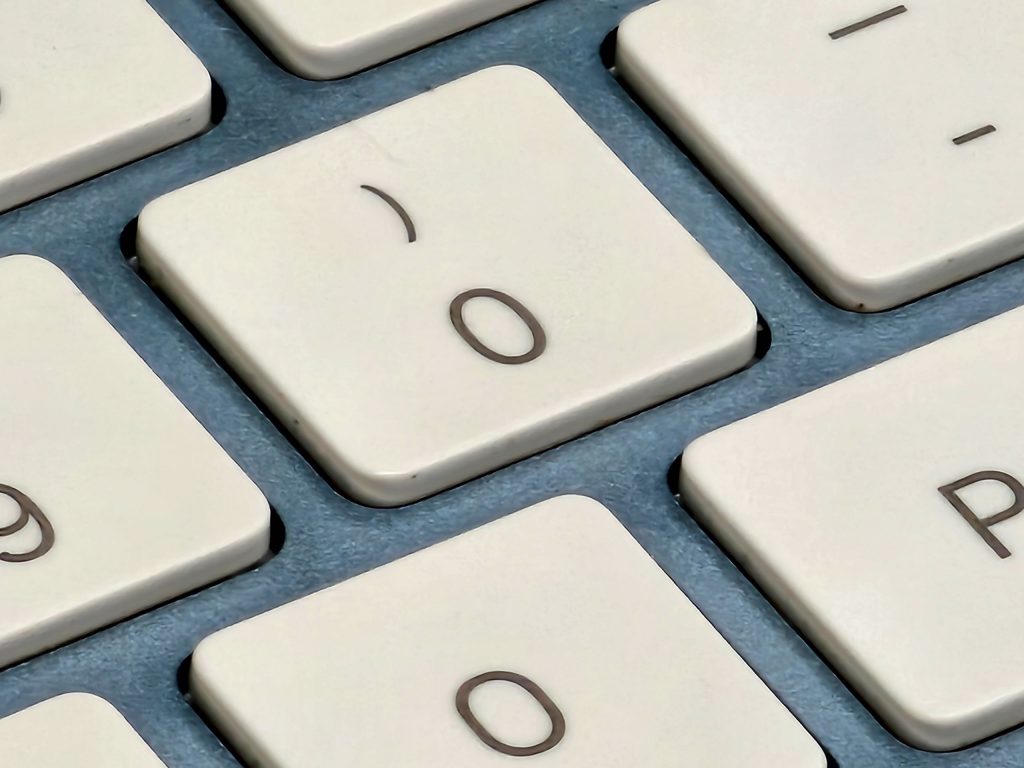
But the AI rears its ugly head elsewhere. You can see in the photo of the Magic Keyboard below that it’s painting in detail that just isn’t there—the edges of the keys are pin sharp, but the texture on the blue aluminium chassis is just a muddled mess.
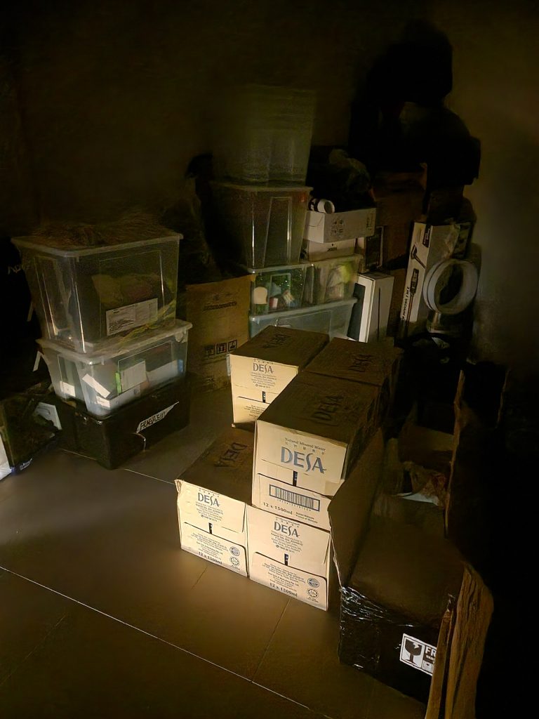
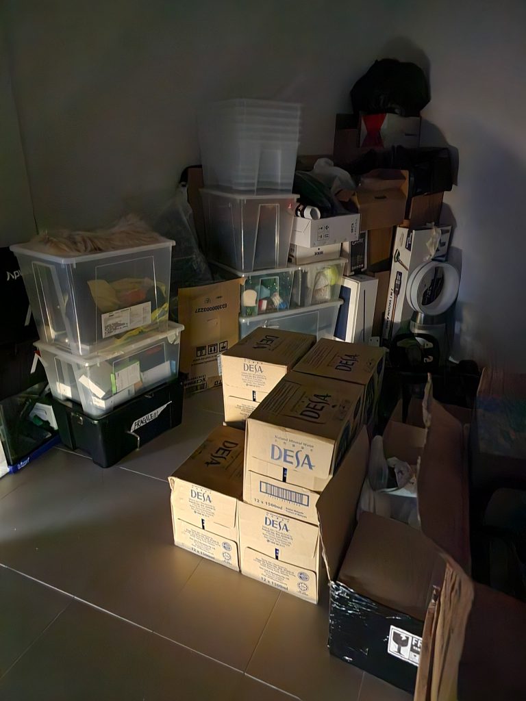
Then, check out the comparison of the shots taken of our storeroom in near pitch darkness, between the S22 and S23 Ultra. The S22 Ultra is putting in more light than what was actually there, but it isn’t adding what it can’t see, and the photo does look kinda nice. But the S23 Ultra washes out the whole photo in the service of adding more light. And what’s with all the lines on top of those cardboard boxes, I mean, there are actually words on them.
Obviously these are fringe cases, and we’re clearly pushing the limits of this ISP. But it kinda sums up what we think about the general performance of these cameras. Most of the photos look super processed, and maybe that’s what most people like. But my girlfriend prefers the more natural look of her iPhone, and she isn’t a camera nerd like I am.
There are also a few things that Samsung needs to work on. The first is the shutter lag—a problem with the S22 Ultra that continues here, especially when shooting 50 and 200MP photos and Super Steady videos. It’s much improved with the latest update, but it’s still there, ruining the point-and-shoot nature that we expect from high-end phone cameras these days.
The second is that while the real-time stabilisation is really good, it kinda screws up your framing. It makes it hard to pan smoothly in Super Steady mode, and when using Space Zoom in particular, you’re constantly fighting against the phone, just to get the shot you want.
Still a flagship to end all flagships
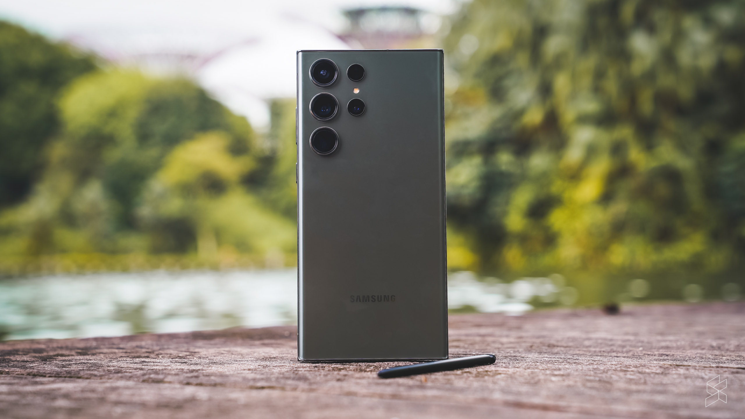
All that is just personal preference, however. The truth of the matter is, outside the same old design and the same old feature set, this is a genuine improvement over the S22 Ultra in most of the areas that matter. And yes, the cameras do go over the top sometimes, but if you’re paying between RM5,699 to RM7,199 on a phone, you have every right to want a camera you can show off to your friends.
It’s hard to escape the fact that the entire smartphone industry is either standing still or actually pulling back on some of its innovations. But Samsung has made some bold changes this year that many people will really like. Just don’t mix up your shiny new phone with someone else’s S22 Ultra at the next teh tarik meet.
Additional photography by Hanif Azrai

