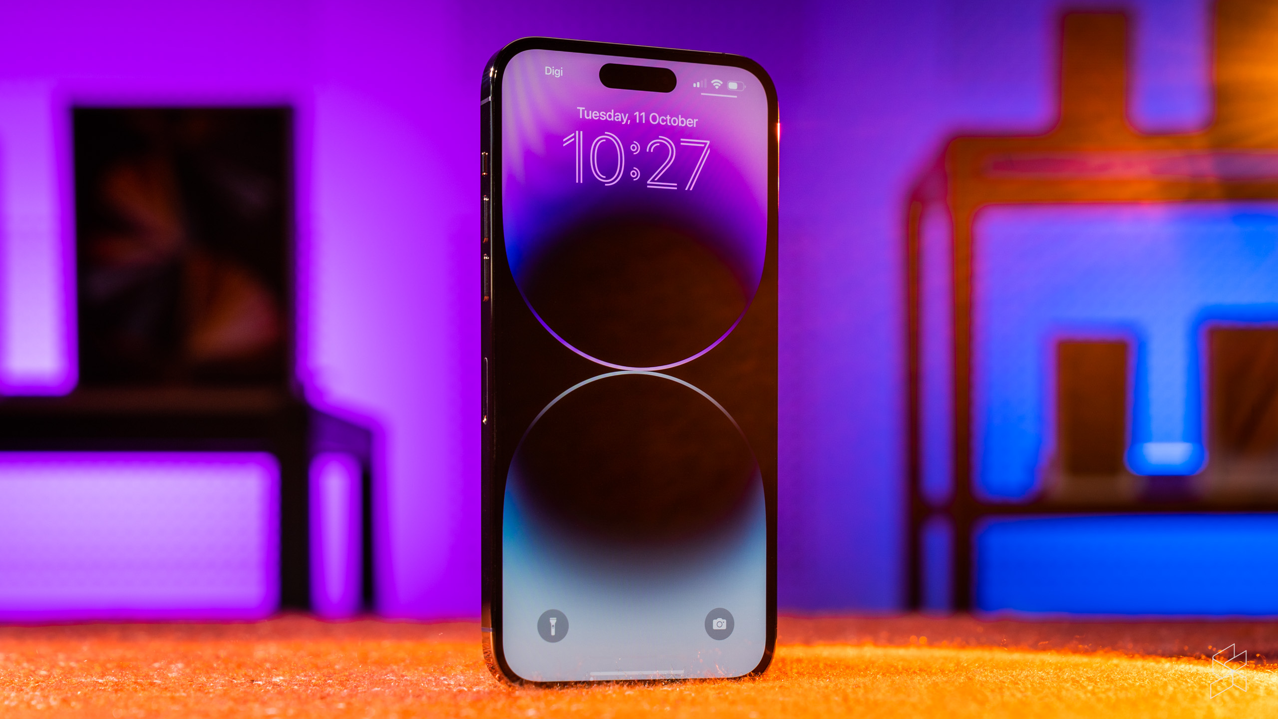
Every review of a new iPhone starts with a pained philosophical preamble about what an iPhone is supposed to be. And for good reason—each year, Apple makes a slickly-produced presentation showing us all the ways in which its newest product can fundamentally change your life. Journalists like us fall for it every time, and so every review ends up being a high-brow deep dive into every part of the device (as you can probably tell, this is one of those reviews).
This year is no different. Apple blew the world’s collective minds at its annual September event, when it debuted the expandable pill-shaped display cutout known as the Dynamic Island. It also announced its first camera with a megapixel count higher than 12, and made its usual promises about increased performance and improved battery life.
But the stakes are higher this time around—for the first time, the company is reserving the vast majority of those changes to the iPhone 14 Pro, meaning that the regular 14 (and the new, larger Plus model) are little more than warmed-over versions of last year’s 13.
This comprehensive reorientation of Apple’s main smartphone lineup not only leaves less well-to-do customers out in the cold, but it also means the Pro models need to be damn well good enough to justify the move. I’ve lived with this 14 Pro Max for over three months now and I have a lot of thoughts.
Still a lonely island…
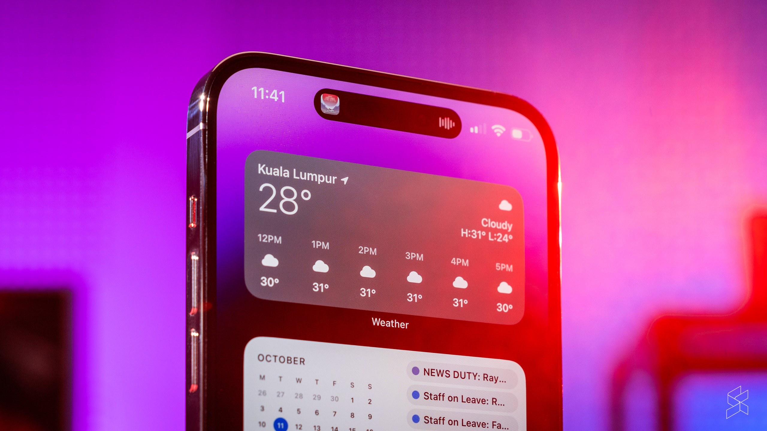
Apple is pinning its hopes on the Dynamic Island as the future of the iPhone, replacing the ubiquitous (and instantly recognisable) notch. You’ve seen the keynote—play some music or start a timer and the pill expands to show what’s happening in the background. What gets displayed on the Dynamic Island changes depending on the context—album art (and a colour-matched waveform), a timer icon, a tiny navigation arrow showing a turn you need to make.
Information on certain key functions also flash up on the Dynamic Island, such as when Face ID is trying to authenticate you, or if your battery is running low. When it all works, it’s a sight to behold—animations are fluid and playful, constantly morphing and splitting up into separate bubbles. It complements iOS’s already slick nature and does a commendable job making a bunch of cameras and sensors feel like part of the interface.
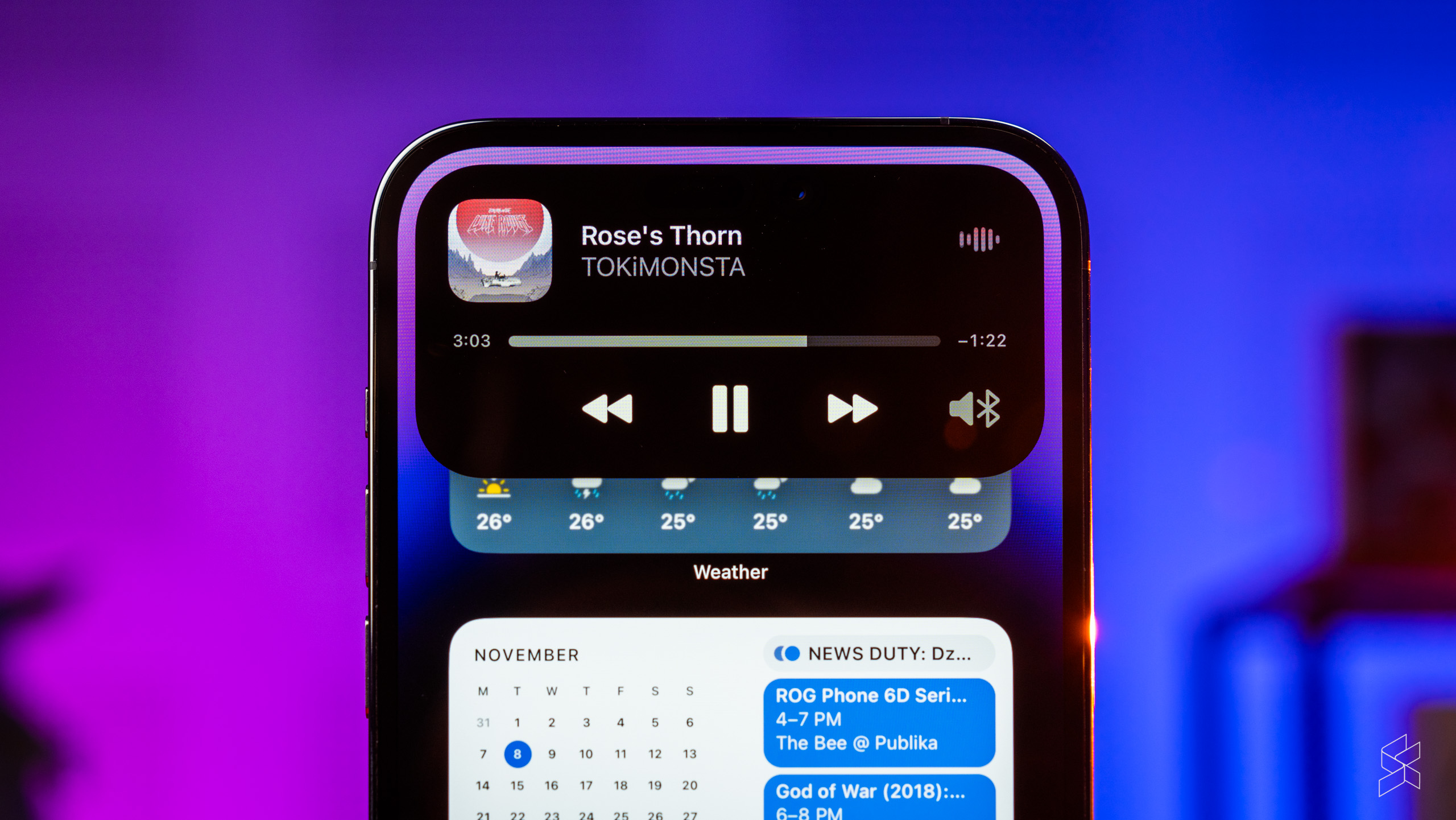
But even three months after, the behaviour of the Dynamic Island is still wildly inconsistent. For a start, I still find it odd that regular notifications appear separately—the large bubbles drop down below the black pill instead of incorporating it. This completely ruins all the good work Apple has done to integrate the hardware and software.
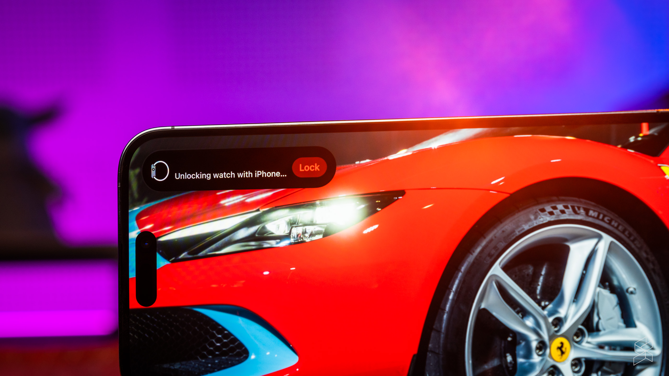
On top of that, almost all of the Dynamic Island’s functionality goes away once you put the phone in landscape, and when it does show information—such as when the device is unlocking your Apple Watch—it phases awkwardly to the top left of the screen. The cutout remains, of course, so the illusion falls apart immediately. I’ve also seen it break when it tried to show me information just as I rotated my phone, like whenever i flick the silent switch. It’s a mess.
Even when the Dynamic Island is working fine, there are still hardly any third-party apps that take advantage of it, aside from the usual music and podcast apps. Google Maps only displays an arrow indicator when navigation is turned on (without any turn-by-turn directions), and Waze dispenses with the Island completely. Apple rolled out Live Activities support in iOS 16.1, but until Grab and Foodpanda use the feature to show the progress of eHailing arrivals and food deliveries, there’s really nothing for us Malaysians to see.
When it isn’t at work, the Dynamic Island is a constant presence on the screen, in the way the relatively unobtrusive notch was not. FaceTime calls, TikToks, even YouTube videos shot in specific aspect ratios to hide the notch—they all betray the cutout. Whether by design or not, it’s something you will most definitely notice.
…on a fantastic display
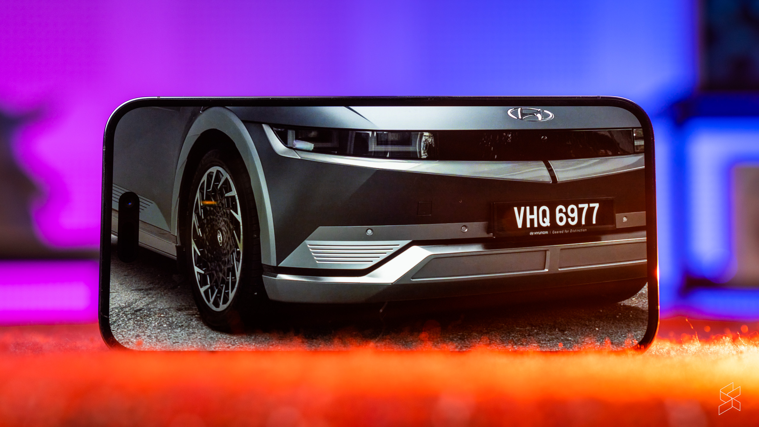
Whatever you think about the Dynamic Island, there’s no denying it’s affixed to one hell of a display. It’s gorgeous—as it should be, given the inky blacks from the 6.1″ (6.7″ on this Pro Max) AMOLED panel, the crisp 460ppi resolution and the smoothness of the animations unlocked by the 120Hz adaptive refresh rate, which blows the doors off the iPhone 14 and every other 60Hz iPhone before it.
But what’s even more astounding are the colours. Apple hasn’t gone overboard with the saturation, so that photo of your half-eaten pasta in some dimly-lit trattoria will still look awful. But play any HDR video that’s been professionally graded and you will be left in awe—the hues pop off the screen while maintaining true to life, there’s lots of dynamic range and the highlights are so bright they’ll hurt your eyes.
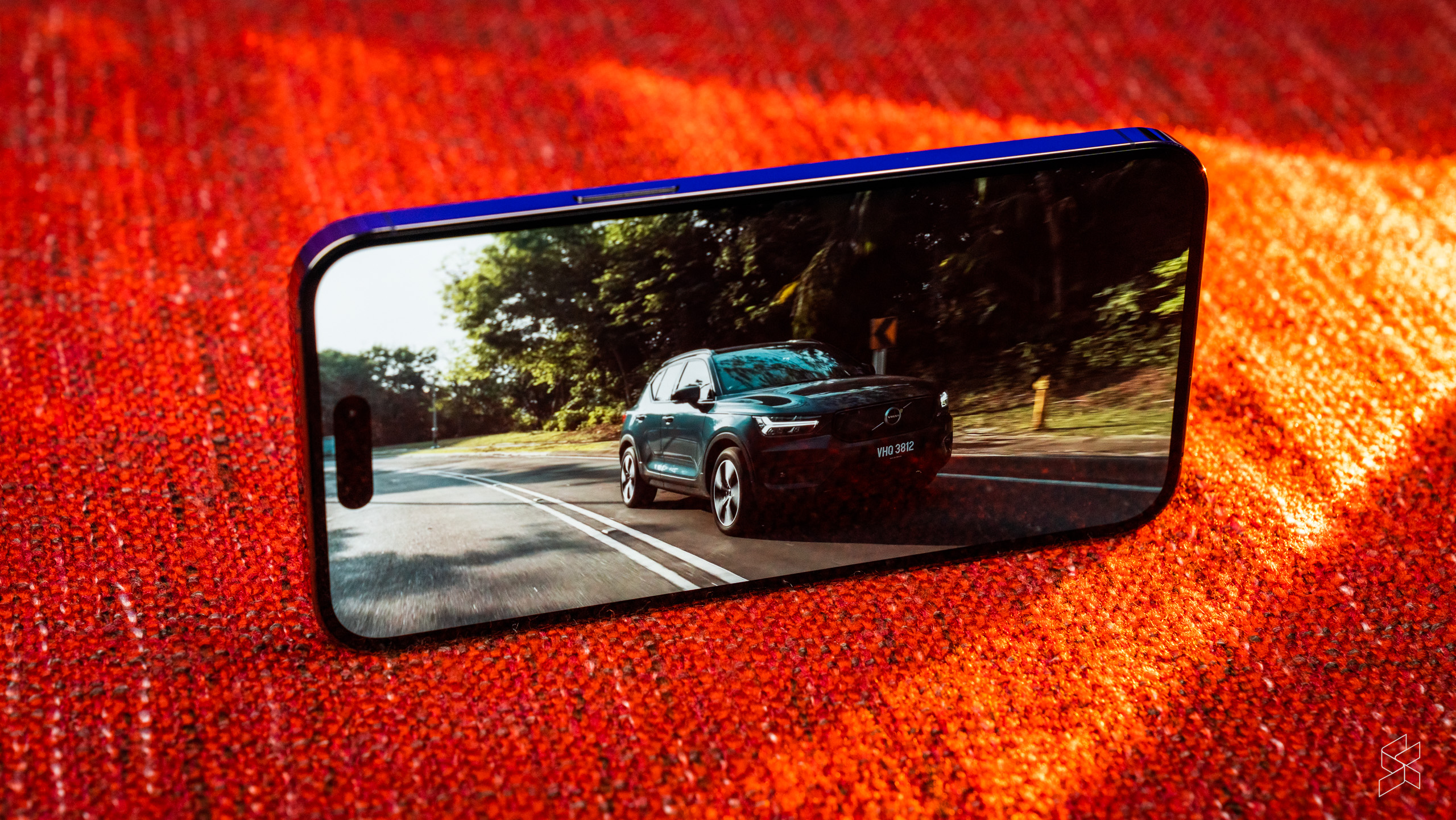
The latter is because the company has bumped up the screen’s max brightness to stratospheric levels. In most situations, the display still maxes out at 1,000 nits, but with HDR content playing the 14 Pro and Pro Max can now achieve an impressive 1,600 nits, and if you step outdoors, the devices are able to ramp up brightness to a scarcely believable 2,000 nits. The effect of this is profound—this is the first time I’ve pulled out a phone in the harshest Kuala Lumpur sunlight and the display remained perfectly legible throughout.
Against the sheer brilliance (literally and figuratively) of the display, the stereo speakers have their work cut out to match it, and inevitably they fall somewhat short. They’re still good, mind you—they can get very loud and deliver a reasonable amount of bass at lower volumes. But they still sound resolutely like smartphone speakers, so if you want the full theatrical experience afforded by the display, your best bet is still to get yourself a pair of good headphones.
Aside from being very bright, the display can also now go significantly dimmer than before, which leads to the next part of this review.
An always-on display is nice, but…
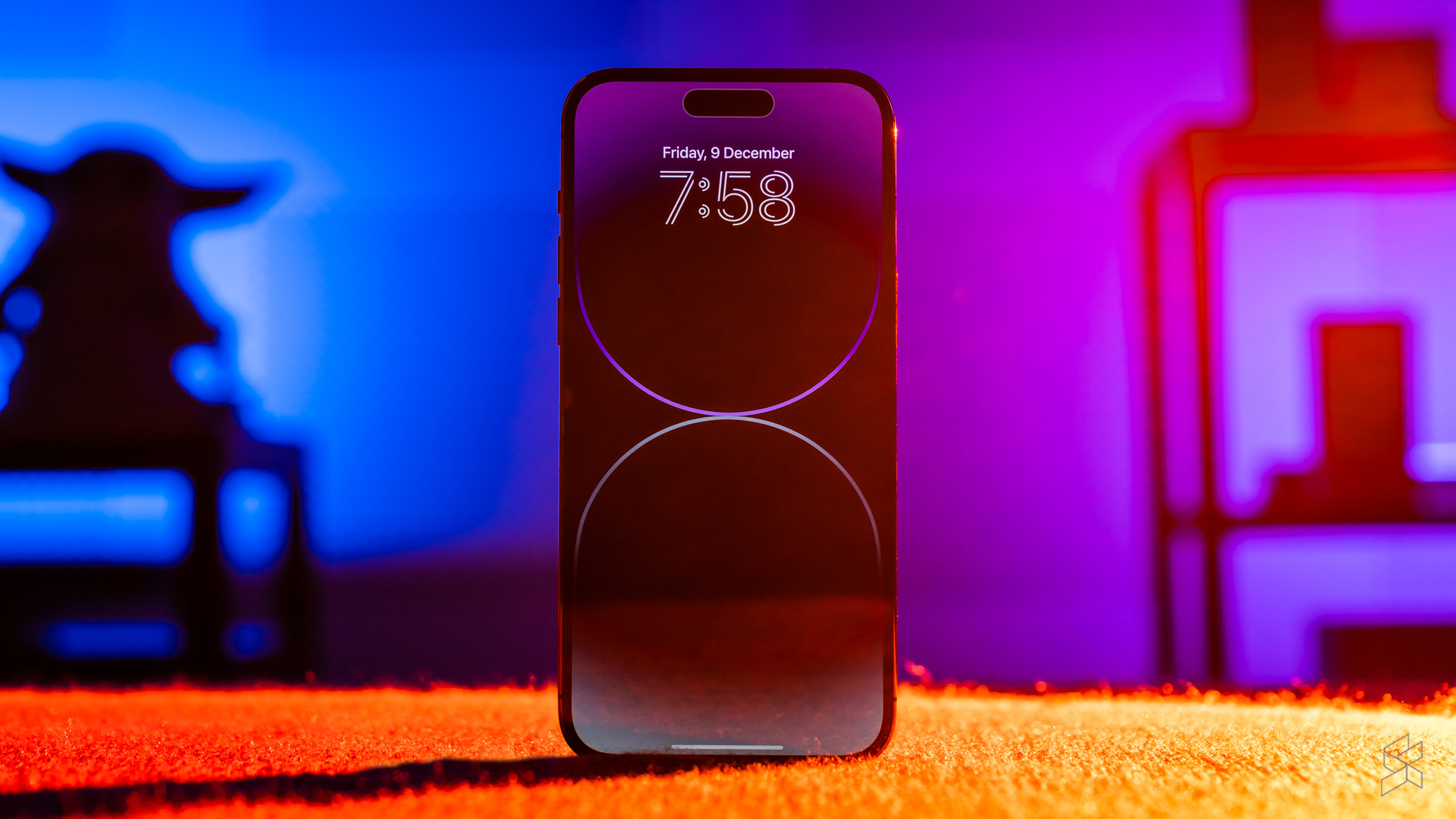
For the first time, the iPhone 14 Pro comes with an always-on display, finally adopting a technology that Android users have had for years. It’s always seemed like such a waste that Apple stubbornly held off on such a feature, despite the iPhone having had a more power-efficient OLED display since the iPhone X back in 2017. It became even more bizarre when the 13 Pro debuted a 120Hz ProMotion display that could dial down the refresh rate to just 10Hz.
With the 14 Pro, however, Apple has gotten its display tech to reach a minimum of 1Hz. This matches the Apple Watch Series 5 and later, which is likely the reason why the company has belatedly added the always-on function, a staple of those wearables. Its approach to the 14 Pro’s AOD mirrors the one for its watches, dimming the screen instead of having a dedicated low-power display, which seems like a rather lazy implementation.
Now, I don’t really have a problem with the AOD myself. I like seeing full-sized notifications and the Now Playing widget instead of tiny icons, letting me get more context at a glance. But I understand some users would prefer not having their phones look like they were on all the time, or have their notifications blasted out in the open for all to see. That’s probably why both of my 14 Pro-toting friends have turned the AOD off.
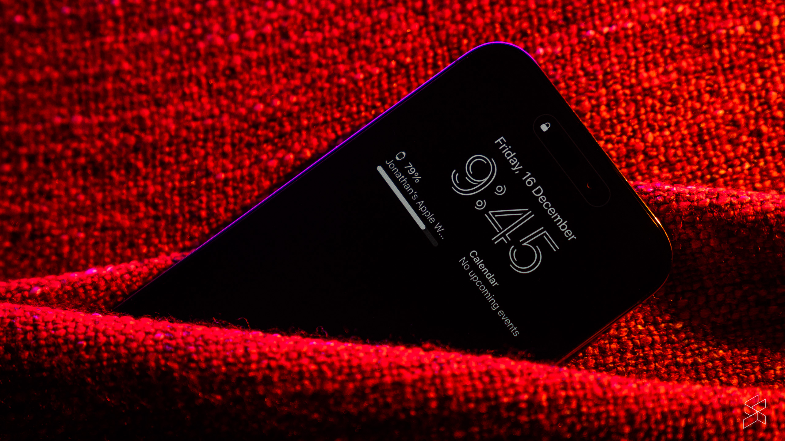
Apple finally gave its customers more options three months later with the iOS 16.2 update, which allowed customers to remove the wallpaper and notifications from the AOD. The latter seems like a rather strange all-or-nothing approach, as there’s still no ability to have smaller icons for notifications—something found on practically every Android phone nowadays.
And despite all that, it’s still not possible for the AOD to show what is arguably the most important piece of glanceable information—a battery indicator—unless you manually add a battery widget to your lock screen.
This means you have to sacrifice valuable (and already limited) widget real estate to fit something that should already be on the AOD in the first place. Even then, it won’t show the phone’s battery level if you have another device linked to the phone, such as an Apple Watch. And speaking of the battery…
Battery life takes a hit from AOD
Apple’s particular implementation of AOD also seems to have a noticeable impact on the 14 Pro’s battery life. Our Pro Max actually has a slightly smaller battery (4,323mAh) than last year’s 13 Pro Max, according to a previous report. Yet it’s claimed to have an improved battery life, capable of up to 29 hours of video playback.
But as you can probably expect, simply dimming the pixels instead of turning the vast majority of them off uses quite a bit more power. In my usage, the Pro Max seemed to drain a significant amount of charge even when it’s locked, giving an impression that the phone was a battery hog.
In reality, the Pro Max was still capable of lasting about a day a half, managing to average between six and seven hours of screen on time. However, the AOD’s drain on the battery became obvious when I turned the feature off—doing so netted a whole extra hour of screen on time, extending battery life by several more hours overall. This means the Pro Max is a two-day phone…if you don’t use one of its key features.
Battery life is, of course, is very much dependent on usage. On a recent trip to Singapore, I utilised the phone far more heavily, relying extensively on Google Maps for walking directions, taking lots of photos and browsing Instagram while walking or on the train. During that time, I consistently ran down the battery by the end of every day. As usual, your mileage may vary.
Still the fastest in the industry
Another key feature is the A16 Bionic processor, the latest version of Apple’s industry-leading chips. The company is doing something different this year—rather than fitting the new hardware into all its new phones, it’s reserving it for the Pro models, leaving the regular iPhone 14 and 14 Plus with last year’s A15 Bionic. This led to an outcome we all expected—while the standard 14 continues to sit unloved on store shelves, the Pros have been flying off them, with wait times stretching up to five weeks at one point (it’s now back down to two).
Never mind that the the A15 still outclasses every other smartphone chip—the fact is, this move has firmly established the 14 Pro and Pro Max’s status as apexes of Apple’s lineup, for better or for worse. And this newest model pushes the company’s superiority to new heights, if only incrementally.
On Geekbench 5, the 14 Pro Max achieved a score of 1,871 for single-core and 5,509 for multi-core performance, easily beating the 14 Plus’ scores of 1,736 and 4,770 respectively. The improvements aren’t as big as the jump between the A15 Bionic and the A14 in the iPhone 12 and 12 Pro (1,573 for single-core, 3,940 for multi-core), but the A16 still outstrips every other competitor.


But the numbers only tell half the story. I was enamoured by the performance from the OnePlus 10T’s Qualcomm Snapdragon 8+ Gen 1 chip, but the 14 Pro Max is in a different league. Whereas the OnePlus exhibited a few stutters while playing Apex Legends at ExtremeHD settings and at 60fps, the iPhone did not, although there were some dropped frames here and there. The device can also run the game at the maximum 80fps, although I did encounter a few slowdowns that I suspect were thermal-related.
As expected, the 14 Pro Max flies through iOS, but so does the 14 Plus that I’ve also been using. More concerning is the amount of crashes I’ve had with the device. Every once in a while it shows me a black screen with a loading circle, then kicks me back to the lock screen. It’s never anything major, and it could really be just down to my own iOS install, but it’s something I feel I should point out.
Also, with just 6GB of RAM to its name—as shown in the Geekbench results—the phone doesn’t seem to be able to keep more than three to four apps open in the background. That won’t be a surprise to anyone coming from another iPhone, but there are Android phones with more than double the memory that can do much better—up to 35 apps in the case of the 10T—so that’s something to bear in mind.
Great cameras, questionable artistic choices
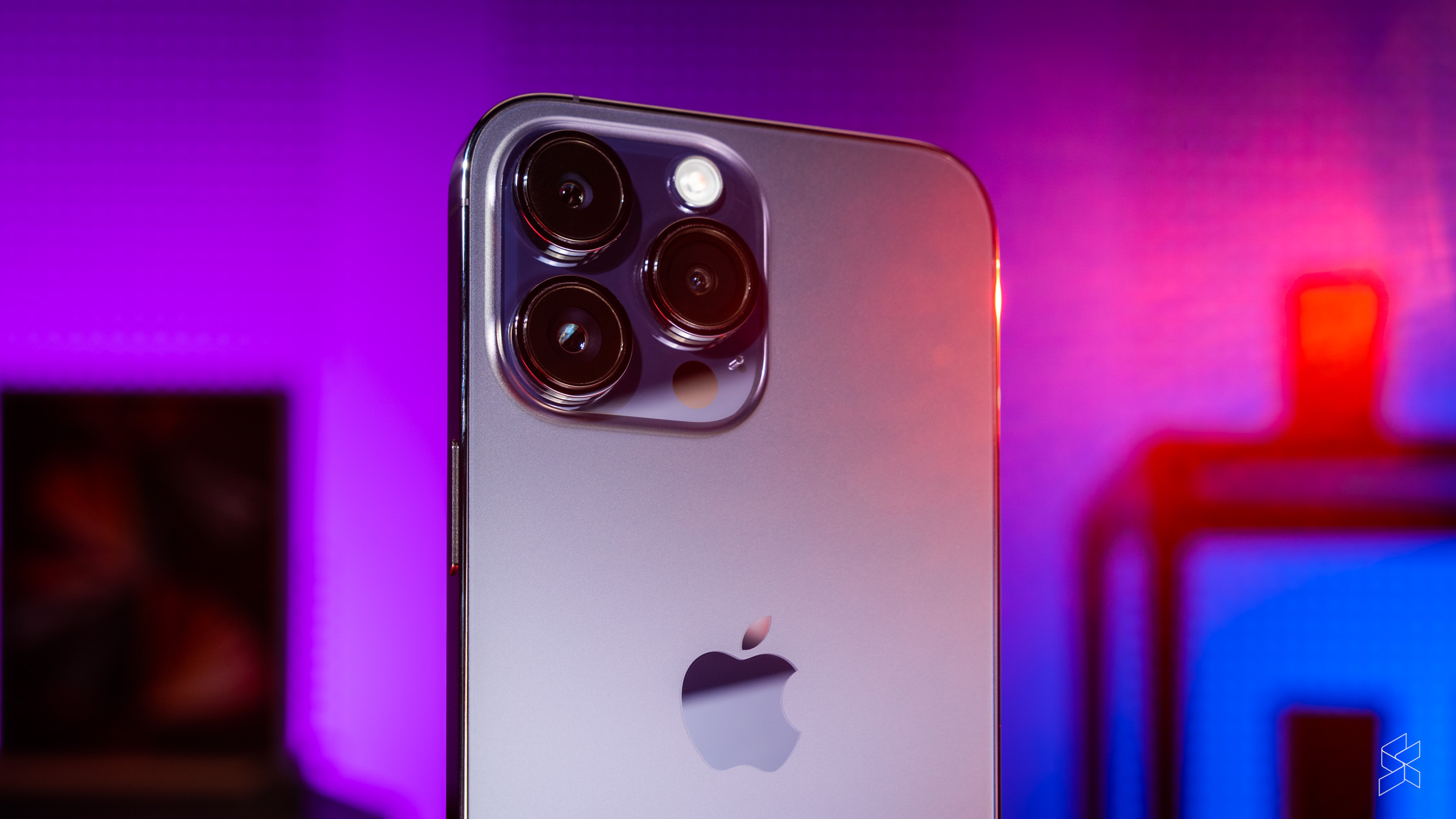
Apple has tended to make incremental changes to the iPhone’s cameras, prioritising computational improvements rather than switching out the hardware year after year. For 2022, however, the device gets its biggest upgrade yet—the 12MP pixel count on the main camera, a staple of the iPhone since the 6S seven years ago, has been bumped up to 48MP, bringing the device in line with the rest of the segment.
With this change Apple is finally jumping on the pixel binning bandwagon, combining multiple pixels to form larger ones. The math behind this is terrifyingly complex, but it essentially means you get the benefits of either a higher resolution (more pixels and detail) or bigger pixels (improved low-light performance), while maintaining a smartphone-sized sensor. The company also made the sensor physically larger for good measure, resulting in three massive camera bumps at the back.
As before, you can take RAW photos with the 14 Pro, and the good thing is you can save them in 12MP form instead of the full 48MP resolution. This means you get the benefits of pixel binning while still maintaining all the exposure, colour and white balance information of a RAW image—and you don’t have to fill your phone’s storage with 70MB DNG files.
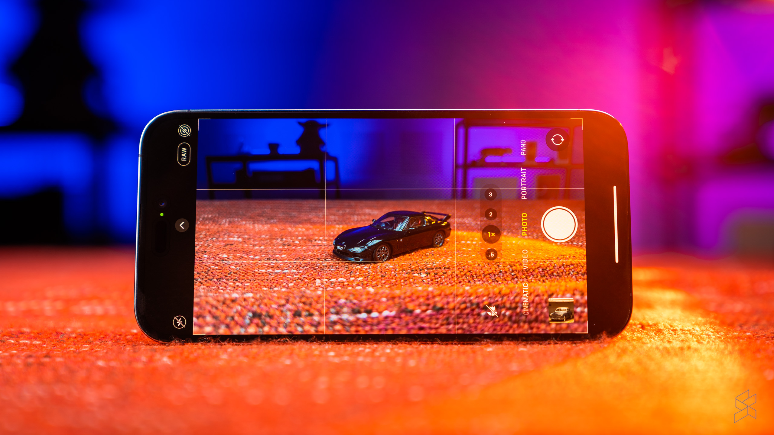
Another neat trick of the 48MP sensor is the ability to take a 12MP crop of the centre of the image, giving what Apple calls a “2x optical-quality” zoom. This augments the 3x telephoto camera and the 0.5x ultra-wide, both of which are still 12MP—although the ultra-wide has a larger sensor, again for better low-light performance.
Underpinning all these improvements is an upgraded image processing pipeline called the Photonic Engine, which applies Deep Fusion—the merging of multiple exposures—earlier when processing a photo. Apple says this preserves more data, resulting in more lifelike colours and improved textures, even when working with less light than before.
You’d imagine that with all these changes, the iPhone 14 Pro would be the undisputed king of smartphone cameras, combining Apple’s prowess in machine learning with significantly better hardware to deliver stunning photos. And I’m afraid the answer is not quite so clear cut. Don’t get me wrong, the 14 Pro has a far more versatile suite of cameras than ever before, taking fantastic images in a variety of lighting and subject situations. But the company is starting to make very obvious choices in how your photos should look like—and I don’t like a lot of those choices.
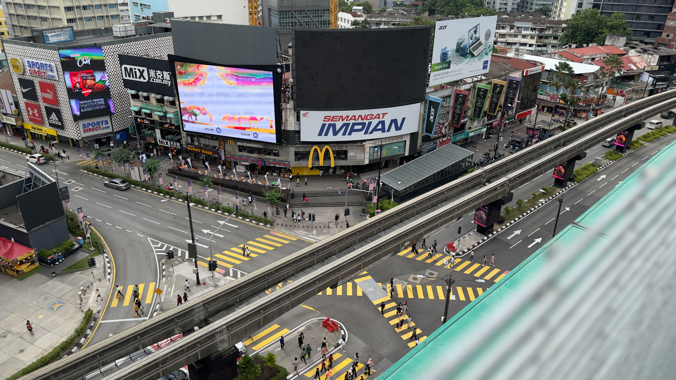

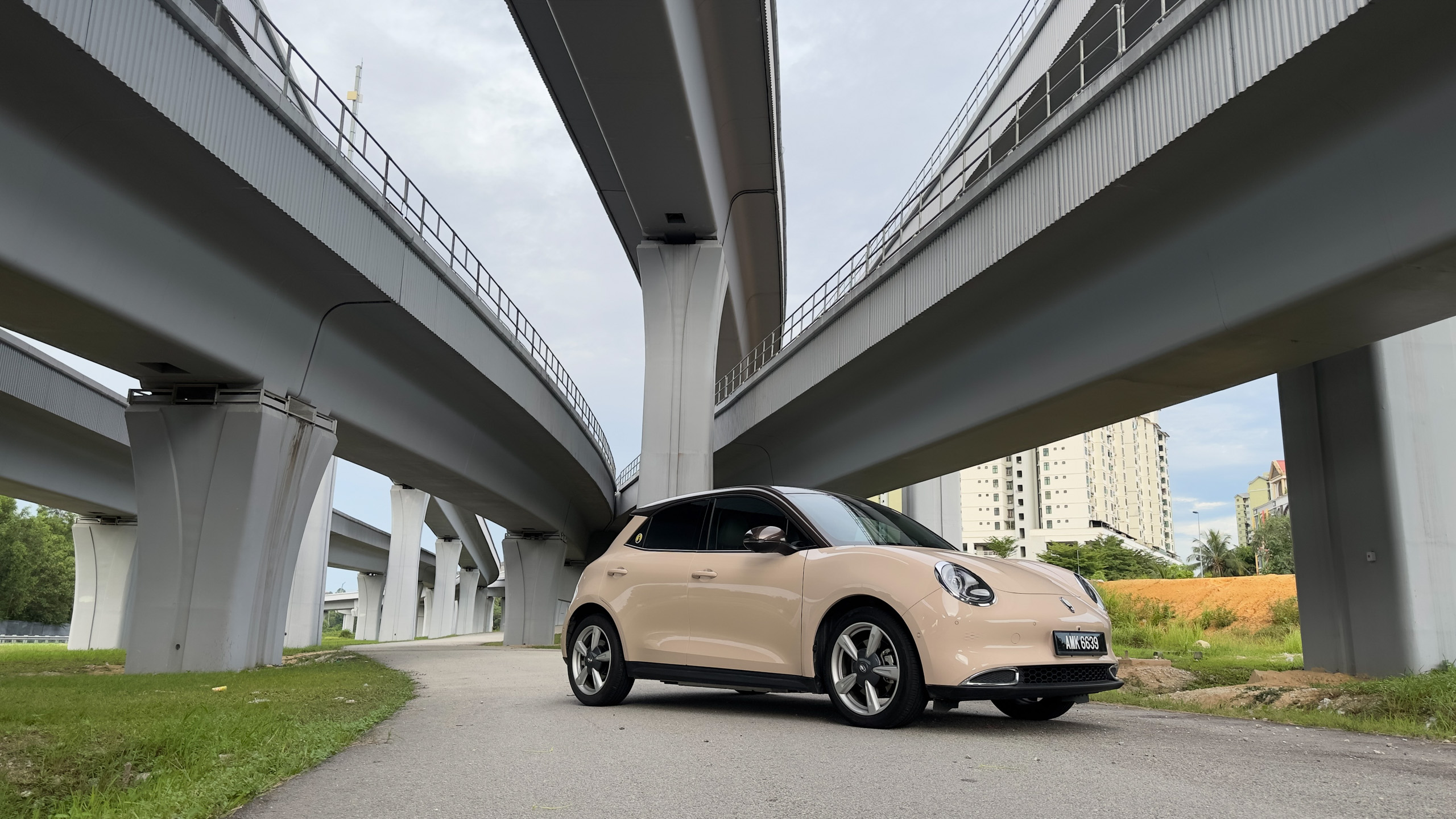

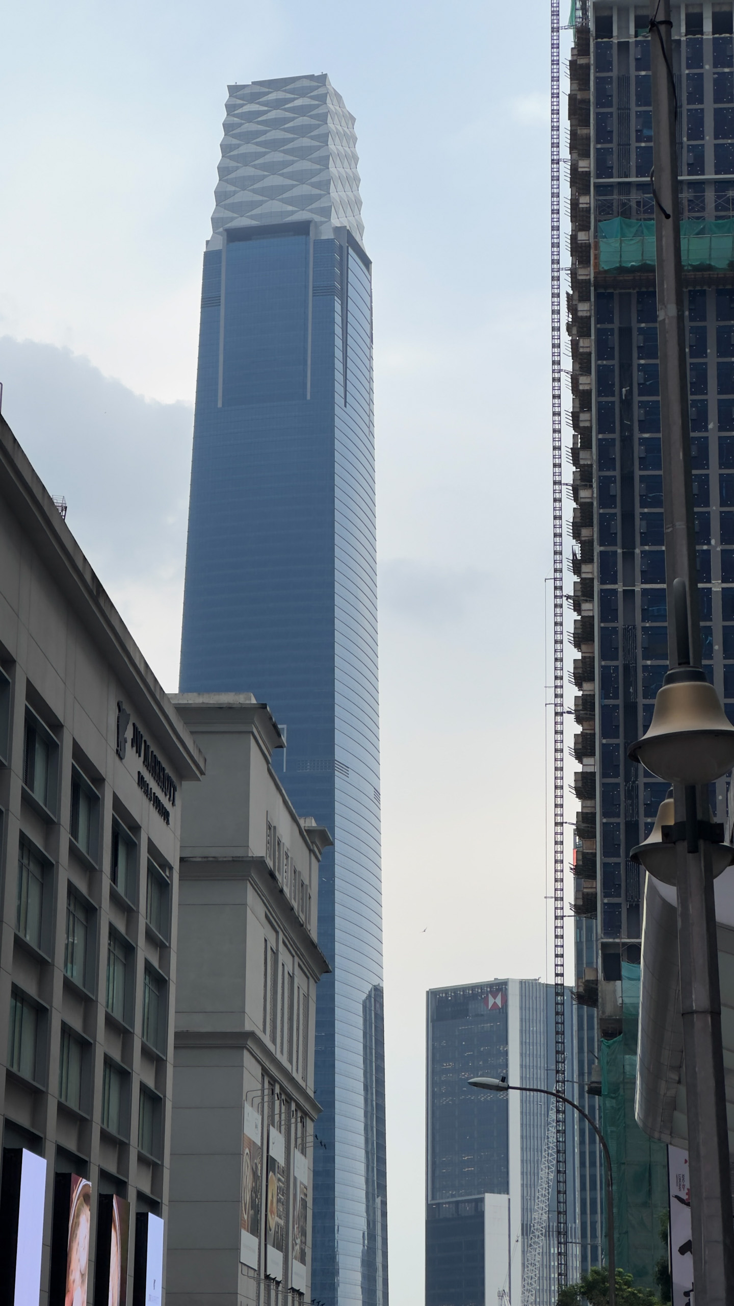


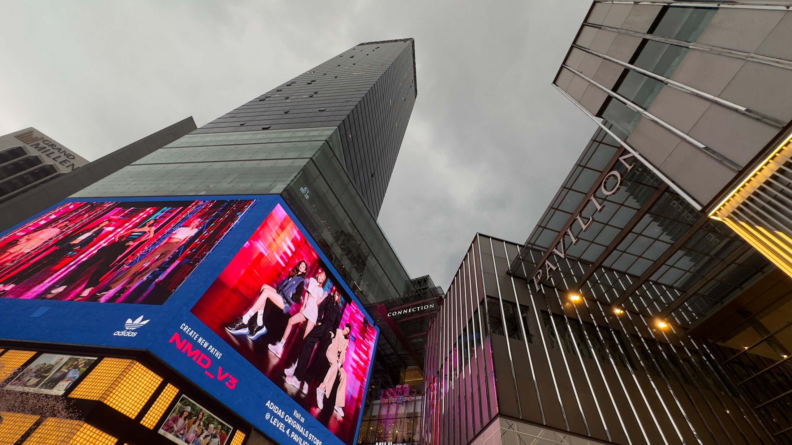

First, the good news: despite technically having smaller pixels, the 14 Pro’s main camera still manages to effectively control noise in low-light environments. It also provides excellent dynamic range while still accurately rendering shadows and highlights, instead of dialling them back. With the 48MP sensor, the main camera also delivers better detail, even though it bins down to the same 12MP resolution as before.
But this level of detail comes at a cost—with the 14 Pro, Apple has ramped up sharpening and noise reduction to new levels. Sometimes, this works to your advantage, rendering angular objects with satisfyingly crisp edges and clean sides. Photos of buildings look especially good on the iPhone’s tack-sharp HDR display.
Other times, however, the phone’s heavy-handed processing muddles a lot of fine detail, ironically negating the advantage of the 48MP sensor. This is particularly noticeable in low-light images, where the iPhone wipes out textures and strands of hair in the service of cutting out noise. Haloing is also very noticeable in areas of high contrast—a classic side effect of over-sharpening.


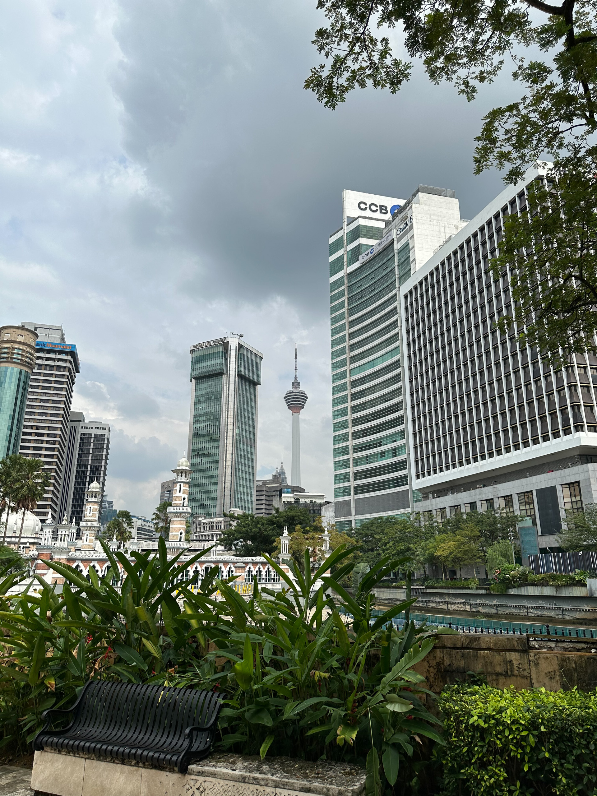

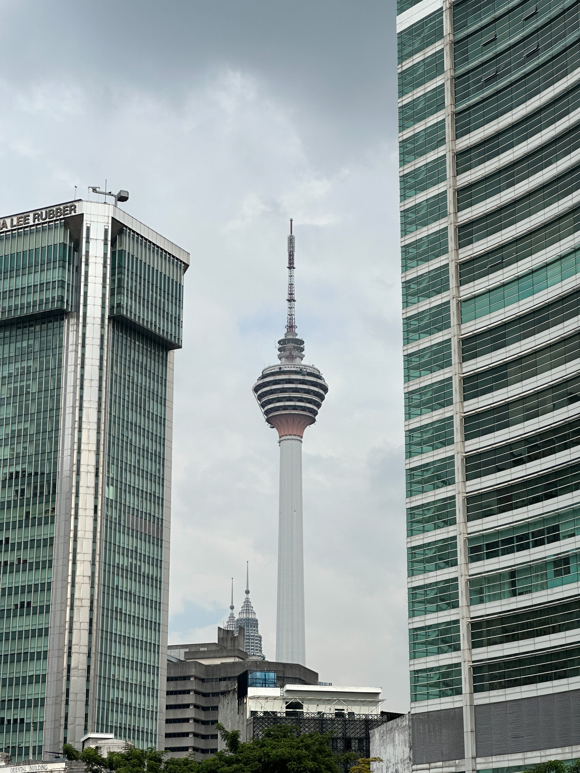

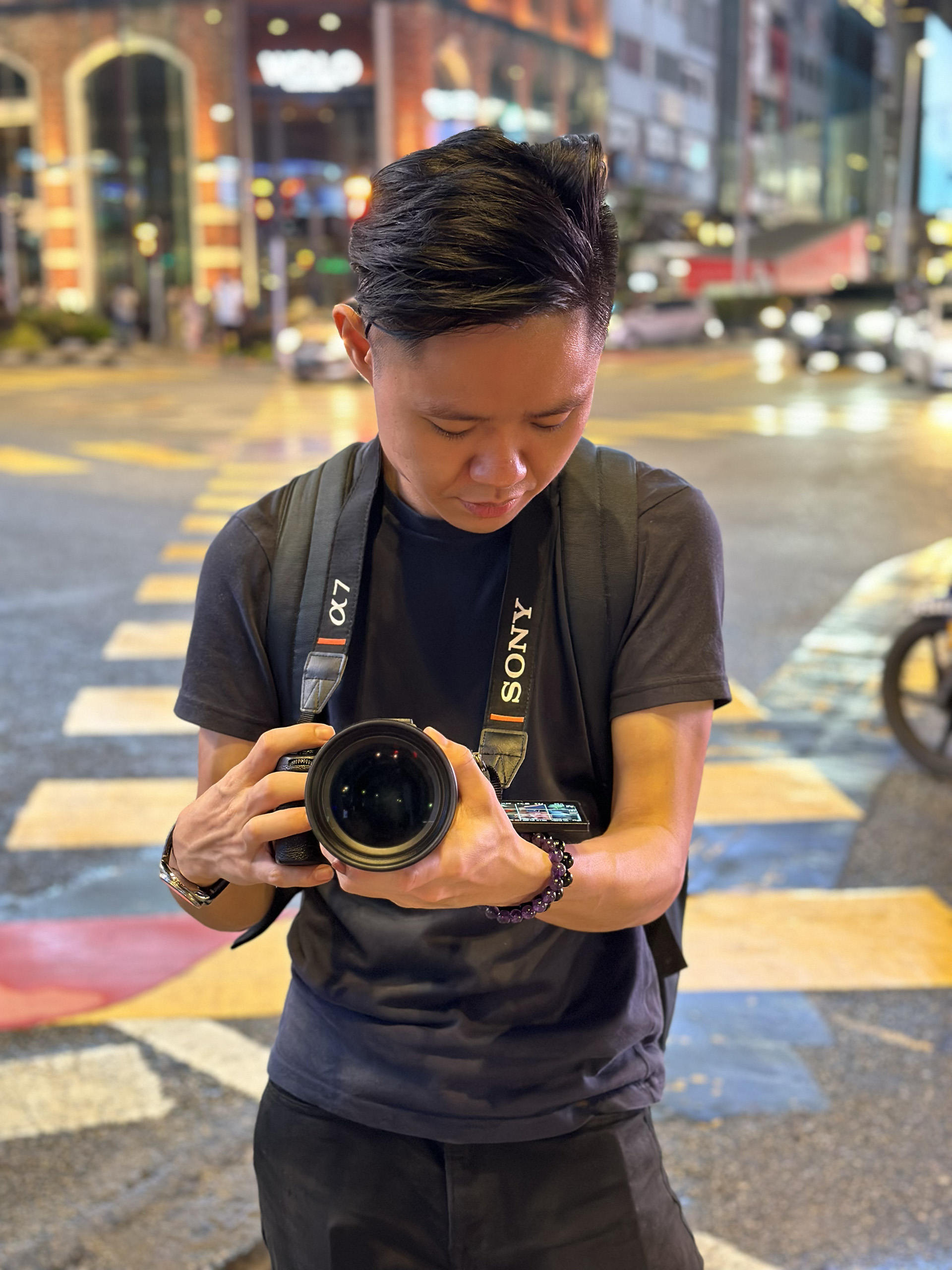


Images from the ultra-wide camera suffer the most from this, looking overly soft when zoomed in. Thankfully, the 2x and 3x zoom photos are more consistent with the 1x ones, even though the former exhibits a touch more noise due to the lack of pixel binning. As for the 12MP selfie camera (which now has a larger aperture that necessitates the addition of autofocus), it produces images that are sharper and have slightly more bokeh than before, but not by so much that the improvements are noticeable at first glance.
Apple also seems to be falling behind when it comes to Portrait mode, another area where it once led. Nowadays, the iPhone can create a nuanced fading depth of field effect and blur the foreground in addition to the background, both of which are very nice. But whereas companies like Samsung have advanced edge detection to a point where they can now separate individual strands of hair, the 14 Pro’s trimming of subjects is still rather imprecise and occasionally misses out areas such as around the arms.
Where the iPhone still holds an unassailable lead is in videos, where it delivers impressive stability, colours and dynamic range—even if it suffers from the same over-sharpening as images. The 14 Pro also shoots in a variety of resolutions (1080p or 4K) and frame rates (24, 30, 60 or 120fps), which will be useful if you’re an actual pro. There’s no 8K video, unlike the Galaxy S22, but who actually gives a toss about 8K right now?
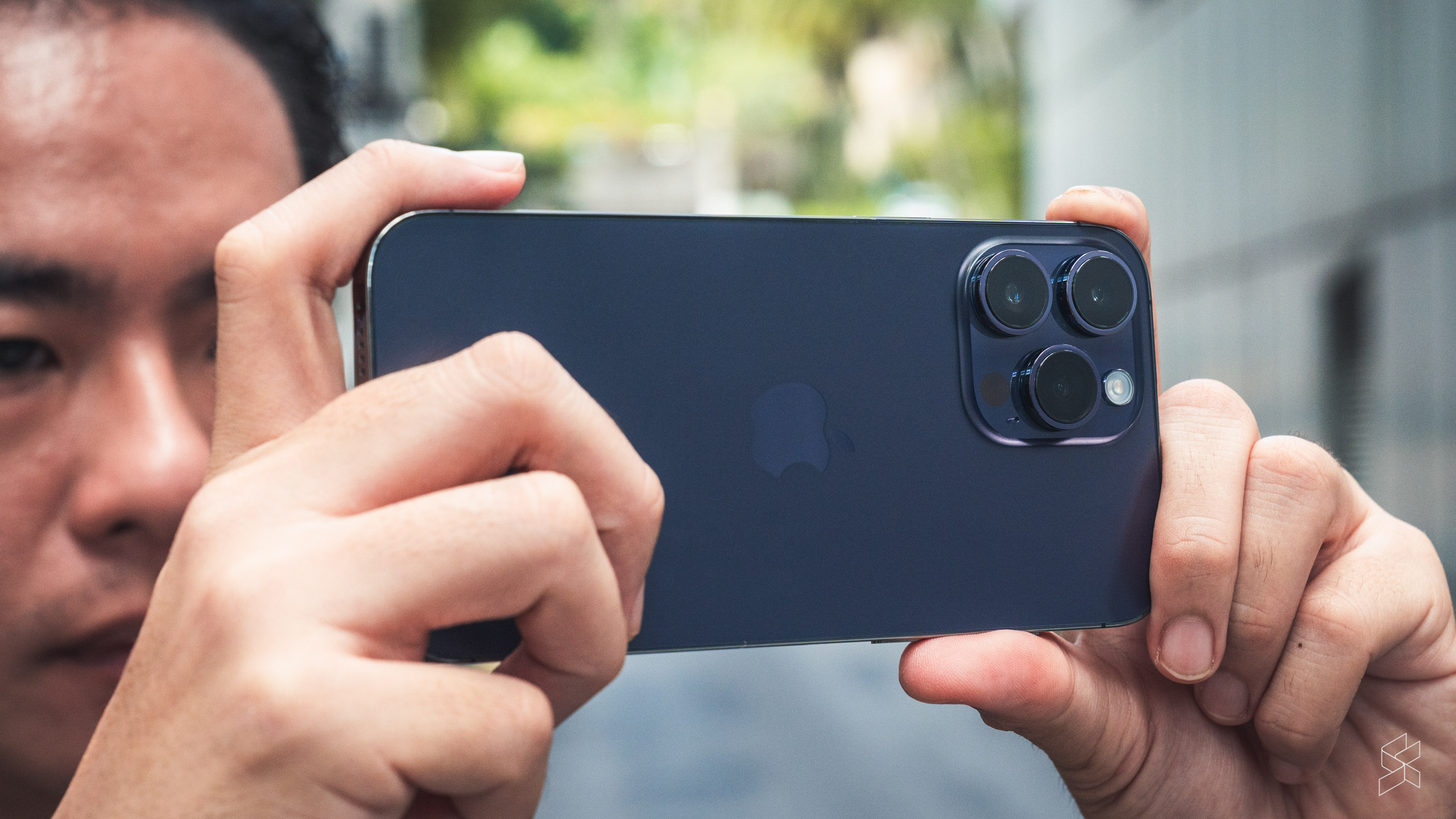
Last year, Apple brought us Cinematic mode, imitating the focus racking of professional film cameras. Despite gaining the ability to shoot 4K video, it still feels like a gimmick unless you regularly take videos of people (it doesn’t really do well with other kinds of subjects), and the shallower depth of field brought on by the larger sensor does hinder the ability to change focus in post. Still, it’s a nice feature to have for a “pro” phone—which is why it’s surprising that even the base iPhone has this.
Another feature added to both models this year is Action mode, which provides an extra level of stabilisation through an extreme crop of the sensor (you’re limited to a maximum resolution of 2.8K, or 2816×1584 pixels), similar to GoPro’s HyperSmooth. Apple says you’ll no longer have to use a gimbal, but don’t chuck your DJI Ronin in the bin just yet—small vibrations from running will still show up in your video. It’s much better with less strenuous movements, but the iPhone already takes smooth enough videos without Action mode, so it’s hardly a game-changer.
Overall, the iPhone 14 Pro still delivers some of the best images and videos from its four cameras and totally deserves its flagship billing. But the competition at the upper echelons of the smartphone market is cutthroat right now, and I don’t think Apple made the best artistic choices this year. I don’t doubt it has the hardware to be the best; it just needs a little more finesse.
More Android-like than ever before
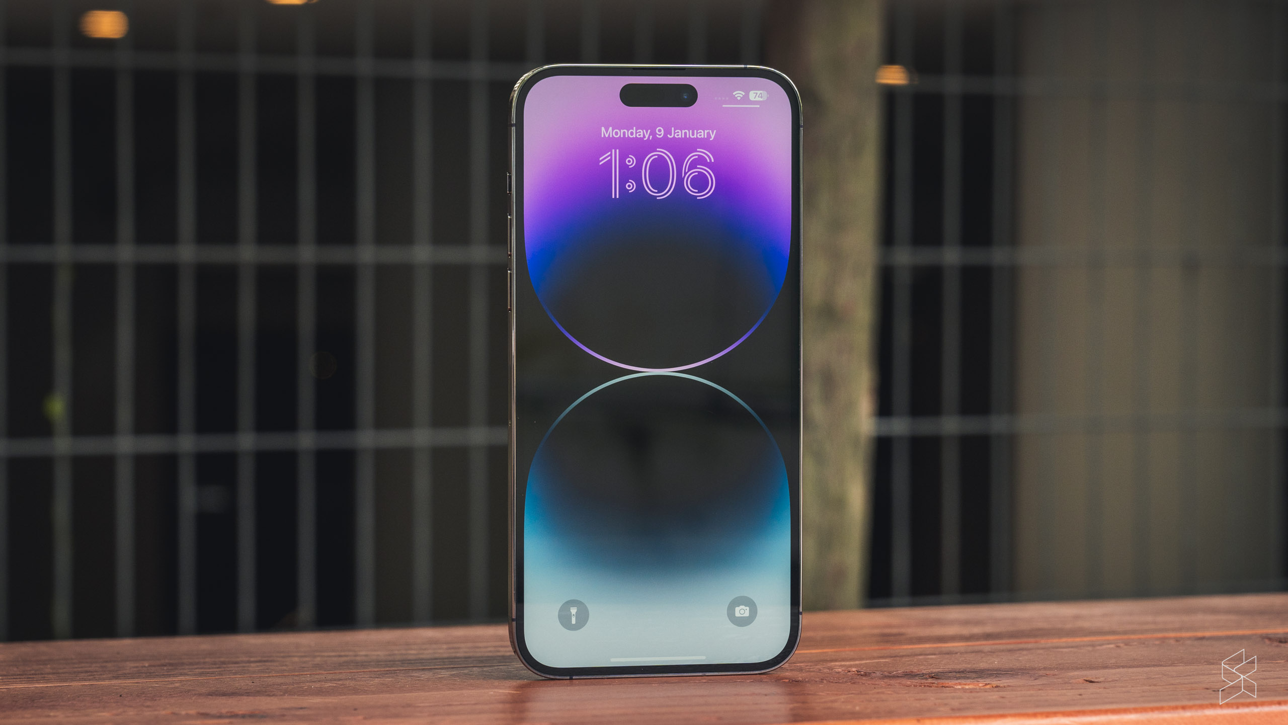
Underpinning the iPhone 14 series is iOS 16, which is arguably an even bigger step forward than the 14 Pro itself. You’ve heard about the headlining new features—a customisable lock screen, a battery percentage indicator and a photo cutout feature that seems to be running on witchcraft. Many of these improvements fundamentally change the iPhone experience and bring the operating system closer to what Android users have been enjoying for years.
Baking in the ability to set each lock screen (and wallpaper) to a different Focus mode is an inspired decision that has made the elaborate task of setting up each mode vastly more compelling. What’s more, it’s smart enough to tie each mode to a specific location. Seeing a Work mode wallpaper as soon as you step into the office or a Fitness mode one when you get to the gym forces a mental reset to get you into a certain mood. Then, when you leave the place, the phone will turn off the mode to remind you that you too should switch off.
Given that there are so many changes (including iMessage and Mail improvements that most Malaysians won’t touch, and iPhone 14-specific features like Crash Detection that we won’t test for obvious reasons), it’s impressive to see iOS 16 being this stable out the gate. As expected, however, there have been a few more early bugs than in most other iOS releases, although those have mostly been rectified in subsequent updates.
A glimpse of next year’s home run?
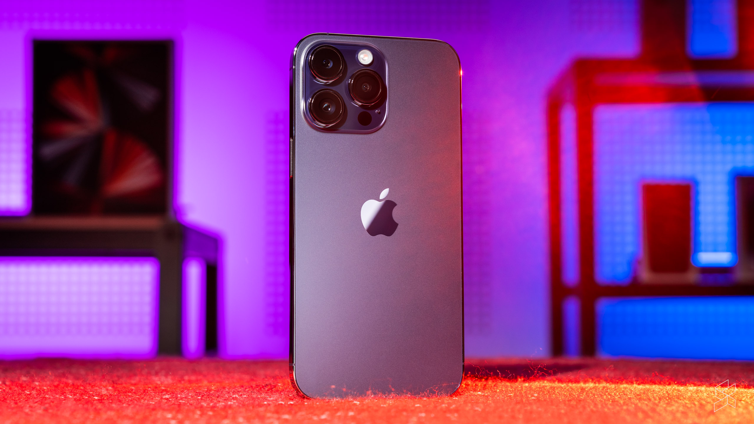
It may sound like I’m having a downer on the iPhone 14 Pro, but that’s not to say it’s a bad device. On the contrary, Apple’s latest and greatest is a flagship more than worthy enough of the name, offering a gorgeous display, excellent battery life (with a few caveats), blazing fast performance and a set of cameras that continue to take great photos. It’s as good an iPhone as there has ever been.
But our job as reviewers is to nitpick, to find faults, and on closer inspection, there are chinks to the 14 Pro’s armour. All the big new ideas look fantastic on paper, but they haven’t been fleshed out enough or polished to the usual Cupertino sheen. Nowhere is this more evident than in some of the photos the cameras take, which betray the company’s relative inexperience with all the new tech.
This isn’t exactly new—there’s been a constant cycle of trendsetting-but-flawed iPhones one year and markedly improved ones the next, dating back to the time Apple tacked on the “S” suffix to the iPhone 3G to create a quantifiably better device. More recently in 2020, we saw the iPhone 12 and 12 Pro, which featured the now-ubiquitous flat-sided design, 5G connectivity and MagSafe, but delivered subpar battery life, just a 60Hz screen refresh rate and image quality that was only just about good enough at the time. The 13—and in particular the 13 Pro—fixed those issues, and how.
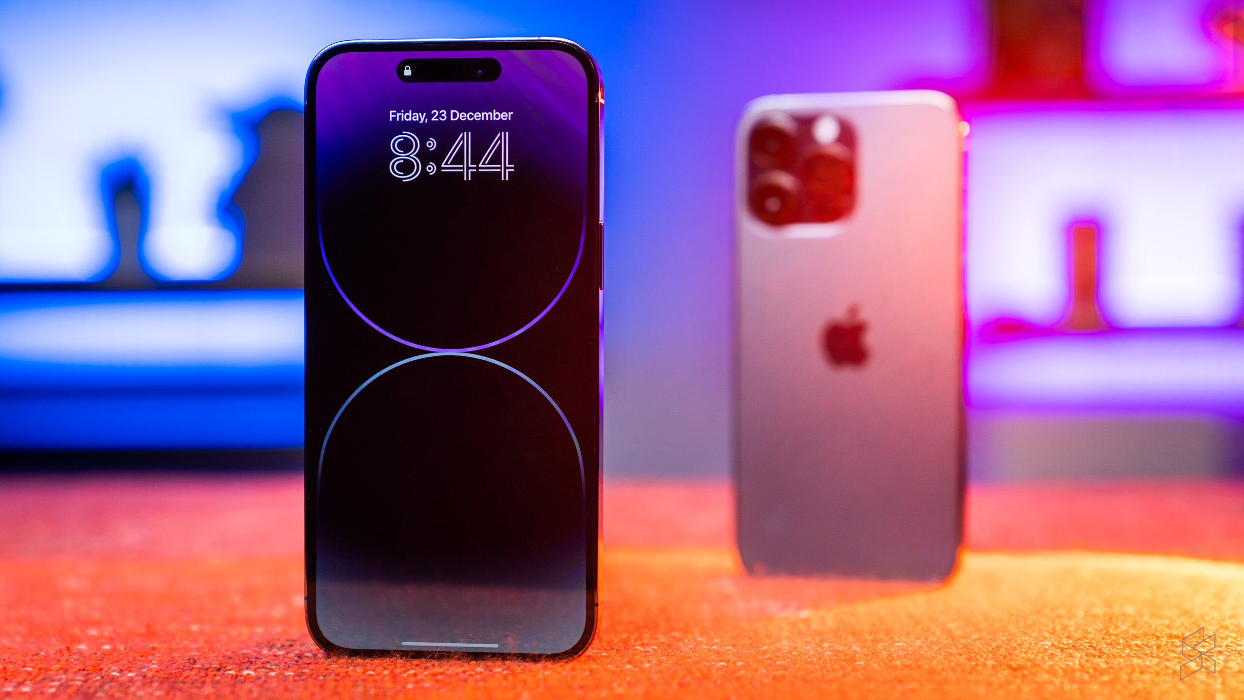
So here we are in 2023 with an iPhone that once again delivers plenty of Apple firsts, but lacks the refinements to bring it to the next level. Don’t let that stop you from getting one, however. Unless you’re the sort of person who pores over every single detail of their device, you’ll be more than happy with the 14 Pro—especially if you’re moving up from anything older than an iPhone 11. And if you’re switching from an Android phone, this latest model is more like your old device than ever before—in most of the ways that matter.
But the 14 Pro also offers a tantalising glimpse of the sort of world-beating phone Apple will probably come out next year, so if you can hold off for the next nine months…
Additional photography by Izham Zamani

