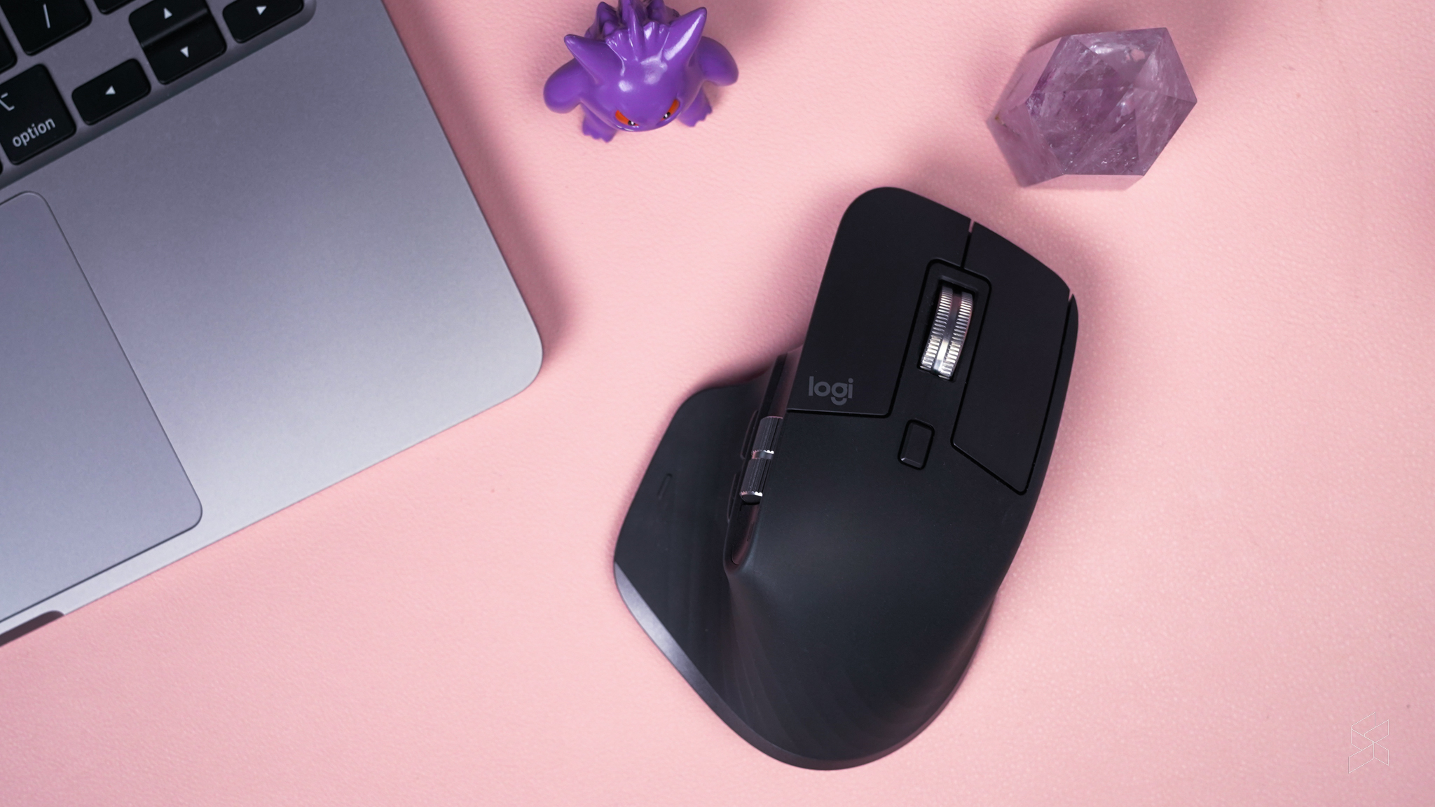
What I love most about the Logitech mice and keyboards that I have personally purchased or reviewed is that they have a wide selection of options if you want a prettier colour or style. For example, the Logitech Lift I recently reviewed had a dorky ergonomic concept, but it still had an adorable pink variety.
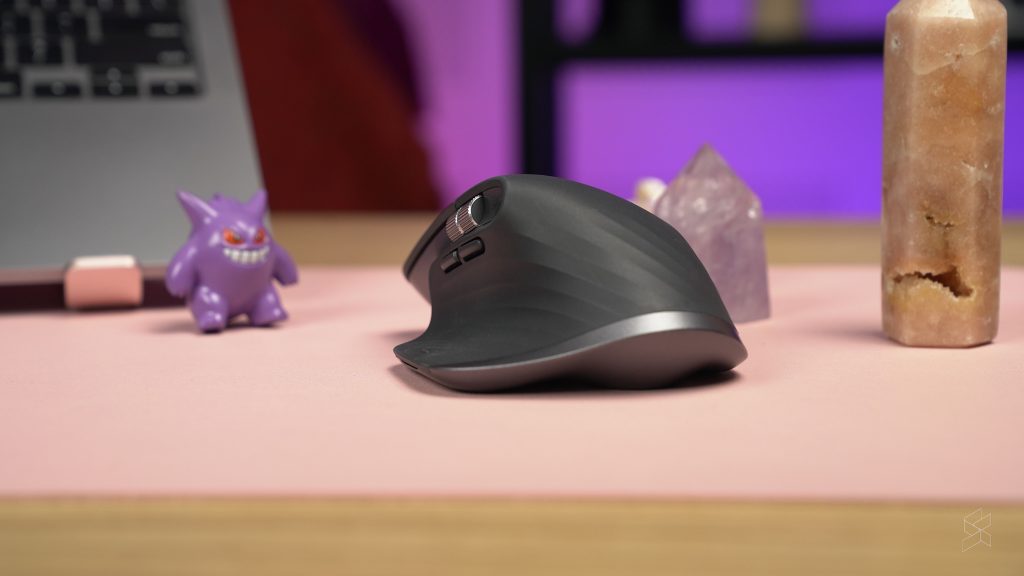
But when my editor Rory asked me to review the Logitech MX Master 3S, I was shocked to find that it didn’t have a colour option outside pale grey, or graphite (their fancy word for grey). It didn’t even look that visually appealing—with a flat lower wing at the side that looked like it kind of melted in the heat.
Alas, Rory insisted that the mouse should be the perfect balance between the vertical Lift mouse I’ve tried and a regular old mouse we’re familiar with. Can a mouse be both ergonomic and something that an average user would enjoy using at the same time?
Despite my initial first impressions of the mouse’s exterior, the MX Master 3S seems to have checked off (almost) all of the boxes on my personal perfect mouse checklist.
What is the Logitech MX Master 3S?
The MX Master 3S is a part of Logitech’s Master series, which is basically its series of ergonomic mice and keyboards that also have a ton of other features that “help you focus and get in your flow”.
The MX Master 3S is apparently Logitech’s refresh of its older Master mouse, which was even more of an eyesore. According to the brand, some of the mouse’s best features are its quiet clicks, tracking sensitivity, and its electromagnetic scrolling wheel.
It all sounds like this is the ultimate mouse. And since I’ve been using a wireless gaming mouse for work, I was excited to try a mouse actually meant for work use—despite how out of place it looks with my desk’s all-pink setting.
So, it looks atrocious
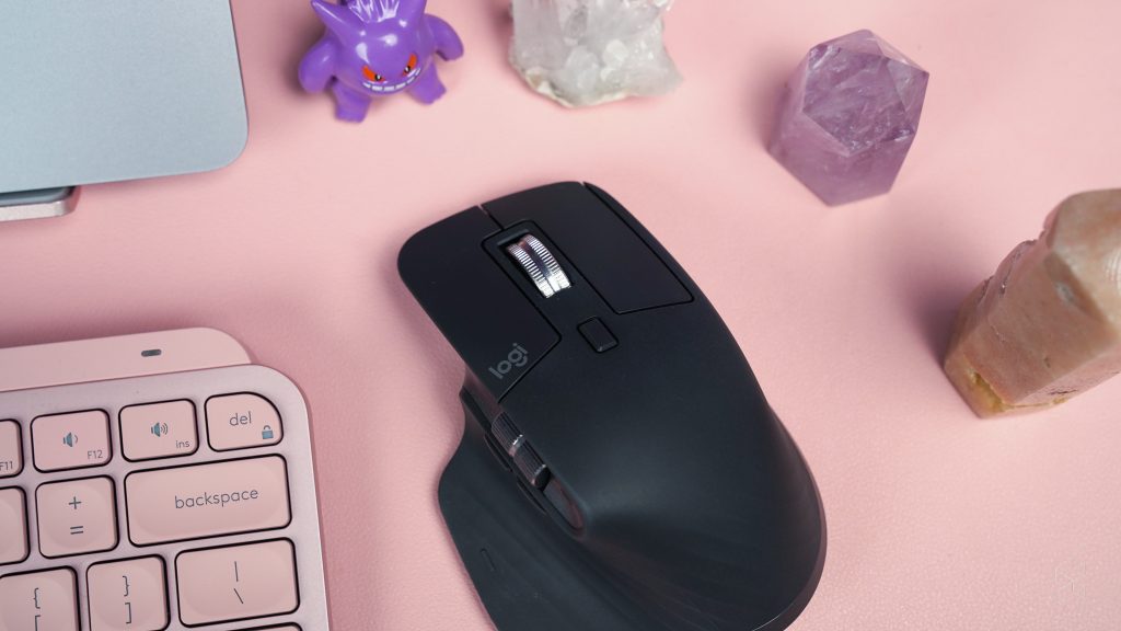
I know I’m being too harsh on its looks. It’s meant to be designed for comfort and for the office setting. Logitech can’t please everyone. I know this. But I’m so bothered by how generically bland and angular the design is.
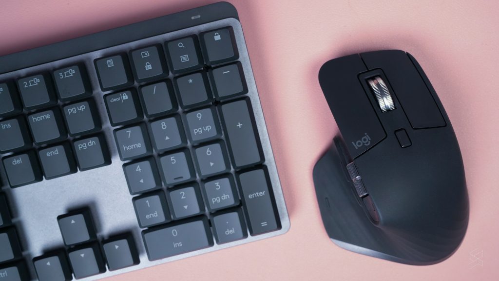
However, the mouse’s design doesn’t include the silly-looking bottom flap where I rest my thumb—that part of it is pretty un-generic. But there’s something about the rest of the mouse that makes me scrunch up my nose and sneer. Maybe it’s because the MX Master 3S looks exactly like how I picture a generic office setting—angular, serious, and boring.
But what I can give them credit for is that it looks and feels expensive. Its body has a ribbed, rubbery texture (don’t start) and its steel scroll wheels look and feel sturdy.
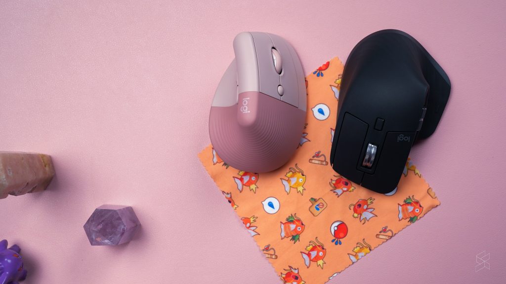
It’s also pretty heavy for a mouse, at 141 grams. The Logitech Lift—which I remarked about how heavy it was then—is only 125 grams in comparison. But the weight doesn’t bother me with the MX Master 3S like it did for the Lift, likely because of its shape difference and how it distributes the weight.
And for an ergonomic mouse, the MX Master 3S’s design isn’t as severe as the Lift’s—nor does it force me to change how I hold mice. It allows me to hold mice like how I’d normally hold mice, but it’s just… more comfortable.
So, so comfortable
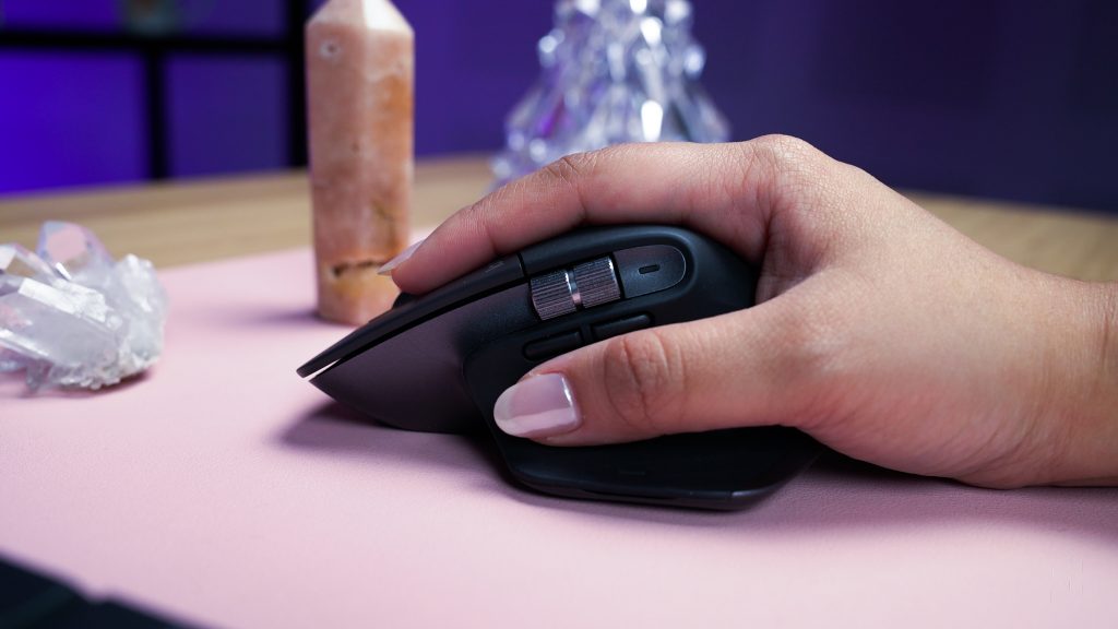
It may be ugly, but damn if the Master 3S isn’t the most comfortable mouse I’ve ever tried. It has a slightly zany back-end of the mouse’s body that’s shaped to fit the palm so well, and the silly flatbread of a side wing allows me to rest my thumb like how a person on holiday rests on a hammock.
I would have also wanted another smaller side wing for the other side of the mouse so I can rest my pinky as it slightly dangles there, but I think that would have made the mouse worse looking.
Some reviewers noted that the MX Master 3S might be too big for smaller hands. I understand where they’re coming from, but even as a woman with smaller hands, it didn’t really bother me too much. The left and right click buttons are big enough for my fingers to click without needing me to reach all the way to the ends. In fact, I think a smaller mouse would mean that the shape would also be a little different, and probably less comfortable for my palms.
To me, this mouse feels more ergonomic over the vertical Lift mouse. I don’t need to change my wrist placements to adjust to a wild shape, and it’s still extremely comfortable for long hours on my desk.
And the fact that I can use the MX Master 3S on basically any surface just adds to what I look for in a work mouse—especially since I have a hybrid office/home model for work.
So cool lah, the features

The MX Master 3S has an 8,000 DPI optical sensor, which you can toggle using the Logi Options+ app you can download. It basically means that the cursor can move extremely fast if you need it to.
You can also use the app to choose the best options for the buttons on the mouse. The mouse has a lot of other scrolls and buttons at the side that I normally would just ignore completely, because they would do actions that I won’t normally need.
But with the app, I can make the side scrolls zoom in and out of a page rather than make a page move horizontally. I can also make the buttons at the bottom of the side wheels adjust volume levels.
Logi Options+ also made me realise that there are more buttons on the side wing itself that I can customise. They’re practically invisible, but you’d need to press a bit more than usual on the side wing itself to activate your chosen gestures like switching between different app windows.
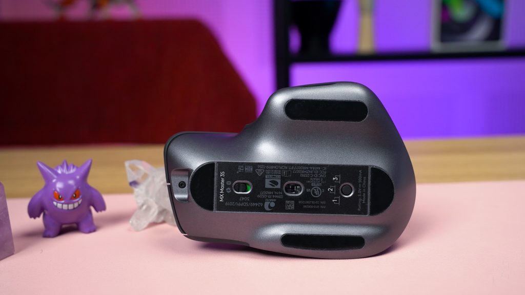
Additionally, I can customise the mouse speed. The fact that it has an 8000 DPI setting allows me to pick from a whole bunch of sensitivity settings. But its sensor options can help you work better depending on the surface you’re on.
As for its Magspeed scroll wheel, I was impressed with how the wheel would just spin on and on and on after a good flick. According to Logitech, its electromagnetic wheel lets you experience high performance “with zero distraction”.
The Logitech Lift‘s Smartwheel is pretty much similar to what the MX Master 3S’s wheel can do, except the MX Master 3S’s wheel is the more advanced version. It’s great for easily scrolling my way to the end of a long article, and it can scroll on and on so I can go through more stuff in just one flick of the wheel.
But I also think that it has a fidget-spinner-like novelty to it. And for me, after a while, the more advanced MX Master 3S wheel seems more like a novelty because I don’t really need to scroll through so much usually. Still, there’s nothing wrong with novelties, and I like that I sort of have a built-in fidget spinner.
And let’s not forget that it’s a wireless Bluetooth mouse, too. It’s something that, in this modern age, should be the norm for mice especially if you’re working with a Mac with barely any ports.
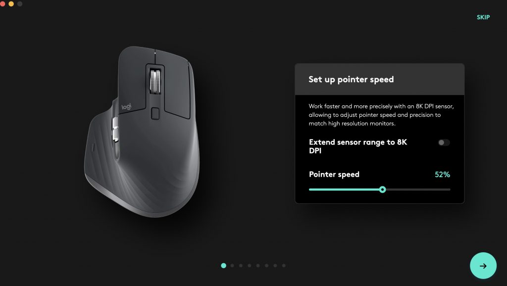
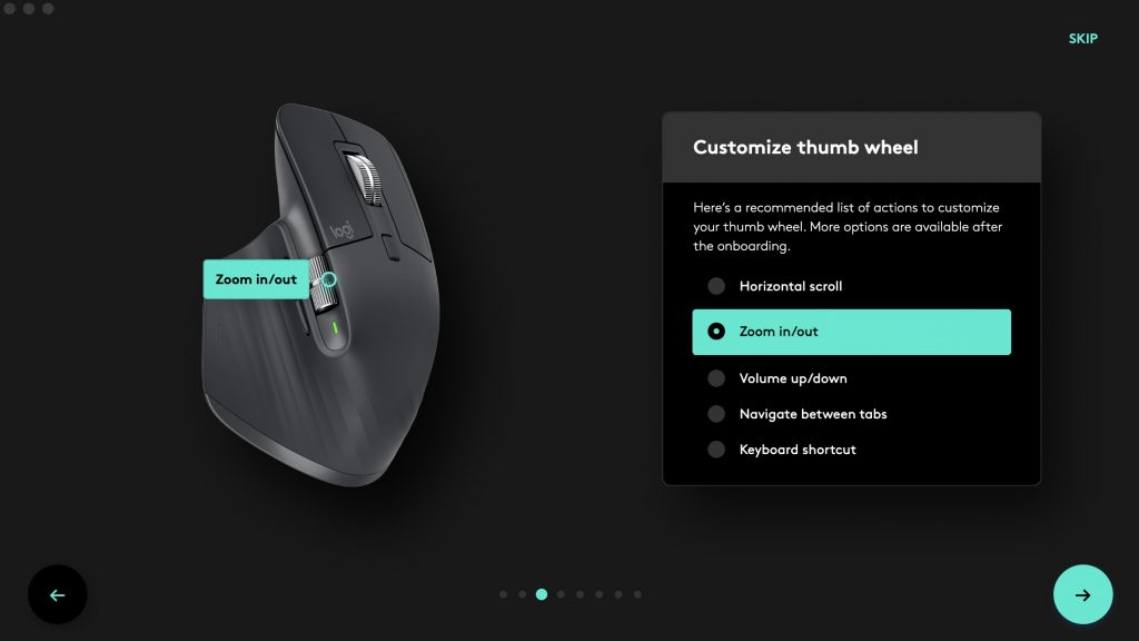
Like the Lift, the MX Master 3S can also connect to three different devices. You can press a button at the bottom of the mouse to change which device you control pretty seamlessly, and you can even use Logi Options+ to check which devices are connected to which number.
All these cool features add to the experience I’ve had with the mouse. I mean, I hadn’t really used the mouse to its full potential like for intense gaming or to edit detailed videos, but I appreciated it for being a good work companion.
So nice to work with
Like I said previously, I have a hybrid work model so I switch between working from home and working in an office. I also usually like working at different areas, changing between working on my desk to working in the kitchen.
The setup I use on my desk includes a laptop stand, a keyboard, and a mouse to complement my MacBook. The setup helps lessen strains on my neck and wrists the way that working on just a MacBook does.
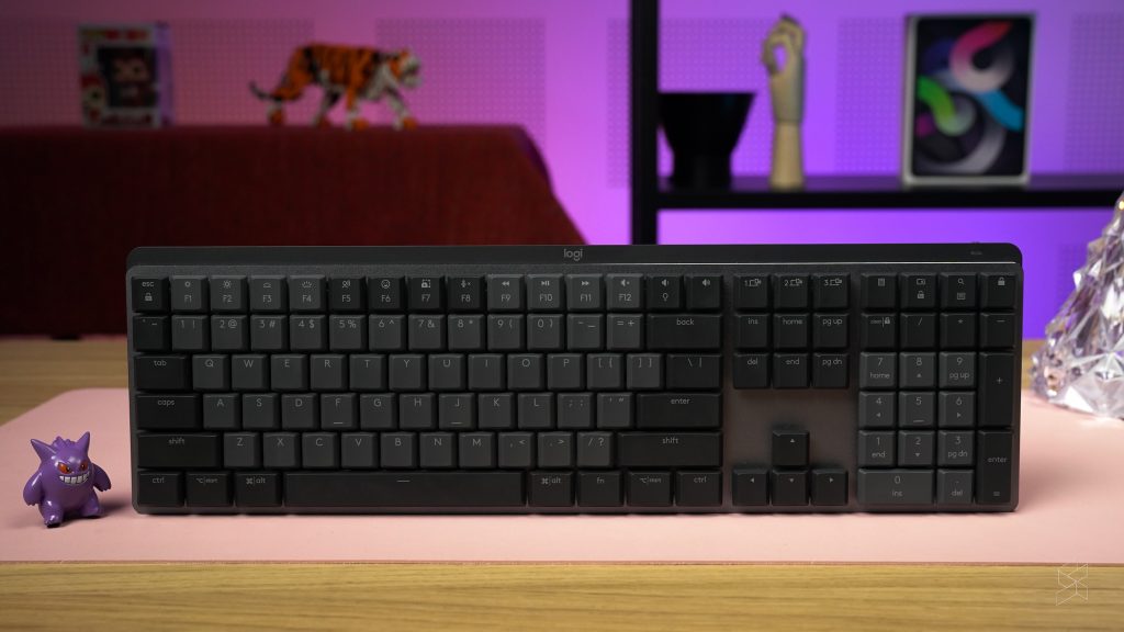
To try and complement the Logitech MX Master 3S, Rory also asked me to try out the Logitech MX Mechanical keyboard—replacing my non-mechanical Logitech K380. I have my own personal qualms with a mechanical keyboard. For one thing, mechanical keyboards aren’t very friendly for users with long acrylic nails.
Here’s a tip: If you’re looking for a good keyboard, are already used to your laptop’s flat keyboard, and have long nails like me, you’d need to note that a clickety clacky mechanical keyboard won’t be as comfortable for you to type on. You’re better off with a flat keyboard like my K380, which I’m still perfectly happy with.
However, I admittedly like using the Logitech MX Mechanical. The keycaps are slightly flatter than other mechanical ones too, which I like. And I also get that satisfying press from the keys.
Personally, I appreciated the quieter clickety clacks from the K380 rather than the Mechanical’s more obvious clicks. Granted, the MX Mechanical’s keys are “tactile quiet” so they aren’t the most aggressive sounded mechanical ones out there. But in a quiet office, the clickety clacks are blatantly obvious—for me, anyway.
The keyboard also has a much wider range of keys as it’s a full-sized keyboard. For me, having all those extra keys like the number pad was a little too bothersome. It was also harder to carry around a larger keyboard if I wanted to use my entire set up at home and at the office.

Even though I wasn’t a huge fan of how big the keyboard is, it did actually complement the MX Master 3S very well. The serious-looking colour palette and design matched each other, and I was also able to do personal shortcuts with it through the Logi Options+ app. So if you wanted a keyboard to match the MX Master 3S in aesthetics, this one would be it. But there are also the mini versions if you, like me, have no need for so many extra keys.
Having both the tactile mechanical keyboard and the ergonomic MX Master 3S as my set up for a couple of weeks made me feel like I had a more professional “grown up” set up. It’s not to say that I had a child-like set up originally.
My usual set up is an all-pink mini keyboard and a gaming mouse, and they’re still great items that helped me balance both work and play. But there’s also something nice about having a more intense set up with a clickety clacky keyboard and a mouse with a comfortable thumb hammock. It made me feel so business-y, and I could have sworn that I’ve been typing just a tad bit faster with the Mechanical.
So… what’s the verdict?

I mean, I hope you can tell that I do like the mouse. It’s useful, comfortable, and everything you need in a work mouse—if you aren’t too bothered by its more angular and basic features.
I also think that the MX Master 3S perfectly balances ergonomic-ness with what people are already used to. The wing might be awkward looking but my thumb has never been happier to have its own nook—and the shape also perfectly matched my palm placement.
This would have been the perfect work mouse for me if it came in a fun colour, and if it has a more curvy design that I appreciated with the Logitech Lift. But I suppose that I’m not exactly the target market—I can imagine the MX Master 3S being in the hands of someone who would rather prioritise performance over looks.
I don’t mind that you might think my opinion is too surface-level. I choose a lot of items based on how good they look, I’m an Apple user. But I also think that I’m speaking out to represent a lot of other consumers who prefer a prettier product. I would just like Logitech and other companies to marry the two ideas together. Because you can be both pretty and useful at the same time.
Basically, I’m saying that I would love for the next Logitech Master mouse line to also come in a pink design. Because girly b*tch*s need to get stuff done, too.
The Logitech MX Master 3S is priced at RM449. You can purchase it on Lazada and on Shopee as well.

