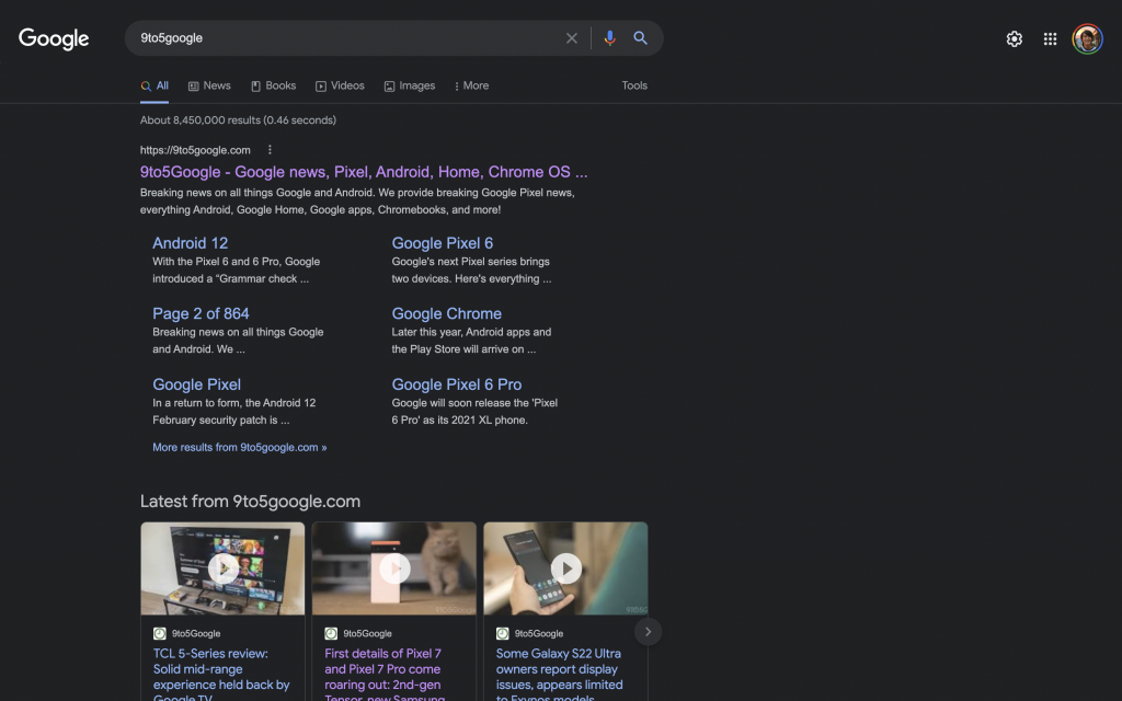
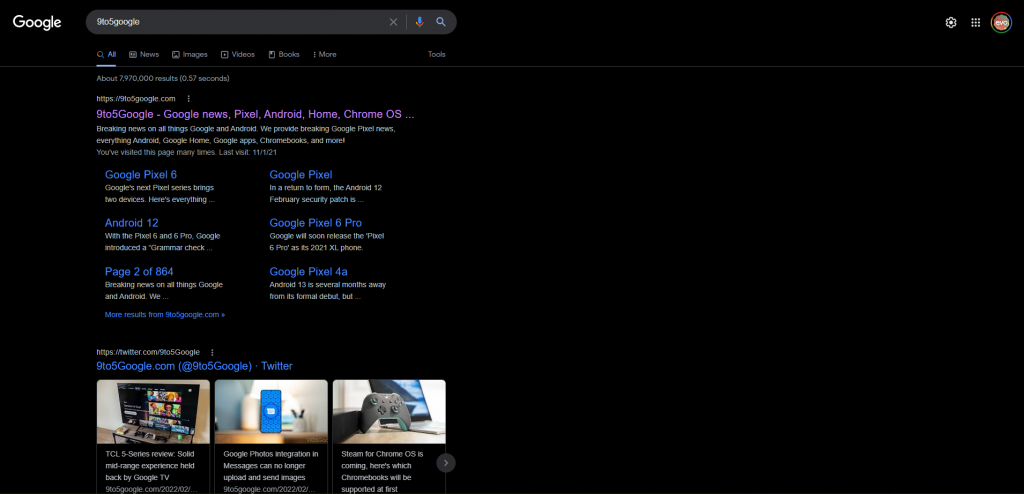
Last year, Google Search started rolling out a dark mode to their home page. Earlier this month, they announced that it was “available on desktop, mobile and everywhere you search”, and now they’re testing out a new pure black version of the dark theme.
Welcome to the dark side.
— Google (@Google) February 10, 2022
Introducing Dark theme, available on desktop, mobile and everywhere you search. pic.twitter.com/qqM7darEif
The new dark theme is pitch-black compared to the older grey version more widely available. The text colours on the new theme seem to be slightly dark too. Not everyone has it yet, and it seems like they’re rolling it out in some sort of A/B test to see if it performs better with users.


So why are they doing this? Well, some users prefer a pitch-black look because they claim it uses slightly more energy for OLED displays. However, the higher contrast makes the text harder to read for a lot of people, so it would be interesting to see if Google rolls this out to everyone in the future.
Right now, it replaces the grey dark theme, but it’s possible that Google will have it as a third option, just like Twitter with its “Lights out” theme.
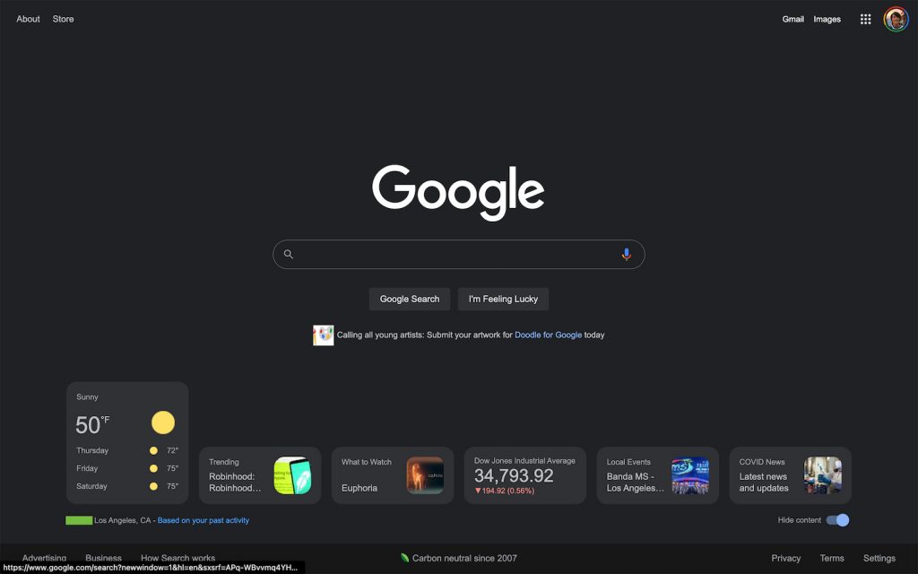
That’s not the only thing Google is changing about its Search user interface. They’ve always had a clean homepage compared to competitors like Bing or Yahoo, but some users have spotted them testing out information cards on the home page. It includes cards for the weather, trends, stocks, events and COVID-19 news. Just like the pitch-black dark mode, this is also unfortunately not available for everyone yet, so all we can do is sit tight and wait.

How to enable Google’s dark mode
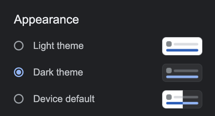
If you’re still on light mode and you want to see if it rolled out to you, then you can enable dark mode by clicking on the gear icon on the top right, going to Appearance, then clicking on “Dark theme”.

So what do you think? Do you like the pitch-black theme or do you think they should stick to the current grey theme? Let us know in the comments section!
[ SOURCE, IMAGE SOURCE ]


