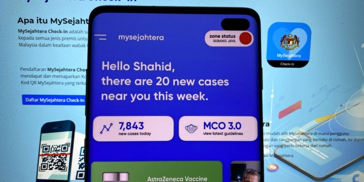
Now, I’m not saying that the current MySejahtera user interface (UI) is terrible, but if I had to look at it for more than 2 minutes I’d be a little annoyed. There’s always space to make the things that we use… better. It’s what Malaysian app designer Shahid Rogers proposed to do in a viral tweet detailing his take on a MySejahtera UI redesign.
Some of my ideas for MySejahtera 2.0, summarised.
— shahid (@rojakdude) May 28, 2021
-simplified dashboard with hyperlocal info about cases nearby, zone status, with some general info like daily cases & MCO guidelines to improve awareness
-simplified vaccination registration
-appointment details + transport info pic.twitter.com/n9Y5eu6ch8
“MySejahtera is a daily touchpoint for so many Malaysians during this COVID-19 pandemic. Young or old. Tech-savvy or not. Yet, so many people struggle with using it for anything beyond checking-in to locations,” wrote Rogers.
Rogers assured to us that he doesn’t think that “it’s lacking in features”. However, he also doesn’t think that MySejahtera was designed with “the everyday user in mind”, so he mocked up a redesign of the app.
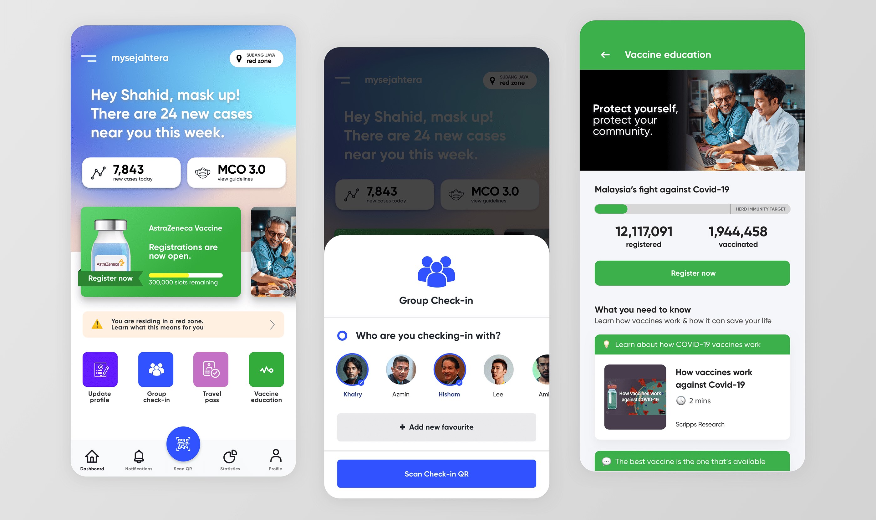
On first glance, the UI looks a lot cleaner and pleasant to look at—using about the same colour palette used on the current MySejahtera. The newly designed dashboard includes sections that easily lets users know what they are—like telling them how many cases are near you in the current week, how many cases there are in a day, a section for the current MCO guidelines to look through, a huge section that lets users click through to register for the vaccine, and other quick actions.
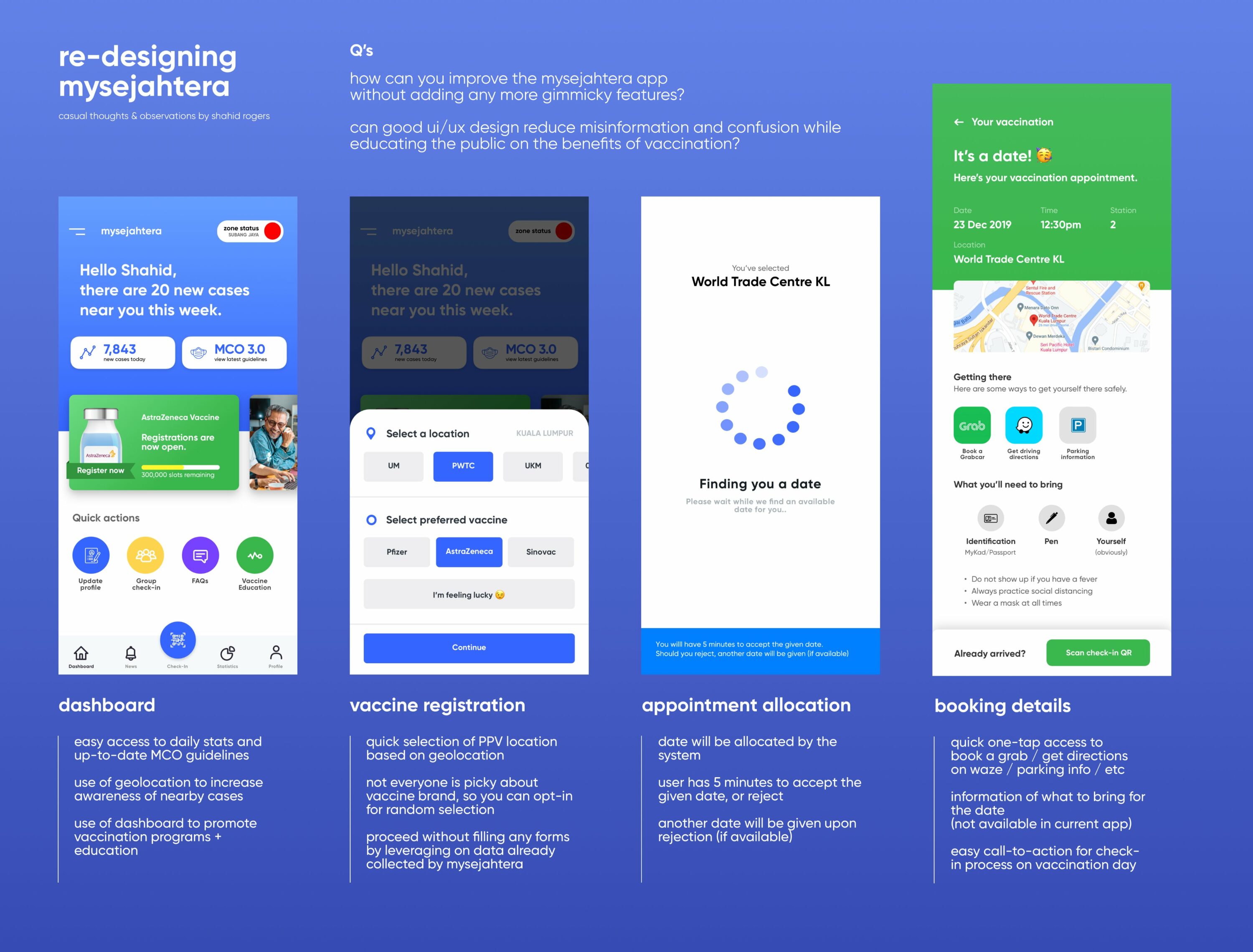
“I have quickly expounded my ideas for an enhanced Dashboard, Group Check-ins & Vaccine Education. I personally feel that people would be more confident to sign up for the COVID-19 immunisation programme if they had a better understanding of vaccines,” Rogers continued.
Rogers also provided a new redesign for vaccine registrations, appointment allocations, booking details. He even created a section where you can do a “group check-in”—which is something that could be a great idea.
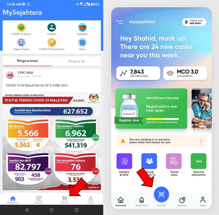
A key difference is the placement of the MySejahtera check-in button. The current app UI places it amongst your profile and statistics, making it sort of hide itself from your eyes. The new redesign highlights the button instead.
Rogers also mentioned that he would “probably change the copy” to make it more suitable for all ages. He wanted it to be more colourblind-friendly, and to make notifications more accessible.
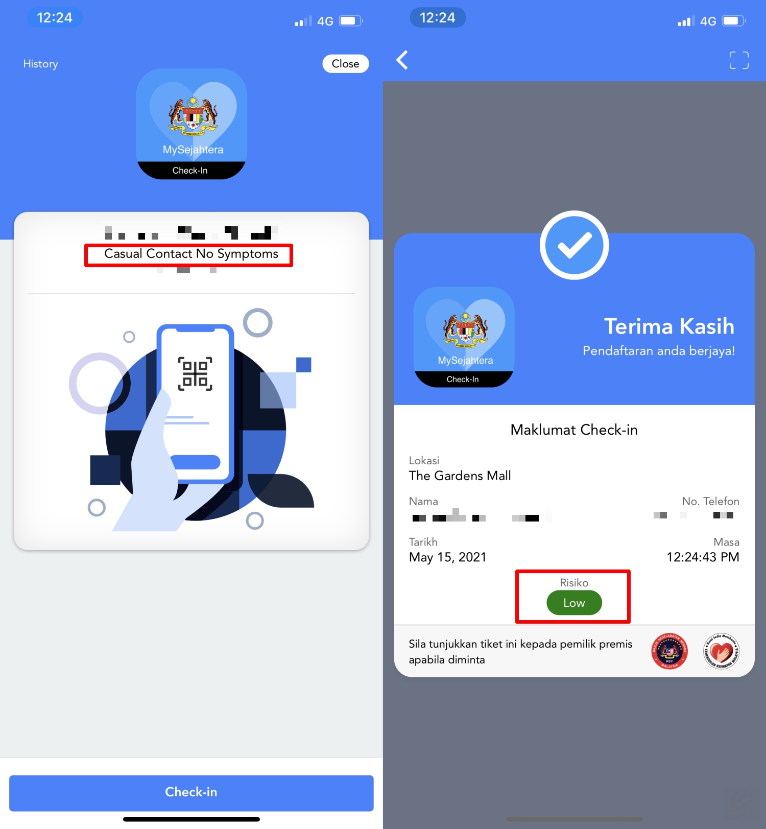
Besides the UI suggestions made by Rogers, one of our biggest problems with the current MySejahtera is the lack of clarity in proving your low risk status—it’s so tiny and hard to see. The general look of its UI also reminds me of websites created in the early 2000s, so it’s kind of sad that something so important to Malaysia is still using a look reserved for vintage internet throwbacks.
Another area that urgently needs to be redesigned is how the app shows a person’s risk status. Before check-in, the MySejahtera app should provide a clear status so that it is easier for guards to see. Think big bold text with clear colours (green and red).
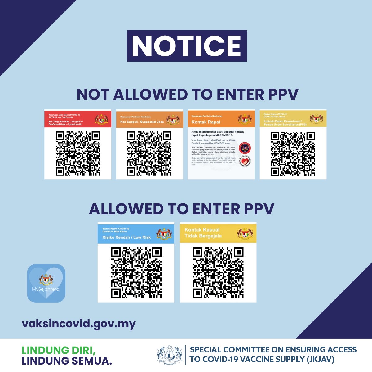
At the moment, users will need to tap to the home screen, then tap on the profile page to show the status and then tap back to check-in again. Something like the “Casual Contact No Symptom” status can be easily mistaken for Person Under Surveillance if the colour palette for each status is kind of the same.
Roger’s tweet garnered almost 10,000 retweets, and more than 11,000 likes. He also added a site where you can take a closer look at his work. So what do you think? Would you want a MySejahtera UI revamp?
[ SOURCE, IMAGE SOURCE ]

