You don’t know what you have until it’s gone.
This, I believe, is something many of us know to be true, but often forget because…well, otherwise the saying wouldn’t exist. For many of us, we experience this very often in our lives, whether it’s that transition from moving out of your parents house or leaving the comforting stability of schooling life.
That saying, distilled into its purest form, basically means that we often don’t know what we will actually miss until its gone. And today — or more accurately, in the past few days –I’ve had the joy of being reminded how true this is. I am, of course, talking about the HTC U12+ — in case I wasn’t being obvious enough in my intro — and how much I now miss buttons. Physical clicky buttons on the side of my phone.
We see bold moves all the time in the tech space. The removal of optical drives from laptops, for example, and more recently, the death of our dear friend the 3.5mm Headphone Jack.
But I often welcome drastic changes, even if it feels incredibly pointless and inconvenient at the start, I know that it will only get better over time. New gesture-based navigation? Sure, I’ll give it a try. Voice assistants? Yeah, OK, whatever. Weird keyboard that also isn’t really a keyboard? Bring it. Without shedding the shackles of our past, there’s no way that we can progress into the future — at least, not at a pace that’s acceptable.
It’s all about jumping in face first so you know you’re all in. And the latest inconvenient new thing I’ve been diving into comes courtesy of HTC. The U12+ is HTC’s brand new flagship smartphone for 2018 and one of its most perplexing features is the fact that this device doesn’t have any buttons.
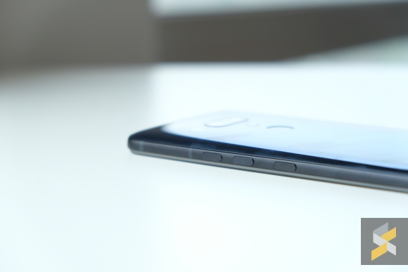
Instead, it’s got what I think can be best described as pressure sensitive nubbins that are masquerading as buttons on the right side of the handset. Let me tell you, it makes the phone weird to use. Very weird.
Don’t get me wrong, the HTC U12+ itself is an excellent flagship device that brings a lot of what made its predecessor good and marries that with a myriad of thoughtful upgrades. It’s powered by Qualcomm’s best processor — a Snapdragon 845 octa-core chip — that’s mated to 6GB of RAM and, at least on my device, 128GB of UFS 2.1 internal storage.
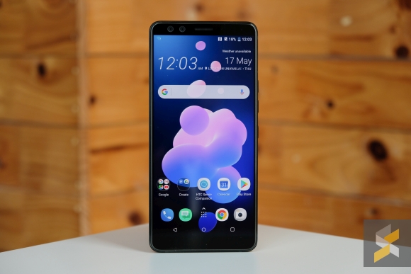
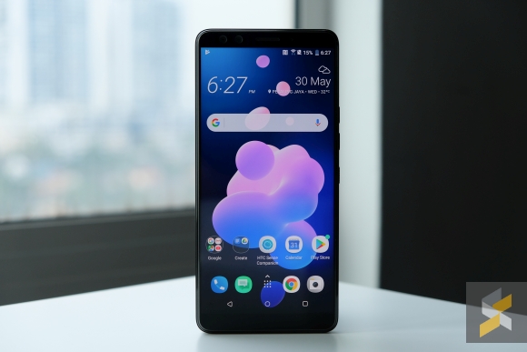
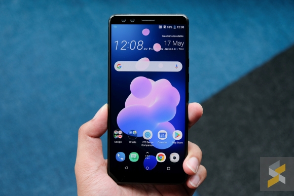
There’s also a great big 6″ Super LCD 6 display that looks faultless to my eyes. It’s sharp, thanks to a Quad HD+ resolution that pushes 537 pixels per inch, bright, and vibrant with really slim bezels. Even slimmer than the U11+ it succeeds, in fact. This panel is also capable of displaying HDR 10 content and the DCI-P3 colour gamut.
If all of that sounds like jargon to you, the only thing you need to know is that everything feels really smooth right now. Launching apps, swiping between them and watching content on that big screen is about as good as it gets on any flagship in the market right now.
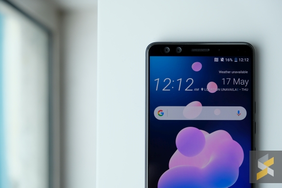
Sure, there’s no notch, nor is there a screen that bleeds over the edge like Samsung’s Galaxy S9, but it’s hard to deny how good using this phone is in the time I’ve spent with it so far.
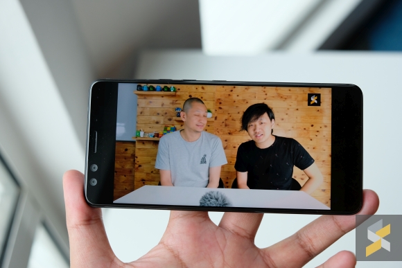
My favourite part is the U12+’s BoomSound Hi-Fi edition speakers. They sound about as good as they did on the U11+, which is my way of saying they’re excellent. Probably one of the best I’ve heard on a modern smartphone.
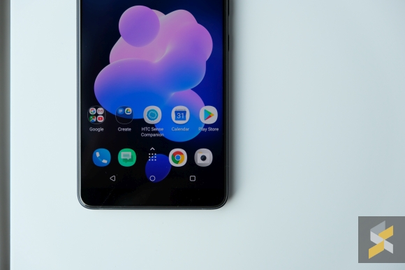
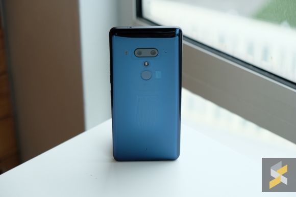
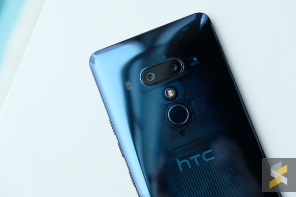
The U12+ also features the U11+’s gorgeous glass and metal body that also happens to be IP68 water resistant. In fact, it feels a little more refined now, with flatter sides for better grip, alongside a nice premium heft.
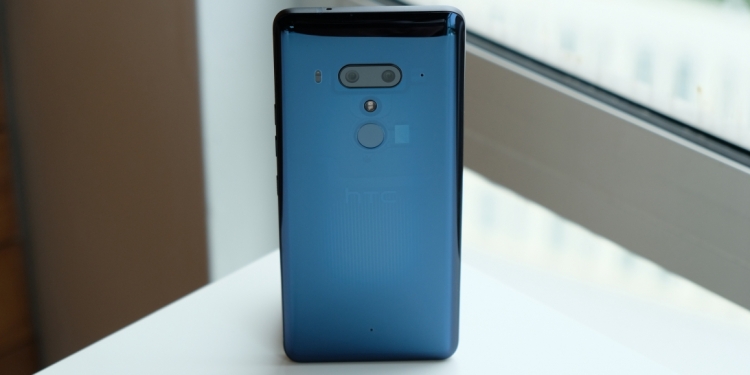
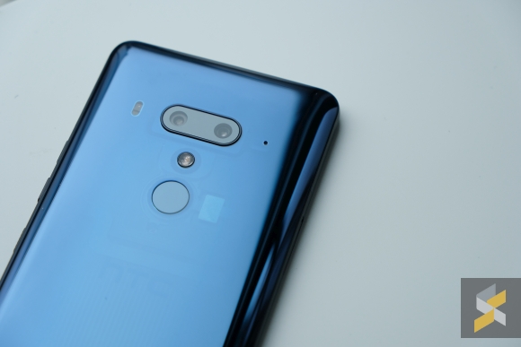
I think the U12+ is prettier too, and it comes in this translucent blue colourway that is a lot sexier than the greenish translucent black on the U11+. Though, I’m not quite sure what the heatsink-like design element in the middle of the phone’s back is supposed to be. And no, there’s still no wireless charging.
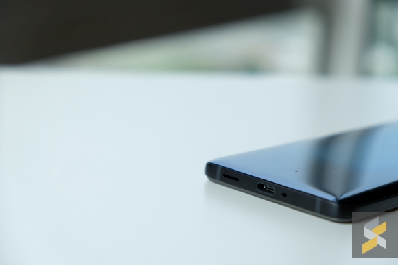
But that’s OK because the 3,500 mAh cell (a downgrade from the U11+’s 3,930 mAh cell, unfortunately) charges via USB Type-C and has support for Qualcomm’s Quick Charge 3.0 fast-charging technology to boot.
Naturally, being big on camera performance, HTC also gave their 2018 flagship an upgraded camera. Instead of one shooter, the device now sports a dual-camera UltraPixel 4 snapper at the back. The main 12MP sensor features large 1.4-micron pixels and a fast f/1.75 aperture lens. That is then coupled with a secondary 16MP sensor with 1-micron pixels which is paired with an f/2.6 aperture short telephoto lens.
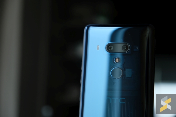
This should theoretically give you better camera performance as well as 2X optical zooming capabilities. It also enables bokeh-fied portrait mode photos so you can get in on that action too.
No Zoom:
2X Zoom:
So far, the camera seems to be able to take great photos, especially in good light. Portraits also look pretty good with relatively accurate edge detection.
Portrait mode with the dual 8MP selfie cameras up front, on the other hand, don’t fare as well and often get confused when confronted with my messy hair.
That said, since this is a first impressions article, I will save my final judgement for the full review.
But now we have to get back to the elephant in the room — the U12+’s lack of buttons. This was all spurred on by HTC’s development of their Edge Sense technology where you could squeeze the sides to do a bunch of things like access certain apps or take a screenshot.
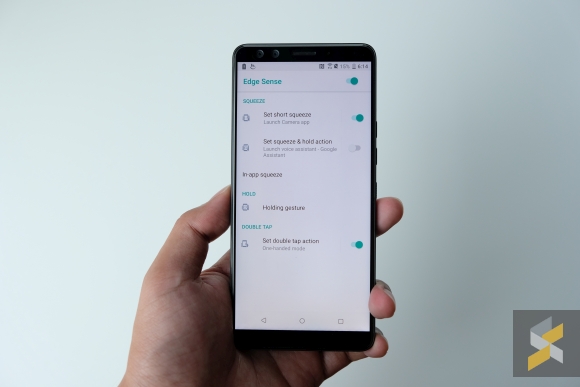
With the U12+, you also get access to tap gestures where you can double tap the side of your phone and it will shrink the phone’s display into a one-handed mode, for example. It works about as well as it did on HTC’s older models so you’ll probably either love it or never use it. But that development itself wasn’t enough for HTC because they thought it would be a good idea to remove the phone’s physical buttons too.
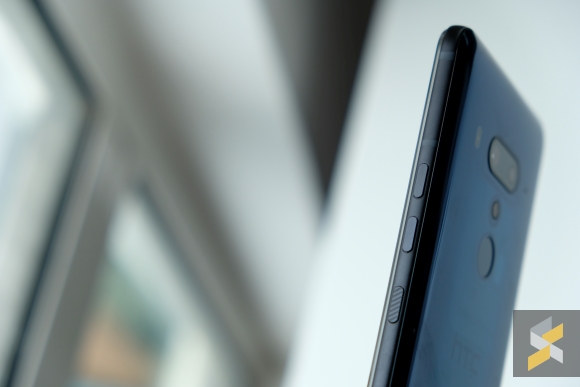
Now, instead of pressing a button, you have to press down on a pressure sensitive nubbin to wake the phone or adjust volume. The layout is still the same, it’s just there are no buttons anymore.
I thought it was going to be something like Apple’s new home button that debuted on the iPhone 7, where it felt like a button but wasn’t one. Only, HTC’s version isn’t like that because it’s a completely different experience. And I think a lot of it has to do with where the “click” is felt.
When you press a button, the phone will give you a little vibration feedback to let you know it registers your input, but that vibration doesn’t happen at the button. It happens in the middle of the phone so the button press no longer feels like a button in the way the iPhone 7’s still kind of does.
This lack of a physical click also means you don’t really know how hard to press. Usually the click lets you know when to stop pressing but because there isn’t one, I find myself having to press much harder than I usually do.
I don’t want to call it a bad interface yet because I want to spend more time using it first, but right now it’s definitely very weird. I also don’t see a massive advantage this has over traditional buttons. Maybe it makes phones more reliable because there are fewer moving parts though that remains to be seen.
I have some mixed feelings about the U12+. On one hand, I like that they’re trying something new and they’re doing that on top of a device that already seems very good. On the other hand, I don’t know if the pressure sensitive buttons are really something I can live with permanently.
Then, there’s the issue of price. How much would the HTC U12+ cost? This year, we’re seeing some really good flagship devices — like the Huawei P20 and the honor 10 — that are priced at almost unbelievable competitive price points. Will the U12+ follow in the U11’s RM3,099 footsteps? Would that be good enough to pull me away from the other flagships in the market?
I guess we’ll just have to wait for the full review to find out.

