This is it. The reviews for the Galaxy S8 are all out and if there was one common denominator between all the reviews, it would be that Samsung makes the best smartphone hardware in the world. But since the S6, I’ve always felt that Samsung did hardware extremely well.
What they were rubbish at was their software, more specifically their Android skin. Gosh, I hate TouchWiz. But it seems like Samsung has been listening because when I spent my time with the Galaxy S8, I actually enjoyed the software experience.
Let me start by saying I’m not a vanilla Android purist. I like my Android UIs about 90% stock, with the remaining 10% packed with useful features that don’t get in the way. That’s one reason why I like OnePlus’ Oxygen and Cyanogen skins. It’s clean, yet functional and those are the two pillars everyone needs to adhere to.
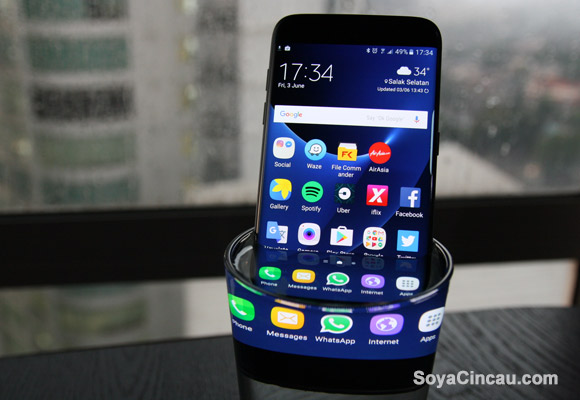
In the past, TouchWiz simply took a sledgehammer to those pillars. Not only did the skin look nothing like stock, it also had really ugly icons, a really ugly notifications/quick settings tray and there was often a bunch of bloatware. It was one of the biggest reasons why I thought the S7 edge fell short perfection.
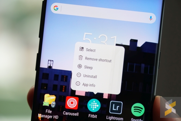
This new and improved TouchWiz changes all that. First off, it’s a lot leaner than the S7 and it even lets you ditch some of the default apps (like voice recorder and calculator — I was befuddled when I couldn’t find it in the app drawer) during setup so you can download the app of your choice.
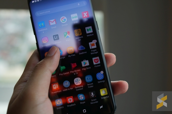
The whole experience is entirely different too. Samsung adopted the Google Pixel’s method of handling app drawers which allow users to swipe up to access the drawer, freeing up valuable space in the tray. I despised the S7’s fixed app drawer icon because it occupied the space where my camera icon usually sits.
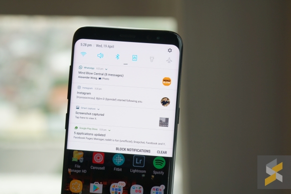
They’ve also improved the notifications and quick settings tray to the point where I think it might be better than stock. There’s a shortcut to block notifications and a really neat way of displaying them. What’s more, Samsung has kept Nougat’s highly detailed notifications which are something I absolutely adore.
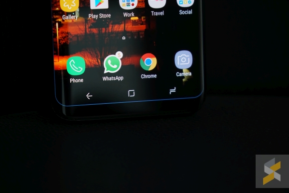
I would also like to thank Samsung for finally allowing me to swap the positions of the on-screen buttons so my back button can be on the correct side of the phone. I actually also like the design of the new buttons — they look edgy and futuristic.
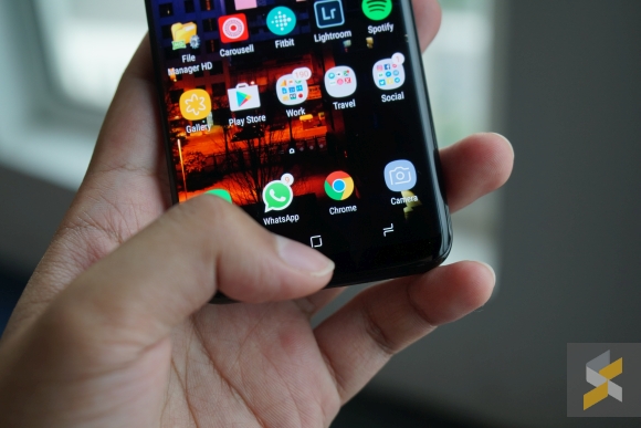
Oh, and if you’re wondering, the S8’s pressure sensitive home button also works like a charm. You can just tap on it like a regular capacitive button but when you’re feeling a little feisty, you can hard press on the virtual button and the phone will give you a little buzz too. Safe to say, I don’t miss Samsung’s classic physical home button.
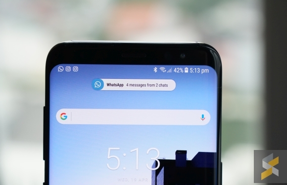
Then you get to the pièce de résistance of this revamped TouchWiz — its notification pop up. Usually, when you receive a notification, a huge banner will pop up at the top of your display. This can be annoying — especially if you’re using GPS navigation — and most of the time I find myself struggling to swipe them away.
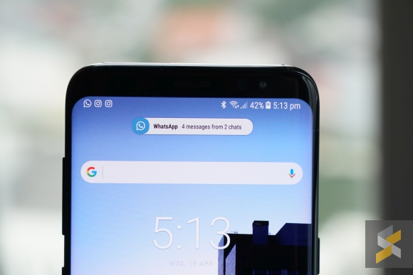
On the new TouchWiz though you get a tiny little icon that expands into a discreet banner followed by a blue notification light that shimmies its way around the phone’s borders. It’s adorable. It’s charming. It’s something Samsung didn’t have to do but I’m glad they went ahead and did it anyway.
I think that really sums up what Samsung did to the software of this phone. When you’re using it, you really get the sense that Samsung finally put thought into their software — like proper practical thought, not some nature designed for humans nonsense — to make sure everything is doing exactly what it should be doing.
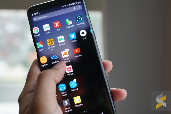
The menu system is cleaned up and neat, the Always-On display is functional and useful, the default clock also adopts this tall and lean look that serves to accentuate the S8’s taller stature. If I had one complaint about the UI, it would probably be that the app drawer is paginated and scrolls horizontally, not free-flow vertical scrolling. It’s also a little annoying that you can access the app drawer by swiping down instead of up.
But those are just minor complaints — nitpicks, if you will — and not big question marks or deal breakers. The biggest question mark (yes, there is one) for me comes in two words and the first word is a greeting.
Hello, Bixby.
[nextpage title=”There’s always a but and this one’s called Bixby”]

It’s the S8’s new assistant. It’s this huge artificial intelligence Siri/Assistant/Cortana-like software that’s supposed to be better than either of those I think? I can’t really tell — it’s not working yet.
What I can tell you now, though, is that Bixby is really nothing more than a nuisance. There isn’t much it can do that the Google Assistant (which the S8 also has) can’t but there’s a whole lot that the Google Assistant can do that it can’t…at least right now. Bixby is supposed to be this powerful assistant that is supposed to let the user their voice to control “almost every task the application is capable of performing using the conventional interface”.
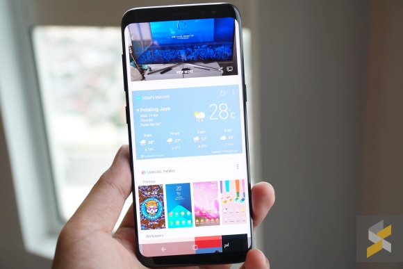
This means it can replace the touch interface and render buttons useless. So imagine my bewilderment when Samsung went out of their way to make a dedicated physical button to launch Bixby.
Either way, when you press the button, you’re greeted with the Bixby interface — which looks like a cartoonish version of the Google Now cards — that doesn’t actually show you much. It’ll show you your gallery (if you took some photos recently), your calendar, the weather, and then spiral into some very Samsung-y things like their theme and wallpaper store.
Not super useful.
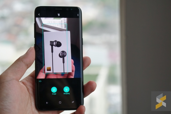
Then there’s Bixby Vision, which lives in the camera app, and lets you scan objects so Bixby can bring up more photos of the same objects, or tell you where you can buy one.

But, if you show it a moderately complex scene, it’ll get confused and show you a bunch of unrelated stuff too. Also, shopping doesn’t seem to work for me (probably because it usually sends you to Amazon).
Again, not super useful.
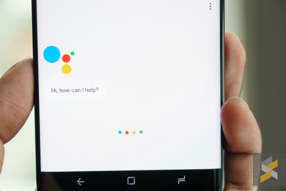
I don’t know. I’m super sceptical about Bixby. I just don’t see how Samsung can develop something that’ll do more than Google’s Assistant, and be more integrated with the rest of Android. Maybe I’m wrong. Maybe Bixby will be amazing and when Samsung finally activates it, I’ll definitely give it a try. For now, I’ll refrain from jumping to conclusions.
Samsung’s Galaxy S8 is a milestone in smartphone hardware design. It’s the standard which all smartphones will now be measured by and for the first time, the S8 has the software to go with its physical industrial prowess. It adds to the phone’s strengths rather than subtracts from it and that’s why I’m super sceptical about Bixby.
I would really hate if the entire experience was ruined because Samsung decided they needed to develop another version of S-Voice.

