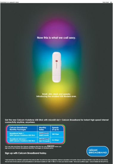
Saw this ad in The Star paper today last week.
Is it just us or is this ad just plain weird?
This – to us – is the most uninteresting, unexciting, uninspiring ad we’ve ever seen this week!
Now, there are a lot of crappy ads out there but this one has it’s place amongst the top and a huge disgrace coming from a telco. What a waste of space!
Ok so you have a new modem to market and yes, it is small (though it’s nothing to shout about considering it’s still the size of a run-of-the-mill thumbdrive). But no, it’s definitely not sexy, in fact it looks like a frigin’ tampon.
Celcom marketing people, if you’re paying attention, read this:
- Instead of highlighting the modem, better bring attention to the price. Recession is here, people would like to find out where and when they can save. The price cut would’ve made more sense don’t you think?
- Your ad agency conned you big time with the stupid and pointless psychedelic background behind the modem. You’re paying for full colour when you could have gotten away with a spot colour ad or B&W ad and save tons of money. The colourful background adds nothing to the messaging of the ad so why have it there? What is the point? Again, we’re saying you’ve been had.
- No one’s going to rush out to buy a “sexy” modem. If you’ve highlighted the fact that the modem came with a Micro SD slot that would appeal more to users who you are targeting.
- Here’s an idea, why don’t you throw in a free 2GB/4GB Micro SD as well to sweetened the deal. SSD cards are cheap and that would make the new product much more appealing, not to mention useful as well.
What do you think? Are we right or are we right? Comments please!
Oh by the way, this is our first Ad-nalysis post. More coming!


