I hate flip cases. They’re horribly old fashioned and often come in colours that resemble different shades of puke. Plus, except for HTC’s Dot View Case, most flip cases never did anything particularly cool. Sure you might have some practical functions, but none that doesn’t scream “ZOMG WHAT A DWEEB”.
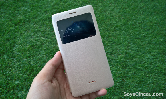
Okay, maybe I’m being a little harsh here but the point is, I would never, ever, ever, use a flip cover case…unless they did this.
Click to enlarge
So with a flip case for your smartphone, you’re often left with a lot of space on the inside of your flip case. Space which can be used to either let your toddler/cousin/nephew/niece enthusiastically doodle on, or perhaps use it as a space for you to stick photos of your loved ones — y’know like the inside of a locker door.
However, neither of those are particularly practical, nor do they help you do more with your smartphone in any way. Well, it looks like the boffins at Microsoft Research — Microsoft’s research division (go figure) — seem to have figured out a brilliant way to make use of that space.
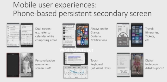
Enter the Microsoft “Type Cover” for your phone. What they’ve done with the flip cover is line the inside of the case with an always-on, low-power display that can display “useful information”. Some examples provided by the concept includes the displaying of travel itineraries, tickets, the calendar while you’re composing an email, and (my personal favourite) a fully qwerty touch keyboard. That sounds fantastic doesn’t it?
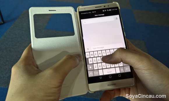
It is, until you realise that if this “inside screen” is touch sensitive and is attached to the side of your phone, how on earth are you going to type with both hands? Here’s a picture to illustrate my point:

So unless you’re typing with your index fingers on the table, or if you tuck the case behind your device, it’s kind of unfeasible. Plus, if you do the latter, you might as well just use the multitasking button to switch between apps.
There is promise when it comes to the full QWERTY keyboard though, but even that has it’s problems. Because if the phone/case does not have a kickstand it’ll just end up looking like this really silly case for a Samsung Galaxy S6.
Either way, it looks like this is merely a concept and could do with a lot more polishing. The good news is that we might not have to wait for the rumoured “Surface Phone” to (hopefully) test this case out because Microsoft Research is supposedly “in deep talks” with the Lumia division to turn these flip covers into real products.
What do you guys think? Is one screen enough?


