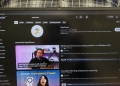
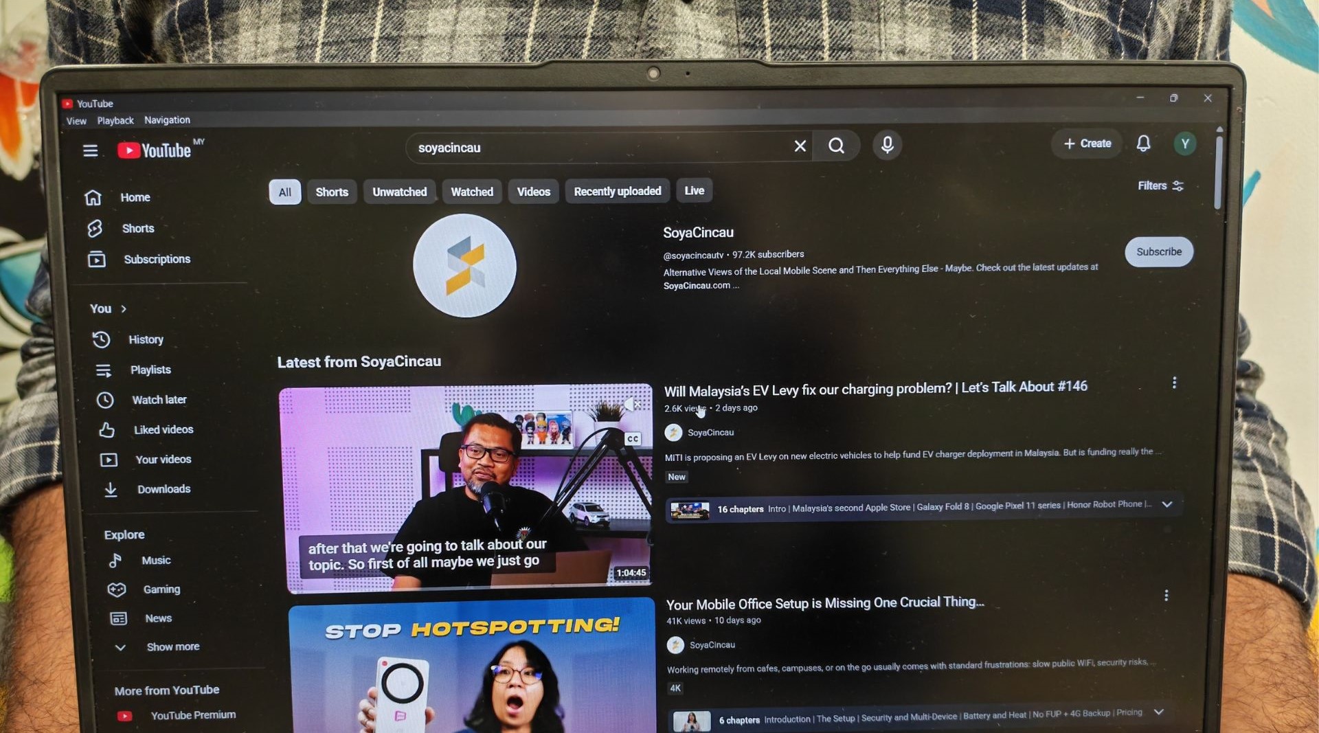
YouTube rolling out a series of visual and navigation updates across its mobile, tablet, desktop, and smart TV apps.
According to Jonathan Terleski, YouTube’s VP of User Experience, the changes focus on standardising button layouts and reducing visual clutter across screens. The design changes aim to offer a cleaner YouTube experience and allow you get to watch history and saved videos faster.
Because YouTube reaches over two billion active users globally, even minor tweaks to button placement directly shift how millions of people navigate, save, and interact with content every day.
Streamlined video player controls on mobile

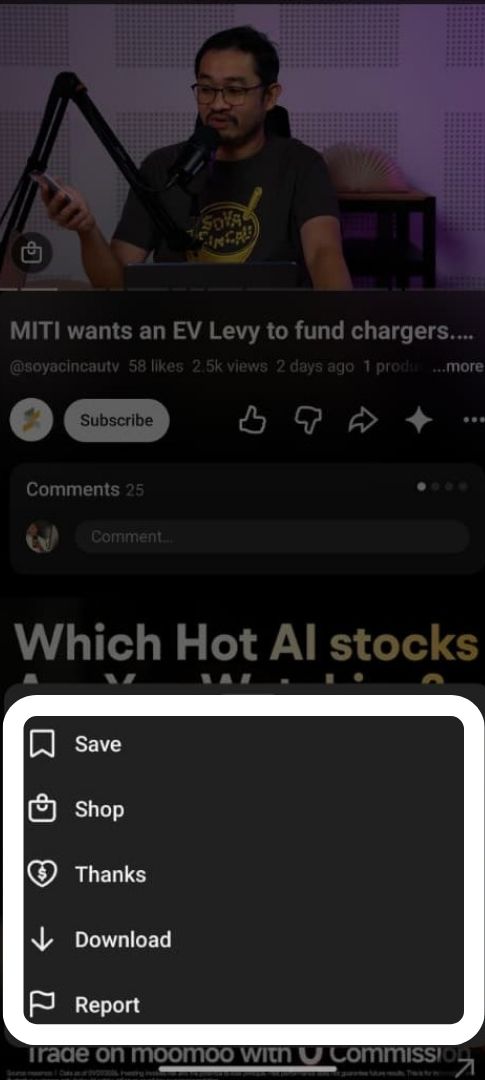
On mobile devices, YouTube has simplified the row of action buttons underneath the main video player. Instead of displaying every available option on screen, primary actions like Like, Share, and Subscribe now use a cleaner layout. Secondary features including Save, Download, Hype, and Report are now tucked inside the three dots “More” menu.
Combined Account and Library tabs on mobile
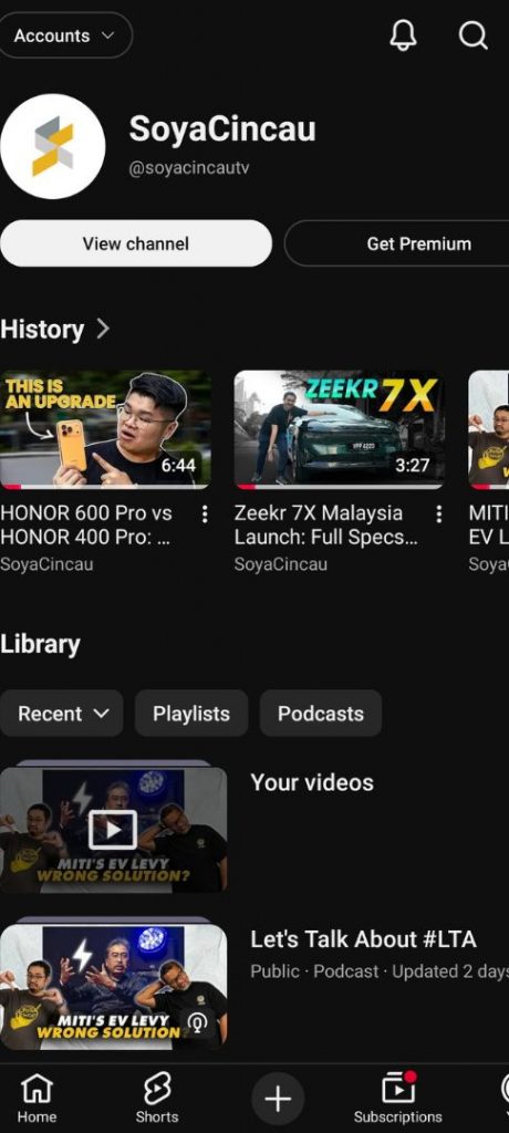
YouTube has also redesigned the main user menu on mobile screens by combining the Account, Watch History, and Library sections into a single tab. Mobile users can now view their channel profile, recent watch history carousels, and saved playlists (such as Watch Later and Podcasts) on one page without navigating through separate sub-menus.
Dedicated Shorts shortcut added to side menu
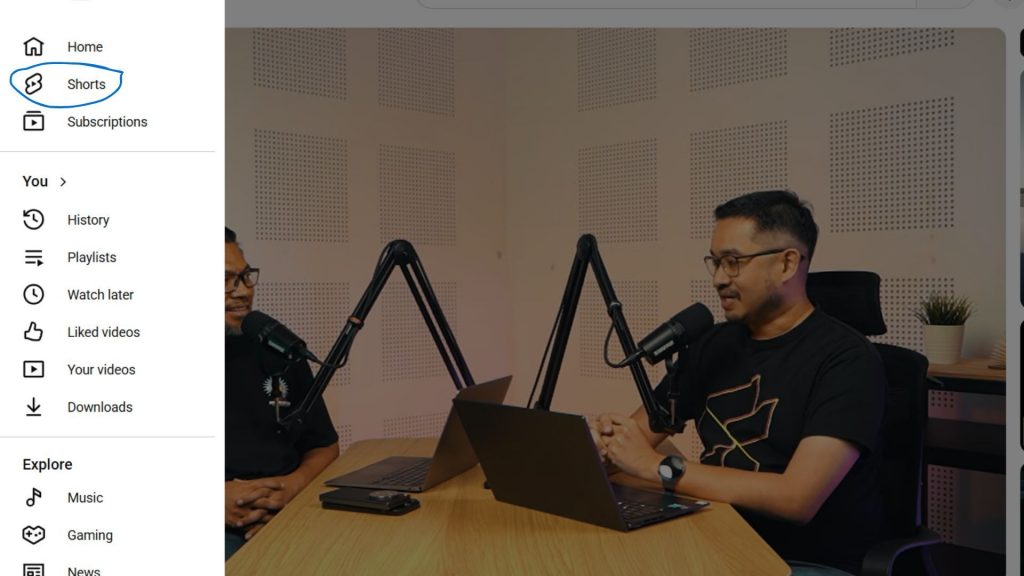
For laptops, tablets, and smart TVs, YouTube has updated its side navigation menu to make Shorts easier to access. A dedicated Shorts tab now sits right below Home at the top of the menu, allowing users to quickly jump straight into short-form videos across larger screens.
The updated interface is currently rolling out globally across iOS, Android, web, and smart TV platforms.
Have you received the new YouTube layout on your mobile, tablet, laptop, or smart TV yet? What do you think of the new menu setup? Let us know in the comments section below.
[ SOURCE ]