Ever since its inception by former OnePlus man Carl Pei, Nothing has been labelled many things. Some called them nothing more than hype, while others questioned their hardware and build quality, especially considering that they’re such a new company. Other meanwhile loved Nothing, calling it a breathe of fresh air in a stagnating tech industry.
Well those people aren’t me, at least not yet, as I’ve never personally used a product by Nothing before. That is, until two weeks ago when I got my hands on their new smartphone, the Nothing Phone (2).
Subtle design changes, big results
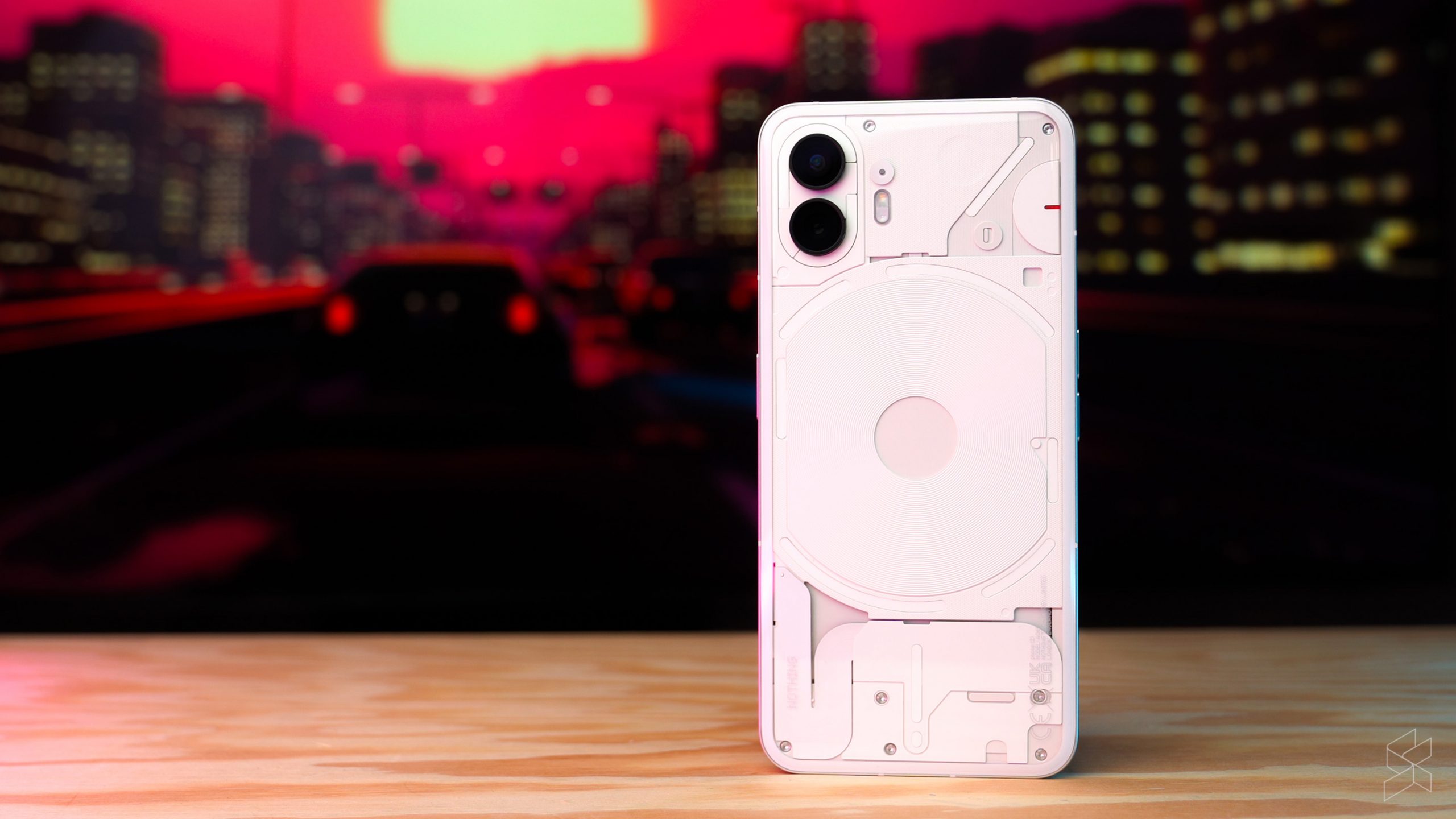
The Nothing Phone (2) is hard to miss, with its aggressive guerrilla marketing campaign meaning that almost everyone has seen or at least heard of the company and its stylish smartphones. But if you were to just look pass all of that hype for a moment, what you have here with the Phone (2) is actually a very well designed smartphone.

Now I’ve never shied away from admitting how much of a fan I am of the flat sides and industrial look that Apple brought back with the iPhone 12 lineup, and when the Nothing Phone (1) came about last year, I also thought that it looked quite decent. With the Nothing Phone (2) however, they. made a subtle change that I doubted at first, but now agree that it has made the Phone (2) just so much better.
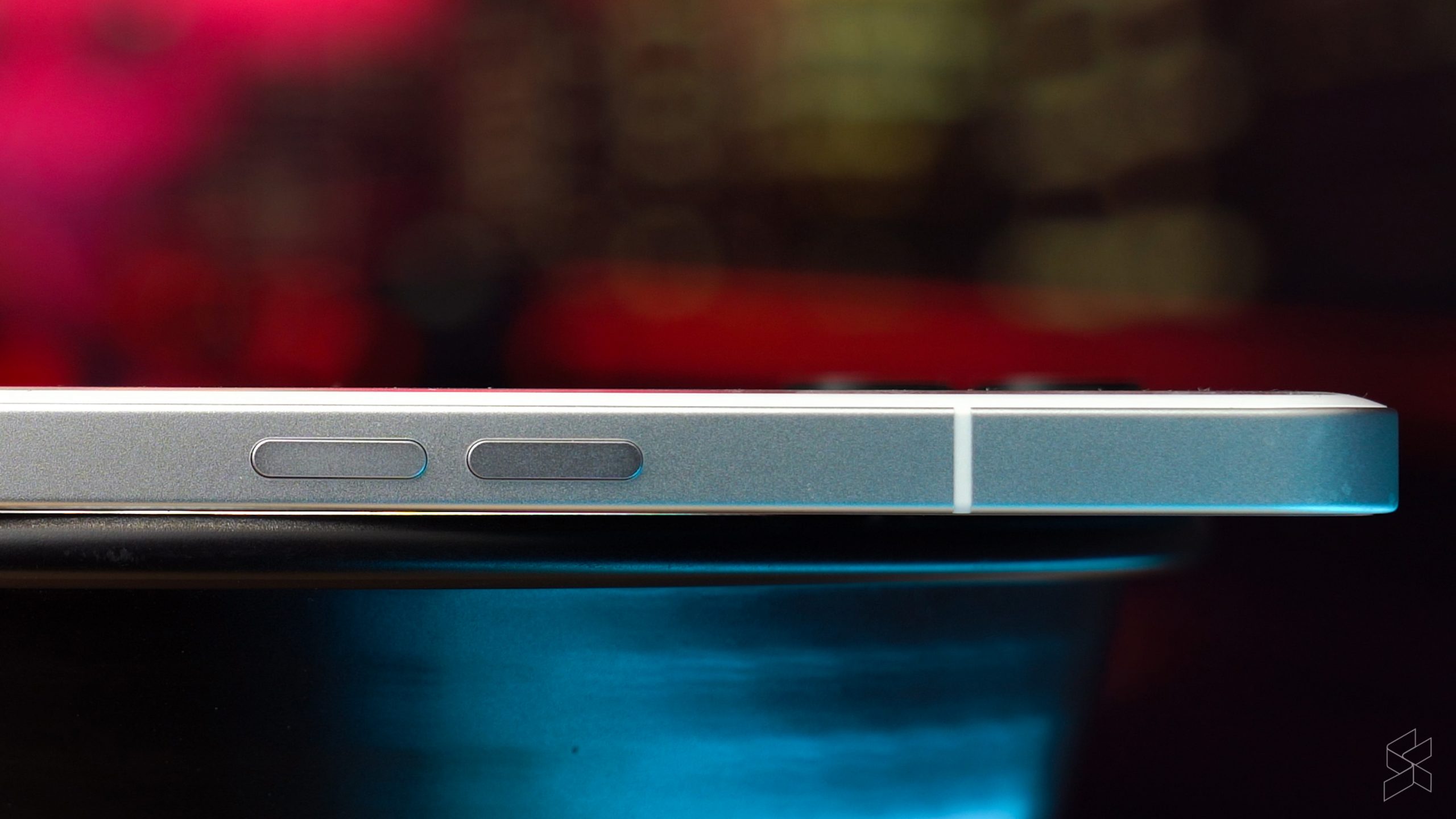
See, with the Phone (2), Nothing has added a slight curve to the glass back, meaning it now tapers off as it meets the aluminium sides. I’m not too much of a ‘curves’ fan when it comes to the ol’ smartphone, but I have to admit, this gives the Phone (2) a very comfortable yet still premium feel in the hand, all while not disrupting its industrial design language.
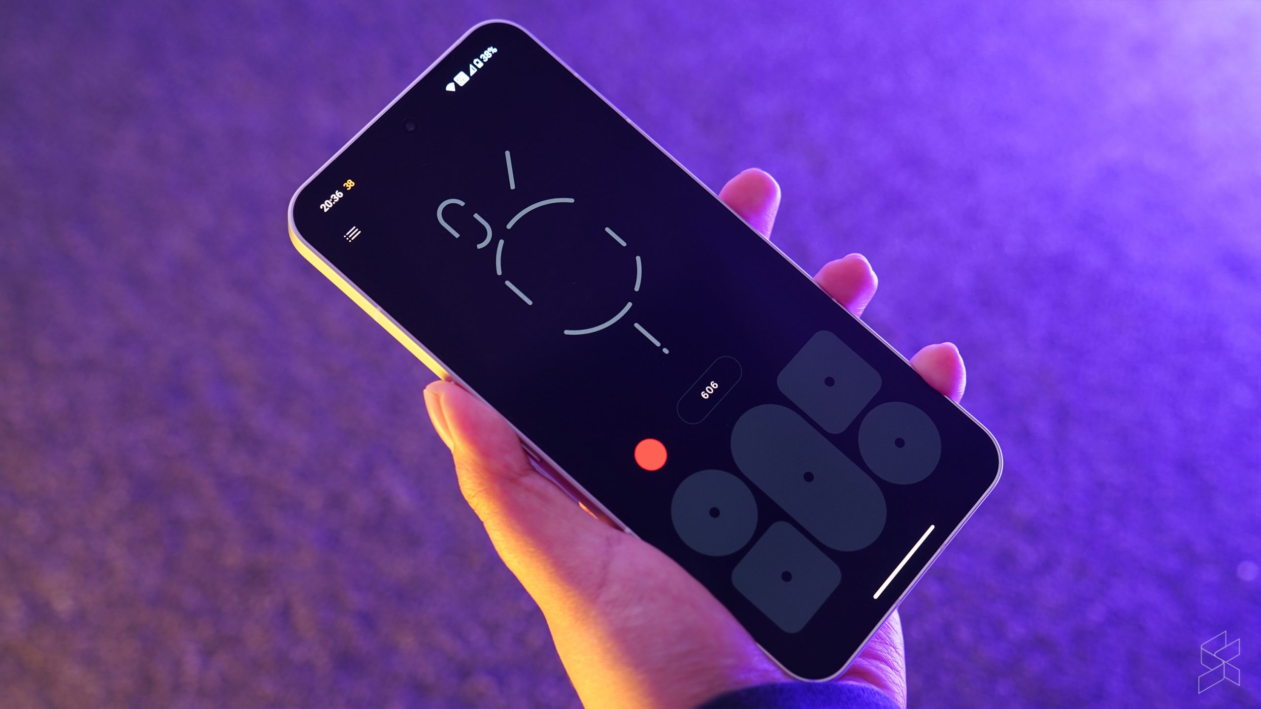
Flip it around meanwhile and again the story is the same. Nothing has made the Phone (2) bigger with a larger 6.7-inch, FHD+ OLED display that makes it roughly the same size as an iPhone 13 Plus or an iPhone 14 Pro Max. I doubted this move too but with an improved 1 to 120Hz refresh rate thanks to the LTPO backplane along with a higher peak brightness, the display does feel on par with its rivals in the flagship smartphone scene and overall, watching content and playing games on the now larger display does feel nice.
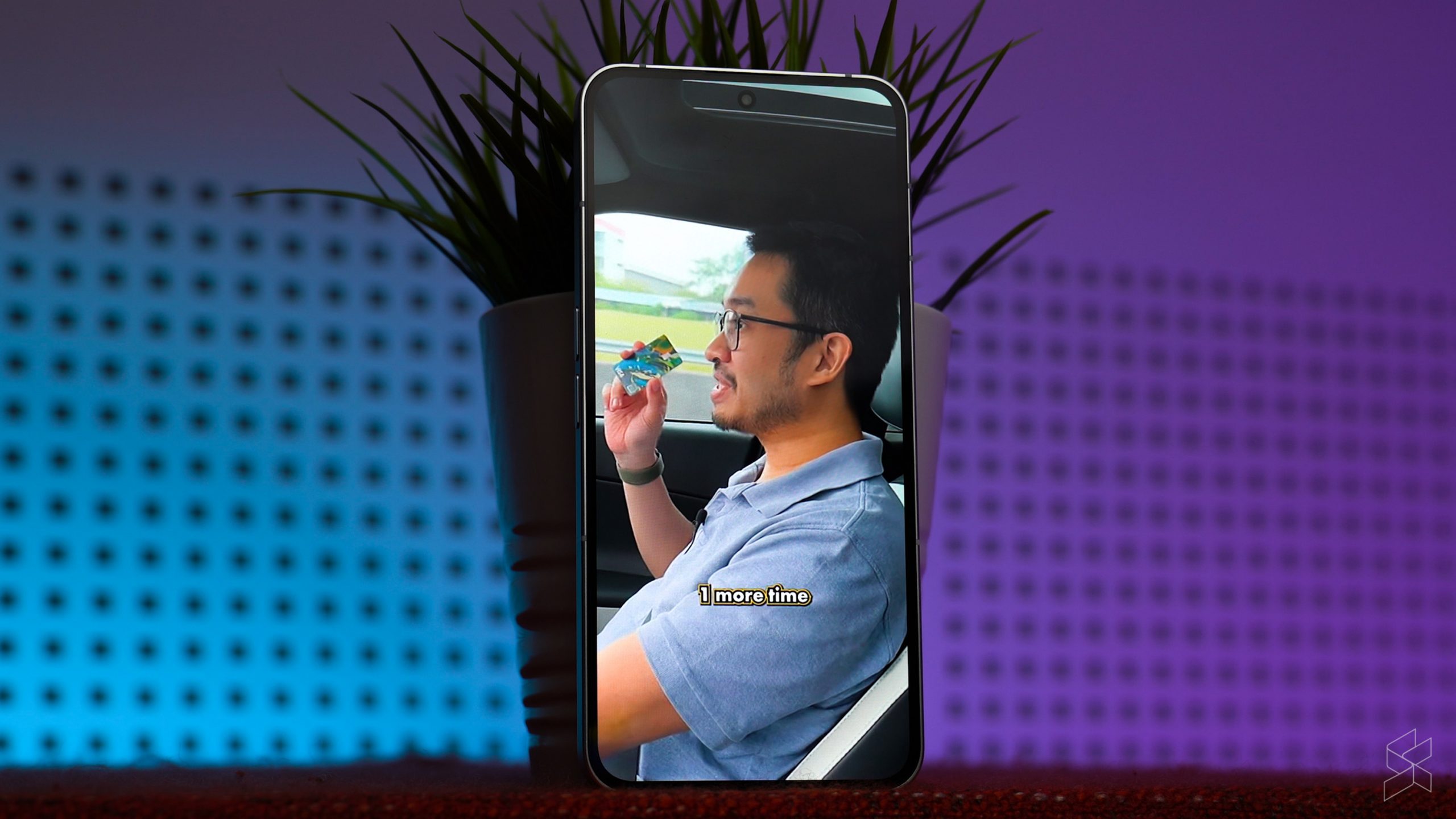
But really it’s this one thing in particular that really does make it stand out from the rest: its uniform bezels all around the edge. Yes, it’s not the thinnest bezels in the world, but there’s just something about the uniformity that makes it quite appealing to use and appealing to look at. Together with the dual stereo speakers that are alright if not the best I’ve seen on a smartphone—that award goes to the Asus ROG Phone 7—the Nothing Phone (2) has aced its hardware design out of the park.
Oh right, Glyph Interface
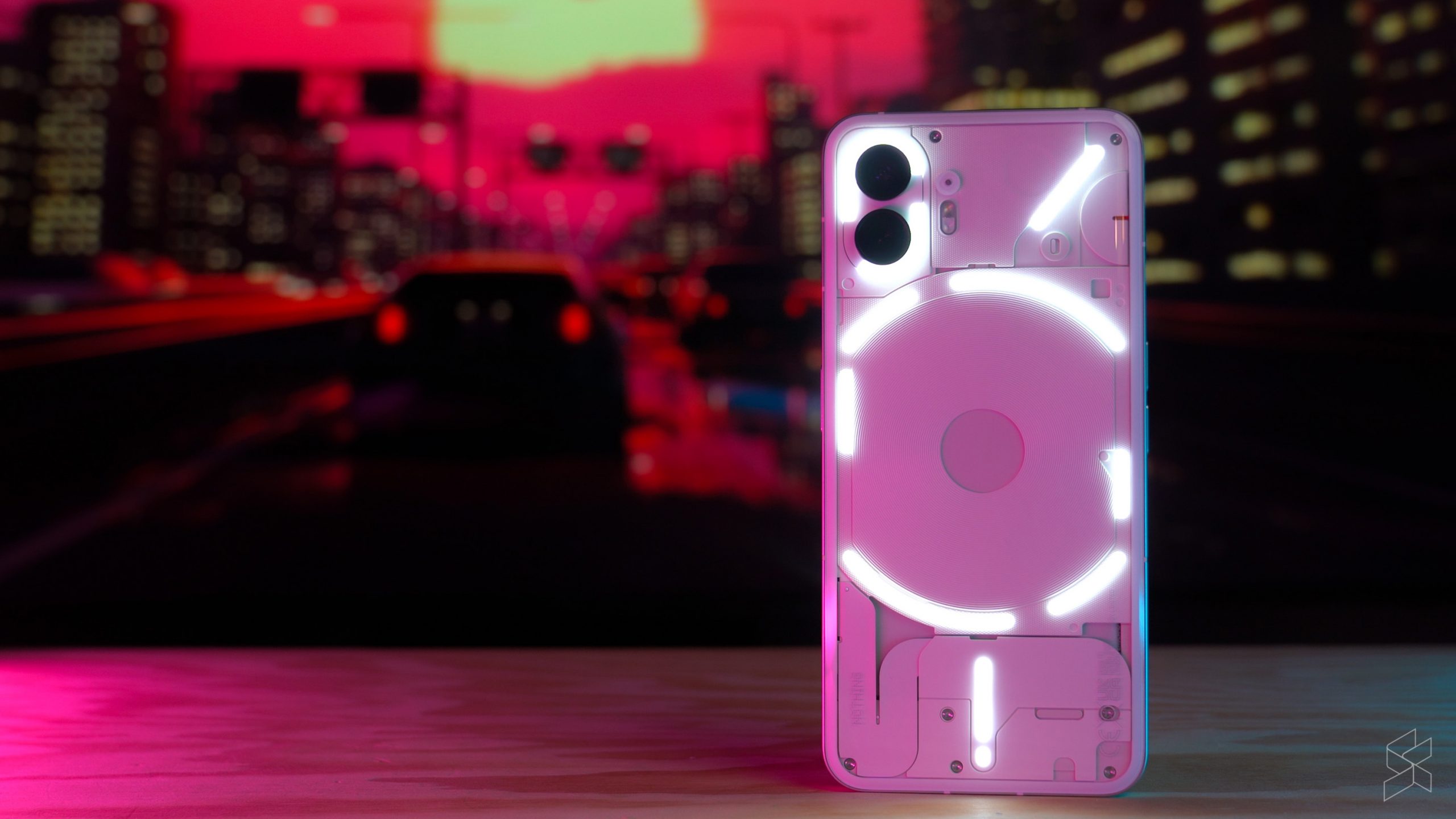
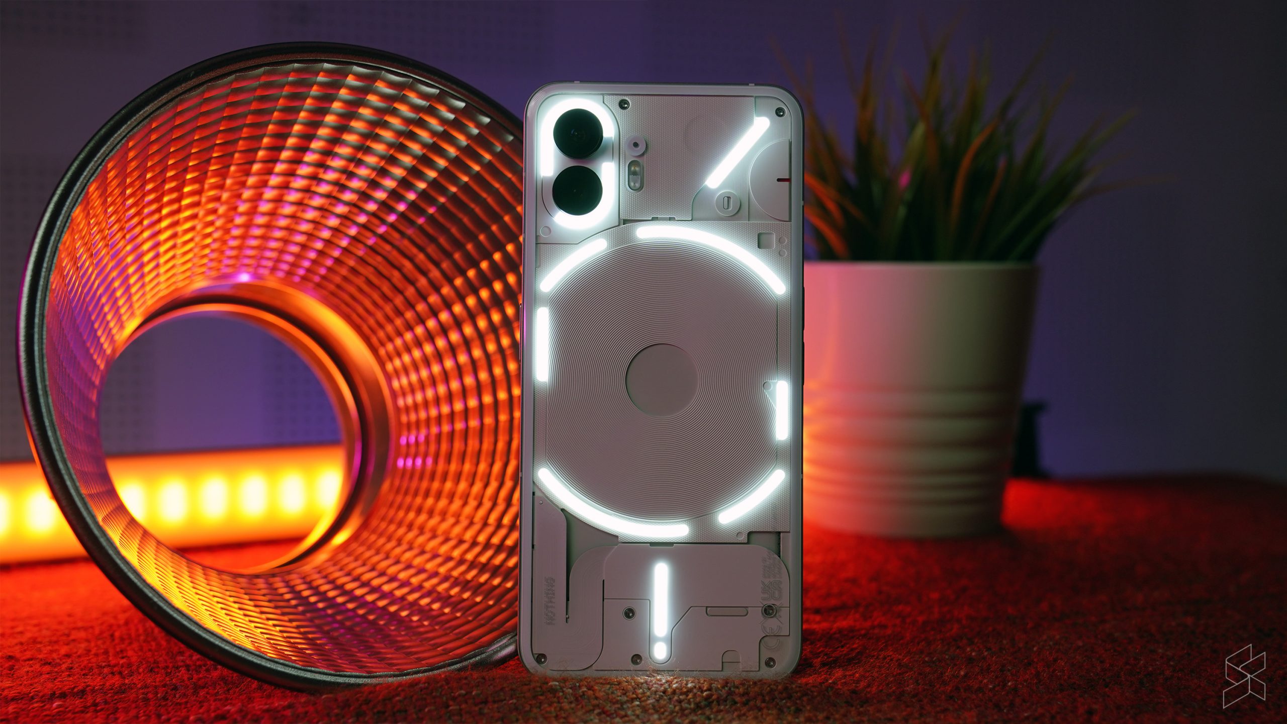
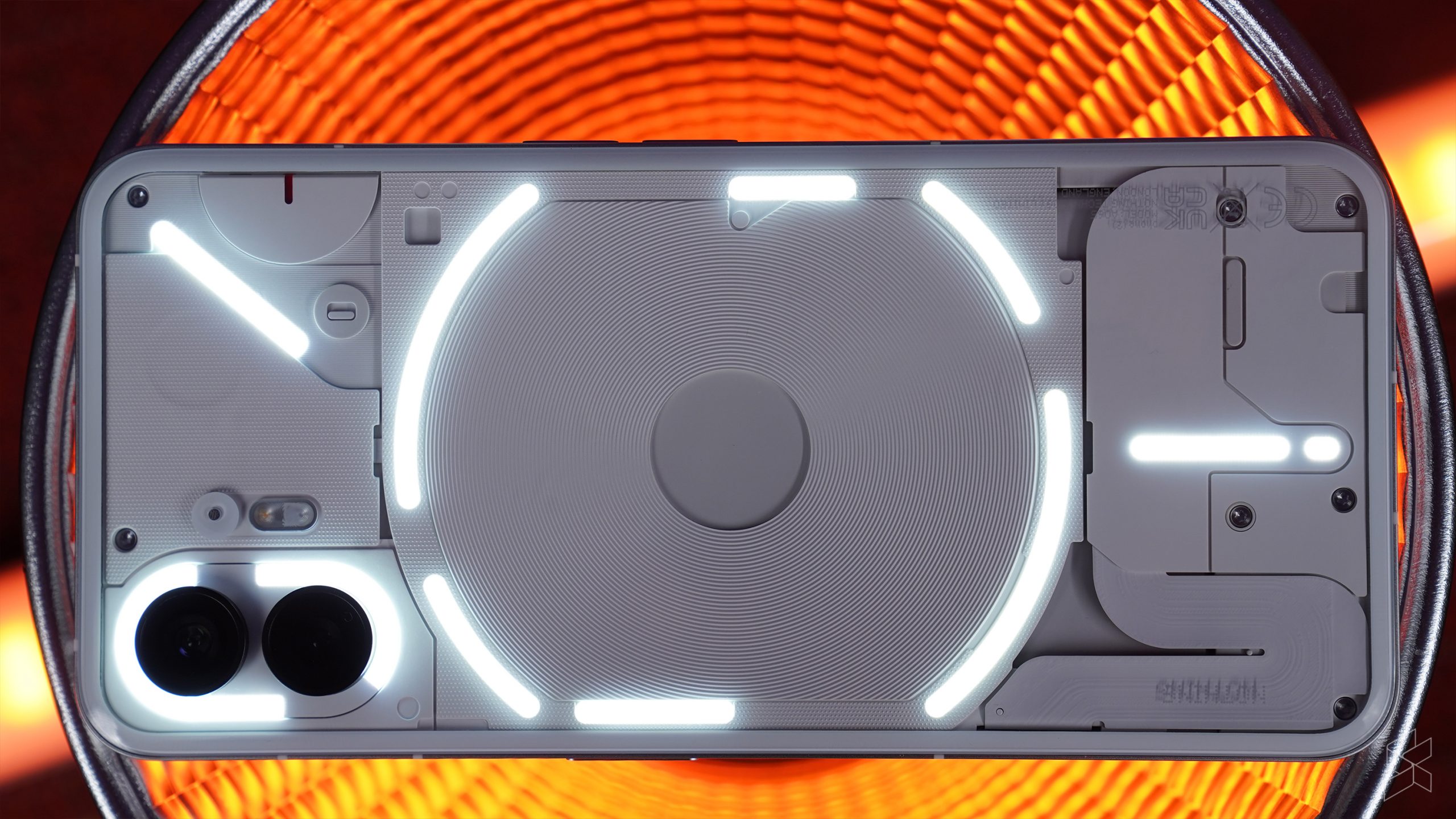
Of course, I can’t talk about the Nothing Phone (2) without talking about the elephant in the room: them Glyph Interface LEDs on the back.
At first glance, it really doesn’t look too different from the Glyph Interface on the Phone (1), but it is different. There are more addressable LED zones than before now—33 of them to be exact—along with a slew of new features such as a Glyph composer for you to customise your own annoyingly staccato ringtone to match the lights on the back. There’s also a feature that has it sync up to your Uber Eats order so that you know just how far away your food is… except we don’t have Uber Eats here so that’s all I can say about that feature I guess.

If I’m going to be honest, the novelty factor of the Glyph Interface kinda wore out after the first day or so with the Phone (2). Don’t get me wrong, I do like the Glyph Interface especially for more of its practical features such as being able to see your charging percentage, see how long you have left on a timer or to more obviously tell when you have an incoming text on your phone—I am one of those people who have their phone screens facing the table—but at the end of the day, it does still feel somewhat gimmicky. A great conversation starter sure, but a gimmick nonetheless.

NothingOS 2.0 brings back monochrome memories
In fact, the best part about the Nothing Phone (2) to me is its UI. I have been a huge proponent of the stock Android experience, with the Google Pixel’s Material You skins in particular one of my favourites ever. And while Nothing OS 2.0 is most definitely not stock Android, it does keep the best parts of it while adding its own unique, minimalist spin to things.
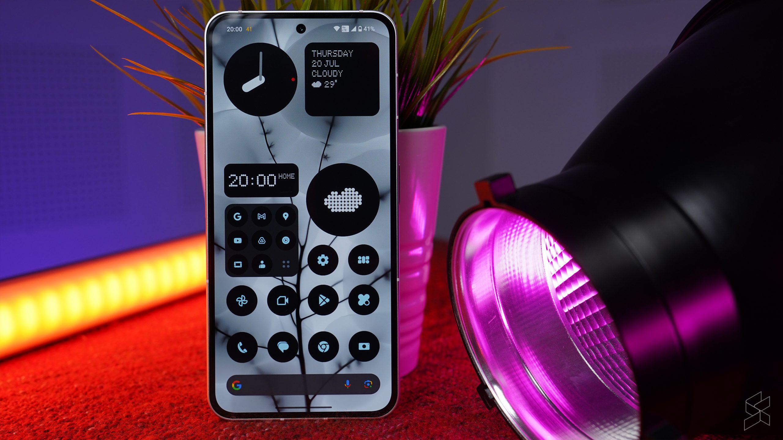
Unlike the likes of OneUI and ColorOS, the Phone (2) doesn’t feel cluttered, messy and all over the place. Animations in particular are very, very sleek and nice to the eye, nothing on your home screen feels like wasted space and while it was supposed to be so that you’d stare at your phone less, the option to make everything monochrome has a very special place in my heart. That’s because in college, I really was that kid with the fully custom Android theme on his unrooted Android complete with five different apps to handle things like the lock screen, wallpaper, app icons and so forth, and the one thing I’d always do was to make my home and lock screen monochrome.

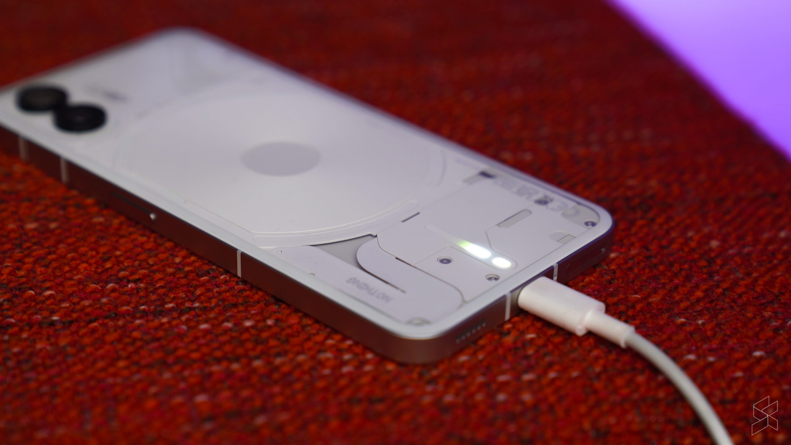
Complementing NothingOS 2.0 is a Qualcomm Snapdragon 8+ Gen 1 under the hood, with 12GB of RAM and up to 512GB of storage. It’s certainly not the latest and greatest mobile processor in the Android scene, but taking that step up to last year’s flagship silicon still means that day-to-day performance is more than good enough. Combined with the slick and speedy NothingOS 2.0, I never found it feeling sluggish at all. Battery life was decent too, with its 4,700mAh battery more than enough to last the day, with wireless charging and reverse wireless charging additional quality of life features that I appreciated. No charging brick in the box though, so that’s something you’ll want to take note of.
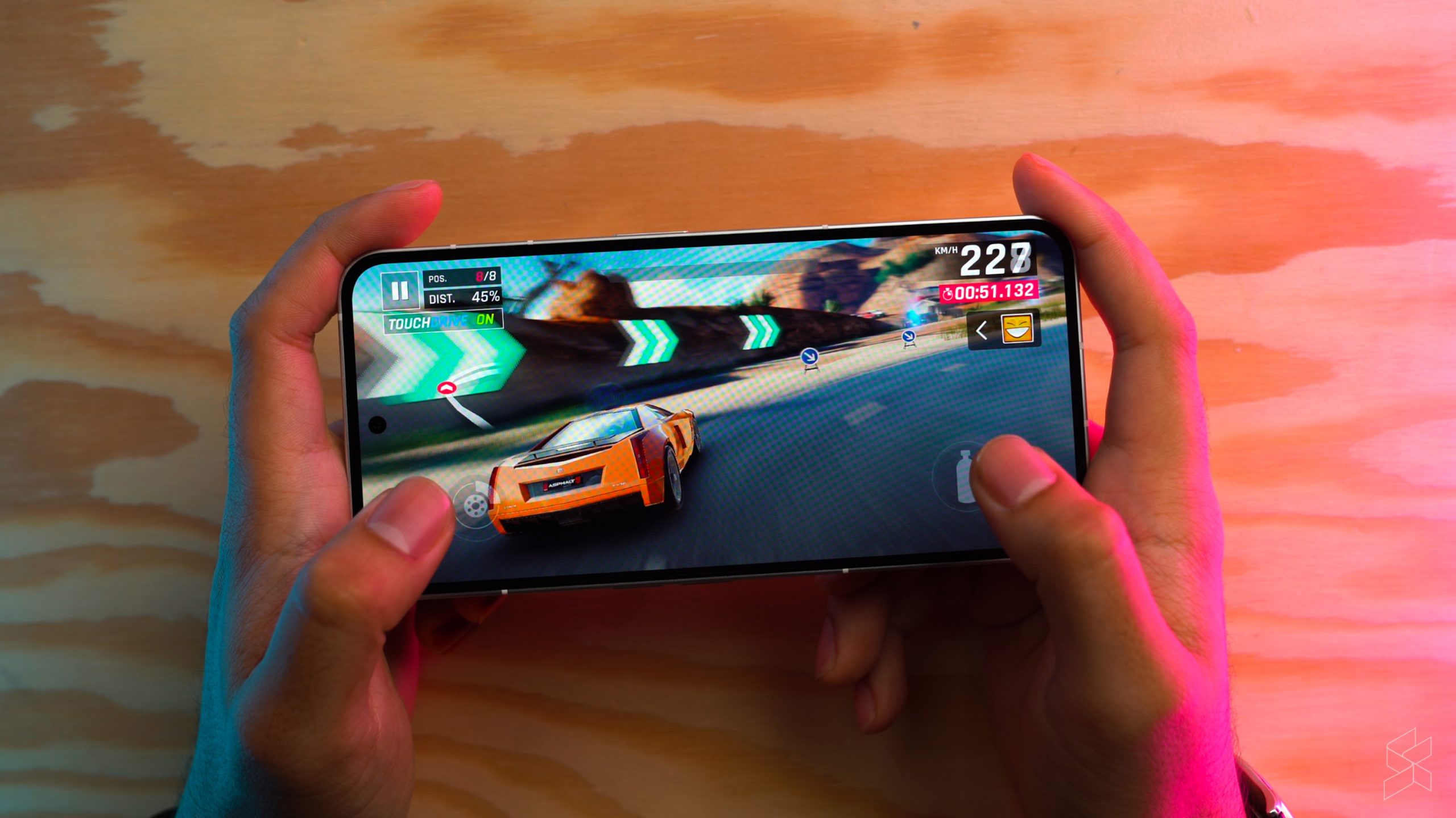
Alas, NothingOS 2.0 is not perfect either. I’ve experience a couple of bugs during my time with the Phone (2) already, such as the Phone (2) straight up refusing to unlock. I’d just keep keying in my password, and the Phone (2) would unlock and immediately lock itself again, requiring a full reboot to get it working properly again. And speaking of rebooting, I also found the Phone (2) randomly rebooting at times. Like, I would pull it out of my pocket, and it would tell me that I had to key in my password instead of using my fingerprint because it rebooted. A quick search online shows that I’m not the only one with random rebooting too.
On the bright side, it’s clear that NothingOS 2.0 has a great foundation to build on, and given enough time for some software tweaks and updates I do think that they’d be able to iron out the bugs. And you should be expecting updates on the Phone (2) too, as Nothing has guaranteed at least three major Android OS upgrades already, along with four years of security patches that’ll come at least every two months.
Its cameras are nothing to shout about

You didn’t really think you’d get through this whole article without a Nothing pun did you. In any case, Nothing has kept a dual rear camera configuration on the Phone (2), with an upgraded 50MP, f/1.88 main camera using the Sony IMX890 sensor. It’s flanked by a 50MP, f/2.2 ultrawide using the Samsung JN1 sensor and rounding things off is a 32MP, f/2.45 front facing camera for selfies.


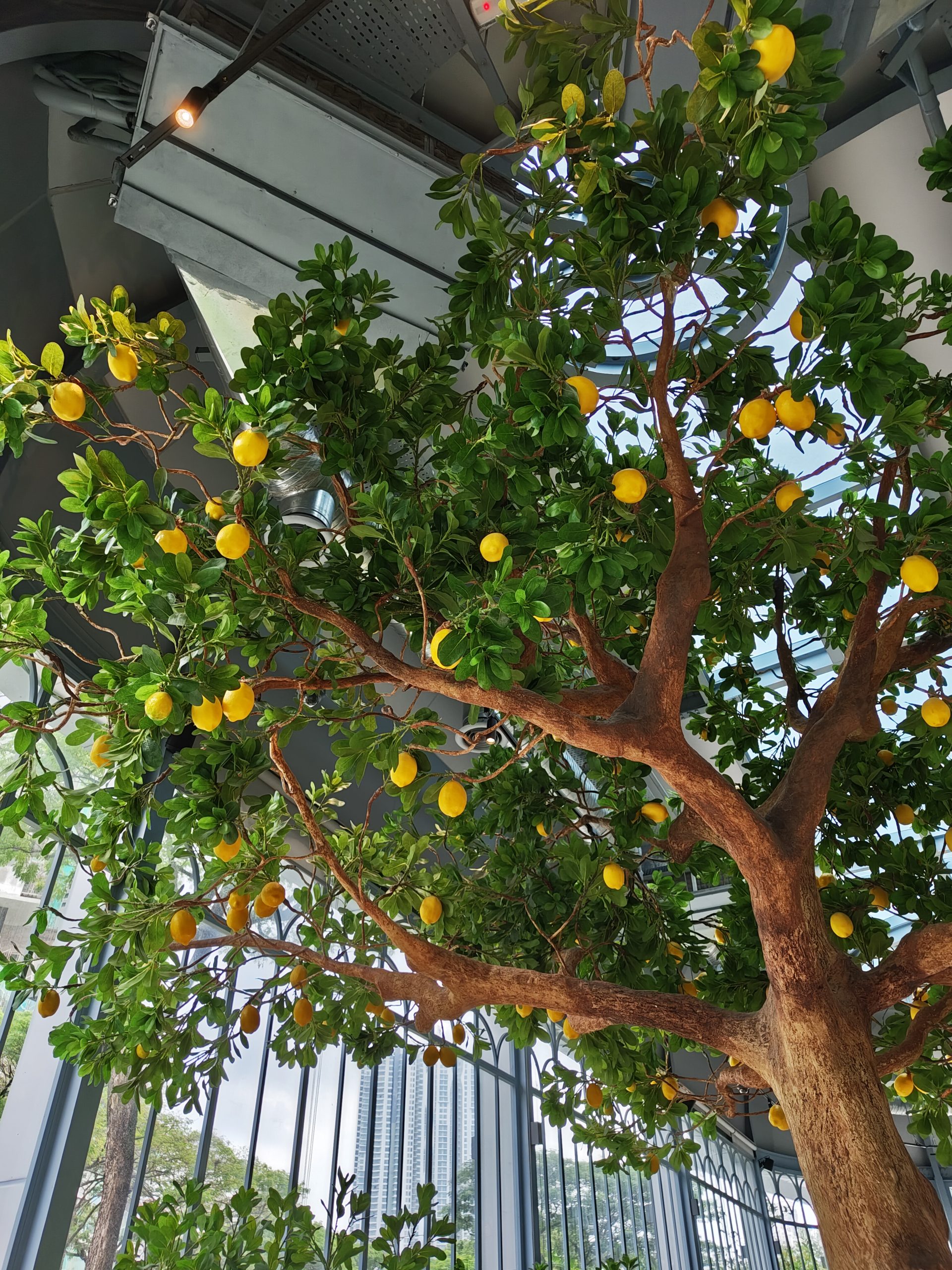

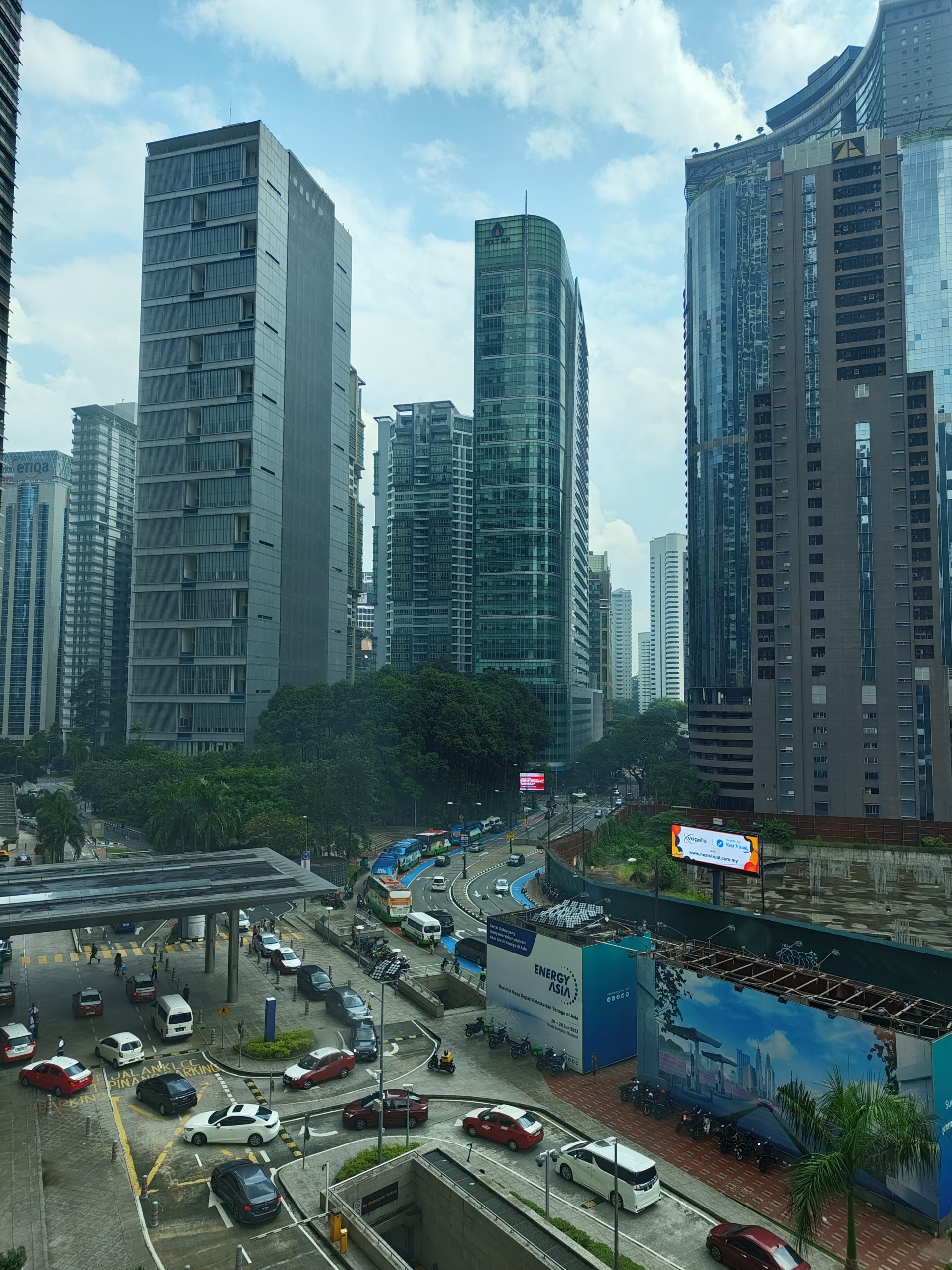

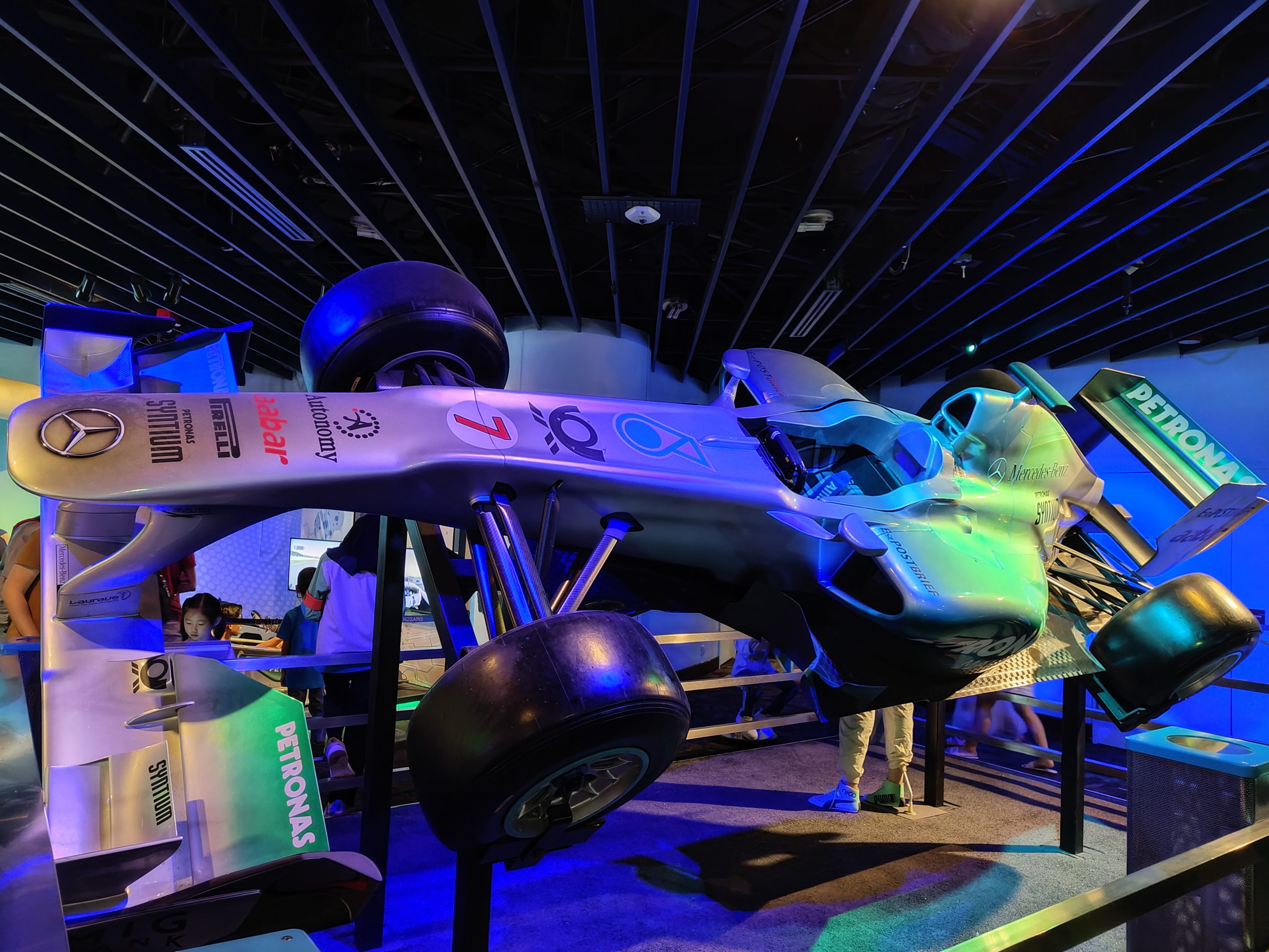

Overall, I actually quite liked the point and shoot experience. I mean, it’s certainly not at the same level as the Pixel or the iPhone, but for just taking shots for social media or even just for your own keepsake, the Phone (2)’s main camera will do just fine. The ultrawide shooter is very much the weaker of the two though, with poorer low light photos and noisier shots in general. Also, if you’re coming from a smartphone with a telephoto shooter, you may find the Phone (2) less versatile; there is a 2x option in the viewfinder, but it’s really just the main camera cropped in.




Honestly, I quite liked the Nothing Phone (2)
At its starting price of RM2,999 for the Nothing Phone (2) with 256GB of storage—rising to RM3,499 for the one with 512GB of storage—I have to say, the Phone (2) is a seriously competent package of a smartphone. I mean, there’s a great screen, solid build quality, usable cameras, fantastic software and guaranteed software updates. Oh, and if it matters, there’s the unique Glyph Interface too.
Compared to its other Snapdragon 8+ Gen 1 rivals that have launched in Malaysia this year, the Phone (2) does stand out as the best overall phone. There’s the Poco F5 Pro that’s much cheaper sure, but you’ll have to make do with a poorer camera setup. Then there’s the Oppo Reno 10 Pro+ which goes for RM3,499, but has a much more complete camera setup with a periscope telephoto shooter. Both of these alternatives also don’t have a guaranteed software update policy, nor do they have a slick UI experience in the first place.
However, the Nothing Phone (2) doesn’t look as good of a deal against the true flagships of this year, like the Samsung Galaxy S23 which can often be found on discount at under RM3,000. It offers a Snapdragon 8 Gen 2 for Galaxy processor, has a longer five year update policy from Samsung and packs slightly more versatile cameras on the back.
Nevertheless, the Nothing Phone (2) is an impressive piece of hardware with the software to go along with it, and if you want something in your pocket that’s a little bit different from the crowd, it’s hard to go wrong with the Nothing Phone (2).

