It’s time to talk about the Dynamic Island. I was riding a wave of hype and excitement when I talked about it earlier this month. I loved the creative problem solving employed by Apple, but I hadn’t actually had the chance to use it yet. Well, good news is that the iPhone 14 Pro Max came in yesterday night. And I’ve gotten a hot minute to try some of these features out. So, does it really live up to the hype or was I just really sleep deprived? There’s only one way to find out.
Literally the very first thing I noticed was how the Dynamic Island isn’t one single pill the way it was portrayed in the keynote. There is actually a bit of screen separating the camera lens from the sensor module, it’s just that when the screen is on, it’s always black to hide this fact.
While that works most of the time, when you put your phone under bright lights or in daylight, you will be able to see the gap and that’s honestly kind of triggering me. But I guess it makes sense because you do need some screen to register your touch inputs.
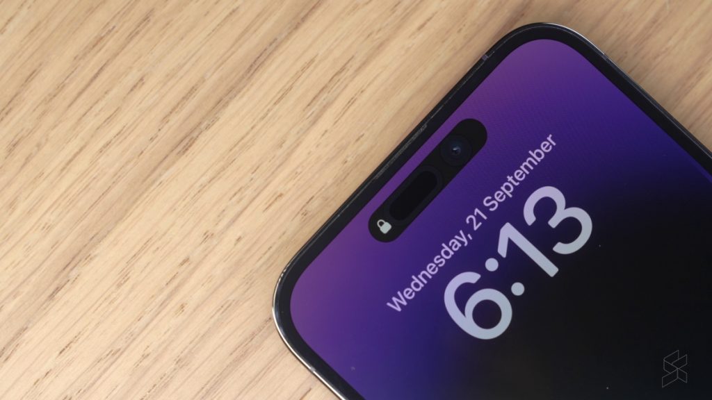
Since we’re on the topic of touch inputs, there are actually two ways to interact with the Dynamic Island—one is a tap while the other is a tap and hold.
Smudging the selfie camera was something a commenter pointed out in my last video as being a potential problem, and I have to agree. But having used it, I don’t think it’s as big of a problem as I initially thought. For starters, I find myself tapping the middle of the Island most of the time, so since the camera is off to the side my finger doesn’t really overlap.
That said you can smudge it occasionally, of course, so I thought a cool feature Apple could add was a smudge detection system like Samsung does. That way it’ll prompt you to wipe it if it thinks your camera module is smudged.
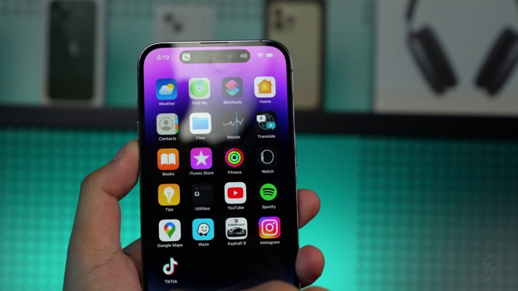
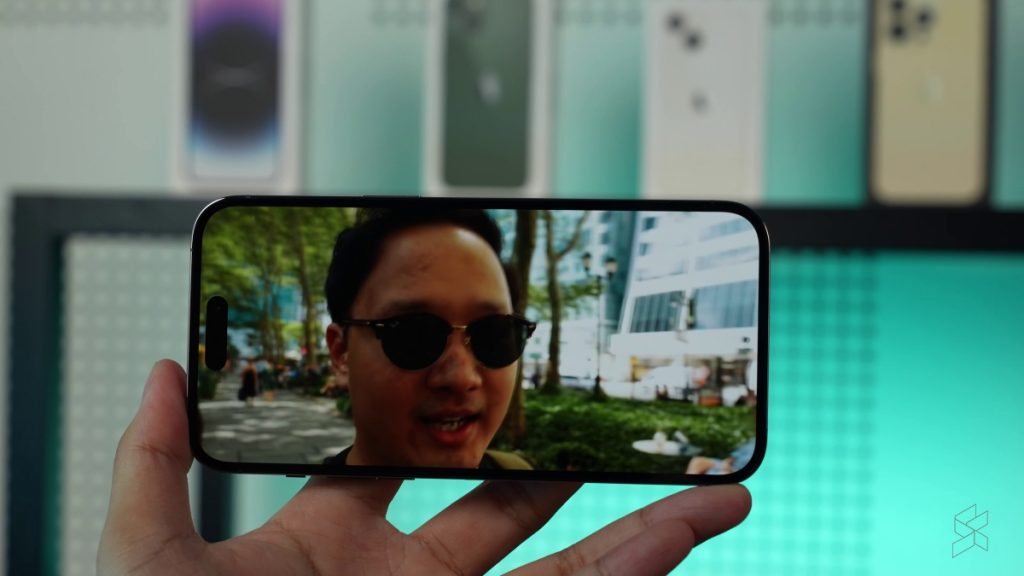
Onto the topic of being an obtrusive piece of rubbish on your screen, the Dynamic Island does a phenomenal job here with getting in the way of full-width content. It’s way more noticeable than a notch which makes it way harder to ignore. I will add that I think for most horizontal internet videos it won’t be an issue because they’re still mostly 16:9. But if you start watching TikToks or 21:9 movies, then it’s absolutely a huge eyesore.
One thing that I found peculiar however is the fact that Dynamic Island doesn’t work with reachability. If I pull the top of the phone down, the Dynamic Island stays stubbornly at the top. This means you can’t really interact with it at all without shifting your grip.
That said, Jon told me that this feature should be coming on the next iOS version so we’ll see what happens with the next update. Just seems abit weird that it doesn’t work out of the box. Did Apple also forget about Reachability? Hmm.
From a software perspective the one thing that I was probably most disappointed with was the “multitasking” possibility. It doesn’t really work as well as I thought it would. Yes, you can tap and switch between different apps quickly, but the position of the Island especially on a phone as big as the 14 Pro Max means you won’t really be interacting with it that much unless it’s like on a table.
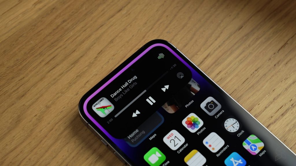
There’s also the issue with app support. There just aren’t many apps that give you proper dynamic island experiences—especially not apps that you’d want to multitask between. The good news is many first-party Apple apps are supported. Apps like your Timer, Apple Music and Apple maps have slick Dynamic Island interfaces which definitely add to the experience.
But third party apps are severely limited. Most of them are music apps, so stuff like Spotify, YouTube Music and Stitcher will work. But navigation apps—well, neither Google Maps nor Waze work so that’s a bummer. All you get is a notification that something is using GPS in the background.
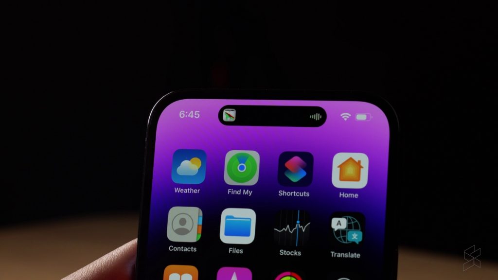
That’s a shame for now because aesthetically, I still really like the way it has been designed. Little touches like matching the waveform colour to the album art cover in music apps, are fun for the eyes.
Since publishing my last video on the Dynamic Island, I saw a post on Instagram about how the Dynamic Island is a “UX Mistake”. At first I was like hmm, ok, but when I dug into it a little more I realised the way this person was thinking was flawed in the same way my thought process was.
The main argument the IG post made was that the position of the Dynamic Island was in a portion of the screen that gets very little finger traffic because many use their phones with one hand. I can definitely agree that it’s hard to reach—it’s one of the main issues I faced when attempting to multitask with it.
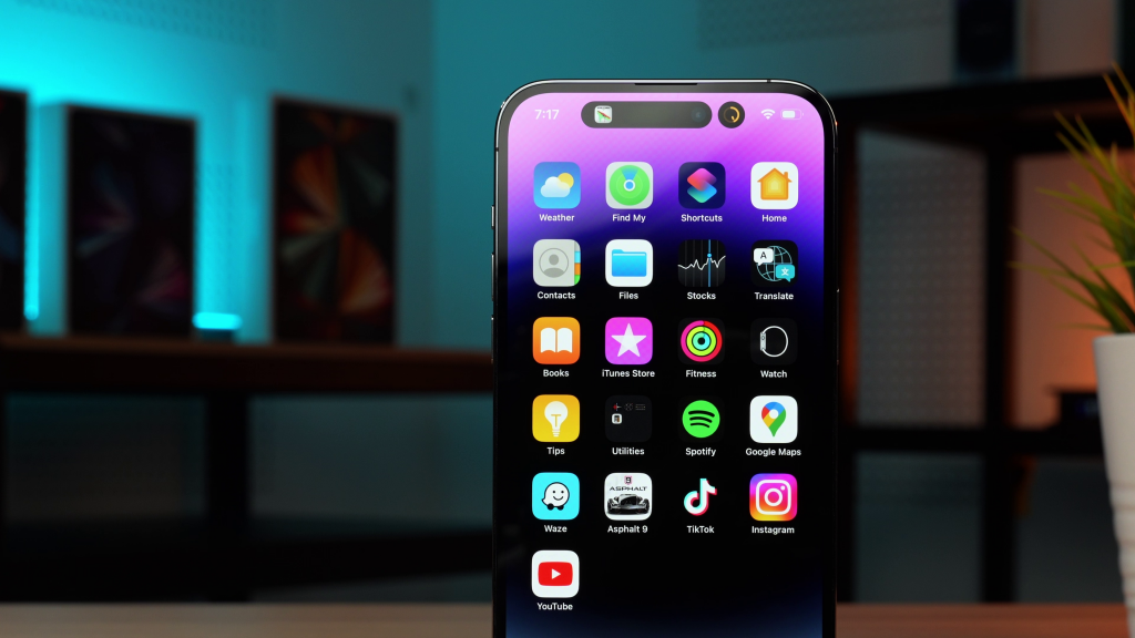
But what I think it doesn’t take into consideration is that the Dynamic Island isn’t meant to be constantly interacted with. What I learned actually testing it myself was that you should look at it as an evolved version of your push notifications.
Think about the kind of apps that currently work with Dynamic Island, and the kind of apps Apple showcase in their keynote. Timer, voice recorder, Navigation, Music—these are all apps that you usually leave running in the background. You only really want to keep an eye on it as you do other stuff.
That is also why I think Apple pushes the idea of making it “intelligent” and adaptive depending on what you’re doing with it. If interaction was the main goal they would have just made it look like a widget.
Also, if you put the Dynamic Island in the zone of the phone screen that we usually interact with, it would be competing with all the other things we frequently interact with like the keyboard, for example.
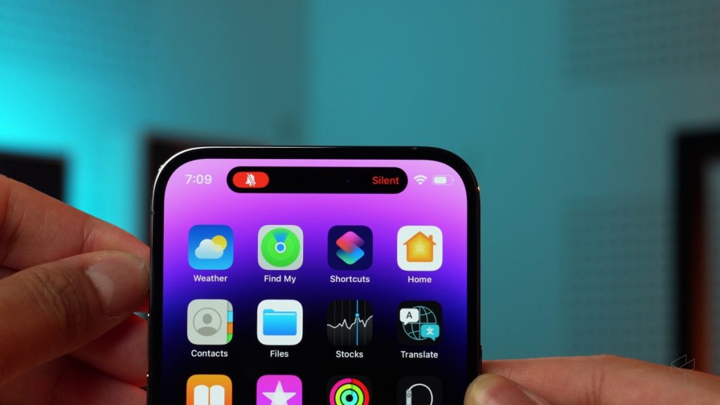
If you want to talk about bad UX design when it comes to interaction, I think the far bigger crime here is the fact that Apple doesn’t let us place our apps at the bottom of the home screen independently. Instead, forcing us to fill up the top of the screen with useless apps and widgets just so the apps we actually want to interact with frequently can stay near the bottom.
Yes, the Dynamic Island is clearly a band aid solution to the punch hole—that much is obvious. What I think made it a success is that Apple has managed to make such an ugly punch hole seem desirable, they turned into the skid, so to speak. Instead of trying to hide that it’s there, it now looks like it was always meant to be there—that it’s a feature not a bug.


