The iPhone 15 lineup is already set to be one of the biggest shifts in design for Apple’s flagship smartphone. Not only will it feature the USB-C port for the first time thanks to the EU, it’s also set to feature a redesign of the chassis and, if the latest rumours are to be believed, the end of the iconic mute switch on the side too.

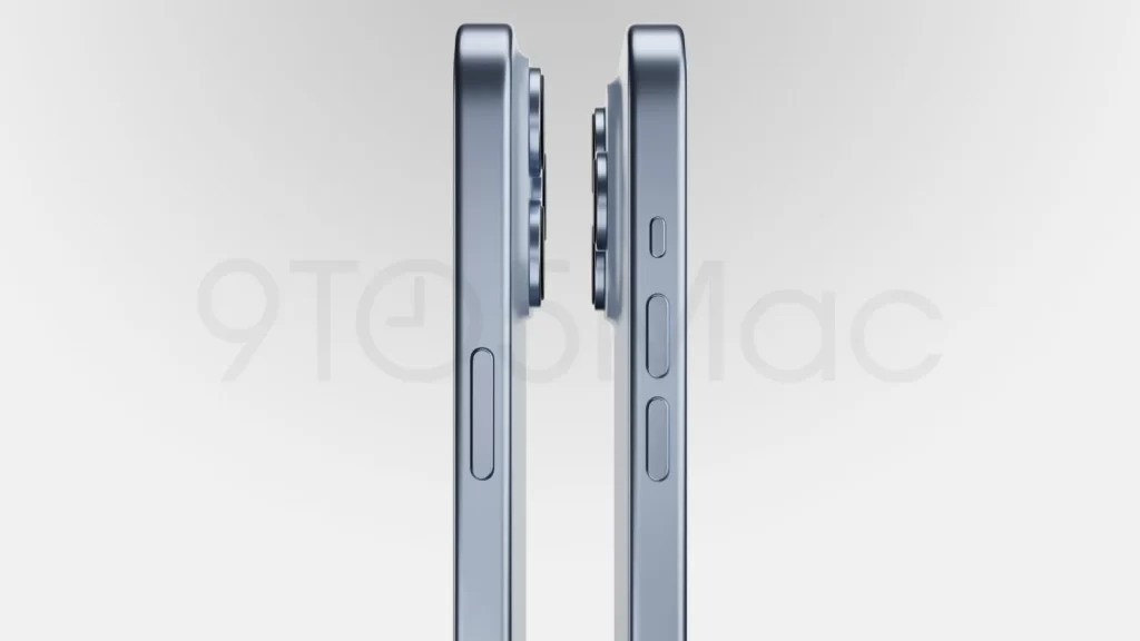
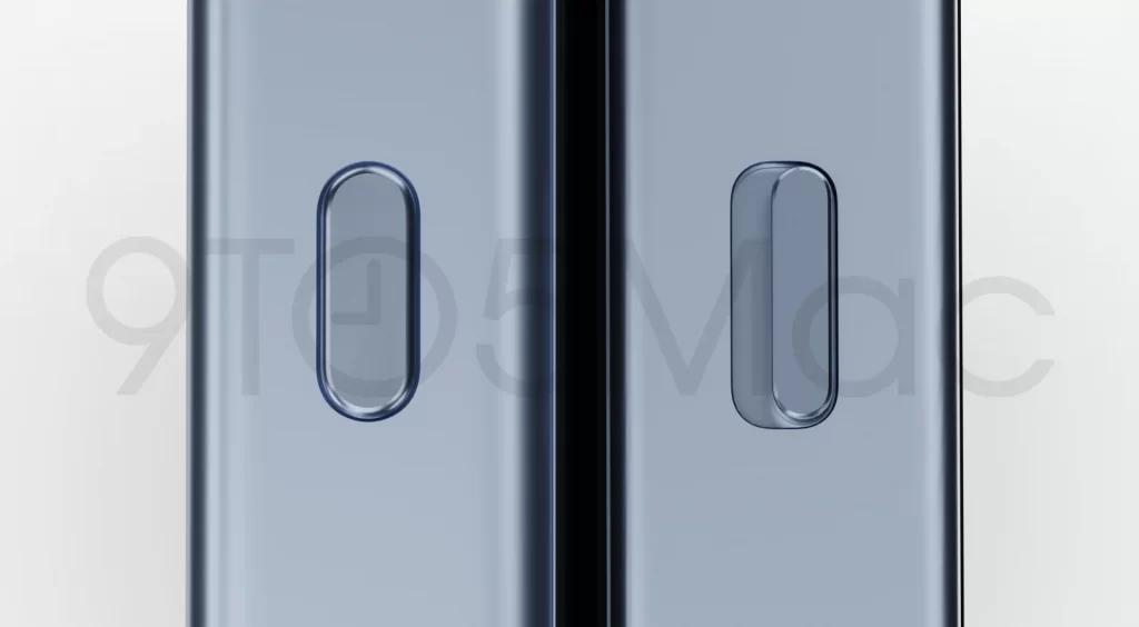
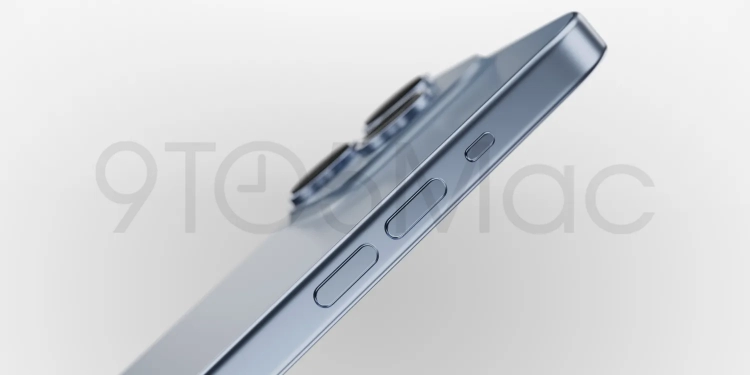
According to 9to5Mac’s latest renders of the iPhone 15 Pro and iPhone 15 Pro Max based on leaked CAD files, Apple is set to go through with the long-rumoured move of killing the mute switch. However, rather than switching to haptic buttons as believed, due to production issues Cupertino is apparently set to switch to using a traditional button that will double as a mute button too.
In their new renders, they show off the traditional physical buttons on the side including the volume buttons but in place of the mute switch is just a regular button. This is expected to be similar to the Action Button found on the Apple Watch Ultra. This is also expected to only feature on the iPhone 15 Pro and iPhone 15 Pro Max; fans of the good old mute switch will be happy to know that the iPhone 15 and iPhone 15 Plus should still be getting the current mute switch.

This Action Button won’t just be a glorified mute switch though. On the Apple Watch Ultra for example, the Action Button on the wearable allows the user to activate Shortcuts, which then lets you customise what actions it does. While it would still likely work as a mute toggle, the iPhone 15 Pro and iPhone 15 Pro Max’s Action Button will likely feature similar programmable functions, though there’s no word on how this will look like at the moment.

The end of the mute switch will likely be a polarising move for many Apple fans—the mute switch has been one of the key defining features of the iPhone since the original debuted back in 2007. As OnePlus found out a while back with the OnePlus 10T, they’re more fans of the mute switch than you’d expect. Then again, seeing as Apple is technically replacing the mute switch with even more functionality, it could still turn out alright but as Cupertino knows all too well sometimes the better design is the simpler one—remember Touch Bar anyone?


