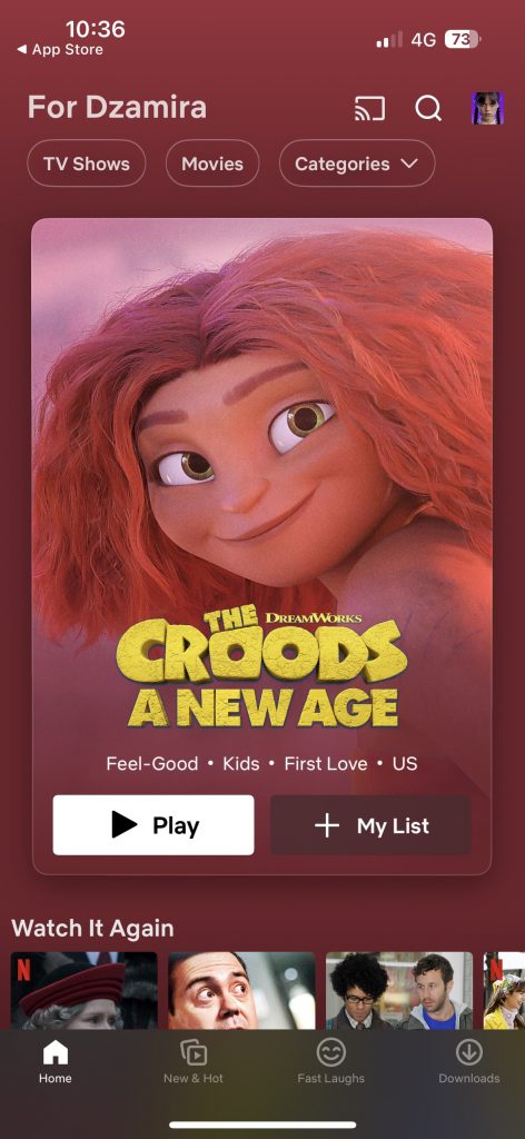
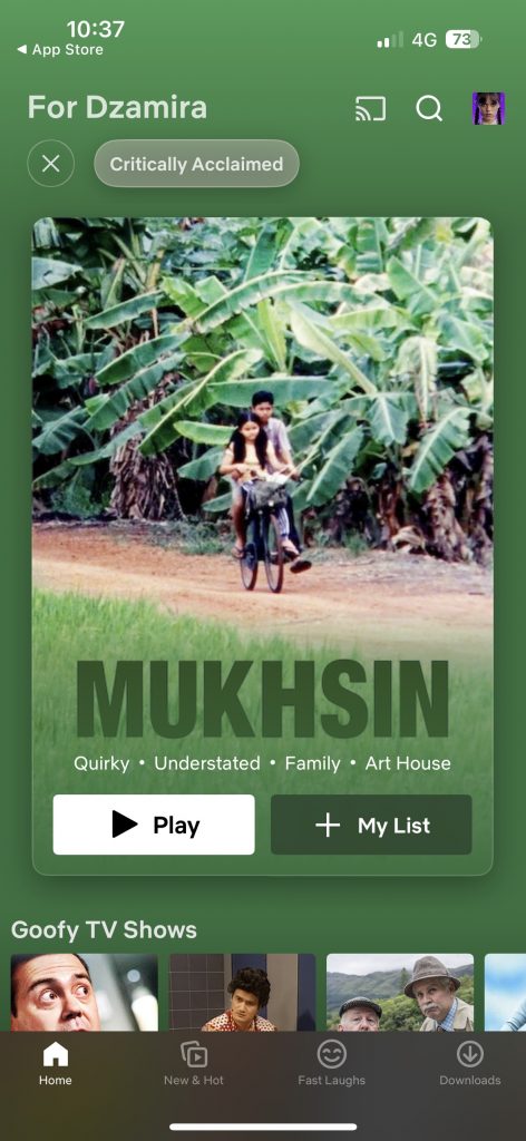
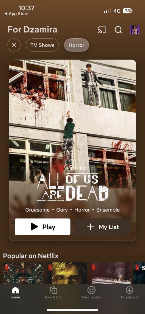
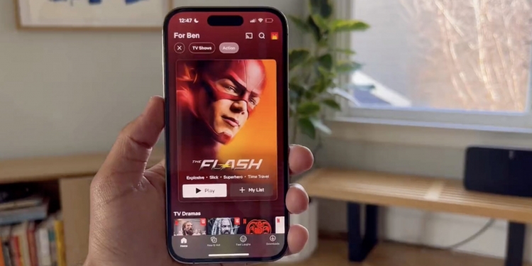
Netflix has released a refresh of its UI for its iOS app, and you can experience it now if you own an iPhone. Janum Trivedi, a former senior software engineer for the platform, even posted a video showcasing what it looks like—calling the UI “more fluid, delightful and polished”.
This last year, I’ve been leading a UI refresh to make Netflix feel more fluid, delightful, and polished.
— Janum Trivedi (@jmtrivedi) January 16, 2023
Today, all that work shipped!
Huge thanks to @nebson and @b3ll for helping bring this to life ❤️
Details below, but try it out yourself! pic.twitter.com/cZFb7c42Fd
“This last year, I’ve been leading a UI refresh to make Netflix feel more fluid, delightful, and polished. Today, all that work shipped!” wrote Trivedi, who now works at Browser Company.
According to Trivedi, the new changes for the app include a “new billboard layout” that “responds as you move your device, with a subtle lighting effect”. Changes also include “wallpaper gradients that are created on-the-fly”, a “new card transition that’s fully interruptible/interactive”, “new launch/profile animations” and “more”.


Netflix’s new UI looks and feels more sleek to use at first glance. The animations, like for the buttons after you select a square, feel more fluid, and there’s a very convenient billboard-like layout that suggests something for you to watch.
And if you want to look for something more specific, there are conveniently placed buttons at the top for “movies”, “tv shows”, and other “categories” if you want even more specific suggestions. Specific genres will give you suggestions based on what they think you would like.
If you’re still not into the top suggestion by Netflix, you can scroll down to find other suggestions based on the specifications you’ve chosen. Besides that, the other big change I’ve noticed is just how nice it feels to use.
“Netflix is really big on metrics and AB testing, and this was a really significant win across the board. Don’t let anyone try telling you craft and quality doesn’t matter to the business,” wrote Trivedi regarding the UI change.
Currently, the UI refresh is available for iPhone users. There is no word yet of when the refresh will be available for Android users.
[ SOURCE ]


