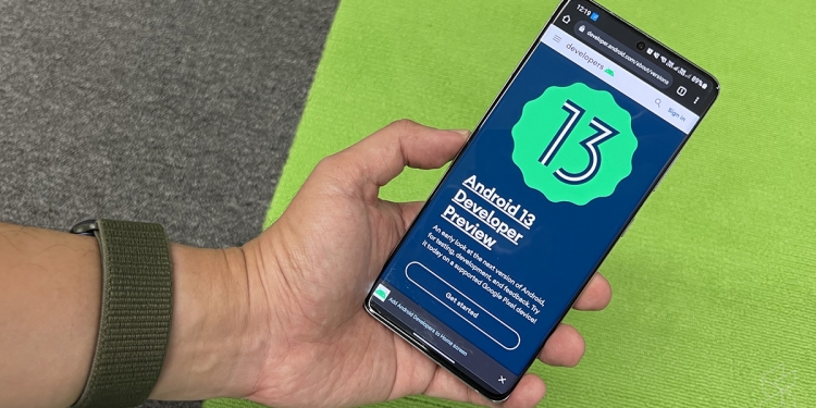
We’re barely a few months into smartphone manufacturers rolling out Android 12 versions of their own skins of the OS, but that hasn’t stopped Google from releasing the first developer preview of Android 13. Of course, it goes without saying that this is an extremely rough and early view of what we can expect to see by the end of the year, but it’s still an interesting look into the direction that Google is taking Android into.
1. Privacy matters
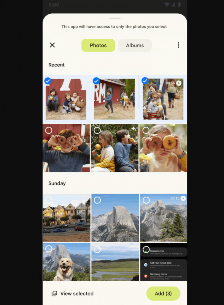
It’s perhaps a testament to how good Apple is when it comes to privacy and security with iOS that they’ve pushed Google to further innovate and improve on these things in the Android space too. Google says that privacy is core to Android itself, and Android 13 builds on this even more. One feature they highlighted is a new photo picker system that allows you to share your photos and media more securely with apps.
This new system-wide photo picker makes it standardised and optimised for users to upload media from both their phone’s internal storage as well as their cloud storage, like Google Photos. It’s not a totally new feature, being built on top of the document picker that’s been around for a while now. With this new photo picker, any developer can thus use the photo picker API to access specific pieces of media without needing permission to view all the media stored on the device.
Another new security and privacy feature in this early Android 13 preview is the nearby device permission for WiFi. Specifically, Google is adding a ‘nearby WiFi devices’ runtime permission for apps that manage the devices connections to nearby WiFi access points. Apps that call many of the commonly used WiFi APIs will be required to ask the user for permission to access nearby WiFi devices, and allows these apps to discover and connect to other devices over WiFi without accessing location data. Right now, apps that needed to link with other devices over WiFi needs permission for location data, despite not actually needing it. Android 13 should rectify that by using the new nearby WiFi devices permission instead.
2. Improved developer tools
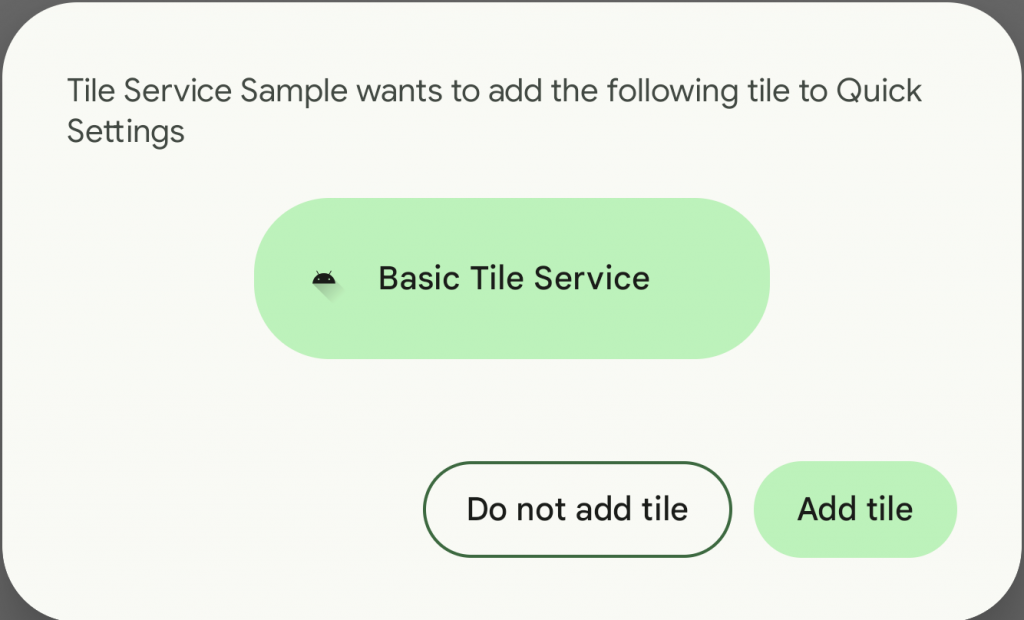
There’s a reason this early look at Android 13 is called the developer preview, as it’s targeting developers and showing them what’s in the pipeline for Android. One thing Google showed off in particular is the new Quick Settings Placement API. Quick Settings here refers to the settings you’re able to access via the notification shade when you pull it down, and Android 13 will now allow app developers to prompt users to add a custom tile for the app to the Quick Settings area, bypassing the need for users to manually do so in the Settings app.
Other notable new developer tools include per-app language preferences. It essentially lets apps use a new platform API to get the user’s preferred language set in the system itself, instead of needing to ask the user what their preferred language is when they first load up the app. This should reduce the need for repetitive boilerplate code. Google is also adding support for programmable RuntimeShader objects, with Android Graphics Shading Language. This allows app developers to create advanced graphics like blurs, stretch overscroll and ripple effects in their app UI.
3. Material You now applies to all apps
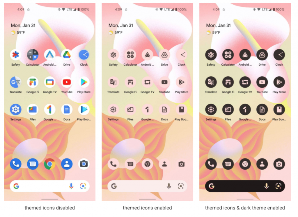
Remember how custom Android themes were all the rage a number of years back? With Android 13, Google is sort of making a similar move, except it’s to make third-party apps follow the stock system’s Material You design. You might’ve heard about their Material You design philosophy before, with its focus on combining colour with UI and engineering; if you’ve seen the Pixel 6 or Pixel 6 Pro before, you’ve seen how it looks like.
However, it’s bright and playful colour tones understandably don’t all fit with the generic logos that come with the apps. As such, in Android 13 users will be able to apply the Material You theme to all of their apps, even if they’re not Google apps. This will need app developers to supply a monochromatic version of their app icon, and a tweak to their adaptive icon XML. Here’s a quick sample of how they’d look like, along with a version of the themed icons in dark mode:
4. More big screen optimisations
We’ve previously covered the Android 12L special feature drop coming to larger form factor devices soon, with its new features like split screens and two-column notification shades. Android 13 will continue in this direction, with Google saying that there’s no better time for you to optimise your apps for tablets, foldables and Chromebooks. They’re making it easier for developers to do so, even making guides for developers to check out to know what to expect when using their app on a large screen device.
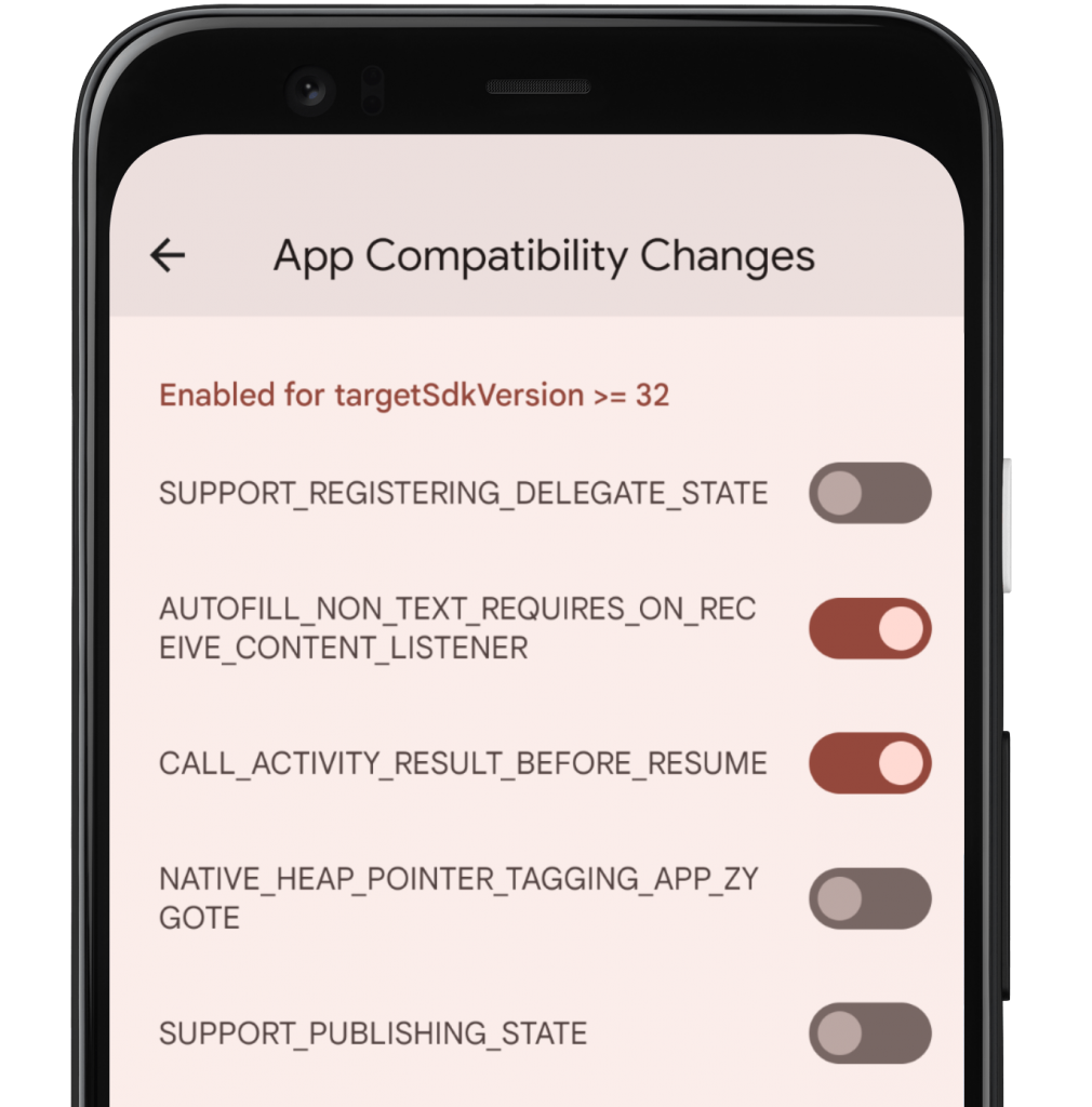
Further developer-focused improvements in the Android 13 developer preview include a tool in the Developer Options that make sit easier for you to test the opt-in changes that can affect your app. These new changes are now able to be turned on with just a toggle of a switch, and allows you to force-enable or disable these changes individually from the Developer options.
Google have also expanded the Google Play system update project, giving apps a more consistent and secure environment across a user’s devices to deliver features and capabilities. Essentially, this means that going forward we can expect to see more updates like security patches done via the Google Play Store rather than needing OTA updates instead. These new Android 13 features like the photo picker could also get sent to devices running older versions of Android via the Google Play Store too.
Of course, you probably shouldn’t be installing the Android 13 developer preview on your device unless you’re actually a developer or you know what you’re doing. Google adds that Android 13 ought to move into beta by April, with a stable preview available by July followed by its official release later this year. For more information about the Android 13 developer preview, you can check it out on the Android Developers website.

