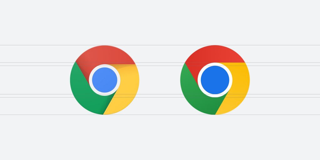
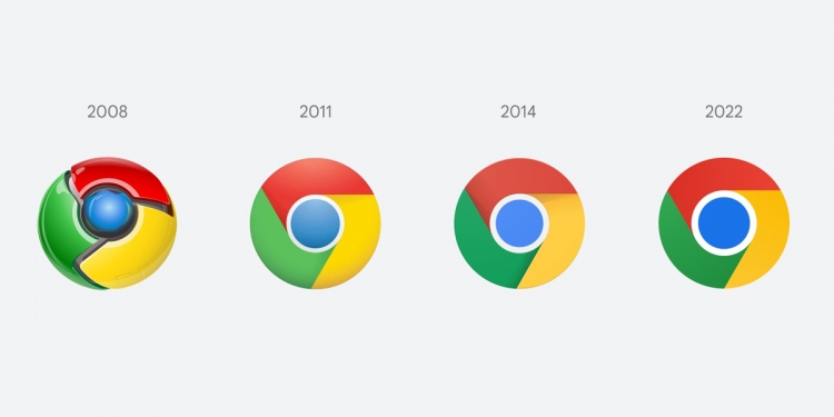
In a time where every other logo and icon appears to get more and more minimalist, Google Chrome is the latest to join the club. Despite arguably already having a fairly minimal logo, Google is set to introduce a redesigned logo for its browser by removing the shadows between the segments, with a couple more tweaks to the proportions as well as a brighter colour tone in line with Google’s brand.

Google Chrome designer Elvin Hu shared this new update on his Twitter, and adds that they found the old logo had this thing called ‘colour vibration’, due to the shades of red and green that they used. As such, the new logo also comes with a very subtle gradient shift in the red and green segments to make it apparently more ‘accessible’. The blue circle in the center is also much larger now.
Fun fact: we also found that placing certain shades of green and red next to each other created an unpleasant color vibration, so we introduced a very subtle gradient to the main icon to mitigate that, making the icon more accessible. pic.twitter.com/H26wQKRhp9
— Elvin 🌈 (@elvin_not_11) February 4, 2022
On top of that, there will also be a bunch of OS-specific tweaks too to make the logo feel more at home depending on the device you’re using. Windows users for instance will be getting the new logo with a gradated look to it, making it more in line with the rest of the Windows icons. ChromeOS versions of Google Chrome meanwhile will come with icons that are brighter without the aforementioned gradients to match the rest of the system icons in design. As for MacOS, it’ll have a 3D look to them just like other system apps on a Mac.
On macOS, they look 3D. For Beta and Dev, we applied colorful ribbons to them. pic.twitter.com/U3674XS7k6
— Elvin (@elvin_not_11) February 4, 2022
However, besides the obvious jokes about the little to no changes, the subtle differences between the current logo and the new logo. John Wu, the creator of Magisk, a root tool for Android, chipped in on the new Google Chrome logo too. He states that as someone with Daltonism, also known as protonopia or colour blindness towards red and green, the new logo makes it a lot harder to recognise the different sections of the Chrome logo. This is in part due to the removal of the shadows and gradients that gave it a sense of a border between the coloured segments.
His complaints didn’t go unheard though, as both Elvin and Google Chrome head of design Alex Ainslie replied to his tweets by acknowledging the feedback and by the looks of things will be looking into touching up the design a little more before it debuts on stable versions of Google Chrome.
In the meantime, those of you curious about the new Google Chrome logo will still need to wait. Elvin did say that the new icon will only be in Chrome Canary for the time being. Google Canary is the developer version of Chrome for those who haven’t heard of it, and typically comes with a bunch of new experimental features. You can think of it like an alpha version of Chrome. If you want to try out Google Canary you can download it here. Otherwise, you can expect to see the new Chrome logo rolling out—perhaps with more subtle tweaks for colourblind folks—in the coming months.


