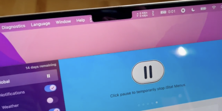
As you know, the new MacBook Pro has a notch on its display, which was a controversial design choice when it was announced. The notch appears at the center of the status bar, but it seems that Apple hasn’t fully ironed out all the bugs yet.
Quinn Nelson from Snazzy Labs got his hands on the laptop and found some issues with how the notch interacts with the menu bar. He posted two videos on Twitter demonstrating the bugs.
In the first video, he explains what happens when there are too many status items (like the battery indicator) on the menu bar. To test this, Nelson opens up iStat Menus, and the items just get hidden by the notch, making it impossible to read the items.
After that, he demonstrates how regular menu items (like File, Help, etc.) behave when encountering the notch. Opening DaVinci Resolve, the menu items simply avoid the notch, with the mouse being unable to enter the notch while a menu is being opened. This behaviour is intentional, making it so that older apps can’t display menus in the notch area.
These menu items also override menu status items, making them disappear when there are too many to display on the screen. According to MacRumors, this is also normal behaviour, but the notch does exacerbate the problem by taking up space on the menu bar.
This is undoubtedly a MacOS issue. The operating system is not fully optimised or ready for a notched MacBook Pro. It is surprising to see this being overlooked, as Apple has full control on both the hardware and software.
Compared to when the iPhone got the notch, Apple had an easier time accommodating for it as they only had to worry about their default status items. However, it’s different with MacOS as users can easily add more items and cause problems.
The developer of iStat Menus said that they are using the standard NSStatusItems protocol, and that Apple should be the ones to fix the problem.
The good thing is that this can be easily fixed with a minor software update. We are not sure how Apple will fix it, but they will probably just handle the menu items the same way menu status items are handled. Hopefully the issue is resolved soon, as it can be incredibly frustrating for users who have a full menu bar.
[ SOURCE, IMAGE SOURCE ]


