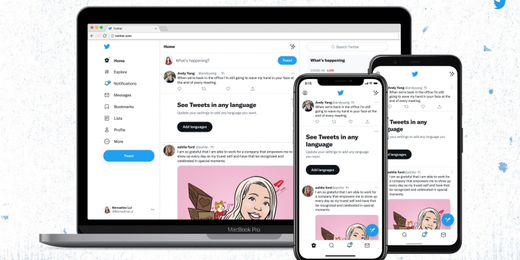
I honestly didn’t really notice anything changed until Twitter users pointed out that the platform now has a different font. It has created quite an impression online, but there are also a few other new design updates that you might not have noticed.
Twitter announced that their very own font—Chirp—is “ready to use”. According to the platform, the font for Western-language text “now aligns left, making it easier to read as you scroll”, but the font for non-western languages remain unchanged.
At first glance, it doesn’t look that different to the fonts used previously but it won’t leave your mind once you’ve noticed it. In the past, the company has used SF Pro, Roboto and Helvetica Neue. With Chirp, its “key objective” is to improve how Twitter can “convey emotion and imperfection”.
While I personally think that the new font is really cute, not a lot of people think so. Netizens have called it “ugly“, “kind of weird“, and even like “typing a formal literary piece to be submitted to a professor“.
But the new font isn’t the only thing that has changed. Twitter says that it has updated its colours to be “high contrast and a lot less blue” to “draw attention to photos and videos you create and share”. The platform also mentions that they will be introducing “new colours” soon.
Twitter’s “buttons” are now high contrast as well—including the follow button—to help important buttons stand out more. Additionally, they have “cleaned up a lot of visual clutter”.
“There are fewer gray backgrounds and unnecessary divider lines. We also increased space to make text easier to read,” continued Twitter.
Twitter also said that the design changes are “just a start”. The changes have already started rolling out on iOS, Android, and the web.
[ SOURCE, IMAGE SOURCE ]


