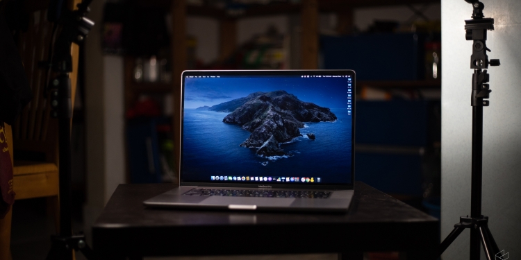
If you’ve ever been a Windows laptop user for any amount of time, you’ve probably heard a lot of good things coming from the Mac camp. MacBook users will swear by their device’s hardware and experience, justifying the higher price tags with the same kind of intangibles and refinements that Apple is so well-known for in the rest of their product lineup.
And as a Windows user myself who has studied these mythical machines from afar, I’d be lying if I said that I haven’t been…tempted. Then I finally bit the bullet and took the plunge into the MacBook world when we got our hands on the brand new MacBook Pro 16.
So, is the grass greener on the other side? Is MacBook land the utopia all laptop users should move to? Can a long-time Windows user truly make the switch? Well, let’s see if I can help you find out.
With a video like this, I think the best way to answer the question is to break it down into what I liked, what I didn’t like, and what I think really doesn’t make a difference. And we’ll start with what I liked, because as the promised land promised, there is quite a lot to like.
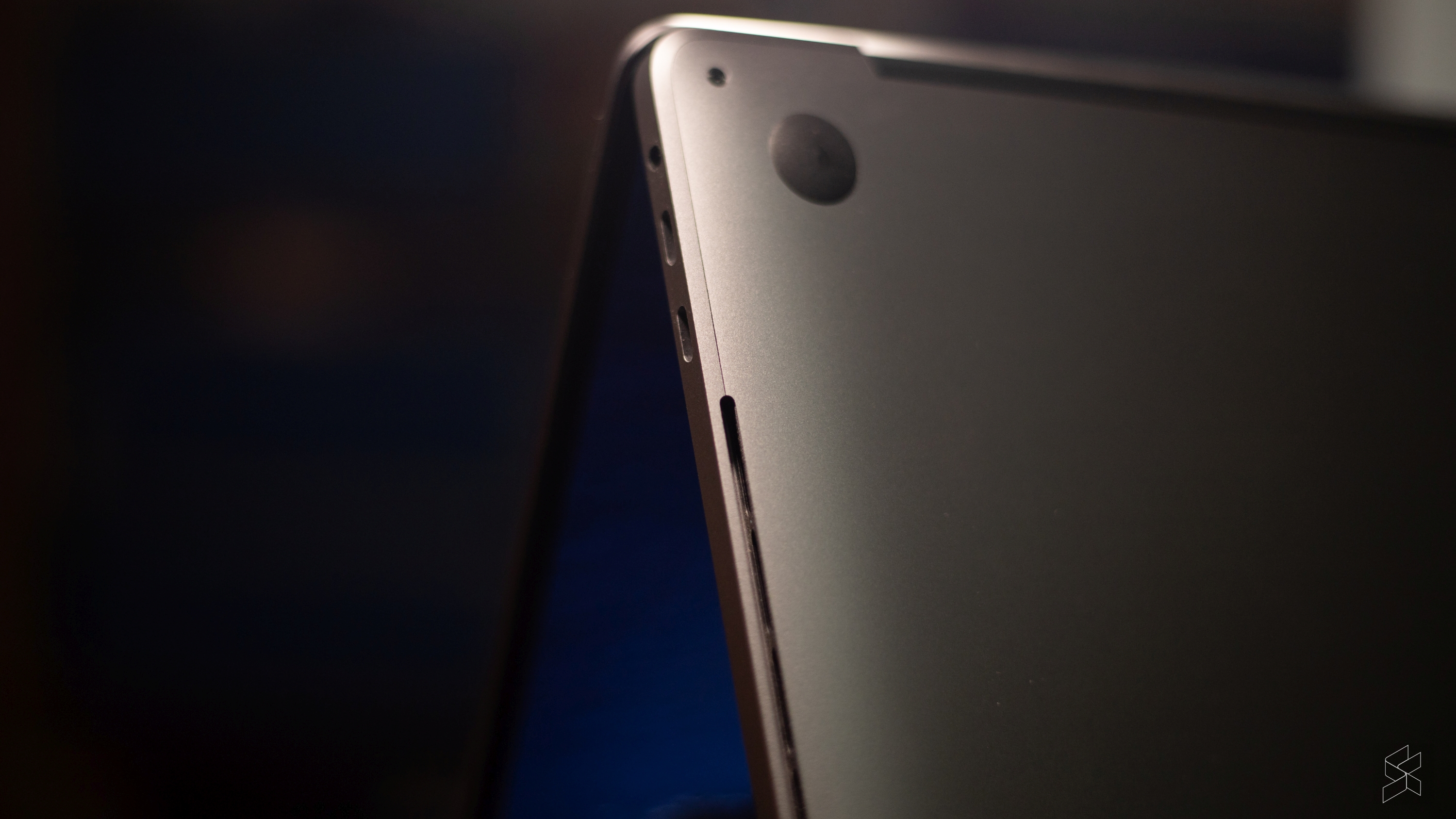
Most of it, however, lies in the hardware because oh my goodness Apple knows how to make a well-built machine. This particular MacBook Pro 16 I spent my week with simply felt better put together than pretty much every Windows laptop I’ve ever had the chance to use.
Mouthwatering build
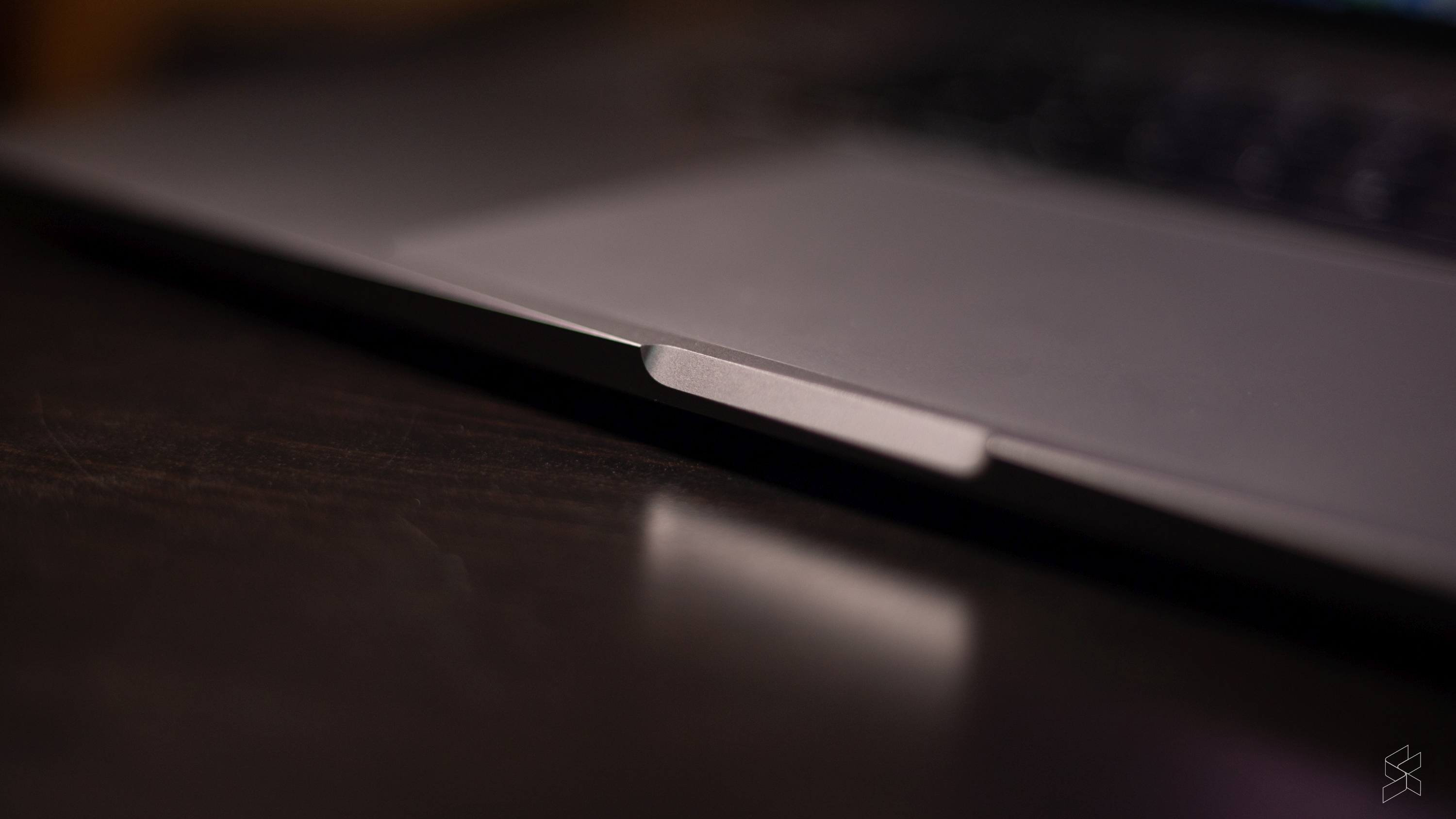
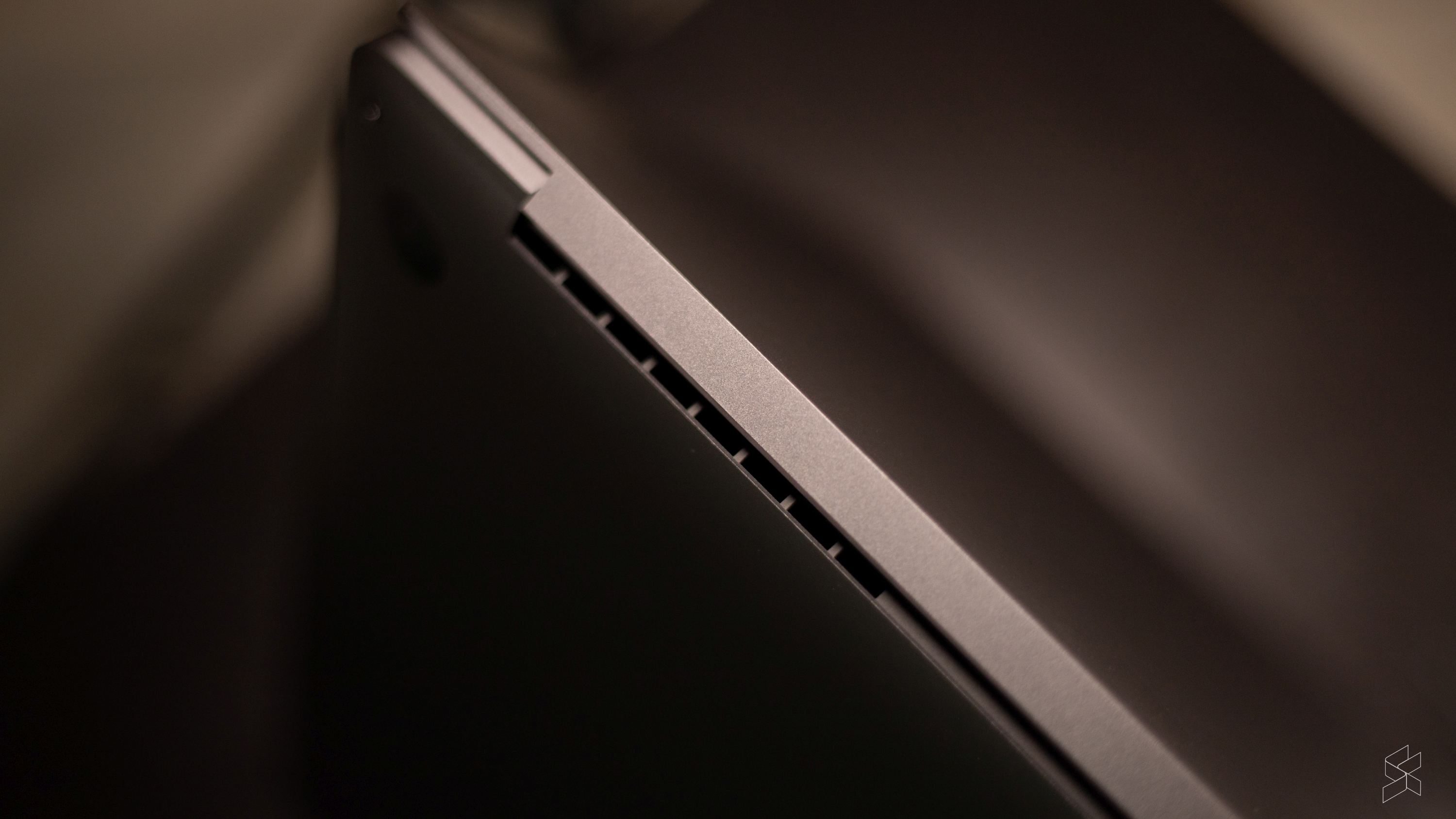
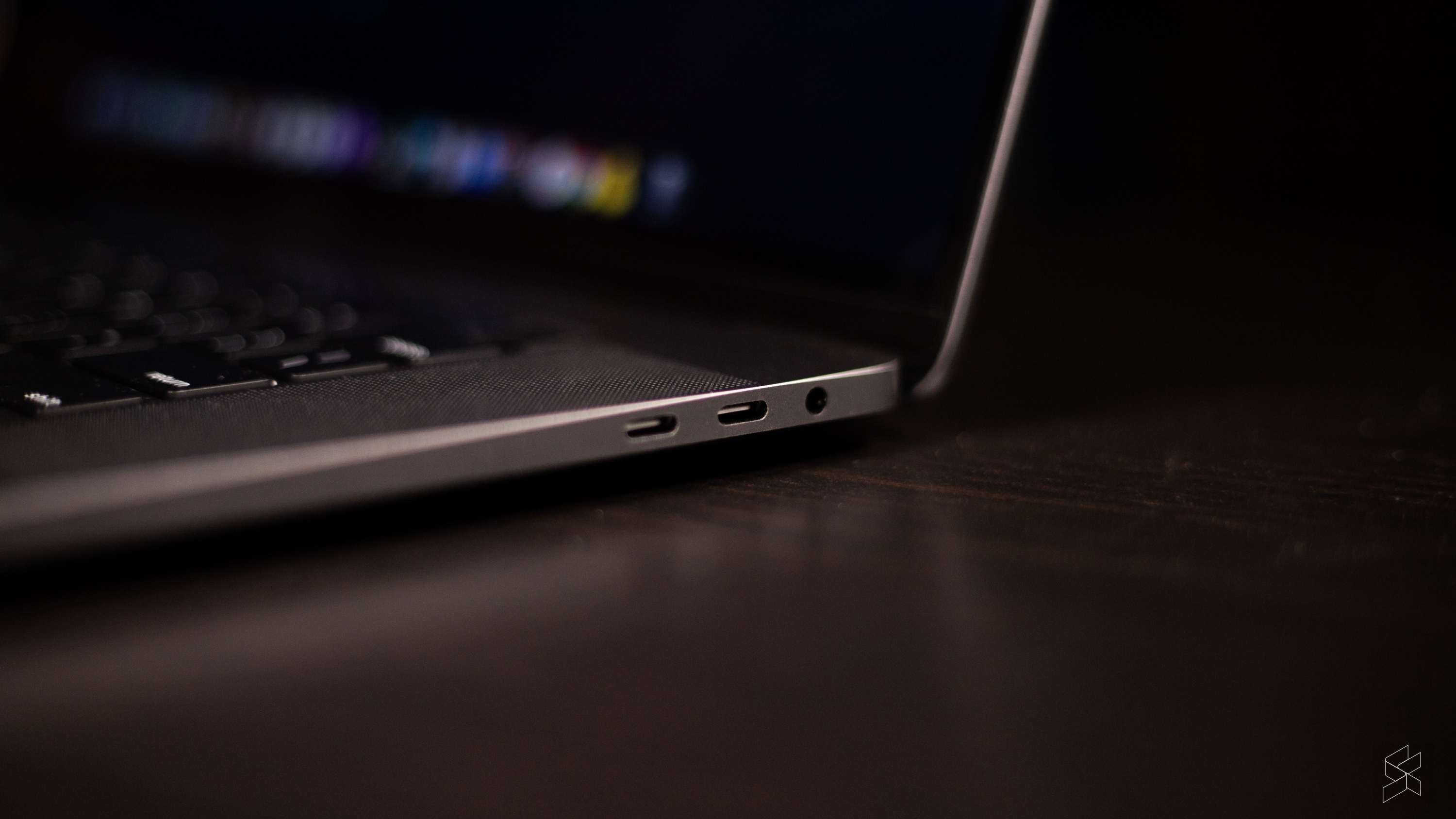
Its build alone is enough to blow most PC machines out of the water. Every seam, every little corner feels like it was machined in a hermetically sealed lab by a Sheldon Cooper-type. Does it lack character? Yeah, because it looks like every other MacBook out there, but if the build is this phenomenal, I don’t think anyone would mind.
The chassis is rigid, and the screen has hardly any flex. It feels like an absolute unit—dense and unyielding. I also love how Apple gets the clamshell design just right. Something as simple as the hinge resistance and weight of the bottom half is so perfectly dialed in that every single Mac I’ve used has passed the one-finger-open test with flying colours.
But, it’s not just the outer shell that’s stellar, almost every major component you interact with is top of its class. The Retina display isn’t 4K, but it’s punchy, bright and features good viewing angles for an IPS panel.
Would I have liked to see an OLED screen like those living in high-end Windows laptops? Yeah, sure. But did I really miss it in my day-to-day usage with the MacBook Pro 16? Not really.
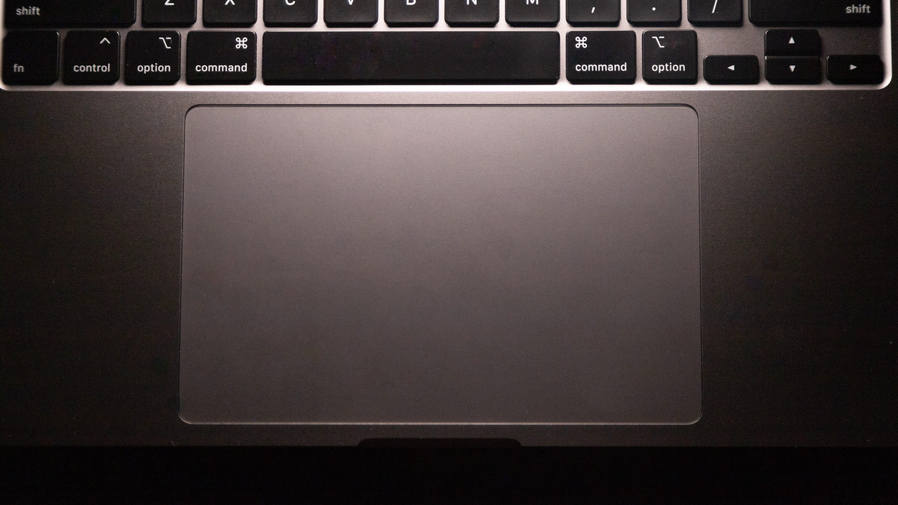
Then, there’s the trackpad. The rumours are true, the trackpad is phenomenal on the MacBook Pro 16. It’s definitely the best I’ve used on a laptop, and it’s so big that you could probably play an entire board game on it. Interfacing with it is still a little weird to me, but that’s got more to do with MacOS than the hardware.
Is it really so good that you won’t ever need a mouse with your MacBook? No, I wouldn’t go that far. You just have so much more agency with a mouse, and the lack of a touchscreen interface doesn’t help the MacBook’s no-mouse case.
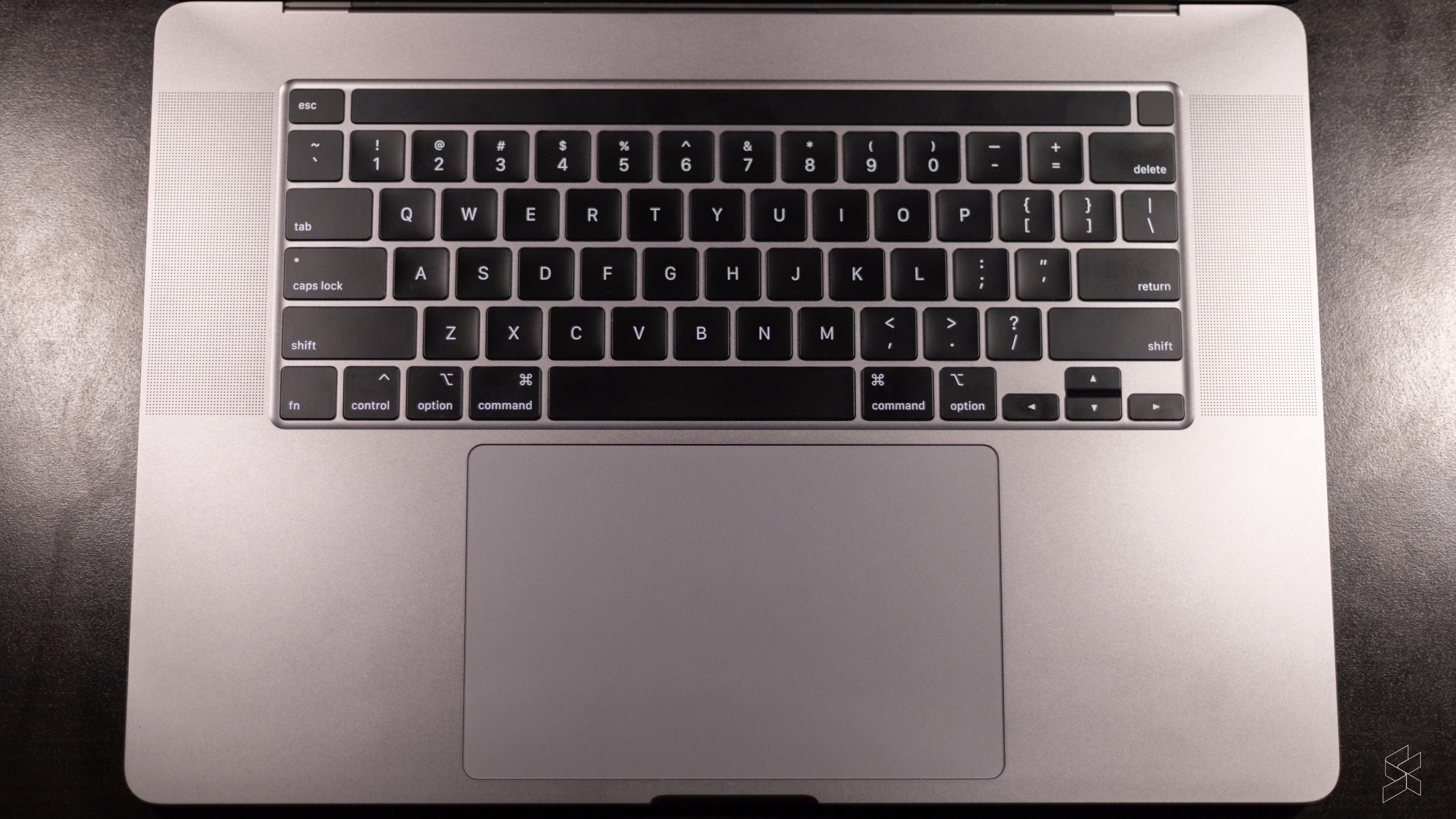
What I couldn’t probably live without with the MacBook Pro 16 are the speakers. When I say it’s the best speakers I’ve ever heard on a laptop, I mean that by a country mile. Now, I haven’t heard those on the Razer Blade Pro so I can’t compare how it stacks up there, but everything else? Even the big gaming rigs? Yeah, this sounds better.
It’s fuller, more balanced, more like a proper speaker setup. It’s just phenomenal and I wish more Windows machines had speakers like these.
Quintessentially Apple
On top of that amazing hardware, the MacBook Pro 16 is quintessentially Apple in the way that the iPhone is. It just works so well with every other key Apple device in the ecosystem.
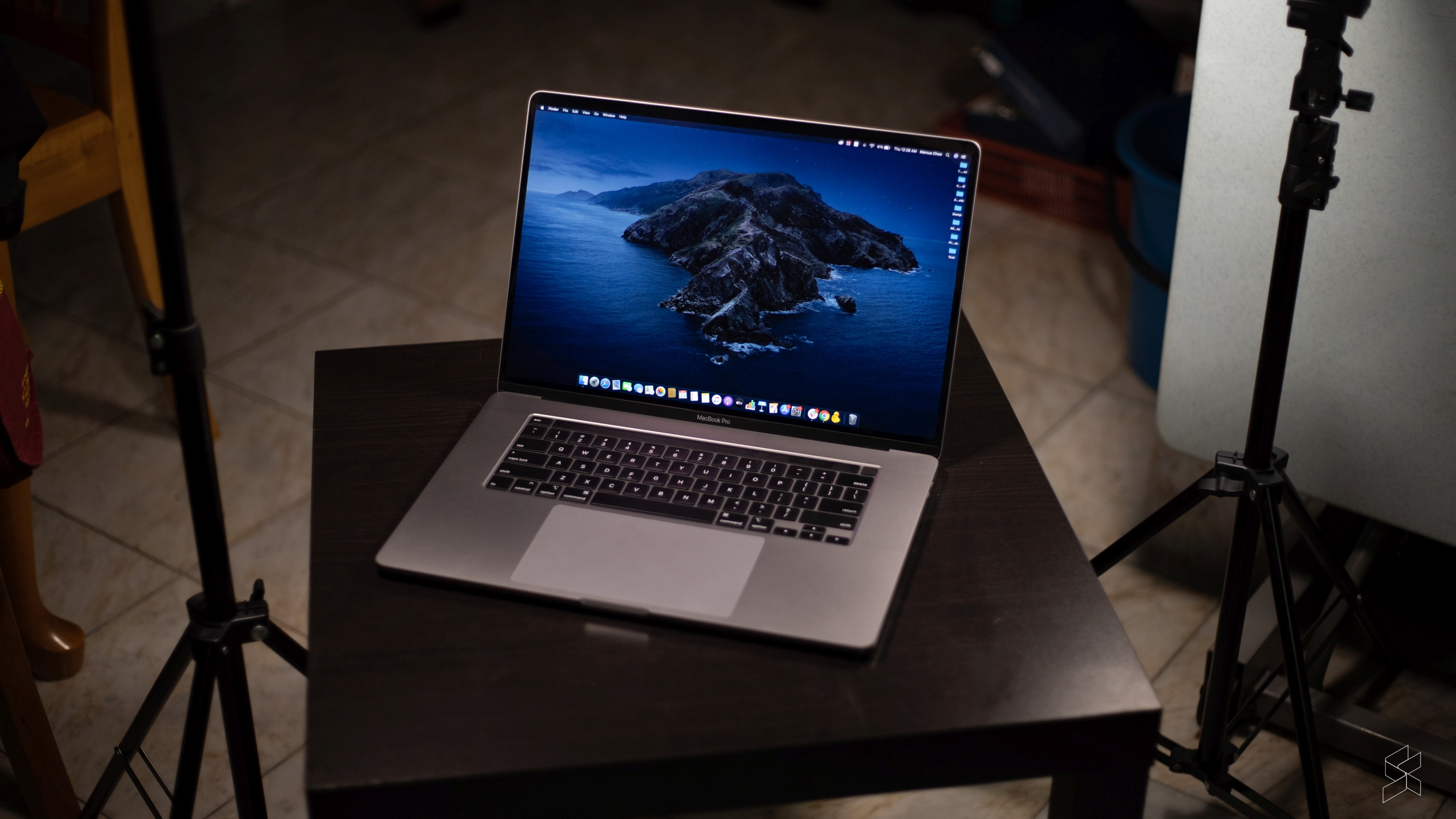
Airdrop, for example, works like a charm for our workflow. We shoot a lot of video on iPhones, so being able to quickly offload it to the laptop without faffing about with a cable is just awesome.
And how has nobody else thought of SideCar? Like seriously, it’s bad enough that Apple has the best tablets in the market with their line of iPads, but now you’re telling me they can instantly double as a secondary display on the go? In retrospect, it seems like such an obvious idea, but I have yet to see anyone else execute it the way Apple does.
Sure, it’s not a perfect solution, but with my 10.5” iPad Air, I get a screen that’s just big enough to dump stuff that I want to keep an eye on but not clutter my main display in an instant. It’s just so awesome, I can’t get over how useful it is.
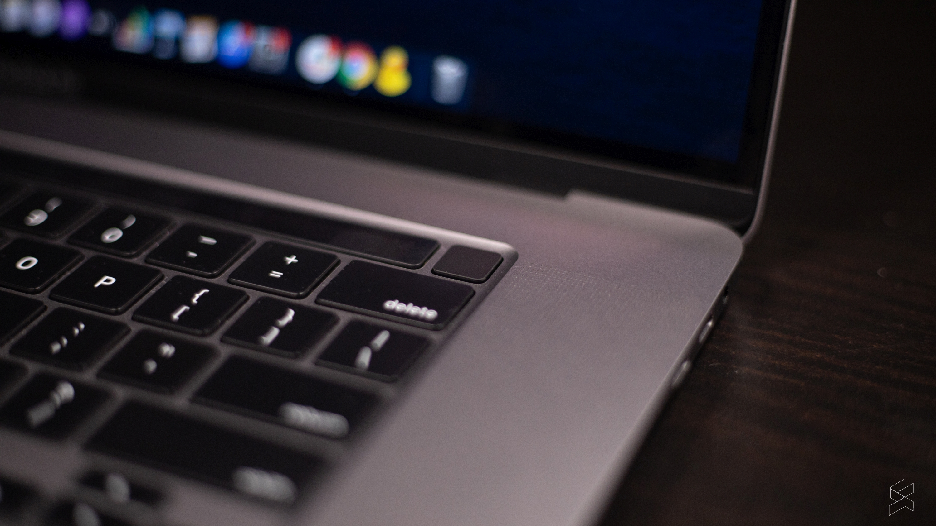
What’s more, if you have an Apple Watch, you’ve got an easy way to secure and unlock your MacBook with Auto Unlock. And if you have an iPhone and you get a FaceTime call or an iMessage your laptop rings too, like it just works and that’s thanks to something called Continuity.
Plus, it goes even deeper than that. You can use your iPhone to scan a document and have that appear on your Mac. You can instantly connect to your iPhone’s hotspot without needing to enter a password. You even have access to a universal clipboard so you can copy text on one device and paste it in another.
It’s quite incredible how much you can do with this feature. And none of them really feel shoehorned in the way something like Huawei’s Huawei Share feature does. Everything feels well thought out and properly executed in this regard. But, inevitably, while the magical aura around the hardware and ecosystem definitely elevated the MacBook Pro in my eyes, what I quickly realised I probably could never live with was MacOS.
The MacOS conundrum
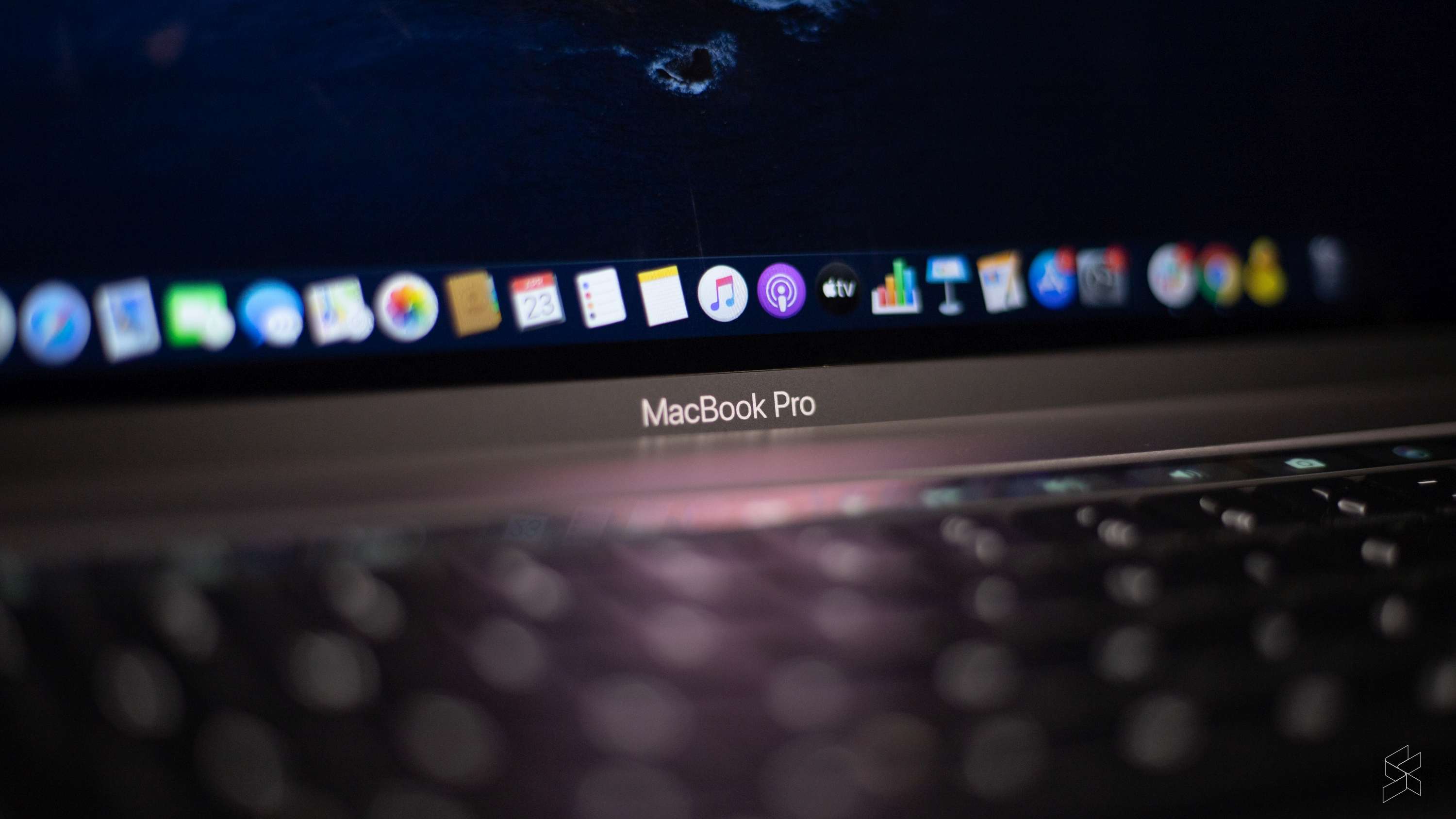
Now, before you start writing angry comments down below, I will concede that MacOS is really well optimised for the hardware. It works well on the MacBook the way iOS works well on an iPhone. But, in a lot of ways, it is equally as frustrating. I’ve always had problems with multitasking on the iPhone, and what I was surprised to find out was that I would have those same issues on the MacBook. Simple things often felt overly complicated to me and I just couldn’t understand why they had to be done this way.
For example, I’m someone who almost always writes in split screen. I have my reference material on one screen, and then my document on the other—it just makes sense. On Windows 10, all I need to do is pull the window I want to snap to the corner of the display and it would pop into place. Then I could simply select the other window I wanted it snapped with and that falls into place too.
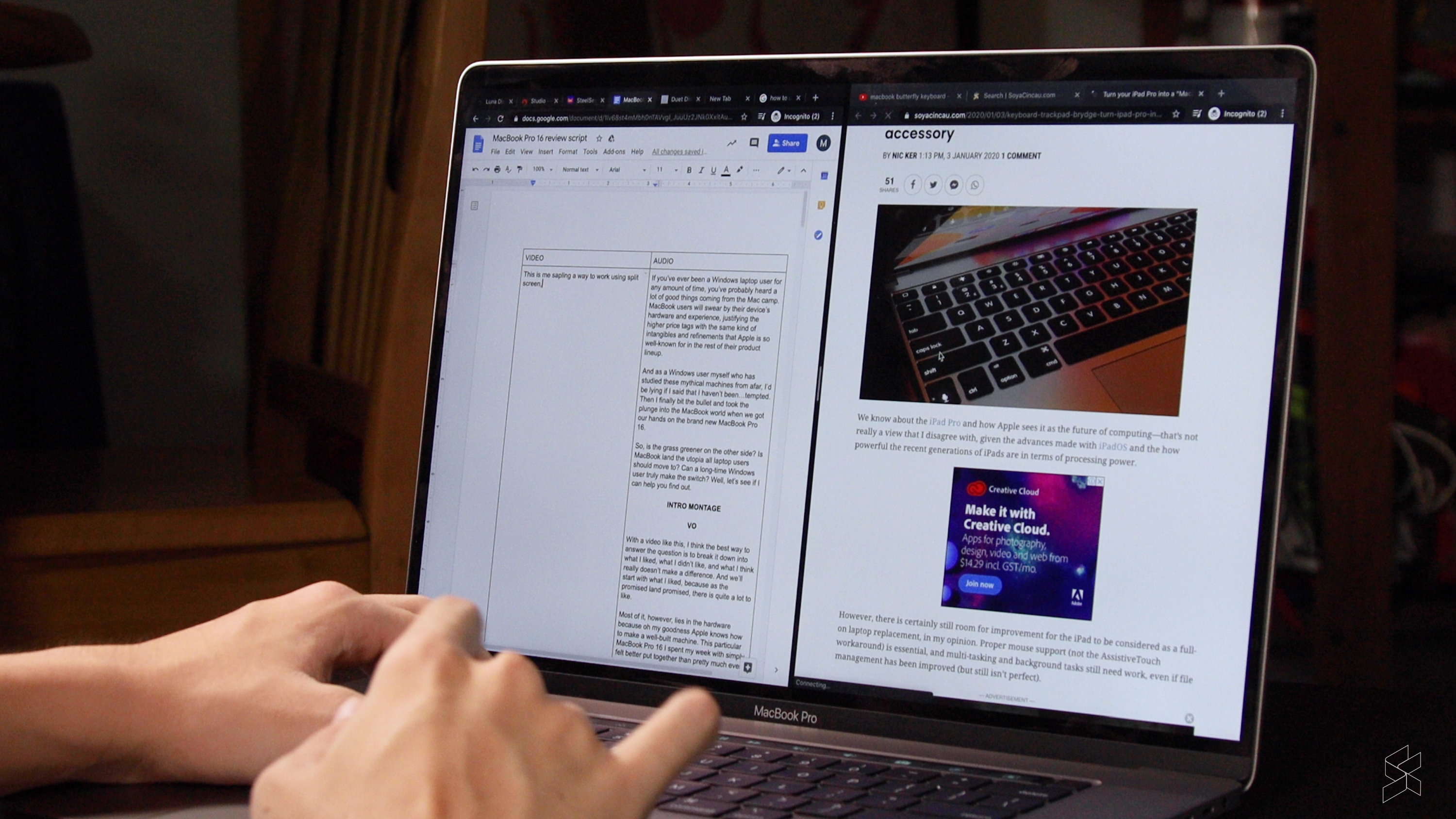
But then I go and try to do it on Mac and I find out that I need to do it on a different desktop altogether? The quickest way I found was to enable full-screen on one window and then go back to the home screen and drag the second window over to the full screen before it snapped into place.
Fine, I guess that’s just how it works in Mac-world, but then when I try to drag a photo from the Explorer app Finder into one of my snapped windows I find out that I can’t have a third floating window in my snapped desktop. So, I had to go back to my main window, grab the photo from Finder, then switch back to the full-screen snapped window and drop it in there. Now, imagine doing that with MULTIPLE full-screen desktops active. Like, I fully understand why every time I see a Mac user do stuff, they just have a whole bunch of windows scattered around their main desktop.
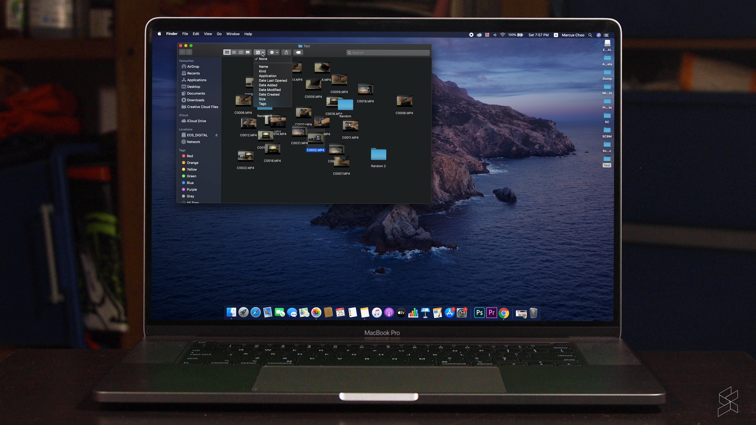
Also, why is the file explorer called Finder but the search function called Spotlight? Wouldn’t it make more sense to use Finder to find things?
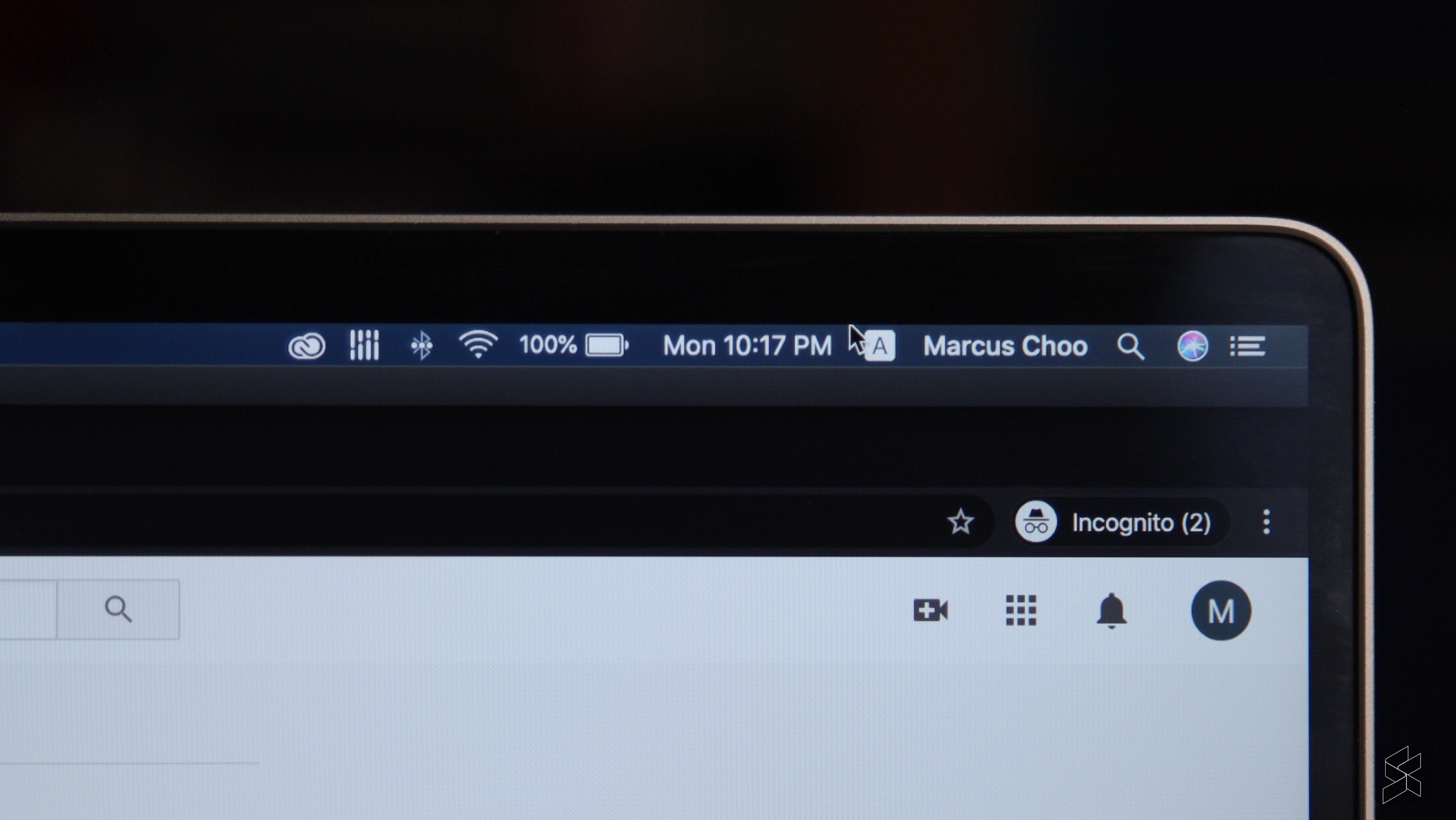
And that’s just the main issue I had with it. There are also a whole bunch of little things that drive me over the edge. Stuff like the time, wireless signals, battery status and other critical information being hidden when you’re using a full screen window. Like, I’m not watching a video or anything, why do you need to hide the time?
File management is also something that Mac users swear by but I personally prefer the Windows solution because my folders will align to grid and auto arrange themselves in Explorer by default. Oh, and if I double click to open a photo in the Windows Photo viewer, I can then scroll through all the photos in that folder without needing to close the window. On MacOS, I need to change the way images display in Finder before I can do that. Like, why? That just messes up the whole folder view for no reason.
But, I think as far as interfacing goes, the biggest missed opportunity with MacOS is the absence of touchscreen input. Looking at those big beautiful icons on the home screen reminded me so much of iPadOS which is basically Apple’s interpretation of a touchscreen “computer”. It also doesn’t help that Launchpad on MacOS looks like a screen if App icons on an iPad!
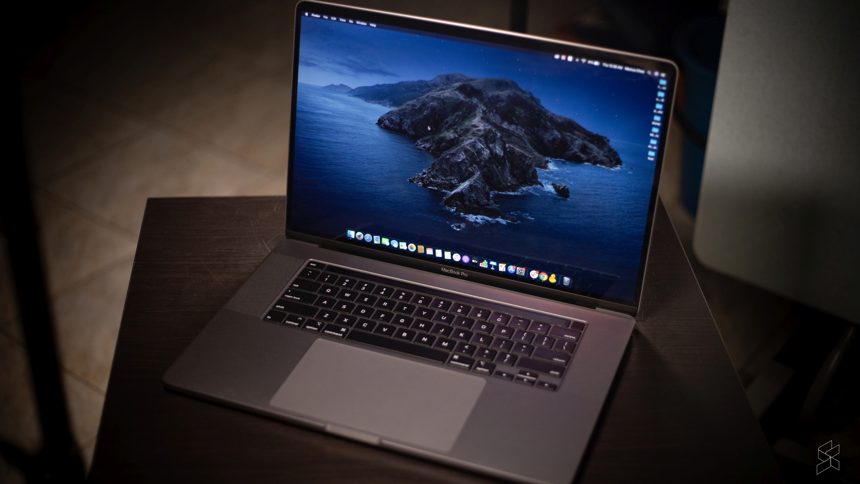
Windows has a horrible layout for touch in this regard, but on MacOS it just seems to make sense to have the ability to tap on those nice big icons.
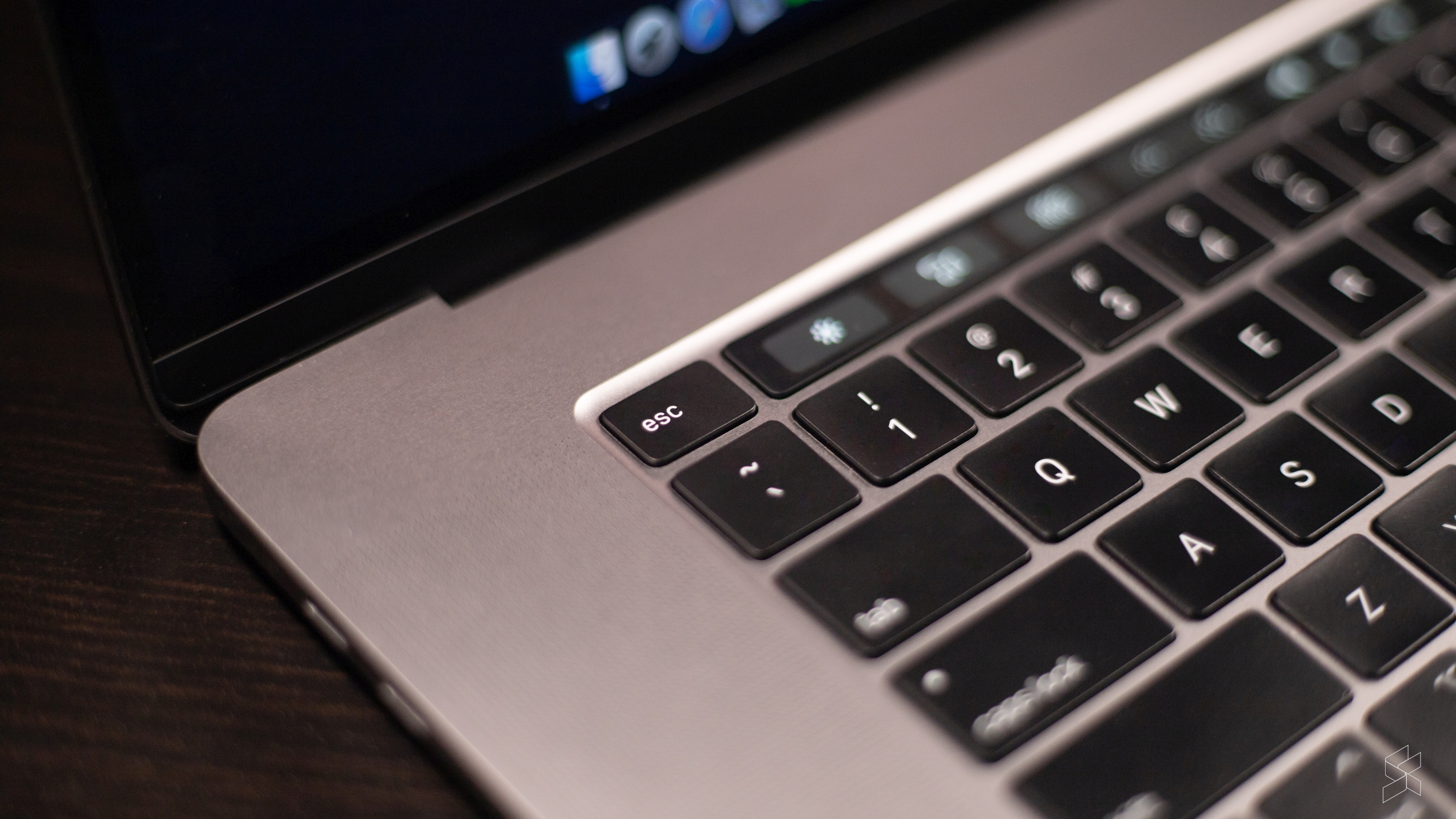
But, all I have instead is TouchBar which is just a huge waste of time. It’s a pretty gimmick, and I think even Apple knows that because with the MacBook Pro 16, they brought back the escape key. Why? Because almost nothing on TouchBar is ever where you expect it to be in any app.
Controls move around all the time, and sometimes a control that executes a function is not always in the same place in other applications. It’s just just not productive in my experience—especially if you’re on non-Apple apps.
That being said, I already know that arguing MacOS versus Windows is like Android versus iOS. It’s a pointless discussion that die-hard fans on both sides will fight to the bitter end to defend.I have no intention of starting any of that. The reason I highlighted all of that is to give existing Windows users who are considering the switch to MacBook a little bit of a heads up.
So, take it as that and let’s put an end to this discussion because I want to move on to some of the things I noticed that Apple has tweaked with the MacBook Pro 16 over its 15-inch predecessor. Now my editor Zach uses the previous gen 15” MacBook Pro the two main issues he’s been facing have been with heat dissipation and the keyboard.
With the MacBook Pro 16, Apple has departed from their problematic butterfly key switches and opted for a new Magic Keyboard. I think that’s the right move with regards to reliability, but I’m not that big a fan of this keyboard. I may be the only person in the world who actually prefers the Butterfly key switches because I love the tactile bump it has. It’s a short travel sure, but it’s so satisfyingly clicky.
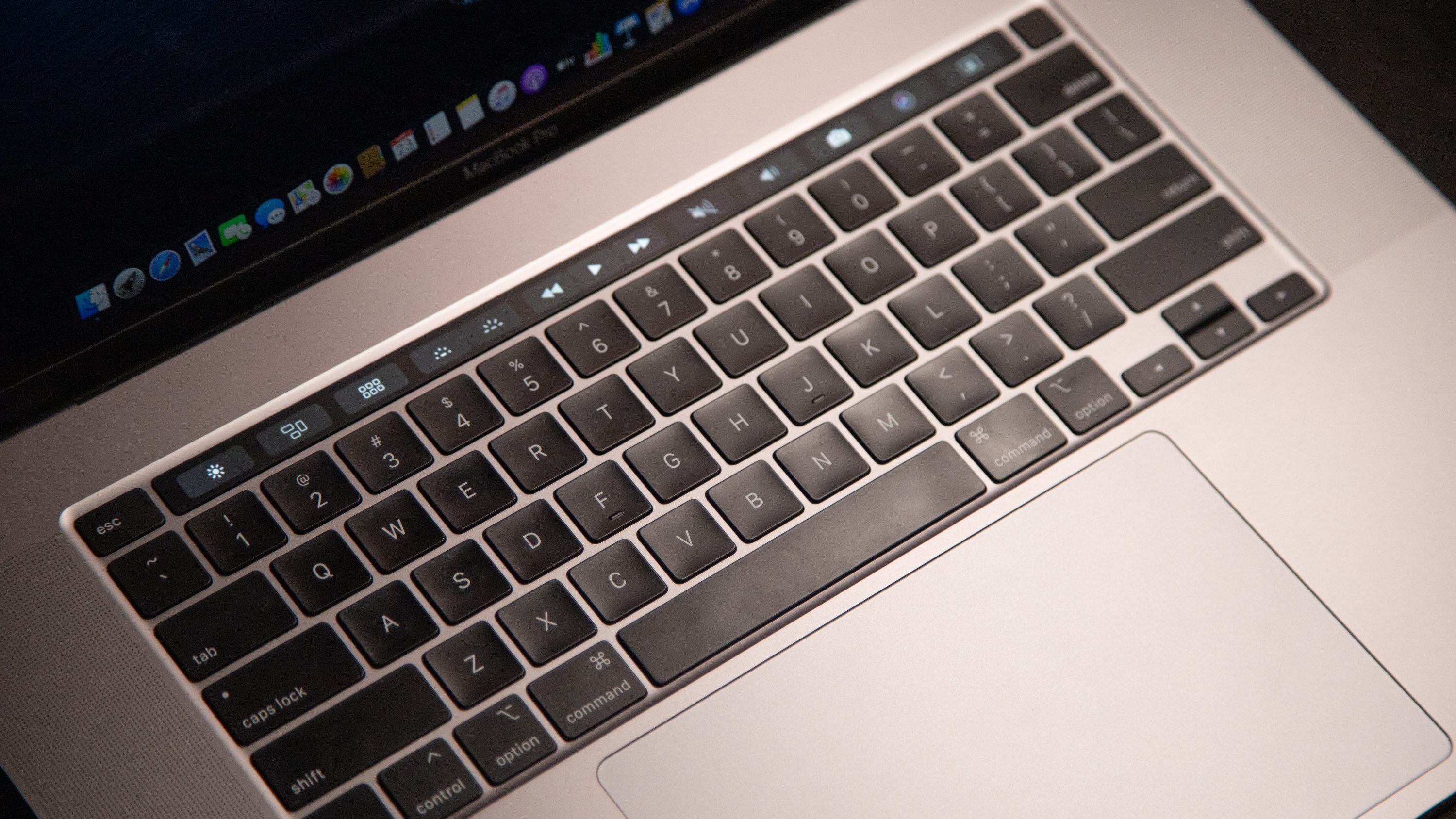
This new one has good travel and has almost no key wobble, but it just isn’t satisfying enough to me. However, I think that Apple has definitely made the right move because this one should be far more reliable in the long run.
I was, however, a little disappointed with the way heat was dissipated on the MacBook Pro 16 because I thought Apple would figure out a fix to the “sweaty palms” syndrome that has always plagued portable laptops. But, no, the deck where your palms rest on still gets hot and your hands will get uncomfortable after prolonged use…y’know, something you’d expect Pros to do. This 16” model doesn’t thermal throttle the way our 15” model does so I guess cooling has been improved here.
Now though, we need to address the elephant in the room. And that’s the price.
The “Apple Tax”
Everyone knows that when you buy a MacBook, you’re going to be paying a premium. The “Apple Tax”, or whatever it is you want to call it, prevents the company from competing in the same performance-per-ringgit that other Windows machines are able to.
Our unit here, with an Intel Core i9, 1TB SSD, 16GB RAM and AMD Radeon Pro 5500M will set you back a whopping RM12,199. And even if you want an entry-level model, you’ll have to fork up at least RM10,499. And it’s powerful, for sure, but if you’re editing on Premiere Pro like we are, I’d wager that a similarly specced Windows machine with NVIDIA GPUs will give you a similar, if not better, experience for less money.
But you’re not buying a MacBook Pro just for raw performance-per-ringgit. You’re also paying for the amazing speakers, incredible build, if you’ve got an iPhone or iPad, how well it works with the other stuff in the Apple ecosystem. For me, I guess the perfect laptop would be a combination of the phenomenal hardware from the MacBook Pro as well as all the convenient productivity things I love about Windows. But that machine doesn’t exist just yet. At least, I haven’t found it.
So, for now, to answer the question we posed earlier, I don’t think that the MacBook is the utopia all laptop users should go towards. And for this particular long-time Windows user, I won’t be making the switch.
But, I can definitely see how a Windows user with a different workflow than mine might actually prefer MacOS over Windows. Amin, for example, has made the switch to a MacBook Air and has not looked back. He says that the interface is designed in a way that makes it easier to focus on one task at a time instead of jumping from window to window.
Of course, his workflow isn’t quite as multitask-heavy as mine, and mostly consists of looking at documents, decks, spreadsheets and emails.
But, I’d love to hear your thoughts in the comments below.
Photography by Marcus Choo with the Canon EOS RP.

