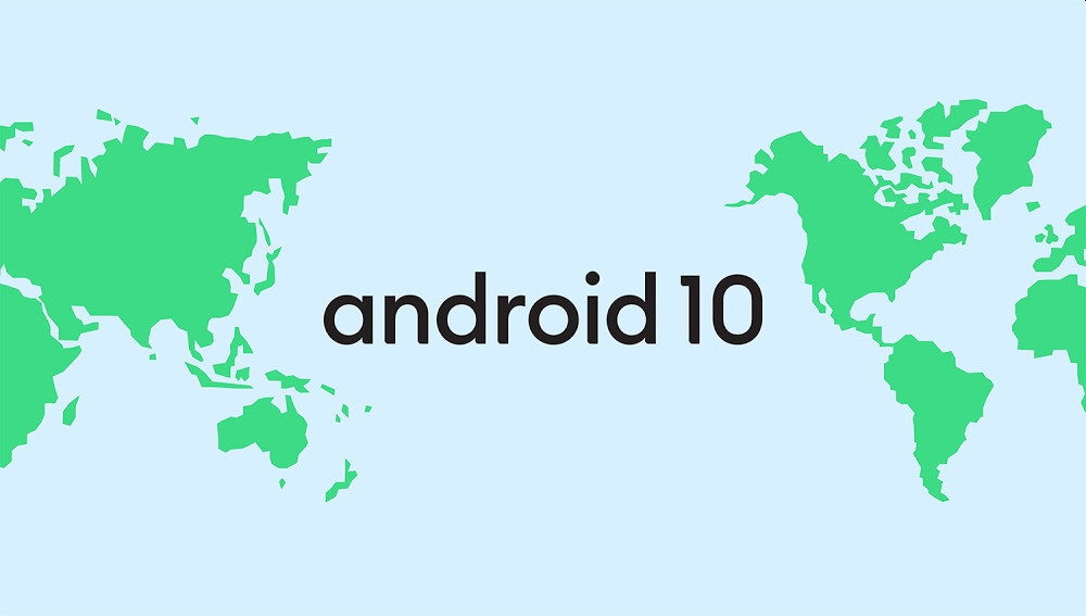
This is it. The end of an era. An era that spanned generations of users, smartphones and software versions. Android, as you and I know it, is dead. Google is finally killing the sweet-treat-theme and giving the Android a brand revamp that includes changing the font and text colour of the logo, as well as beheading everyone’s favourite robot mascot.
OK, maybe I’m being a little melodramatic here, but I just don’t handle change very well alright? In any case, Google dropped a bombshell today when it announced that they’d be completely updating the Android brand, including the discontinuation of a fan-favourite feature.
Android Q will simply be called Android 10.

Yes, no more sweet treats. No more quiches, quesadillas or quinoa. Android is officially dropping the name and fully embracing the number…like ever other boring piece of software out there. But, as much as I’m a little upset about this, Google does make some valid points. According to the search engine giant, they’ve received a bunch of feedback about how these names are just not connecting with everyone around the world. And that makes complete sense because you can’t expect everyone everywhere to speak and understand English, after all.
I know, you must be thinking: “But if they drop the name, couldn’t they keep the letter?”. Well, even that’s a little complicated as Google explains that letters like L and R aren’t distinguishable in some languages–something I, as a Malaysian, completely understand. So, when they were trying to talk about Android Lollipop, or Android L, Google said that it wasn’t intuitively clear that it referred to the version of Android after KitKat.
In addition to that, not all sweet treats that Google’s considered a dessert are really desserts everywhere in the world. Case in point: Pie.
So I guess if you think about the fact that Android is expanding its reach into more and more countries around the world, it makes sense to have a cleaner, more logical progression to their version updates. But, Google didn’t stop there because–as I alluded to earlier–they also updated the wordmark.
The font is now slightly different, and in a completely different colour: Black. Additionally, the Android android had its body removed from its head so it’s now just a semi circle with two antennas sticking out of it and two holes cut into its “face”. They even changed the shade of green!!
Google says that this is because the previous green text was a little harder to read for people with visual impairments–again, absolutely reasonable.
In all seriousness though, I think the new look and logo looks pretty clean. It’s contemporary, and definitely a sight better than that first version of the Android logo with the half cut letters. Gosh, that looks so cringe-y in 2019.

The thing that I’m the most sad to see die is the sweet treat naming convention. For people like us in SoyaCincau, it’s always fun to try and guess what sweet treat Google would call their next Android version, then get mad when we didn’t get it right. I guess you could say that the sweet treats were a little more than just something to call the next version of Android.
But, while I think it’s perfectly reasonable for Google to want to make Android more inclusive by reverting to just version numbers, maybe the truth is more simple than that. Maybe they just couldn’t think of a good dessert to call Android Q.
What would you have called Android Q? Let me know in the comments below!
[SOURCE]


