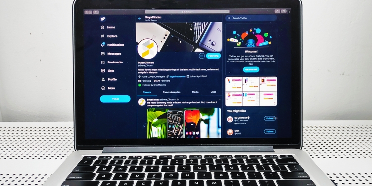
Twitter’s desktop client has been due for a redesign for some time now, actually. The tech company earlier teased the upcoming update with a message on its platform—“A whole new Twitter is coming”—and will feature not only a new format, but also a host of new tools.
And the update is now here. According to Twitter, the updated desktop interface will make it easier for users to navigate the site better, while more customisation options are now available.
Twitter tells us that the updated features have been in the works for awhile, with tests receiving hundreds of thousands of responses that have been taken into account for the revamp.
A quick breakdown of the new features
- Twitter is finally bringing over the “Explore” feature over from its mobile apps to desktop, with more live videos and personalised content becoming more accessible on the desktop client.
- They’ve moved the top navigation bar over to a sidebar on the left, which will contain bookmarks, lists, your profile, and of course, Explore.
- Direct messages have been revamped—you can view your conversations and send messages all in one page now.
- Switching between multiple profiles can also be done via the sidebar.
- Customisability options now include two new dark mode options, as well as different themes and colour schemes.

Twitter’s move to bring over popular features from its mobile apps is welcomed by most, with users particularly enjoying the “Sparkle” button that allows for your Twitter timeline to be displayed in chronological order (remember when that used to be a default?). And based off a day with the new Twitter desktop client, perhaps the public baying for a macOS Twitter app of its own will quieten down.
[ SOURCE ]


