While everyone’s caught up in the whirlwind of folding smartphones and other fancy impractical technologies, Xiaomi launched their flagship Mi 9 handset for the global market. Now, I love fancy impractical tech as much as the next person, but I cant help but be psyched when someone launches a seriously good smartphone at a seriously good price.
And we all know that if you’re talking about a Xiaomi smartphone, it’s going to be at least one of those two things. So, let’s find out how well the Mi 9 holds up.
And the Xiaomi Mi 9 is definitely one worth getting excited for.
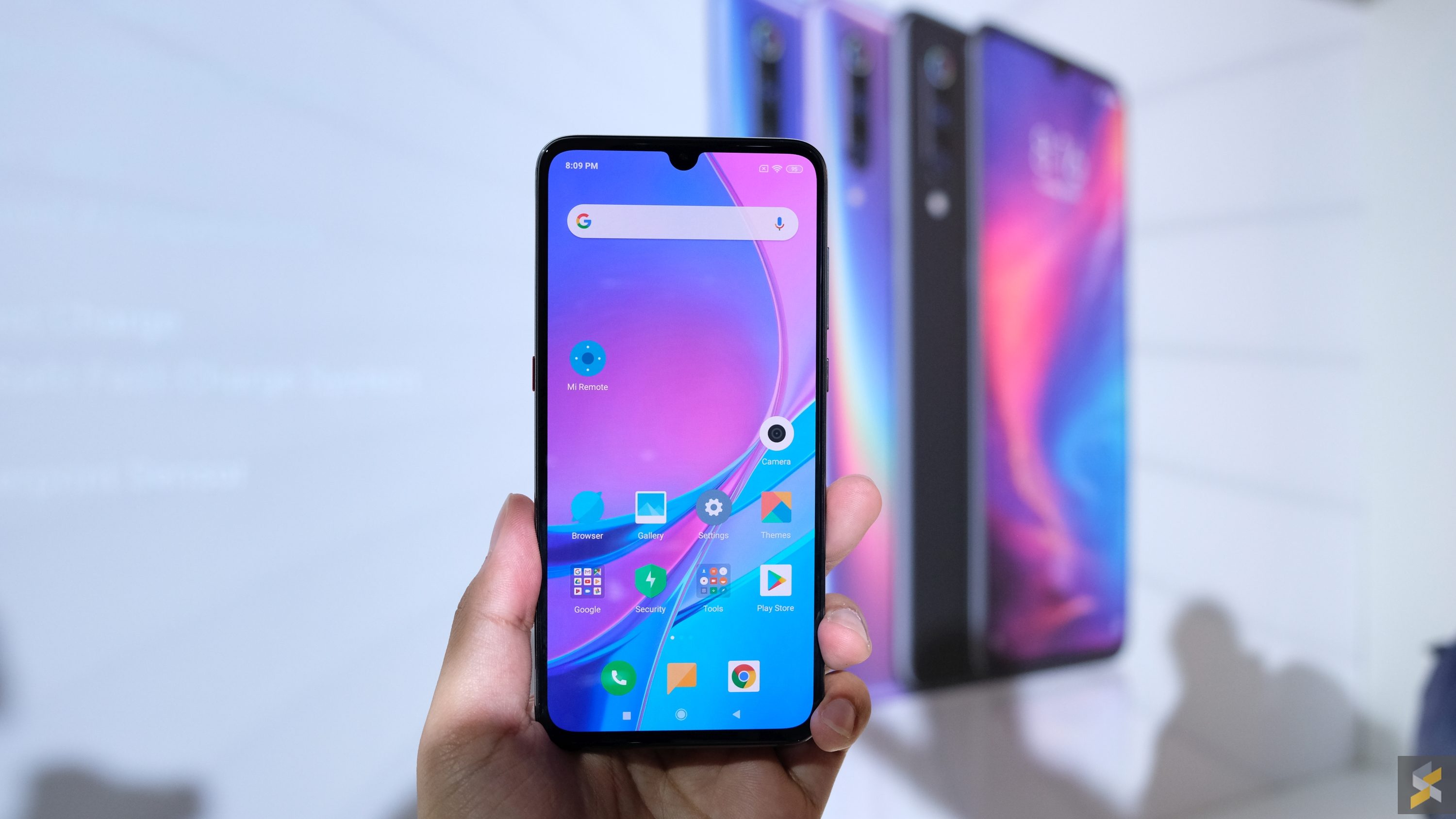
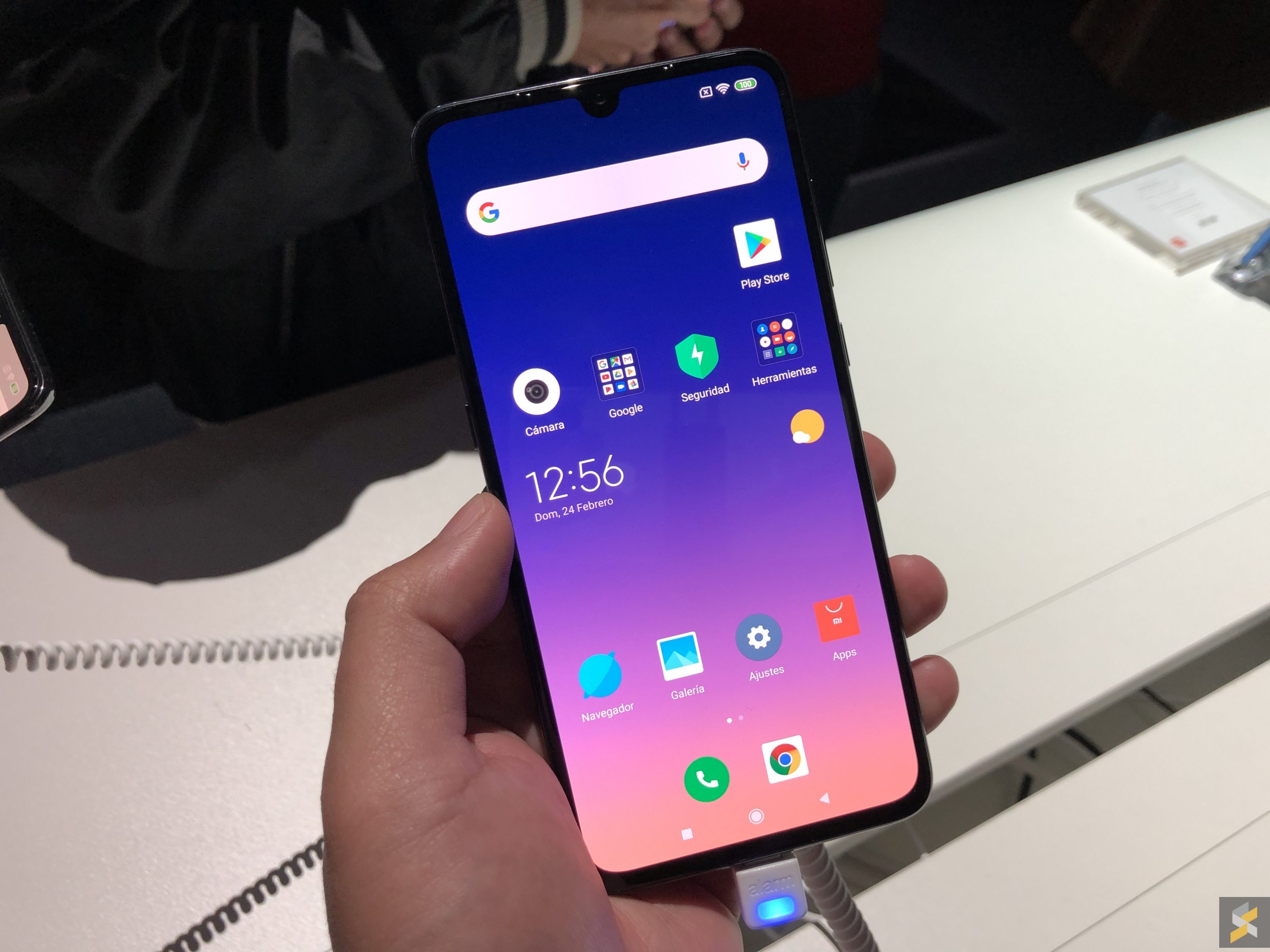
Let’s start with the basics, the thing Xiaomi always nails: Specs. The Mi 9 is the successor to last year’s Mi 8 and it gets upgraded in a lot of the right places. Up front, the Mi 9 gets a larger 6.39″ AMOLED display that pushes a resolution of Full HD+. The most noticeable thing about this screen, besides the larger size, is the fact that its notch is a lot smaller than what we saw on the Mi 8. It helps it move away from being called an iPhone X clone, and I’m sure a lot of notch haters will appreciate this change. However, I’m a little surprised that Xiaomi didn’t jump on the whole punch-hole display bandwagon.

But the larger size and smaller notch aren’t all that the display has in store for you. Yes, it’s a solid looking panel that’s nice, vibrant and has solid viewing angels, but it also houses an in-display fingerprint scanner. Unfortunately, it’s not an ultrasonic one like the one you’d find on the Galaxy S10, with Xiaomi opting to remain on the optical scanner route. Now I’m always a little sceptical when it comes to in-display fingerprint scanners because the ones I’ve used have all been rather awful. Xiaomi says that theirs is 25% faster than the one on the Mi 8 Explorer, but honestly that’s not saying much either. It’s too bad that the devices on display were running demo software so I couldn’t give this a try, so I guess I’ll have to remain a little sceptical until I do.
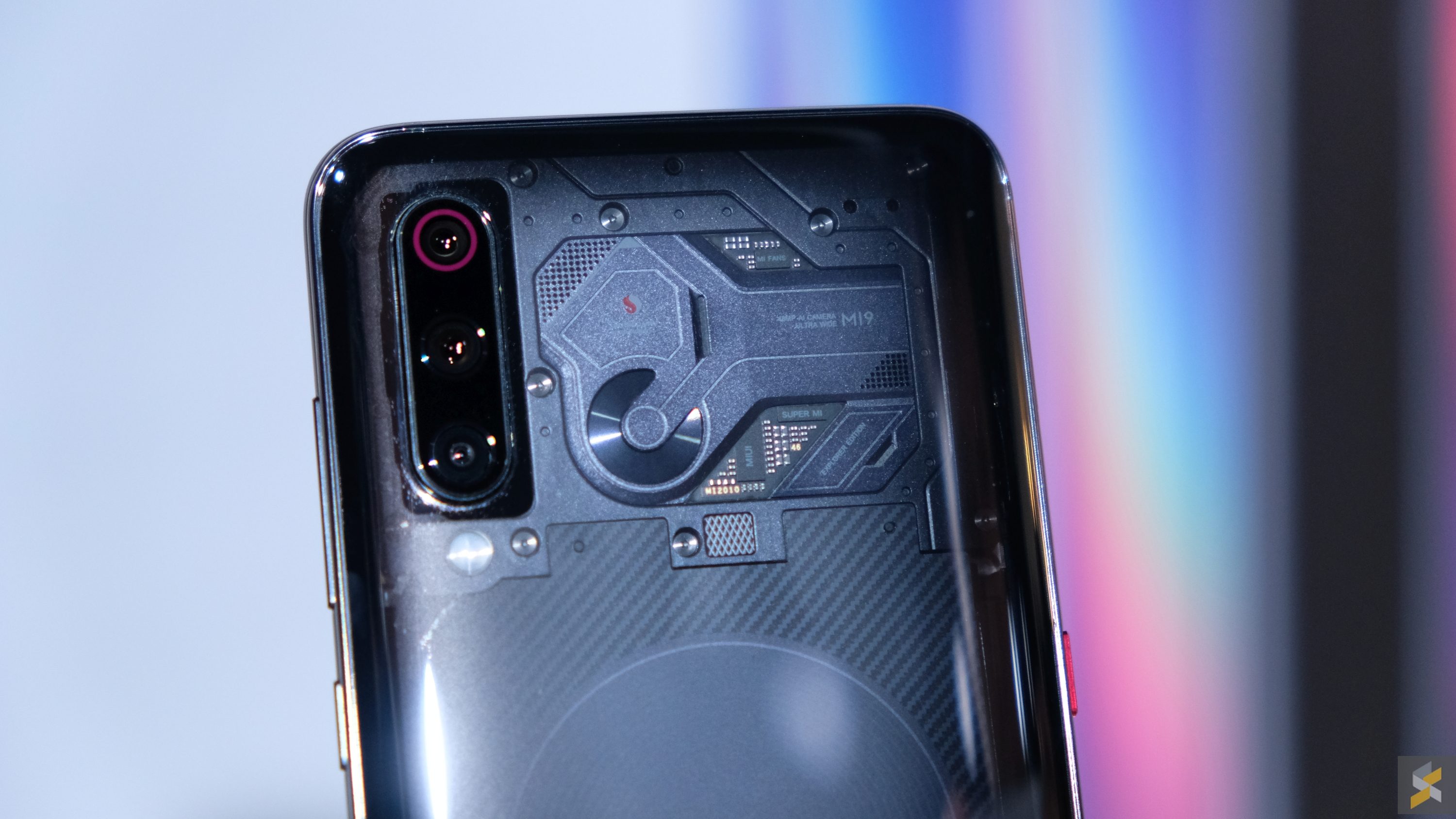
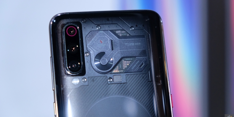
Mi 9 Transparent Edition
Inside though, Xiaomi’s packed this device with some of the best smartphone components you can find. The Mi 9 is powered by a Qualcomm Snapdragon 855 processor that’s mated to 6GB of RAM and either 128GB or 256GB of internal storage. It doesn’t come with some dated Snapdragon 845, so that’s great news. And performance on the demo device felt solid. Everything was snappy and launched quickly, so there’s really not much to complain here. That being said, these demo setups don’t reflect practical daily usage, so that will still have to wait for a full review.
As will the battery life from the Mi 9’s relatively small battery. This flagship handset only packs a 3,300 mAh battery, and that’s super disappointing to me. Of course, what matters in the end is how long the phone will last on a single charge, but I can’t help but be a little upset that it isn’t a 4,000 mAh cell keeping the lights on in the Mi 9.
The good news is that Xiaomi’s equipped this handset with some seriously fast charging. Wired fast-charging via the USB-C port supports 27W fast-charging as well as Qualcomm’s QuickCharge 4+, so that’ll top the handset up in a jiffy. But the truly impressive feat is the wireless charging. The Mi 9 supports 20W wireless fast-charging that the company says can fully charge the handset in just 90 minutes. That’s the charging speed most handsets have over wired fast-charging solutions.
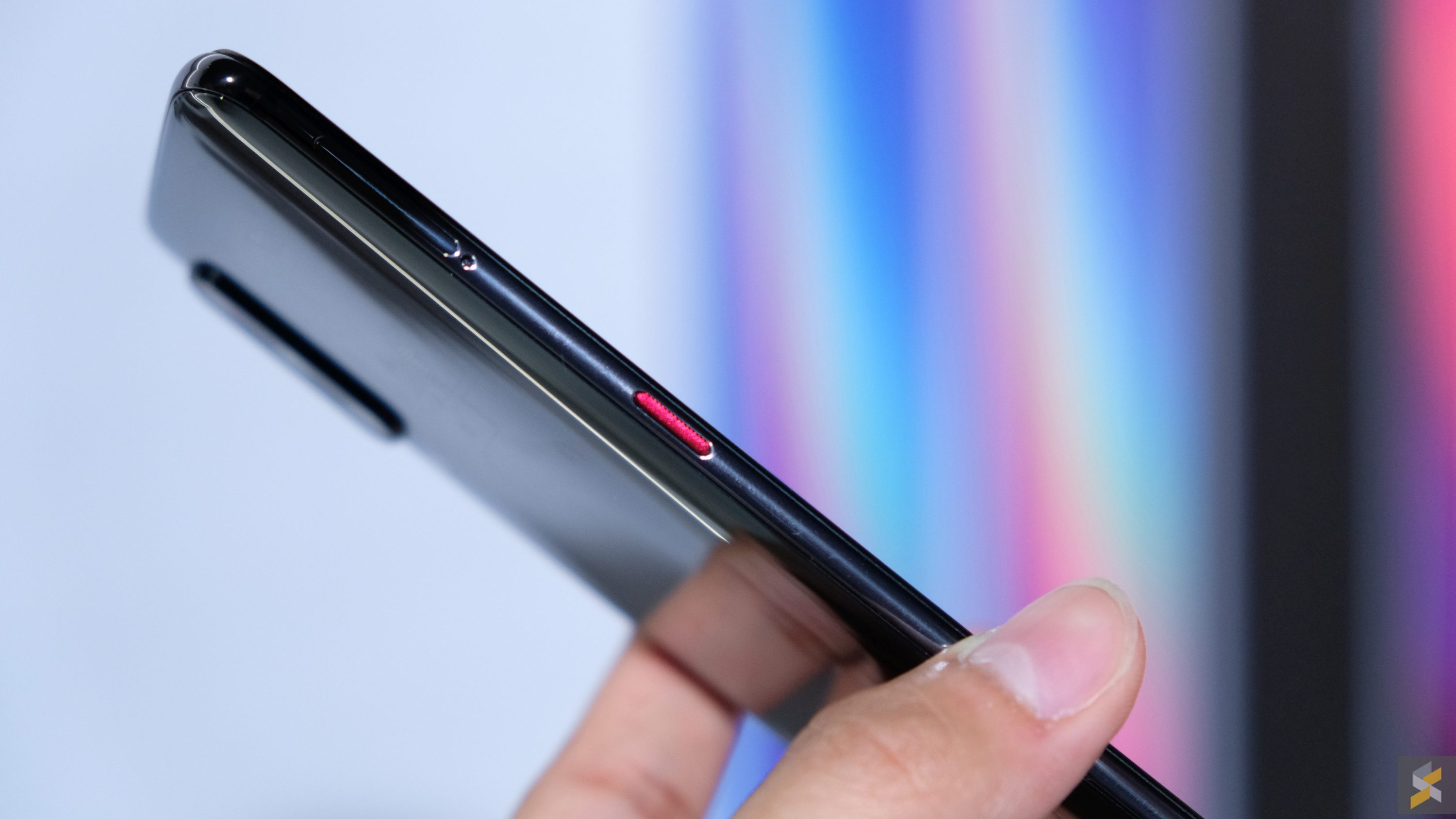
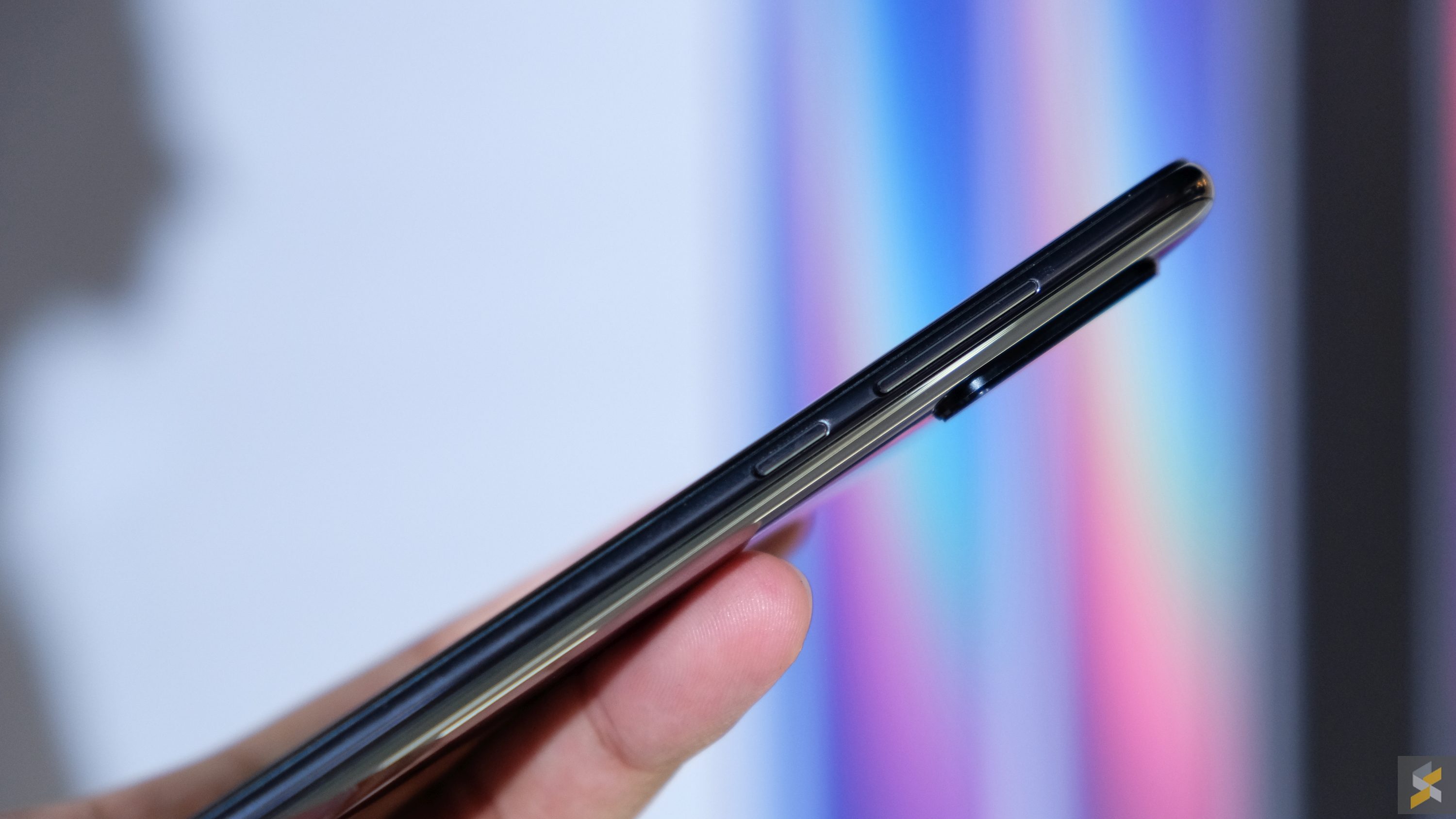
Besides the internal updates, Xiaomi’s also tweaked the smartphone’s body and its camera system. Let’s start with the body. Unlike the Mi 8 — which was curved at the edges, but had a flat back — the Mi 9 is curved all the way from one edge to the other. Now, I’m not sure how I feel about this move because a rounded smartphone tends to rock on the table, but I have to say I love how comfortably this large handset fits in the hand. The thing that caught me off guard was also how light this smartphone is. It feels about as well built as you’d expect a Xiaomi flagship to feel, but the lightness definitely loses the Mi 9 points in what I’d call the “exquisite heft” category. Then again, this is something I’m sure not many people will care about — unless you’re part of #teamheft (this is something I’ve made up literally right this second) — so the lightness is probably a pro for you.
But simply curving the back of the phone wasn’t all Xiaomi did. They also treated it a little differently with a number of layers, made up of materials I’ve never heard of before today, so that when light hits the back of this smartphone, it will spread across the device in a gorgeous rainbow pattern. Now I assume it looks very cool in real life, but I can’t really confirm this because — as far as I could tell — every smartphone at the event was a Piano Black Mi 9. They didn’t have the Ocean Blue or the Lavender Purple colourways on display.
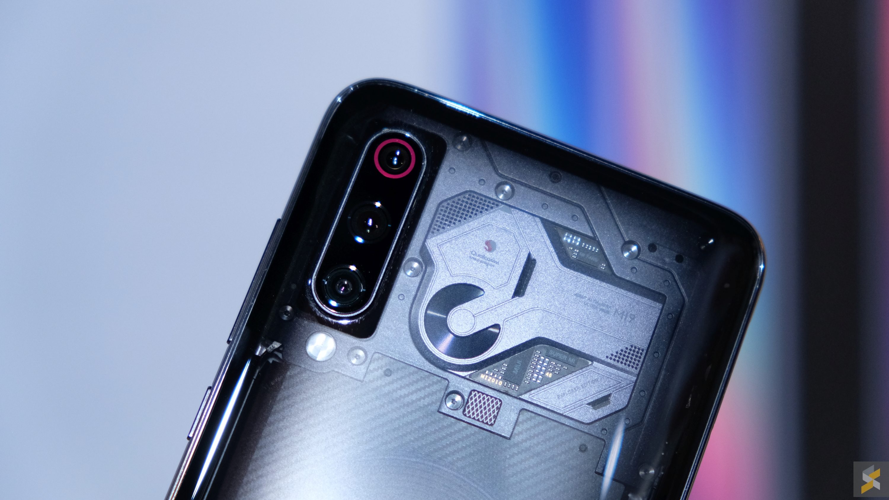
Mi 9 Transparent Edition
In any case, let’s move on to the camera, which is one of the more talked about things on the Mi 9. Why? Well, this handset is the first smartphone Xiaomi’s produced that has a triple camera setup. What’s more, this camera system also received the second highest score on DxO Mark (at the time of writing), pulling in 107 points overall. This puts it just behind the 109 top score that’s split three ways between the Mate 20 Pro, P20 Pro and Samsung Galaxy S10+. However, the Mi 9 beats all three of those smartphones — and every other smartphone in the market right now — in the video test as it scored a top score of 99 points.
Those are impressive numbers, no doubt. But, I’ll reserve my judgement until I’ve had my own chance to give this camera a proper go. The event hall wasn’t really an ideal testing ground because the lighting was rather atrocious and there really aren’t many scenes to shoot in.
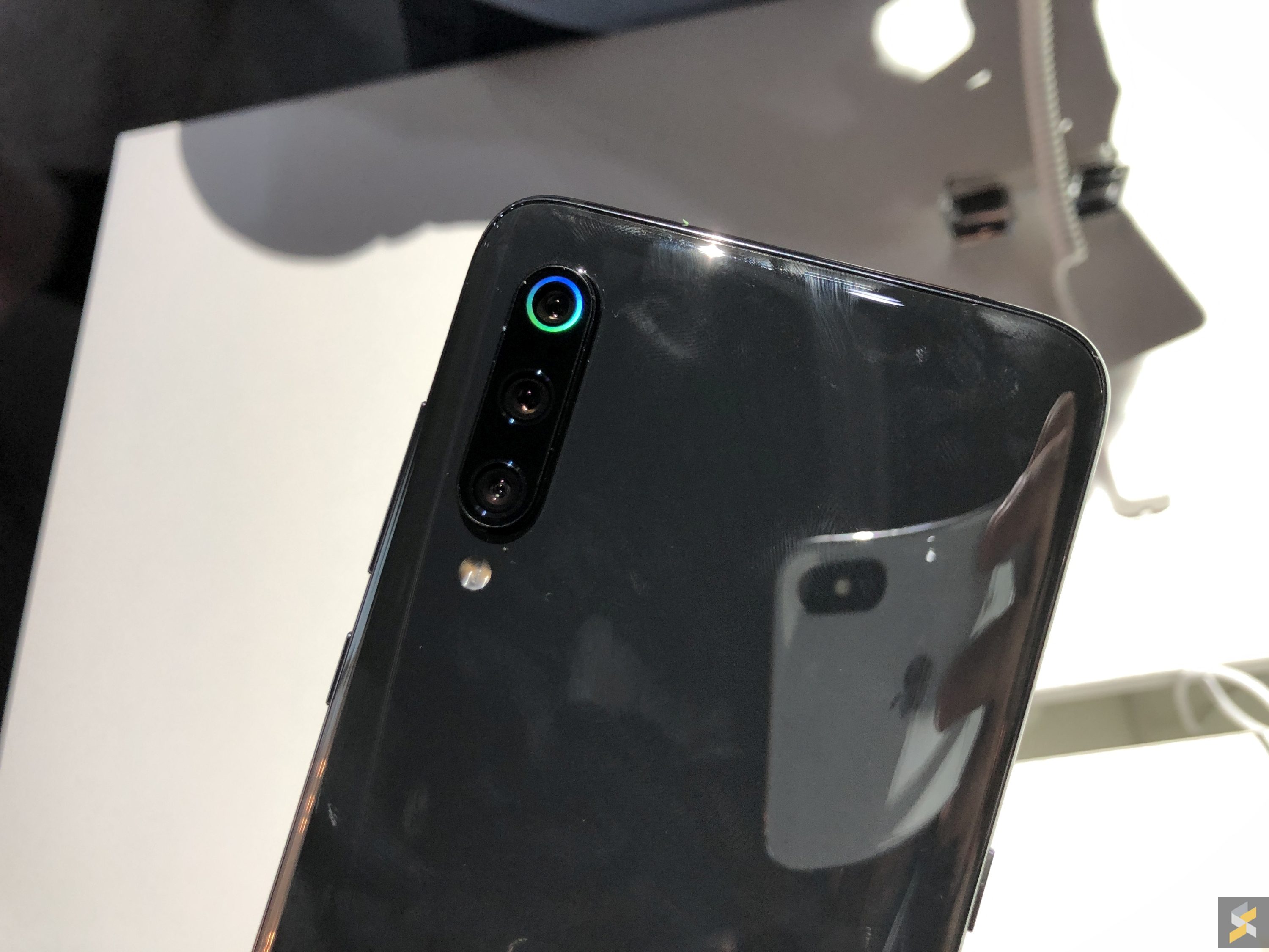
I will, however, say that I like the direction Xiaomi took with their triple camera setup. Much like something like the Galaxy S10 or the Huawei Mate 20 pro, the Mi 9’s triple camera setup consists of a telephoto, a wide and an ultra wide. More specifically, the Mi 9’s got a 12MP f/2.2 aperture 2X telephoto camera, a 48MP f/1.75 aperture wide-angled camera and a 16MP f/2.2 aperture ultra-wide camera.
Again, I can’t speak for the quality of the images because I couldn’t even pull the photos I shot out of the smartphone, but at first glance they look plenty solid. I will, however, comment on the single most unintuitive thing about the camera experience, and that’s the camera app.
I wasn’t a huge fan of the camera app to begin with, but when I saw how Xiaomi handled the transition between the tree different cameras, I was a little triggered.
Let me give you an example of how Huawei handles the triple camera setup. With the Huawei camera app, you’re able to switch between all three focal lengths from a single zoom slider. So you launch the camera app and it puts you in the 1X regular wide-angled camera mode. Then, if you want to zoom out into the ultra-wide, all you had to do was pinch to zoom out and you’re immediately thrown into the ultra-wide lens. The same works for zooming in: Just pinch in the other direction and you’ll zoom in cleanly. Alternatively, you could just tap on the single zoom toggle to switch between the focal lengths — easy.
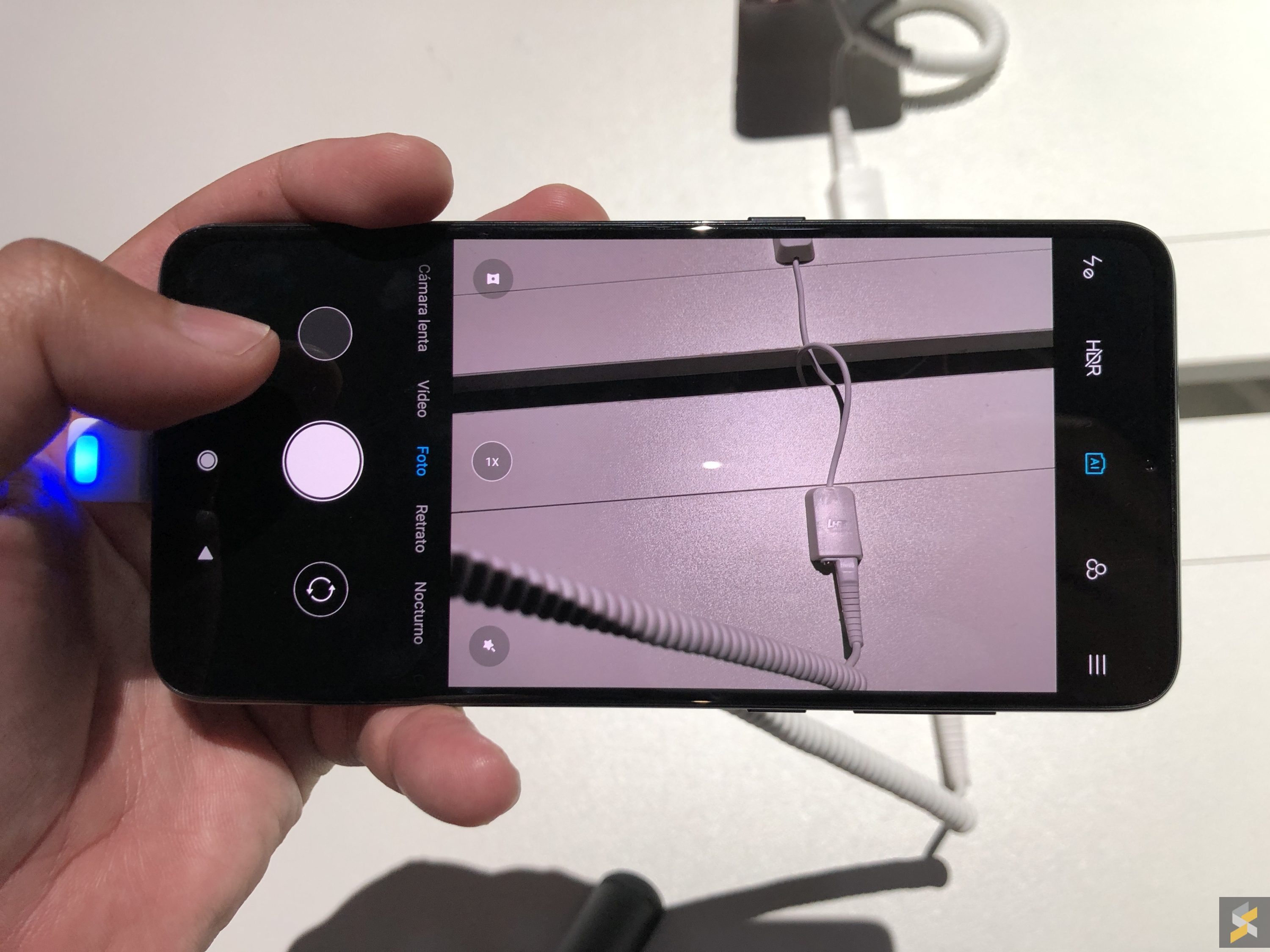
On the Mi 9, it doesn’t work like that. Instead, if you want to switch to the ultra-wide, you have to tap on a dedicated ultra-wide toggle that’s not the same toggle you use to zoom. You can’t pinch to zoom out, you cant slide to zoom out, you have to hit that button. Then, if you want to go from ultra-wide to 2X zoom, you can’t pinch to zoom either. Instead, you have to “turn off” the ultra-wide mode then tap the 2X button or pinch to zoom in. Why must it be this convoluted?
Then, you’ve got the new full-body portrait mode that lets you take portrait photos with the Mi 9’s ultra-wide camera. When you switch to portrait mode on the camera mode carousel, you can’t then tap the ultra-wide button to switch to full-body portrait because that button doesn’t exist in Portrait. Instead, you have to tap a different toggle at the top of the camera app, called full-body portrait. Once you’ve done that, then you’ll be able to capture full-body portraits.
I can’t understand why this needs to be this complicated. Maybe the unit I was testing had some super beta/alpha software or something, but the entire experience was deeply unintuitive. The good news is that I believe all of this is easily patchable in future software updates. And I do hope Xiaomi will at least consider a more intuitive interface for switching between their camera modes when this device eventually sees its commercial launch in Malaysia. Because I really don’t want to dwell on this beyond my little rant here.
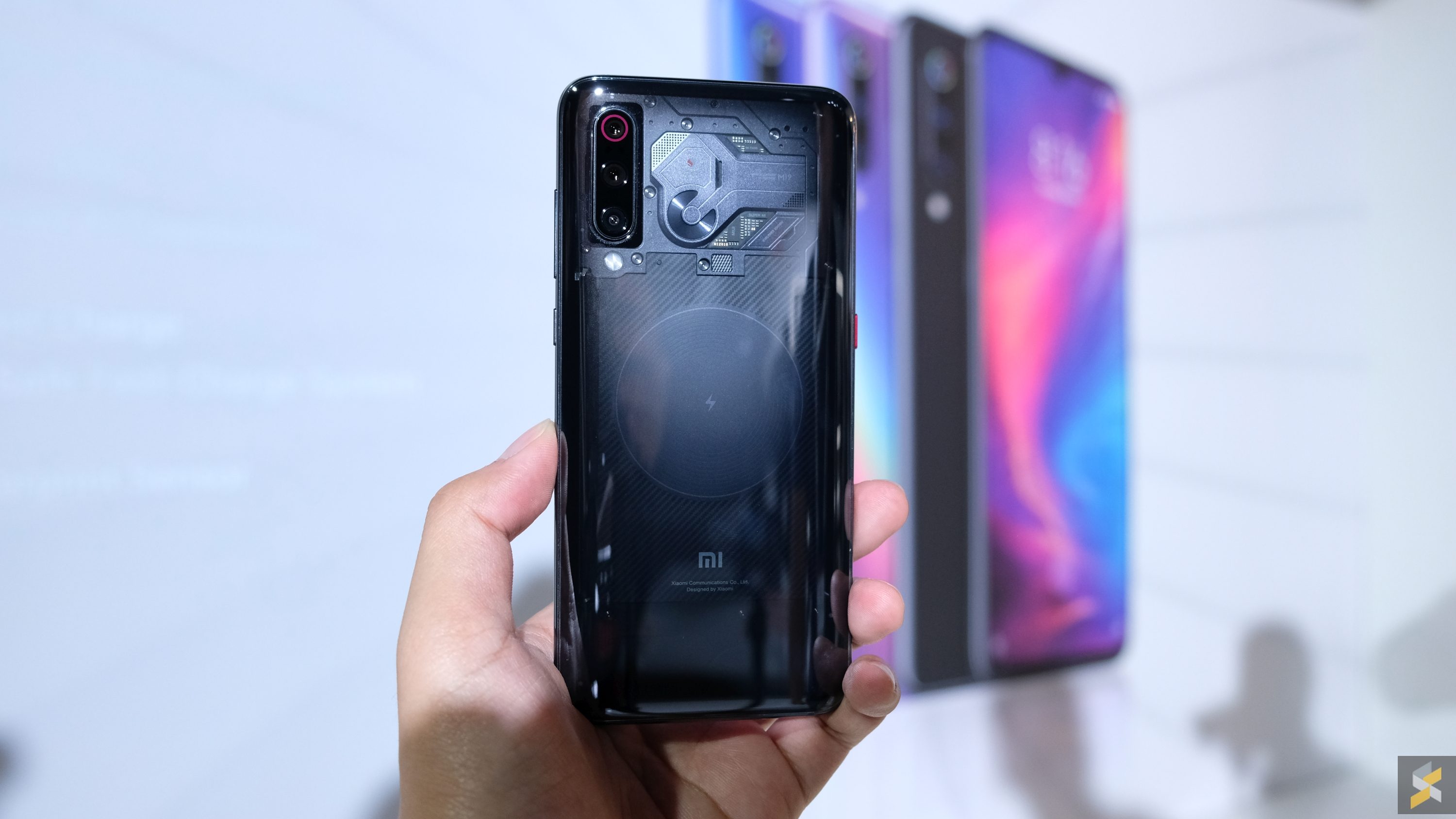
Mi 9 Transparent Edition
And also because the rest of the Mi 9 is a fabulous smartphone — I think that much is obvious when the worst thing I can say about it right now is that it has an unintutive camera app. Sure, there are a couple more annoyances like a lack of IP67/68 water resistance, a lack of stereo speakers and a lack of a 3.5mm headphone jack. But those are things many other — more expensive — flagships also lack. So the fact that you’re getting this much smartphone for what is likely a price tag that’s below RM2.000 is nothing short of awesome. Then again, this is just classic Xiaomi, isn’t it?
Still, I don’t have any official information on when this smartphone will be coming into Malaysia — beyond a “very soon” — nor do I have any official information on how much this device will be priced when it does come to our shores. But, if you look at how much the Mi 8 retailed for, I think you can expect it to be relatively close.
Photography by Hanif Azrai and Rory Lee with the iPhone X and Fujifilm X-T20.

