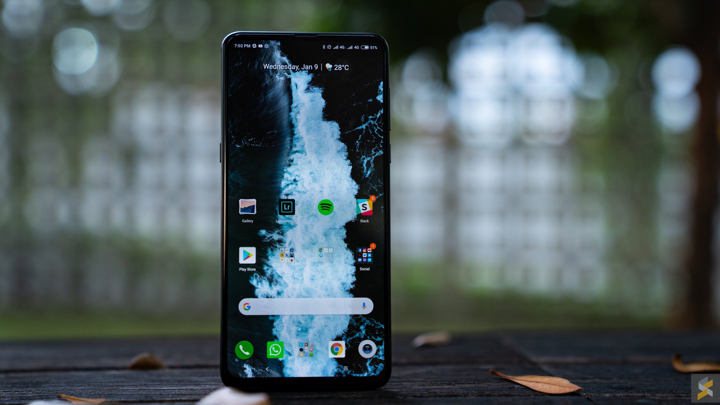
Some phones change the world, or at the very least, they change your perspective on what a phone should be. Others, change to fit a mould. The kind of device that’s designed to maximise what is known to sell, and sell as many as possible. With Xiaomi’s Mi MIX line of smartphones, they’ve given both of these approaches a try.
First, there was the famous, jaw-dropping Xiaomi Mi MIX, which pretty much defied convention with its unorthodox approach to screen bezels. Then, there was the “made-for-the-masses” Mi MIX 2 (and MIX 2S) which reined in some of the original MIX’s craziness to help it be a more sensible smartphone. And, although I think they’re polar opposites, I’ve come to see that they’re actually both sides of the same coin.
There are often two schools of thought when it comes to innovation: Innovating with customer feedback, and innovating without. And, looking back, it was very clear which MIX fell where. Which is why I was more than a little concerned when I heard that there would be a Mi MIX 3 — because I didn’t know which side it would take. Personally, I’m someone who likes to be amazed — especially when it comes to the high-end. I love it when manufacturers push boundaries and introduce risky new ideas or concepts that I probably wouldn’t even have thought of.
If I had asked people what they wanted, they would have said faster horses.
Not Henry Ford, apparently
That is part of why I loved, and probably always will love, the original Mi MIX. And also why I never really enjoyed my time with the MIX 2 (and 2S). I didn’t think that they needed a phone like the Mi MIX 2 because they already had the sensible, moneymaker smartphone in the Mi 6. It almost felt like they had abandoned the initial idea of experimentation in favour of churning out yet another moneymaker, and that was very disappointing.
When I finally got my initial hands on with the Xiaomi Mi MIX 3, I was so glad to find that they brought back some of that magic — some of that pizzazz — that made the first MIX so special. That said, I also get that while I could wax poetic about how “special” a smartphone is, not everyone is willing to buy a “special” phone if it also isn’t something you can use every day. That there are people who prefer the other side of the coin. I guess this is what maturity feels like.
But enough about me. I know that you’re all here to find out if the Xiaomi Mi MIX 3 falls on the side of coin you prefer. And if you ask me, I think it’s got enough of both to please both sides.
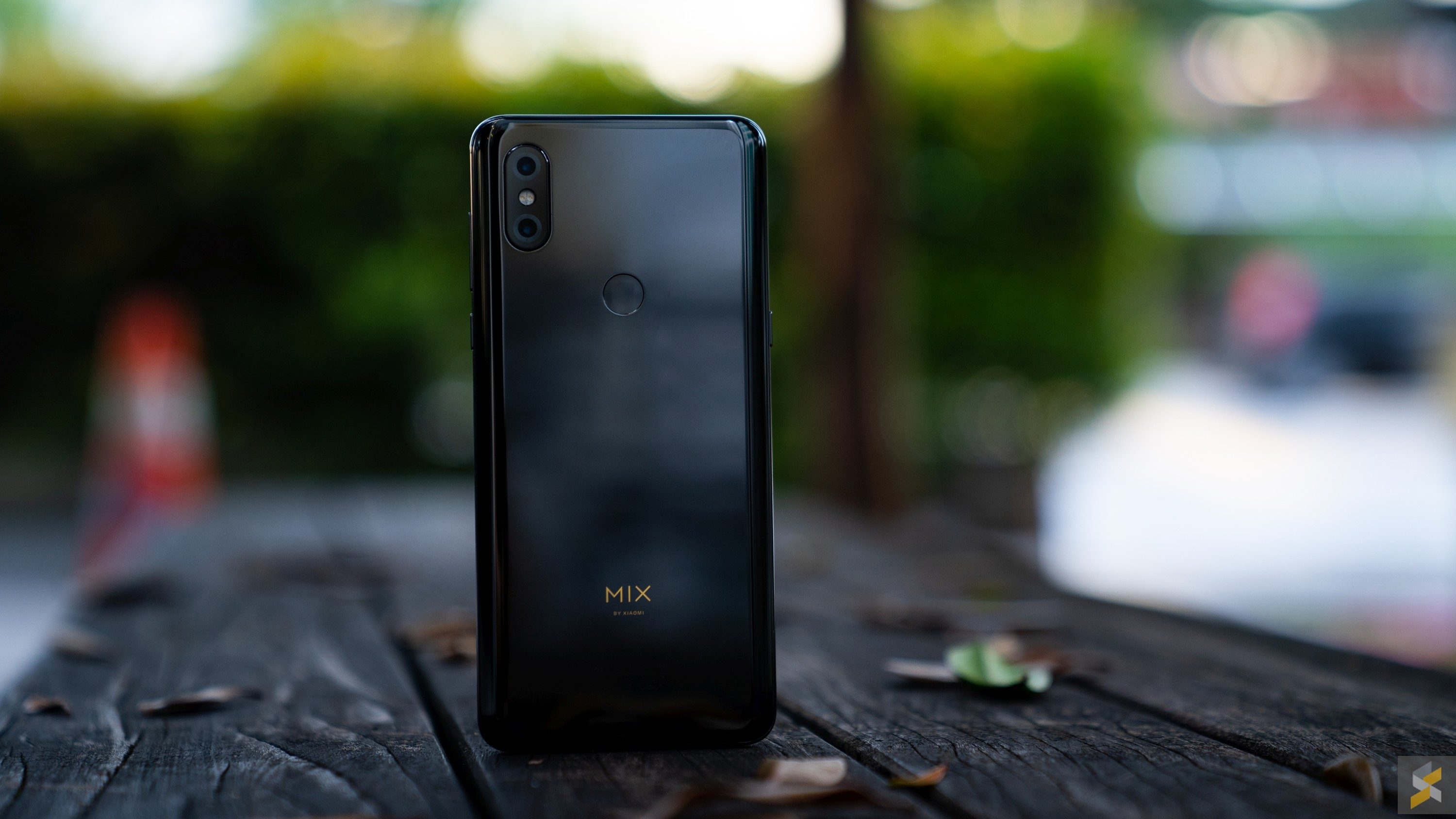
A 2018 powerhouse
Let’s start by getting the first big concern out of the way: Its processor. Xiaomi’s Mi MIX 3 is a flagship smartphone by pretty much all definitions. However, since this phone launched back in October of 2018, its internals aren’t quite as 2019 as some of you might like. There’s a Qualcomm Snapdragon 845 processor at its heart and, in Malaysia, you can pair that with 6GB of RAM and 128GB of internal storage. Personally, I’m not even slightly bothered by the fact that it has Qualcomm’s 2018 flagship mobile processor, because the performance on Xiaomi’s Mi MIX 3 is nothing short of stellar. Coupled with the well-optimised MIUI 10 Android skin (built on top of Android Pie) everything was buttery and smooth. I didn’t encounter any performance issues or bugs during my week and a half with the smartphone, which is mighty refreshing compared to the previous devices I’ve been using.

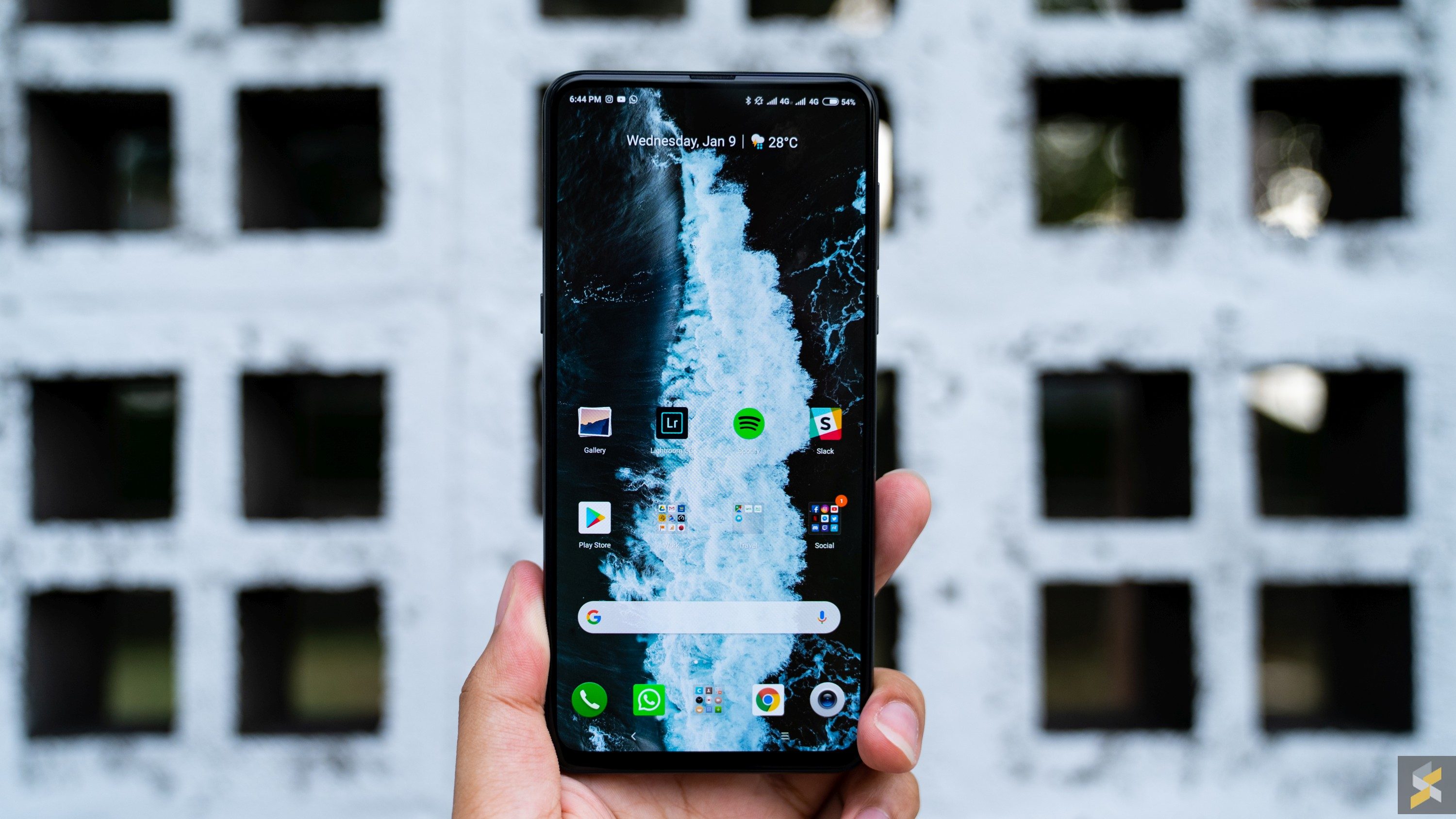
I’m personally not a huge fan of MIUI, but I’ve always acknowledged that it is a seriously well-optimised skin and one of the best ones to come out of China. I do still find it disappointing that there’s no app drawer, and I don’t have the ability to add more than four apps in a row on my home screen, but I think those are relatively minor things. MIUI 10 added a much cleaner look with a lot of convenient touches in the notifications shade that I think anyone would be happy with.
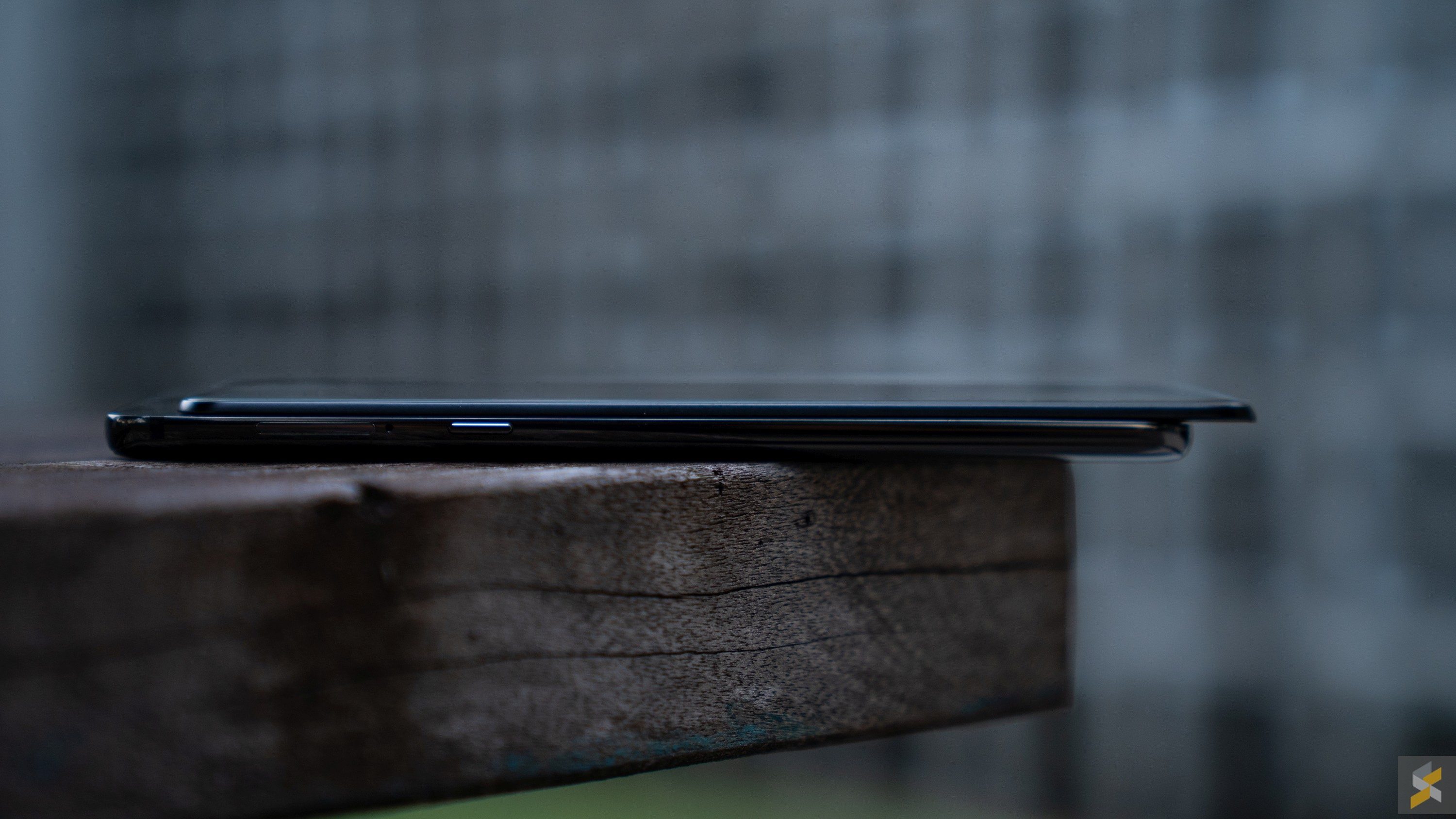
In fact, Xiaomi’s done something I wished Samsung would have the courage to do on their own flagship smartphones. On the Mi MIX 3, there’s a dedicated button whose primary purpose is to launch your AI assistant of choice — much like Samsung’s dedicated Bixby button. However, on the Mi MIX 3, it’s so much more than that. You can also customise that button to do a whole bunch of things — like launch the camera, turn on the flashlight and more — with either a long press or a double tap. This flexibility for customisation is one of the things that drew me to Android in the first place, and to see MIUI handle this aspect so well is certainly good news for the development of this OS skin.
But, while performance and software are definitely pros in my book, my favourite part about the Xiaomi Mi MIX 3 is a lot more shallow.
A body to die for
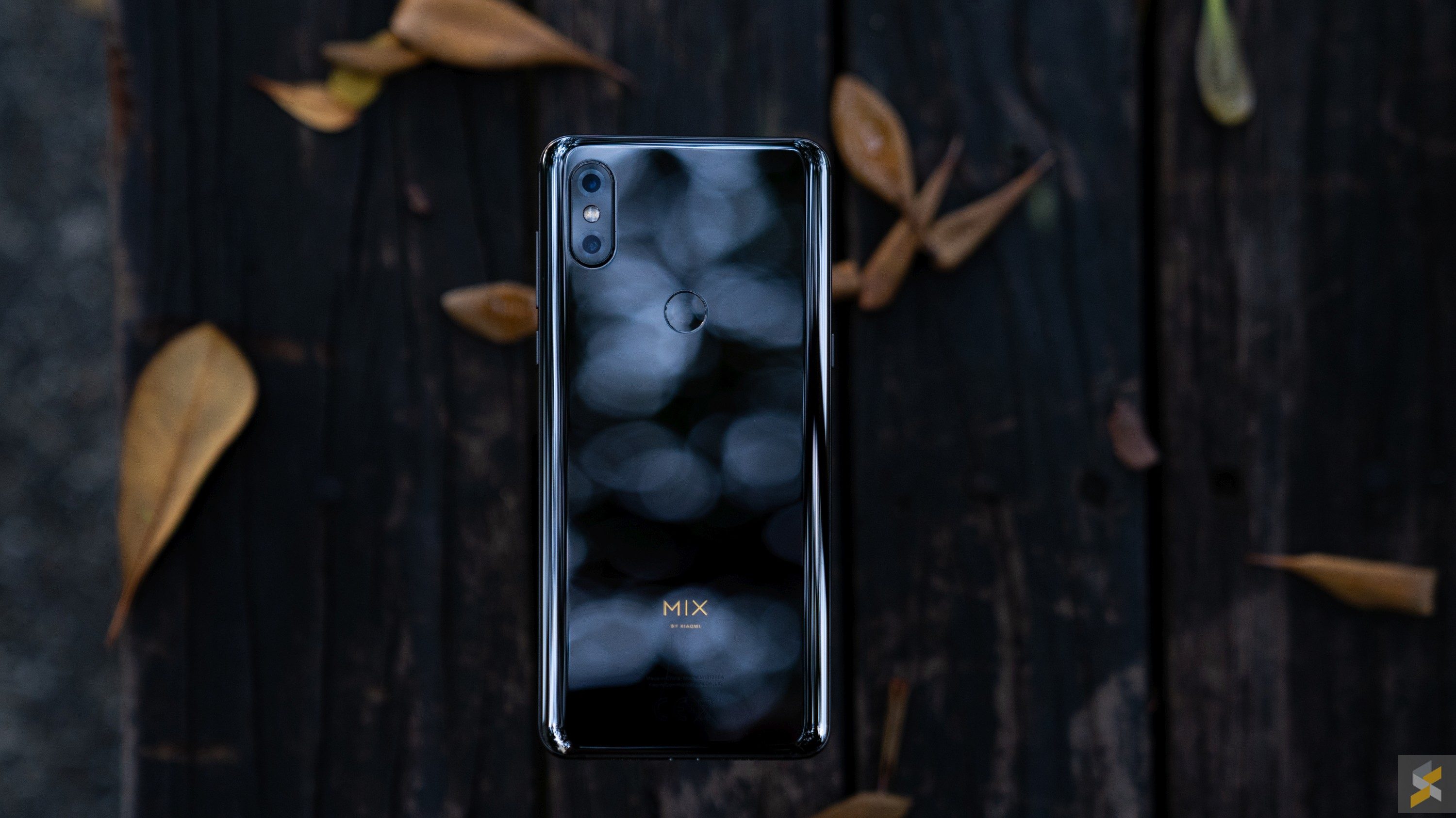
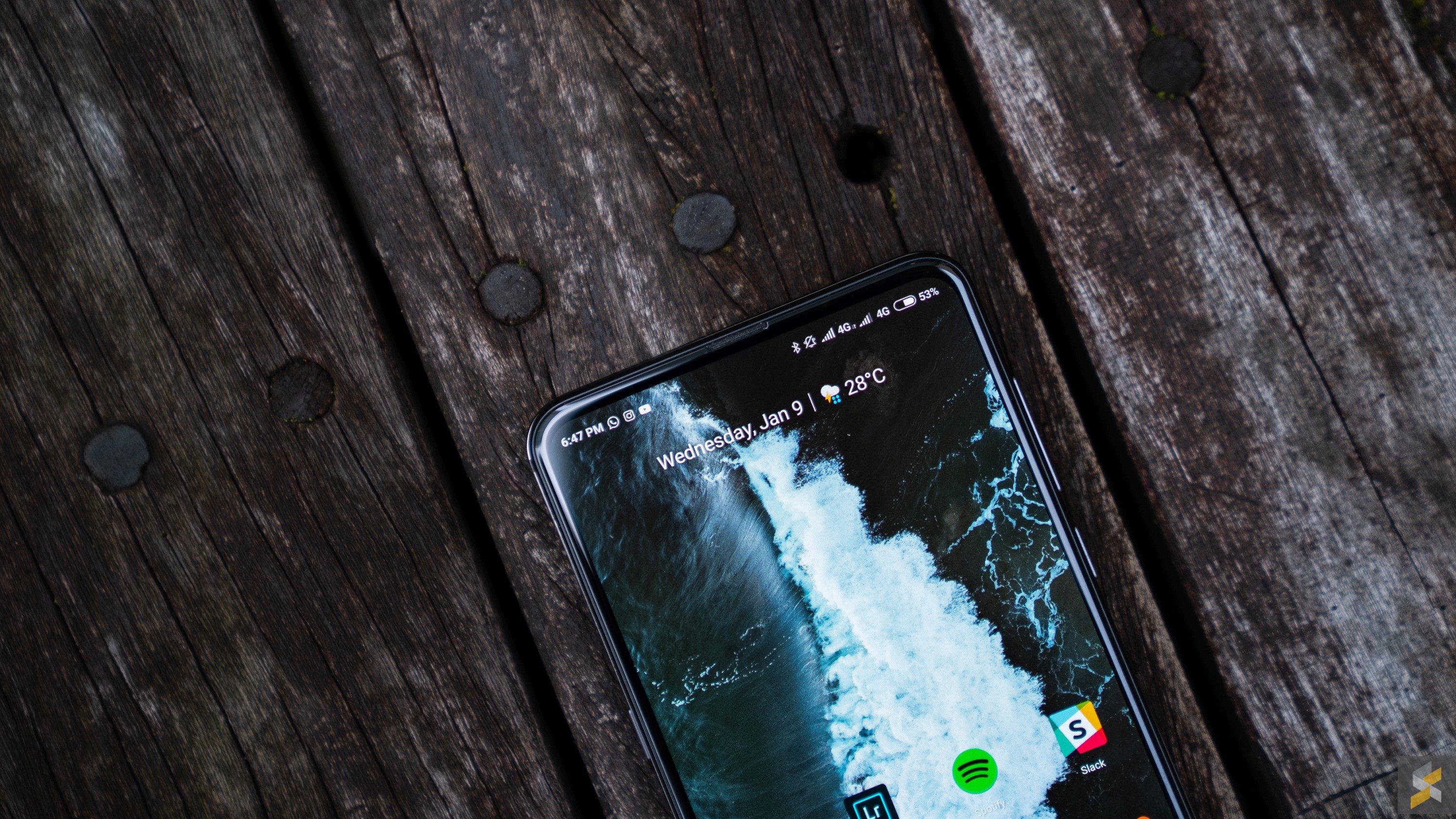
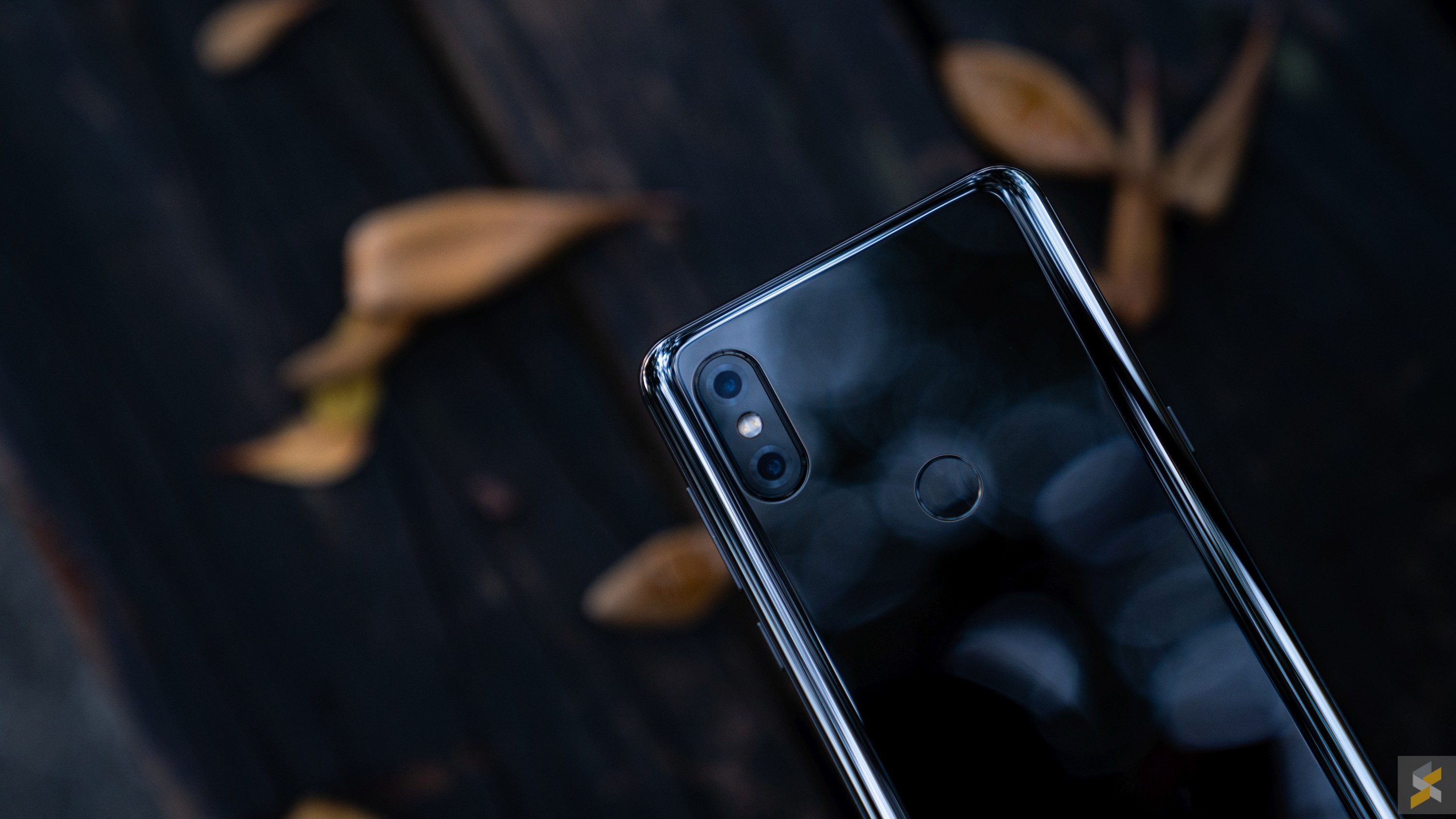
I’ll say this right off the bat, I think the Mi MIX 3 is an absolutely gorgeous smartphone. It’s not flamboyant like a Mate 20 Pro or tacky like the new Honor View 20. The Mi MIX 3 is just all clean lines, great material choices and what feels like exquisite engineering. Consider this: The Mi MIX 3 is a smartphone with a display that slides down (I will get into this a little later), yet you can hardly feel the seam, or the point where the screen lifts off the rest of the body. It’s phenomenal.
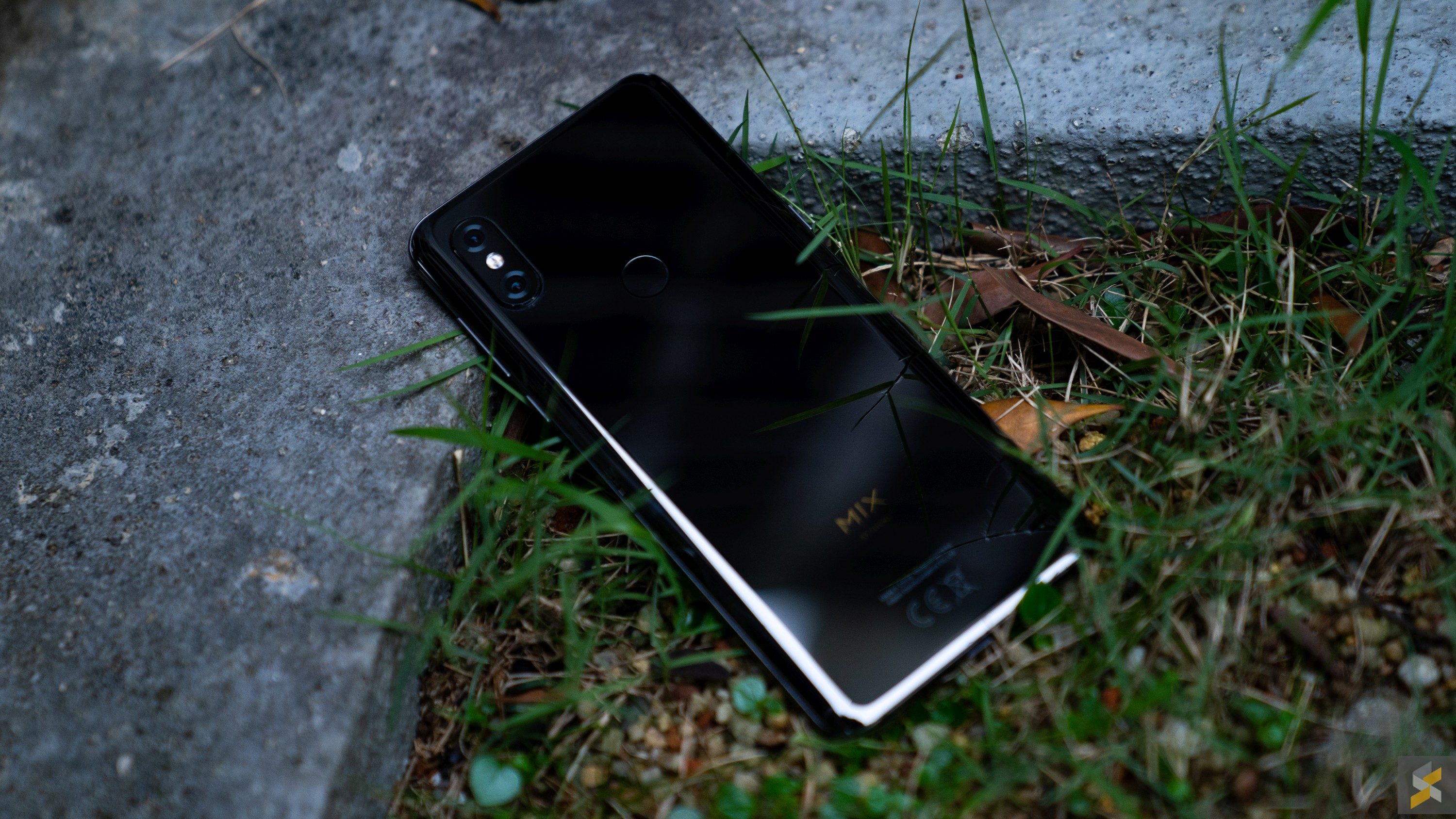
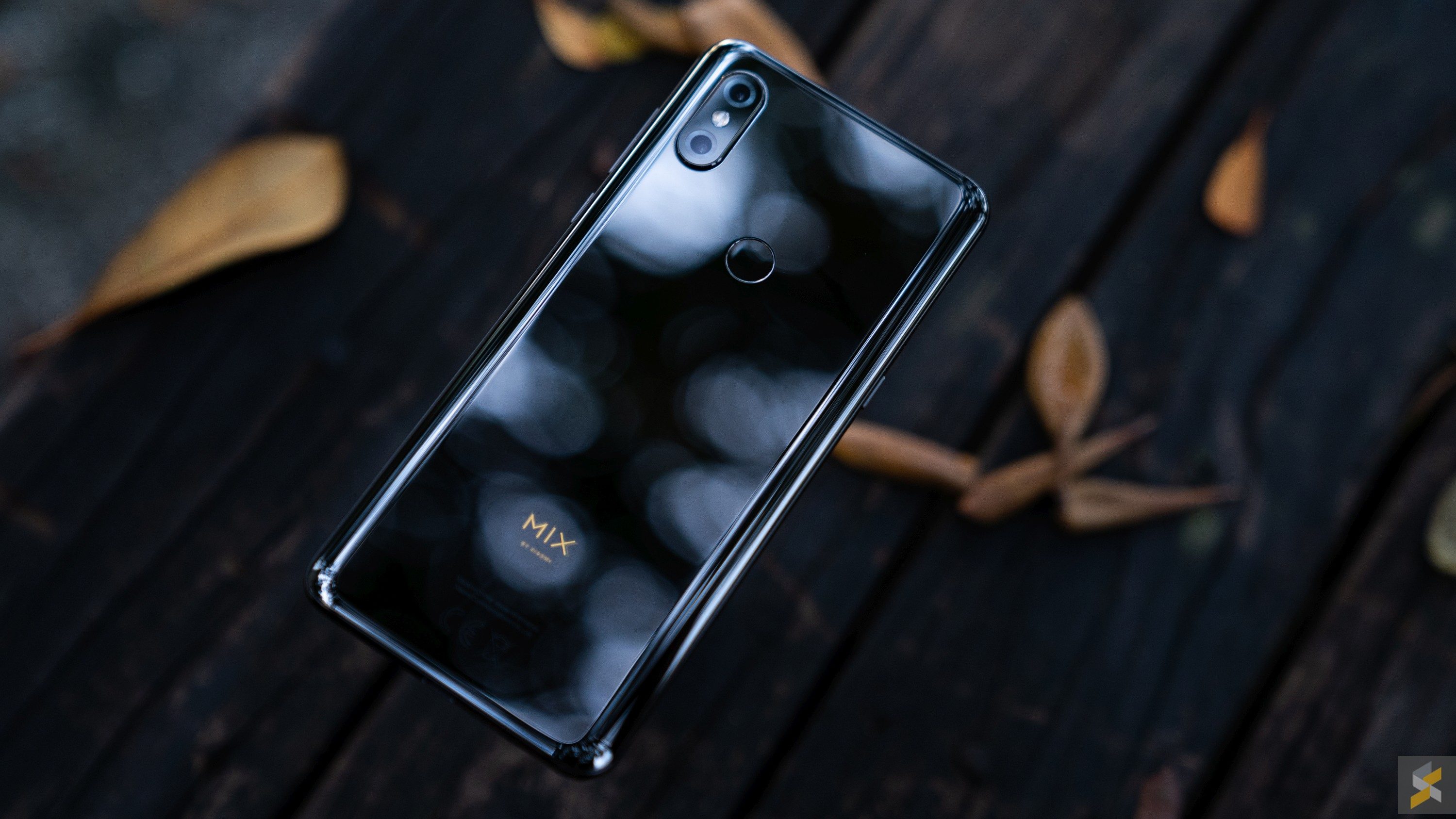
Then, there’s the heft. There is a fine line between a phone that’s too heavy and a phone that’s just heavy enough to feel expensive. Xiaomi’s flagship smartphone absolutely nails it when it comes to this balance. Ceramic also gives this smartphone a kind of look that’s really hard to replicate with glass. But being pretty isn’t all this material does for the phone — it’s also surprisingly durable. I like using my smartphones without a case because it’s a good way for me to discern how well a phone’s body will hold up over time.
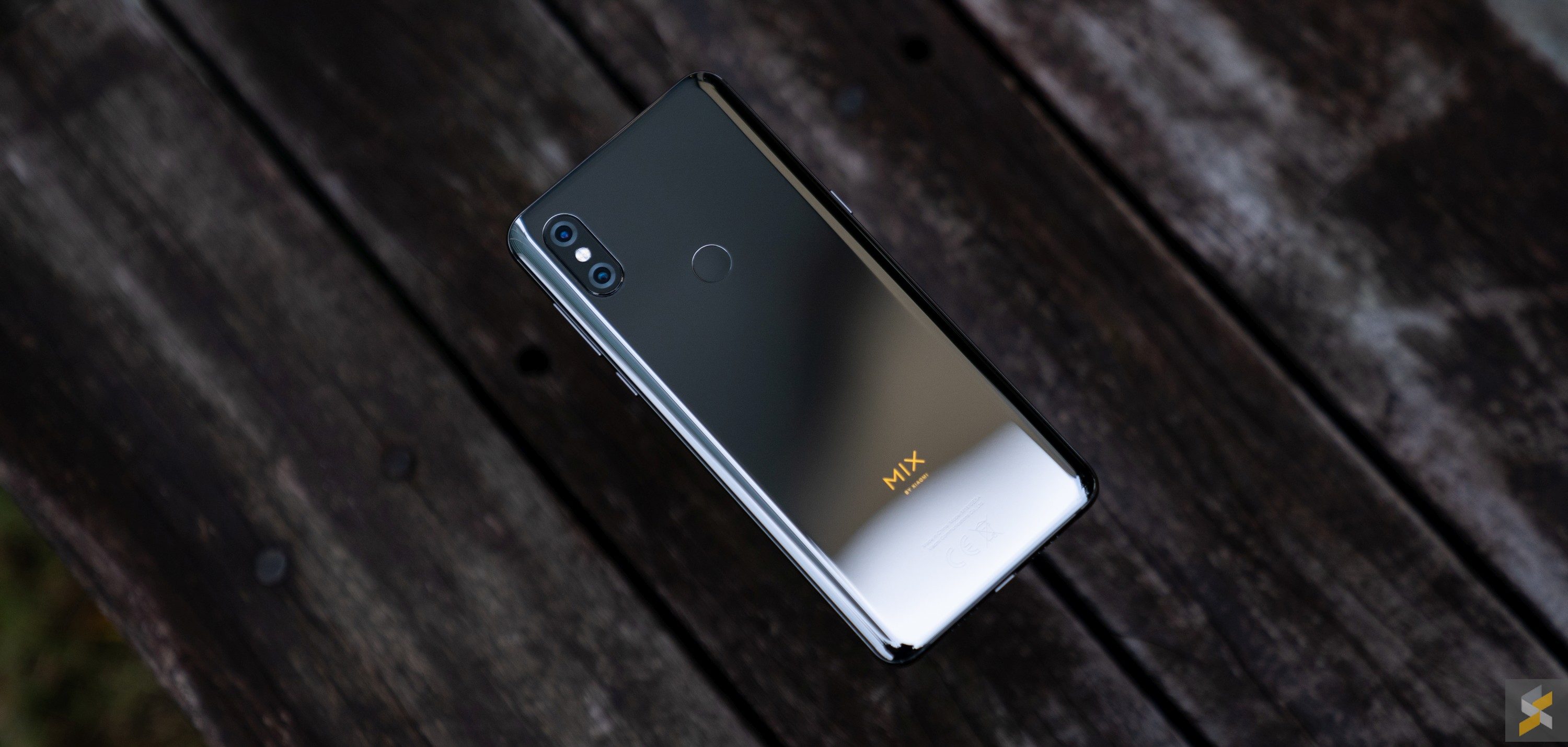
Typically, at the end of my review, the glass-backed smartphones I’m so used to handling would be covered in micro scratches and even a couple of deep grooves, if I’m not careful. But not the Mi MIX 3. That ceramic back is still as flawless as it was on day one and I am just so impressed.
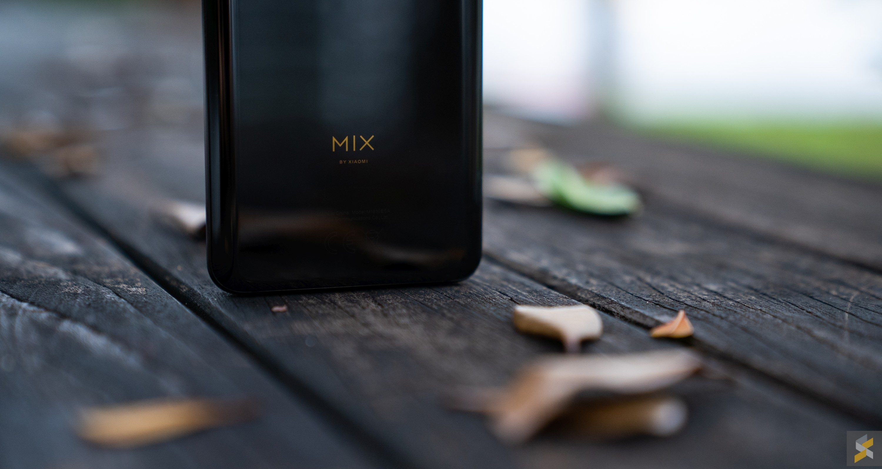
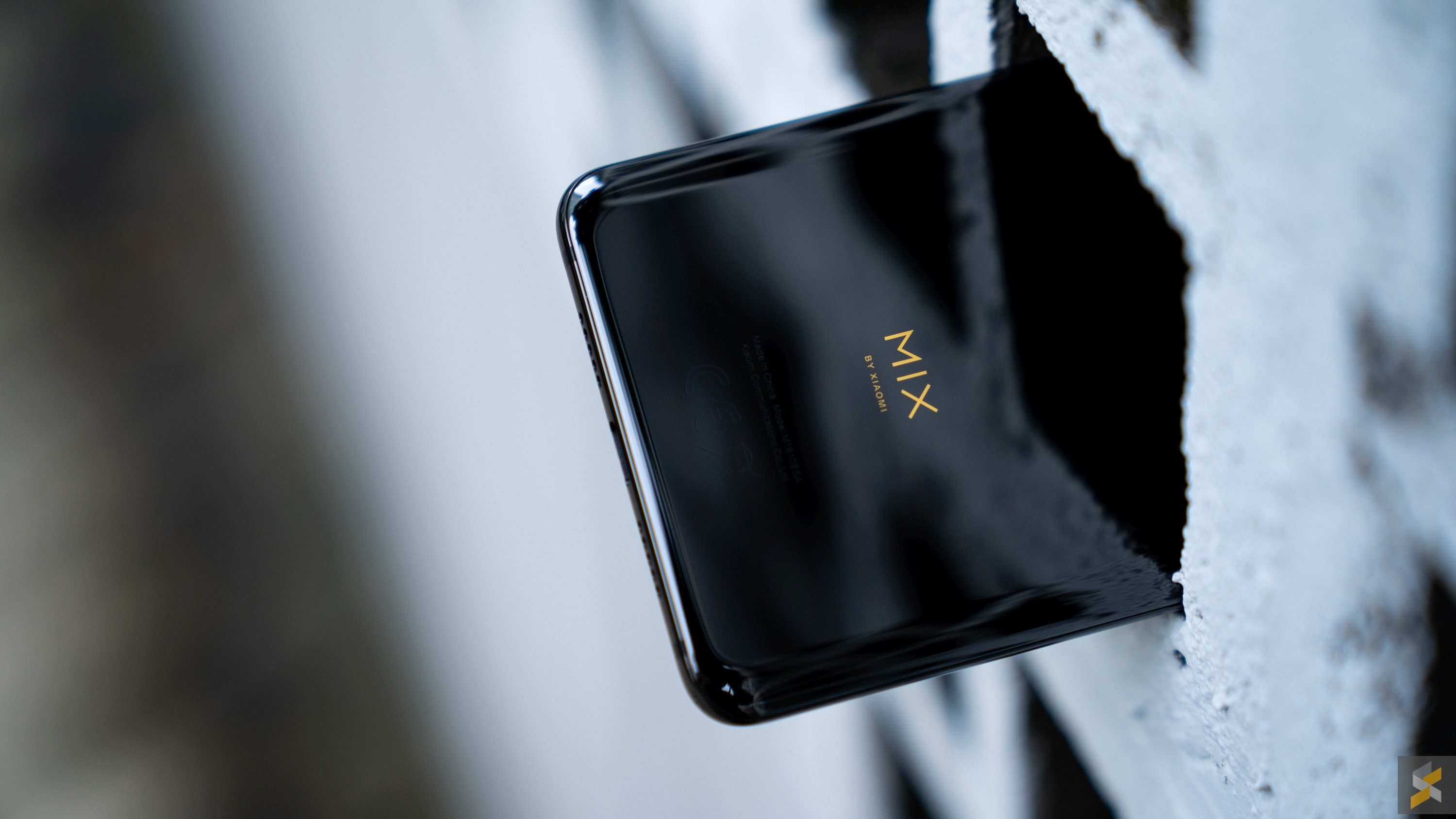
I’m also glad that Xiaomi decided to go with a glossy aluminium band this time, instead of an anodised one like they did on the MIX 2. Yes, it’s not fully ceramic like the original MIX, but it sure as heck feels like it is. For a phone to feel expensive, I’ve always believed that it needed to feel as durable as it did fragile. That may sound confusing at first, but I think you’ll understand what I mean when you pick it up. Xiaomi’s found a great balance here that I think is only second to the Nokia 8 Sirocco — and that’s really high praise.
Despite the amazing build quality, there is one chink in the handset’s otherwise flawless armour of well-built goodness. But, this particular vulnerability also happens to be the handset’s showstopper.
Clicking into place
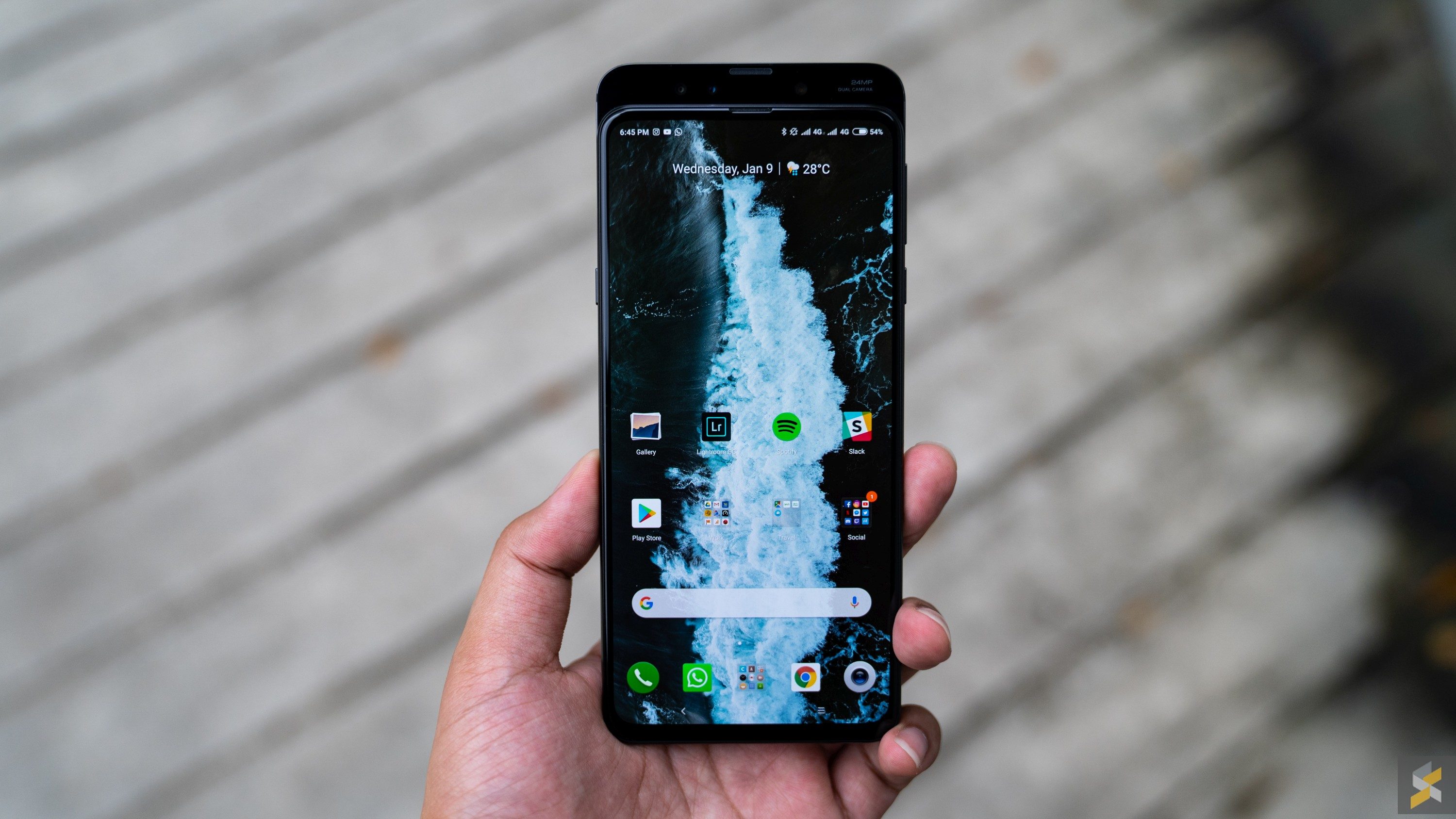
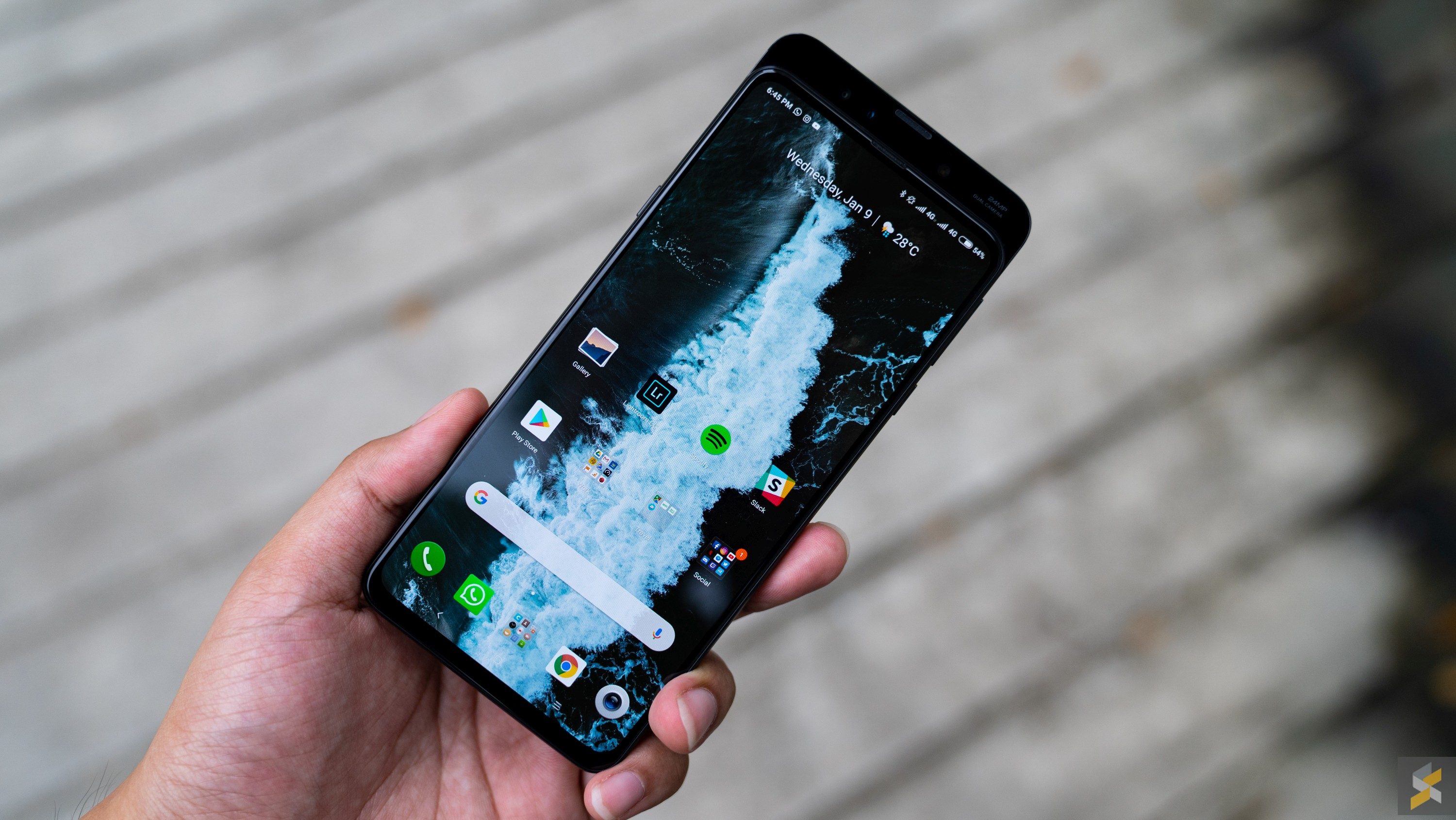
By now, you would probably already know that the Xiaomi Mi MIX 3 is one of but a handful of modern-day smartphones to feature a magnetic sliding mechanism. I go into why this was needed in the first place in my hands-on post, but the gist of it is that this is Xiaomi’s solution to what I like to call the camera conundrum. In the quest to eliminate all bezels from the front of the device, manufacturers have had to come up with creative solutions to house all the elements you’d usually find on the front of a device.
The most popular method we’ve seen is the infamous notch. But Xiaomi’s Mi MIX has never had a notch, with both the MIX and MIX 2 opting to hide their selfie camera at the bottom in the handset’s chin. Then, they either crammed the earpiece into a slit at the top of the device, or opted for a piezoelectric speaker (vibrate the screen to produce sound) plus ultrasonic proximity sensor.
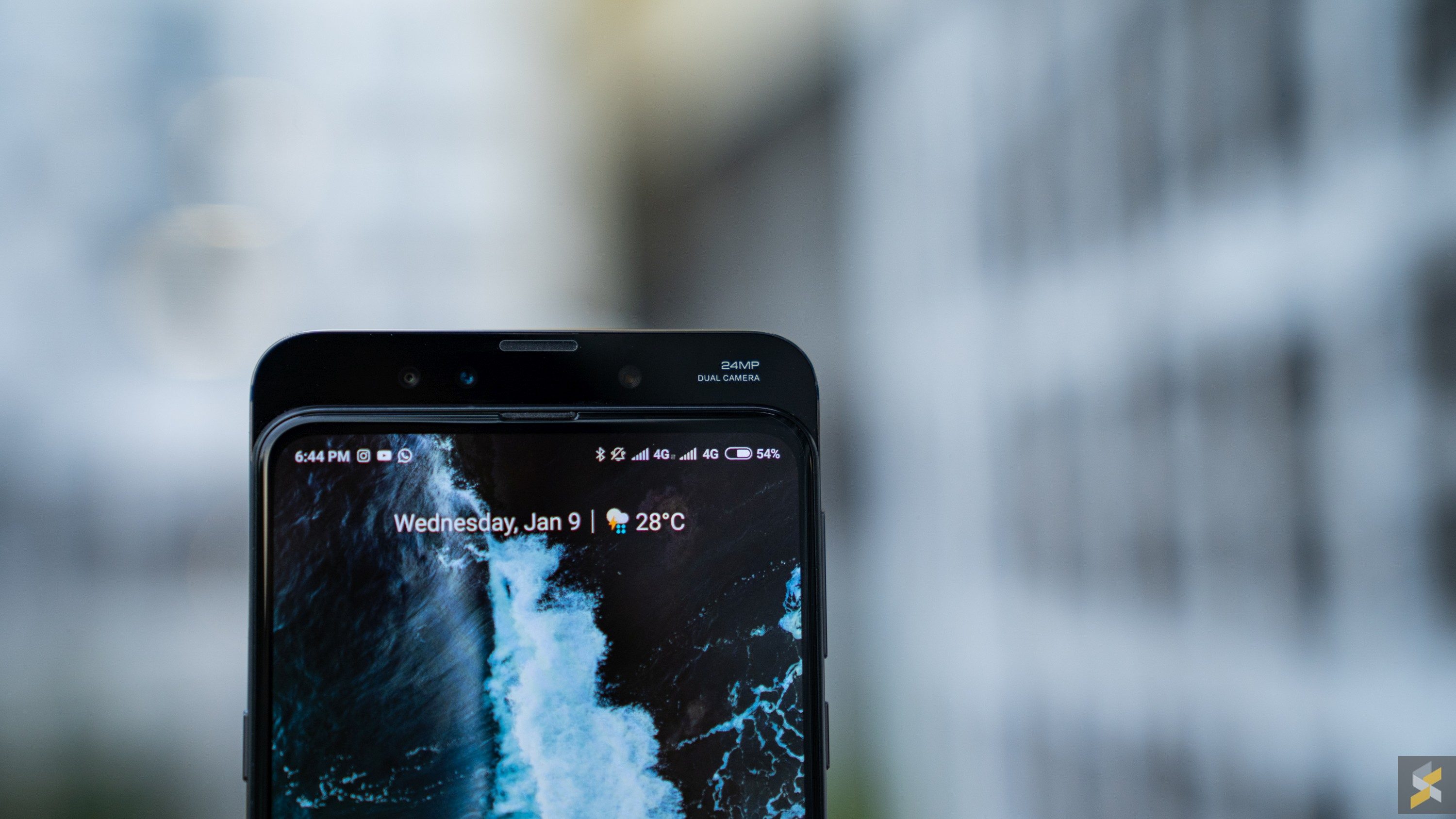
Then, there’s the Mi MIX 3, which opted for an old school approach to solve a new world problem — something that, in retrospect, should have been so obvious: Make the display slide like the slider phones of old.
When you do that, you open up a world of possibilities when it comes to screen bezel size. I mean, just look at the display on the Mi MIX 3. It’s unreal how immersive the viewing experience is. The 6.39-inch Full HD+ AMOLED panel is absolutely stunning and has great viewing angles for an AMOLED display.
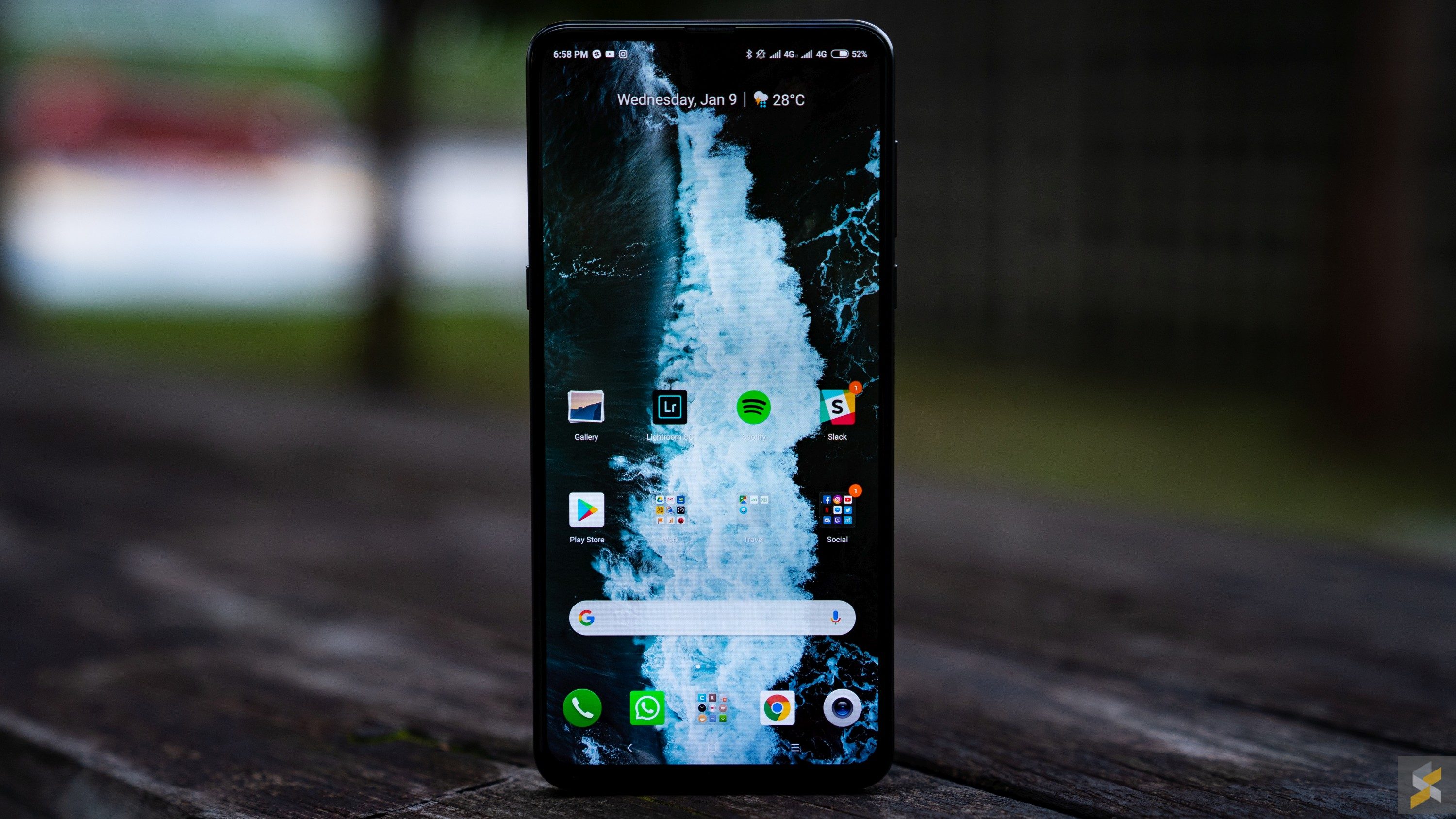
Its sheer lack of bezels and borderline insane 93.4% screen to body ratio (0.934:1) still looks so special even though I’ve been staring at it each day for over a week. However, I will say that this phone’s 19.5:9 aspect ratio is one of the tallest I’ve used on a smartphone so the pillarboxing for 16:9 content (which is most of the videos out there) is real. But, the upside is, the phone’s footprint is still very manageable for a screen this size.
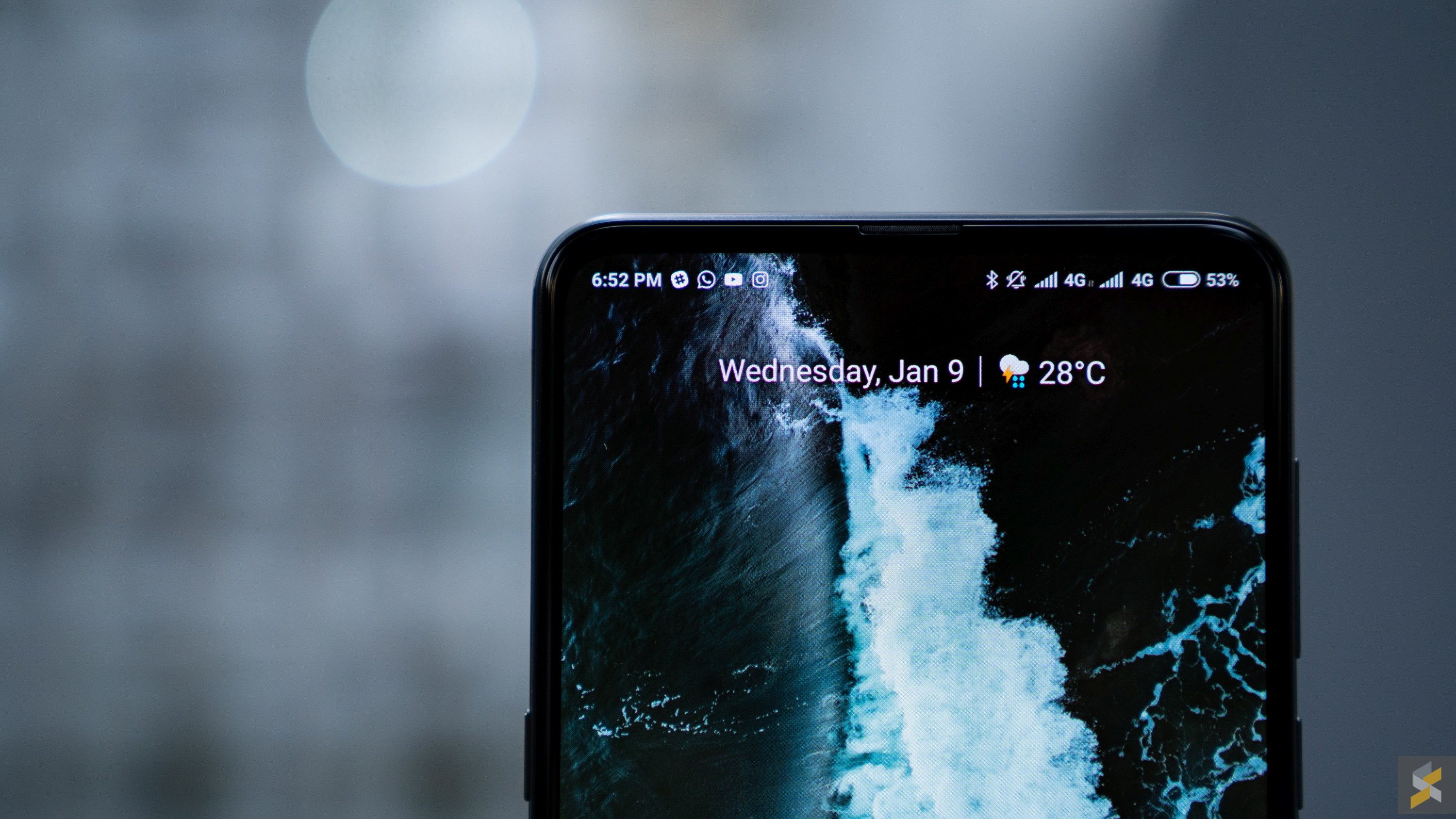
Oh, and as a cherry on top of the proverbial cake, Xiaomi’s sliding front panel isn’t just there when you need to access the selfie cameras. In fact, the company allows you to customise what the slider does, so you can set it to launch specific apps or tools, or you can just leave it on default which automatically launches the selfie camera. But, my favourite thing is that you can now answer phone calls with a slide down (though, you can’t hang up with a slide up).
Naturally, having a moving part on a smartphone is a risky move. If our handsets already go wrong for all sorts of reasons when they have almost zero moving parts, one could only imagine the plethora of issues a sliding display would cause.
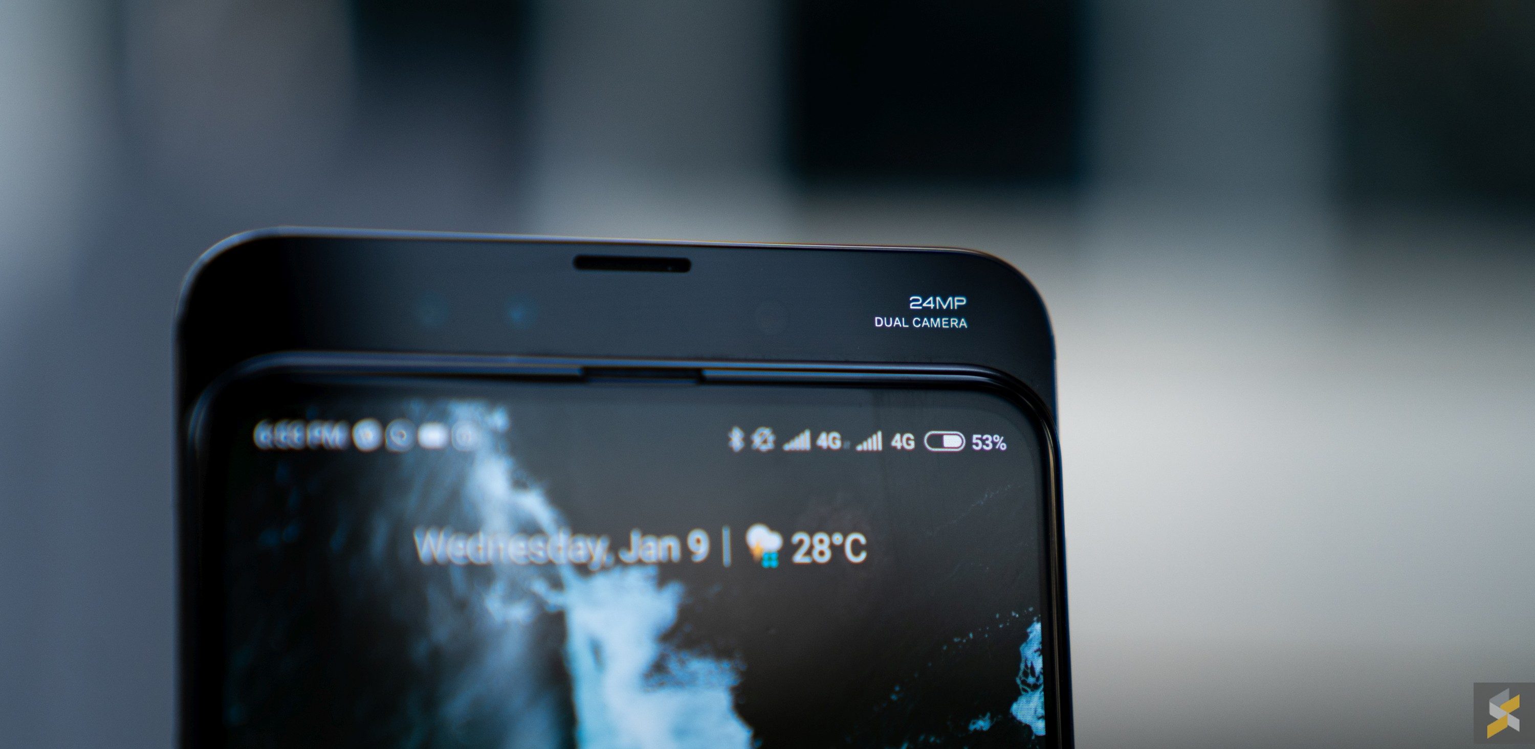
Well, according to Xiaomi, the magnetic sliding mechanism on the Mi MIX 3 is supposed to be very durable. They rate it for about 300,000 slides, which works out to roughly 150 slides a day for a little under five and a half years — very impressive. And, on that note, I think they’ve also done a fantastic job with the feel and quality of the sliding mechanism. It clicks really satisfyingly into place when you pull down or push up the front panel, and it doesn’t accidentally move when you’re scrolling through web pages. It’s buttery and secure and best of all, when the slider is closed, it doesn’t feel like it affects the Mi MIX 3’s structural rigidity at all.
However, even though the gap between the display and the rest of the chassis is something you can’t really feel in your hand, there is still a gap there. And when there’s a gap, it becomes vulnerable to things getting caught in it.
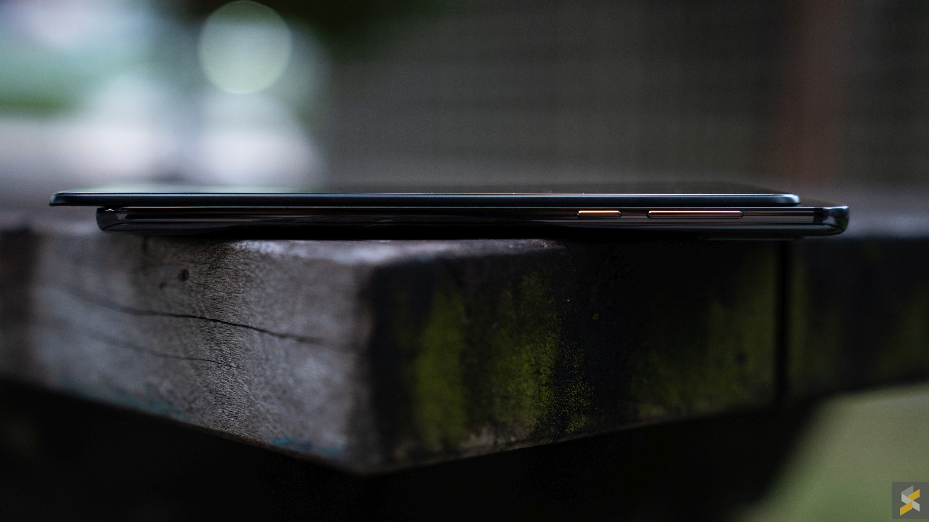
Dust, for one, sticks to the crevices between the display, and in the earpiece and camera section at the top of the phone. But, real problems arise when something a little larger — and harder — gets caught between the pieces. During my review period, I spent an entire day with something small, sharp and hard, stuck between the two panels. When that happened, every time I slid the display down, I was greeted with a painful scratching sound instead of a satisfying click. That said, the grain of sand or whatever it was that was stuck between the cracks was gone the next day, and I didn’t see any visible damage to the chassis of the Mi MIX 3.
But, something like this also made me realise some of the common flagship features would have to give up to own a smartphone like this.
The wrong side of the practical coin
Obviously, with 100% more moving parts than your typical flagship smartphone, you’re not getting any IP67/IP68 water resistance with the Mi MIX 3. In fact, I wouldn’t even want to get caught in the rain with this smartphone because I’m so afraid any amount of water will just kill it. While I usually place water-resistance quite high up my list of needs for a flagship smartphone, I recently switched to the Mi MIX 3 from a mid-ranger that didn’t have water resistance either, so it wasn’t such a jarring change for me. But, your mileage may vary.
What was particularly disappointing for me, however, was the fact that the Mi MIX 3’s speakers are downright atrocious. They’re bad even by mono speaker setups, but I guess in a phone like this, Xiaomi didn’t really have space to put great big drivers or echo chambers to improve speaker quality. To make matters worse, this phone also doesn’t have a 3.5mm headphone jack, but y’know this isn’t something super uncommon at the high end anymore so I’m kind of numb to it now.

Lastly, though, we have the biggest sacrifice Xiaomi had to make: Battery. In the Mi MIX 3, you’ll find a borderline tiny 3,200 mAh battery. With flagships pushing past the 4,000 mAh mark, that tiny battery was the most disappointing thing about the Mi MIX 3 when I first saw the spec-sheet. But, the little cell that could actually posted better numbers than I expected.
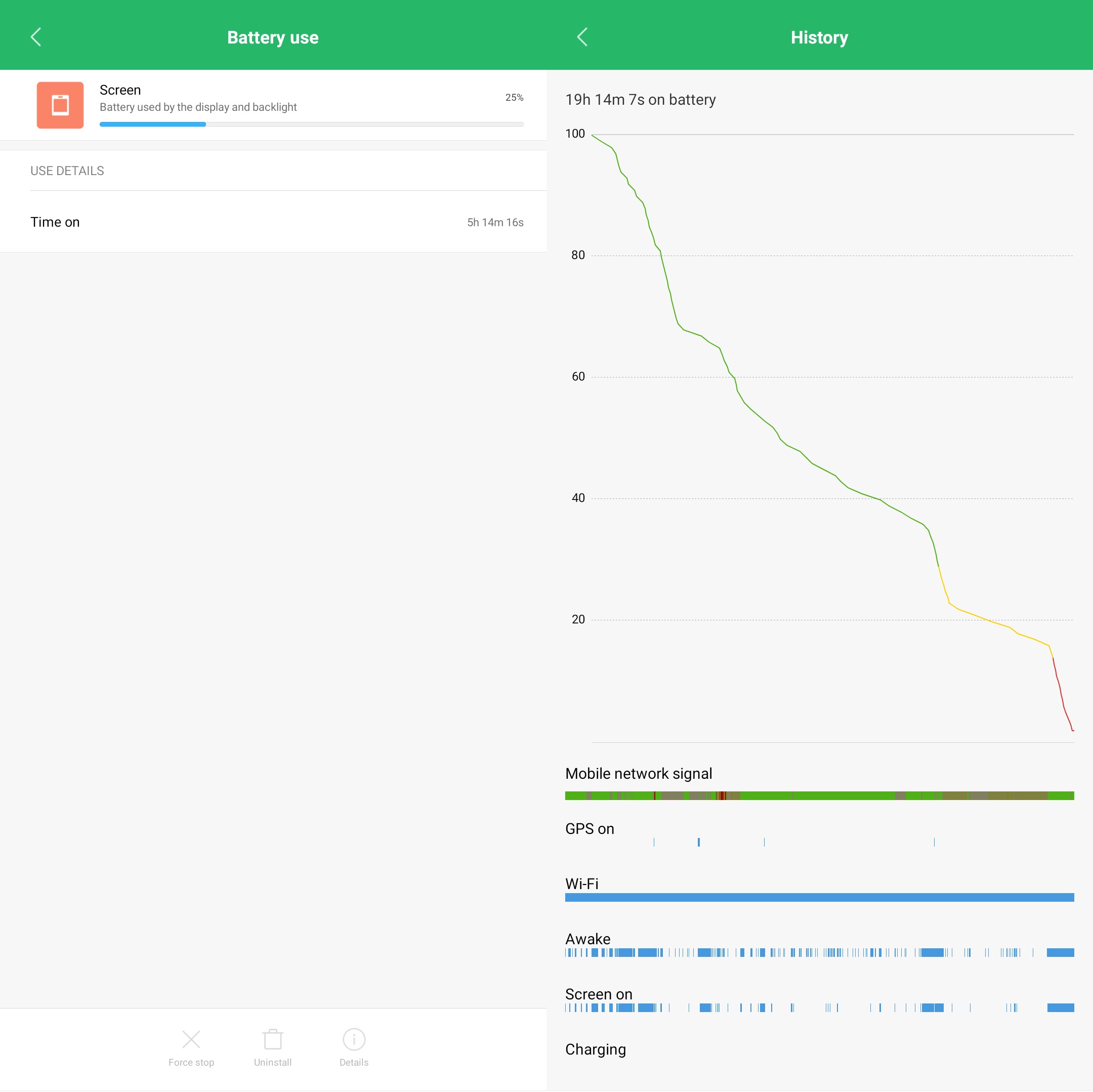
With moderate usage (lots of Netflix, YouTube and social media with a dash of camera) the device actually lasted me over 18 hours on a single charge with about five hours of screen-on time. That’s what I consider “average” battery life for a smartphone in 2019, so props there. That said, could you imagine how much more time I’d get out of this phone if it had space for a larger 4,000 mAh cell? Still, since it isn’t posting awful numbers, I suppose I shouldn’t give it such a hard time for it.
The good news is, Xiaomi did have enough space for a couple more goodies that I think really round out the device.
Rounding out the experience
One of the most important aspects of a flagship smartphone, is its camera. Unlike the mid-range, phones at the high end need to perform because you’re often paying a lot more money for them. But on the Mi MIX 3, I’d say that this camera is decidedly OK. Yes, I know that DxOMark says it’s as good as the Samsung Galaxy Note9 when it comes to photography, but I really wouldn’t go that far.
In fact, to see if I was alone in this, I took a quick side-by-side shot if a typical daylight scene with both the Mi MIX 3 and the Galaxy Note9. Then, I had my colleagues pick between the two and a majority of them chose the Galaxy Note9. Of course, picking a prettier image is a deeply subjective thing, but there are objective ways to judge a handset too.
Xiaomi’s Mi MIX 3 takes photos that often retain a good amount of detail, but the highlights do get clipped from time to time. There’s also an AI mode, but that’s a lot more subtle than what you’d find on other competing Chinese smartphones.
Besides that, Xiaomi also added a “Night Mode” that seems to work like the Google Pixel’s Night Sight and the Mate 20 Pro’s Night Mode, but it doesn’t come close to producing the kind of quality images the other two can.
And quite frankly, I was left deeply unimpressed with the selfie camera as well.

I’d rate this camera at a B+ thanks to its snappy shooting and OK images, but I don’t personally think it can compete at the top end of the market.
What I did love about the Mi MIX 3 that I haven’t touched on already is the fact that Xiaomi didn’t force an in-display fingerprint scanner on the MIX 3. Those scanners tend to be much slower — and far more inaccurate — than its traditional counterparts, so I’ve never been a fan of them.
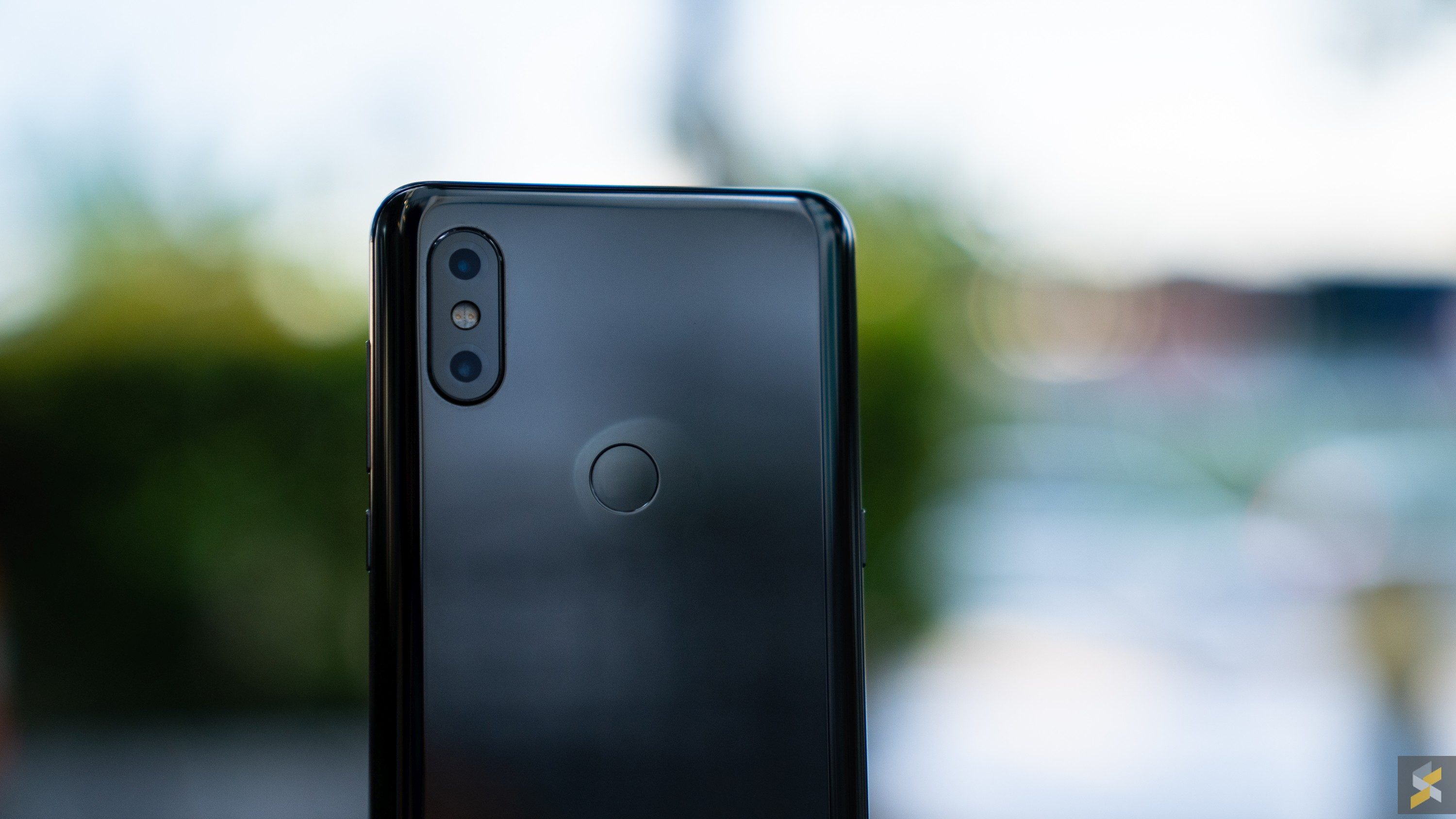
Instead, what you’re left with on the Mi MIX 3 is just a bloody good regular rear-mounted one that I’d take any day over the current crop of in-display scanners. There is face-unlock if you don’t want to reach around to scan your finger, and you also get to slide the front panel down to activate it, which is just the coolest thing.
A little bit of both goes a long way
My biggest complaint about the Mi MIX 2 was how it felt like Xiaomi were trying to sell out. And when they began ditching the magic for practicality, all it did was expose the Mi MIX 2’s flaws when compared to the other flagship smartphones you could buy. That said, while I loved the original Mi MIX, I never got the sense that this was a device that was practical enough that everyone could use on a daily basis. That tore at me because I didn’t want to be forced to choose one or the other. I wanted both.
And in a way, I found that with the Mi MIX 3.
Yes, it’s not quite as practical as your typical high-end flagship smartphone and I don’t think it can really compete toe-to-toe on every one of those flagship features. But, the beauty of the MIX 3 is that it doesn’t have to because it has something none of those flagships do. It has this really special feature that is equal parts cool and impractical, but also entirely awesome. It’s sort of in a league of its own, in the same way that the original MIX was, and I really love that about this handset.
However, I think the best part about the MIX 3 is its price. Much like the MIX 2 it succeeds, the Mi MIX 3 will retail — at launch — for just RM2,199. That’s a seriously good price for a flagship smartphone with these specs, much less a flagship smartphone with a feature as unique as that magnetic slider. And, while I don’t like that you have to pay RM100 more for the Jade Green and Sapphire Blue variants because they’re exactly the same smartphone, it is still a more than reasonable asking price for a phone like this.
Photography by Rory Lee, with Sony A7 III.

