• 中文版
  • BM
  • News
  • Deals
  • Reviews
    • First Impressions
    • Hands-on
    • Comparisons
  • Tech
    • Mobile
    • Computers
    • Cameras
    • Wearables
    • Audio
    • Drones
  • Telco
    • Celcom
    • Digi
    • Maxis
    • Time
    • Tune Talk
    • U Mobile
    • Unifi
    • Yes
  • Cars
  • Contribute
  • Jobs
Menu
  • 中文版
  • BM
  • News
  • Deals
  • Reviews
    • First Impressions
    • Hands-on
    • Comparisons
  • Tech
    • Mobile
    • Computers
    • Cameras
    • Wearables
    • Audio
    • Drones
  • Telco
    • Celcom
    • Digi
    • Maxis
    • Time
    • Tune Talk
    • U Mobile
    • Unifi
    • Yes
  • Cars
  • Contribute
  • Jobs
Search
  • Tech
    • News
    • Mobile
    • Computers
    • Cameras
    • Wearables
    • Audio
    • Drones
  • Telco
    • Celcom
    • Digi
    • Maxis
    • Time
    • U Mobile
    • Unifi
    • Yes
  • Reviews
    • First Impressions
    • Hands-on
    • Comparisons
  • Buyer’s Guide
  • Opinions
  • Digital Life
  • Video
  • Deals
  • How-To
  • Cars
  • Bahasa Melayu
  • EV
  • Contribute
  • Advertise
Menu
  • Tech
    • News
    • Mobile
    • Computers
    • Cameras
    • Wearables
    • Audio
    • Drones
  • Telco
    • Celcom
    • Digi
    • Maxis
    • Time
    • U Mobile
    • Unifi
    • Yes
  • Reviews
    • First Impressions
    • Hands-on
    • Comparisons
  • Buyer’s Guide
  • Opinions
  • Digital Life
  • Video
  • Deals
  • How-To
  • Cars
  • Bahasa Melayu
  • EV
  • Contribute
  • Advertise
Search
Close
Home News

Microsoft is very proud of their new redesigned Office icons

  • BY Raywen Ong
  • 30 November 2018
  • 1:26 pm
  • Comment
Share on FacebookShare on Twitter

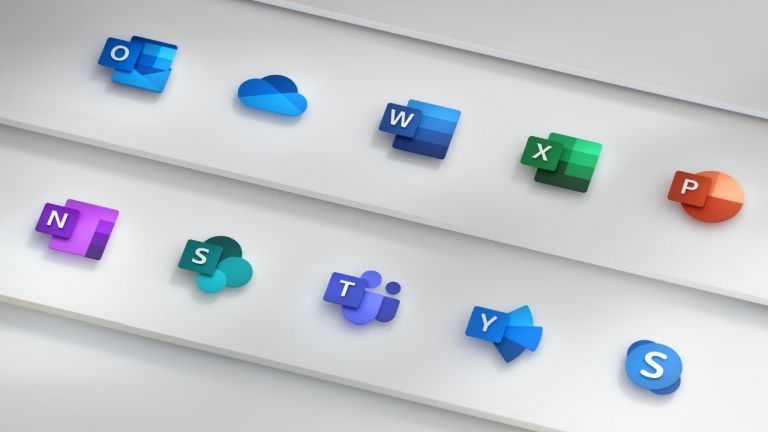
Microsoft has given the icon for its Office family of apps a whole new, fresh and modern look, and they are very proud of it. The new set of icons is part of Microsoft’s ongoing overhaul of the Office experience with a shift towards a more cloud-centric service.

According to Microsoft, the redesigned Office icons are supposed to be more simple and modern to work across multiple devices and platforms. This initiative is also part of Microsoft’s reflection that represents how much the  Office family of apps have evolved over the past five years since the icons last received an update. 

With the new icons, Microsoft replaced the hard outlines used on the current set with a more softer edge both in terms of look and the choice of colours. With the new set, each icon is now divided into two sections: one for the letter and the other is the distinctive shape that denotes the app’s function. For instance, the PowerPoint icon gets a pie chart and Excel gets a green square that’s further broken into cells, just like an Excel sheet.

The Office apps are not the only ones that’s getting their icons updated. Other Microsoft apps like Skype, Teams and Outlook are getting updated too.

The new Microsoft app icons is rolling out in the coming months starting with mobile and web apps, followed by other platforms.

[SOURCE, 2]

Tags: microsoftMicrosoft Office
Raywen Ong

Raywen Ong

POPULAR

Microsoft is very proud of their new redesigned Office icons

November 30, 2018

Why are Malaysians still buying EVs in 2026? | Let’s Talk About #138

March 15, 2026

iPhone to support 5G SA for Yes 5G, U Mobile and Maxis via iOS 26.4

March 16, 2026

Is Your Current Phone Generations Behind? Here’s a Simpler Way to Close the Gap

March 13, 2026

BMW i3: Fully electric 3 Series, 800V EV with up to 900km range and 400kW DC charging

March 18, 2026

Pocket-Friendly Design, Pro-Level Photos: Who Says Compact Camera Phones Can’t Be This Amazing?

February 28, 2026

Copyright © 2025 · SoyaCincau.com
Mind Blow Sdn Bhd (1076827-P)

  • ADVERTISE
  • DISCLAIMER

Copyright © 2026 · SoyaCincau.com – Mind Blow Sdn Bhd (1076827-P)

  • ADVERTISE
  • DISCLAIMER