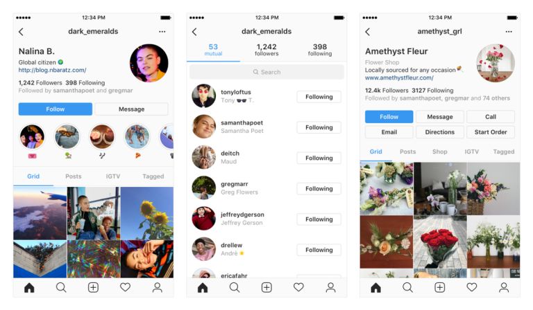
Instagram is testing out a new profile page layout and it expects to release new layout to users in the coming weeks. The company says improvements will allow you to “better express yourself and more easily connect with the people you care about”.
Instagram made the announcement on its press blog in which it also shared how the new profile page layout would look like. From what we can tell, the most obvious new addition are the buttons right at the top of the profile page that allows you to quickly follow, message or email a profile, amongst other things. Instagram has included “Directions,” “Call,” and “Start Order” tabs to make it easier for a user to make a purchase right from the profile page as well.
On the new profile page, it looks like your profile picture will be relocated to the right side of the page (it currently sits on the left). Your Instagram profile name will get a larger font as well. Other than that, your Instagram post count will no longer be displayed on your profile.
The photos and videos that you’ve shared on your profile will remain as it is in a grid format. There will be a set of “Grid”, “Posts”, “Tagged” and “IGTV” tabs where currently there are icons.
Instagram says it’s working on these changes and the new layout will be rolled out in phases with different combinations over the next few weeks. The company plans to keep experimenting and updating the profile page layout with feedback from users before it settles on a final version.
[SOURCE]


