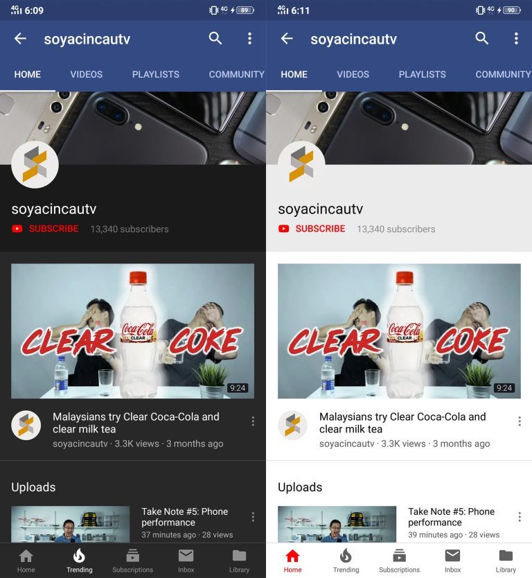
If you want your phone’s battery to last longer, then perhaps you’ll want to try to change your apps
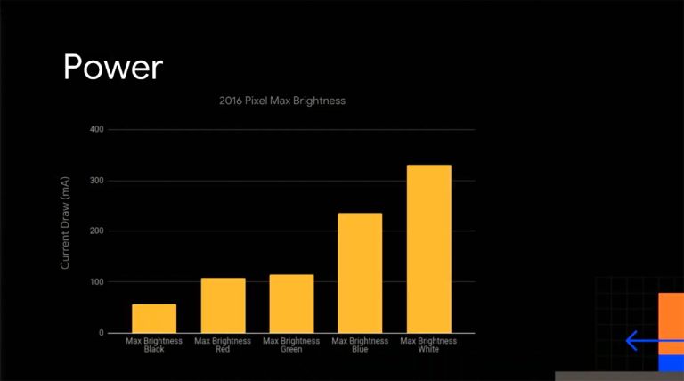
The following charts, taken from a presentation on how colour and screen brightness can affect battery life, show the differences between utilising a white or dark screen. The findings are based on tests using the OG Google Pixel which was released way back in 2016. Granted, the hardware is not new but in principle, the battery savings should be the same for new or old devices.

In term of brightness, you can see that running maximum brightness with a dark theme significantly reduces battery consumption compared to maximum brightness on a white or light-coloured screen.
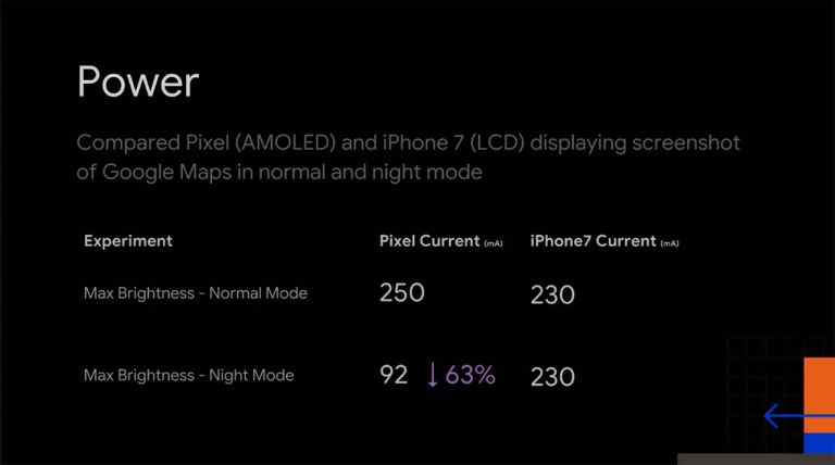
Google also compared the amount of power used by the Google Pixel and the iPhone 7 when displaying a screenshot in maximum brightness in normal and night mode. Do bear in mind that the Google Pixel features an OLED display, while the iPhone 7 has an LCD panel.

Both devices were comparable in Normal Mode with Pixel consuming more power at 250 mA whereas the iPhone 7 current draw was 230mA. In Night Mode though, the Pixel was significantly more power efficient at 92 mA, while the iPhone 7 was at 230mA. This makes

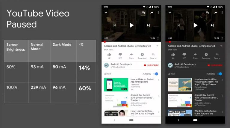
While many Google apps are predominantly white, some apps like YouTube do feature dark mode. As demonstrated, it consumes less energy compared to the normal mode. At full brightness, YouTube in dark mode uses 43% less power than the normal mode.
But here’s the thing, Google has been pushing for the use of white and light colours in their Material Design style guide and this is counterproductive as light-coloured themes — as Google has shown — consumes more battery than dark coloured themes
Well, Google has admitted that using white as their primary colour for all apps and interfaces was a mistake and they will increase the adoption of dark-coloured themes in their app designs moving forward.
So have you converted your apps into dark mode yet?
[SOURCE]


