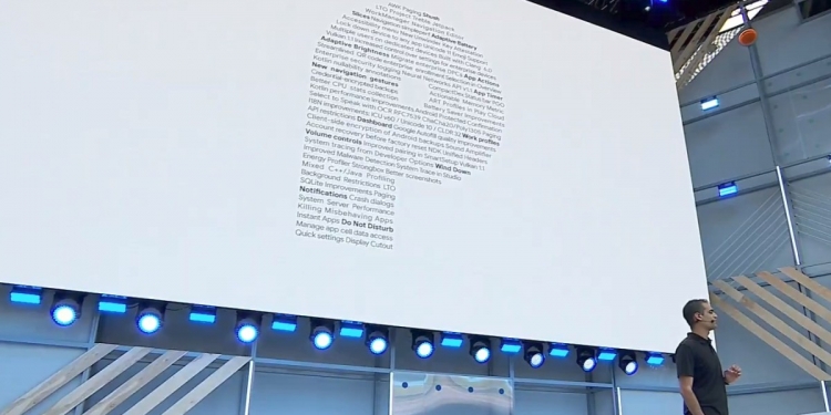
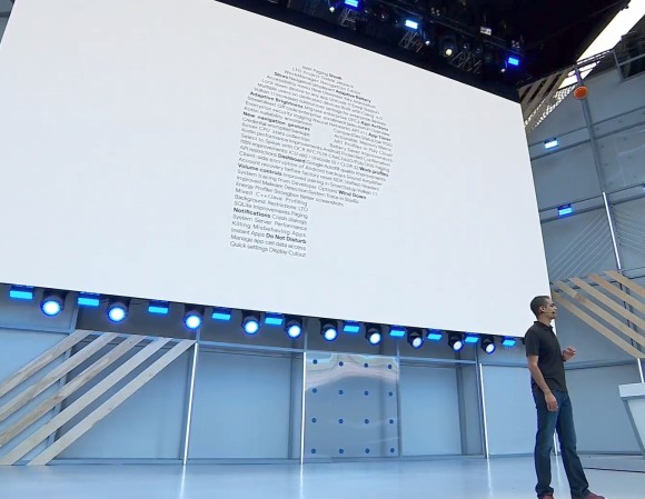
Ever since Android Marshmallow, version updates for the world’s most popular mobile operating system have been less about major redesigns and more about tweaking what works to make everything better. And, for the most part, it works because Android Oreo is definitely a slick experience.
However, with Android P, Google‘s shaking things up. This version of Android represents the biggest overhaul the company has made to the way you experience Android for a long time. It’s almost like an entirely new OS and here are the three biggest changes you need to know about.
1. An all-new gesture-based UI and navigation
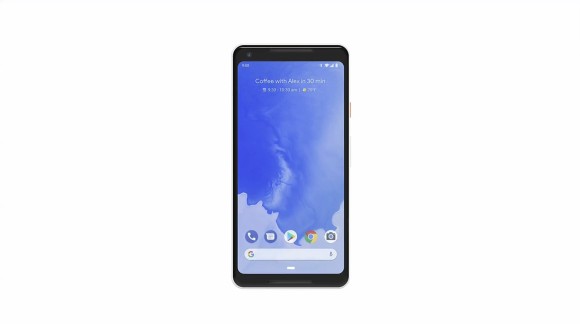
In keeping with the trend of disappearing bezels and maximising screen sizes, Google’s revamping the way you navigate Android with Android P. Gone is the default “Back — Home — Recents” on-screen button layout and in its place you’ll find a tiny little oblong. This is your new Home button, and app drawer anchor, and Recents button, and App switcher button. It’s very nearly your everything button when it comes to navigating Android P.
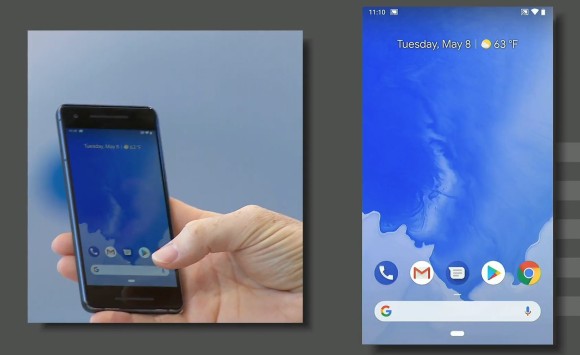
At its core, it still works like the current home button where you can tap it to go home and long press to launch the Google Assistant.
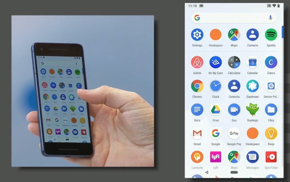
However, now you can also half swipe up to go to the new “Overview” screen (which is basically a revamped Recent Apps screen) or full swipe up (or swipe twice) to go to the app drawer. Additionally, you can also slide it to the right to scroll through recent apps.
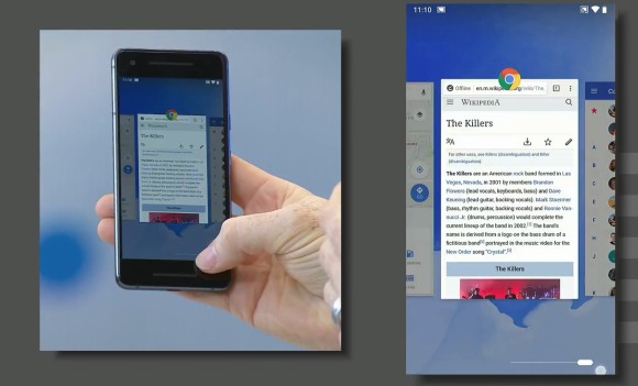
Speaking of the “Overview” screen, you can think of it like an app carousel. Much like the previous Recent Apps menu, the Overview shows you a list of your most recently used applications, only now it’s horizontal instead of vertical. You can scroll through them by swiping across the screen and tap on each of them to get right into the app.
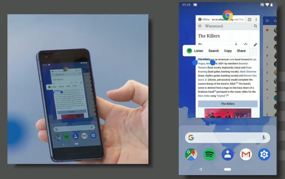
One new feature they added is that these app overviews are live, so you can quickly glance at each app and even highlight text within the app with smart select.
Don’t worry, though. The Back button hasn’t been erased from the operating system. Instead, it’s now hidden and will only make an appearance when you’re in an application, which seems intuitive enough.
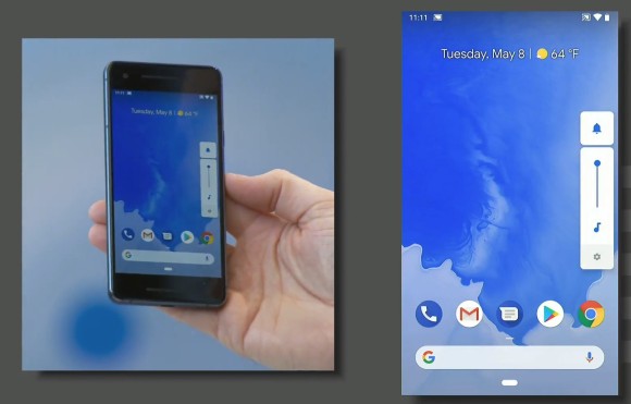
Then, there are other smaller quality of life changes like the new volume toggle which adjust media volume by default (instead of ringer) and appears on the side of the phone, as well as one-time orientation rotation toggles so you don’t have to mess with the global rotation settings.
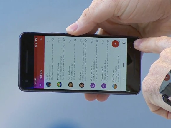
The quick settings menu has also been revamped. Icons get a new look but you no longer get drop down menus for them. Instead, a tap toggles it on or off while a long press brings you into more settings.
2. More AI integration
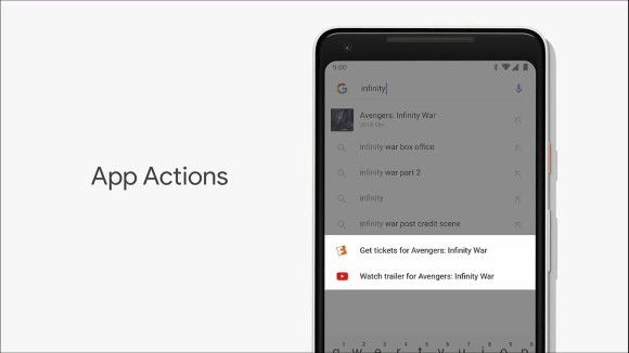
C’mon, it’s Google we’re talking about, of course AI and Machine Learning is going to be at the centre of it all. In Android P, Google’s goal is to make your phone easier for you to use and save you time by leveraging device-level machine learning.
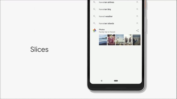
The new version of Android features a revamped App suggestion menu. In addition to the usual slew of suggested applications based on your behaviour, you will also get something Google calls App actions and Slices. These are specific actions that you can take within specific applications.
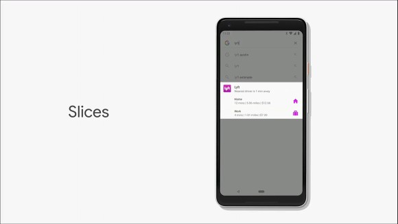
In the demo, they showed off the ability to instantly call a Lyft ride home without needing to launch the app yourself and go through the hassle of hailing a ride.
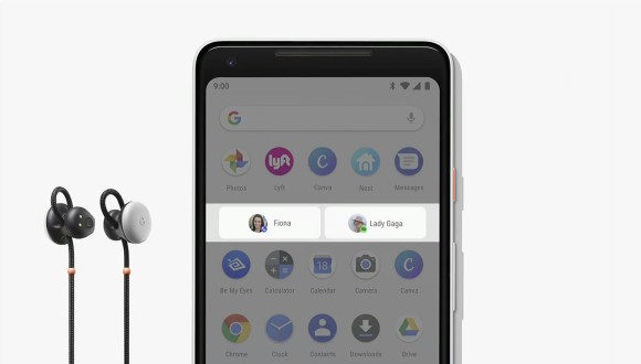
Another example is when your headphones are connected, Android P can switch things up and bring up your last played music playlist so you can jump right in and pick up where you left off.
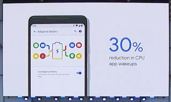
Google also leverages Machine Learning to improve battery life by intelligently predicting and analysing the apps you’re going to use, the apps you have used as well as the apps you won’t use. This “Adaptive Battery” is said to have reduced CPU app wakeups by 30% and help users experience better battery life across the board.
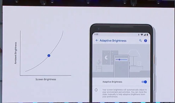
Google is also tweaking adaptive brightness on you display with some Machine Learning goodies. Instead of just adjusting the brightness of your screen based on how bright your surroundings are (the way it works now), it will also take into consideration your own brightness preferences (based on how you manually adjust screen brightness) and will automatically tweak the brightness adjustments based on your own habits
Notifications have also received some AI love so now if you’re always swiping away a notification from an application, the phone will ask you if you want to just switch off notifications for that app altogether. Google’s also included a “Manage notifications” toggle so you can easily manage which notifications you want and which you don’t.
3. Help you spend less time on your phone with new DND functions
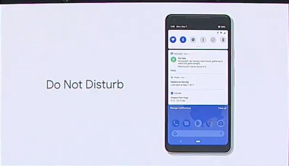
Finally, Google’s addressing the issue of “Digital wellbeing” where they’re intent on helping you separate your digital life from your real life. The first step towards this is the new Do Not Disturb (DND) tweaks where turning on DND won’t just silence your phone, it will also remove any visual notifications so you’re not distracted by them.
There’s also a new “Shush” gesture. If your phone is on the table with its screen facing up, flipping the phone’s screen so it faces down will automatically engage “Do Not Disturb”.
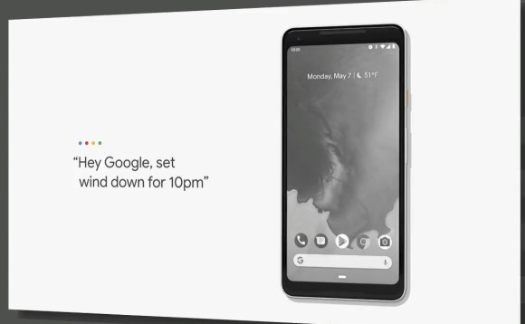
Besides that, Android P will also help curb the good ‘ol “let me just look at my phone for a while before I go to bed, oh no how have 4 hours gone by” problem we all have. It will do that with the new feature called Wind Down. On Android P, you can set a specific Wind Down time and once the time comes for you to wind down for bed, the phone will turn everything on your display into a monochrome image.
Apparently this is far less appealing to the human brain and does help you put your phone away. Don’t worry, the colour will return when you wake up in the morning.
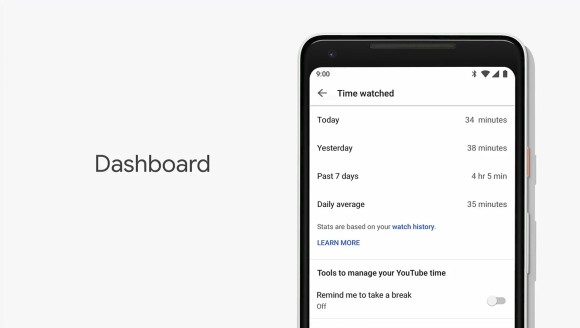
Finally, Android P will also give you more insight into how you use an app on your phone. Which apps are your most frequent? How many times a day do you use it? How many minutes do you spend watching YouTube? What time are you checking your emails?
All of these will be easily accessible in the settings menu of the Android P smartphone so you can get a better idea on how you’re spending your time and if you should be spending your time on those things or not.
While all of this is an admirable attempt at curbing the growing problem of “smartphone addiction”, the proof will always lie in the pudding. Will it actually work? We don’t know, only time will tell.
How can I try Android P?
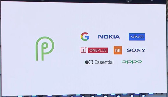
And that’s about it for the major changes on Android P. I’m sure you’re curious to try it out. Today, Android P Beta was announced by Google and you can try them out on Google Pixel, as well as seven more major Android manufacturers.
Perhaps the most interesting part about this is the fact that device manufacturers who often offer heavily skinned versions of Android — like OPPO, vivo and Xiaomi, are also a part of this beta test. However, the biggest omission is the single biggest Android smartphone manufacturer in the world right now: Samsung. What gives?
I don’t really know, but you can check to see if your phone is compatible by heading to this website. According to The Verge, the list of supported devices includes: Pixel 2 / Pixel 2 XL, Pixel / Pixel XL, Essential Phone, Sony Xperia XZ2, OnePlus 6 (coming soon), Xiaomi Mi Mix 2S, Nokia 7 Plus, Oppo R15 Pro, and the Vivo X21.
What do you guys think of Android P? Let me know in the comments below.
[SOURCE]

