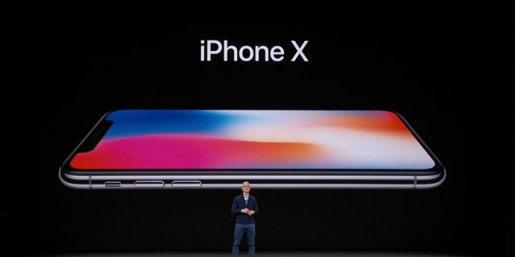
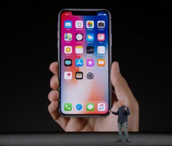
Every phone, no matter how “revolutionary” will have undoubtedly have compromises, things that people don’t like about it. Things that some of us hate, even. It was that way when Samsung launched the Galaxy Note8, so it’s probably no surprise then that it’s also that way when Apple launched the iPhone X.
Thinking of getting one? We think you should read this first.
1. No Touch ID

Probably the biggest thing we loathe about Apple’s new completely redesigned handset. Touch ID on the iPhone worked like all good technology should: It was almost invisible. It almost always worked. And it did not change the way iPhone users interacted with the device at all.
Face ID, though, that’s another matter altogether. I go into detail on why we think it will never be better than Touch ID, but the long story short is that Touch ID has become so invisible, so natural and so reliable that we doubt any facial recognition feature — no matter how advanced — could ever be more convenient.
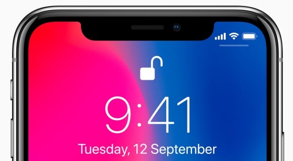
I get that there’s no space on the front of an all-screen device for a fingerprint scanner. And I can also forgive the fact that Apple couldn’t figure out how to tuck Touch ID under their display. But was it really so hard to just put a Touch ID fingerprint scanner at the back of the phone?
2. The “notch”
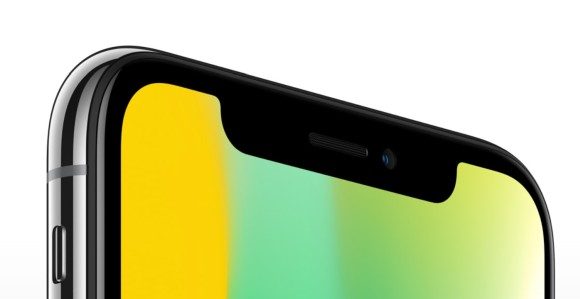
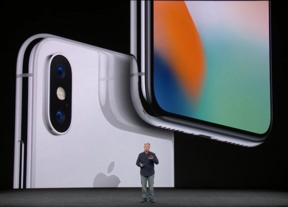
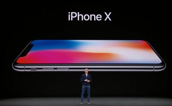
Instead of going with Samsung, Xiaomi and LG’s approach of cramming the front screen elements into minimal top and bottom bezels, Apple followed Essential’s path and settled for a notch instead. The only problem is that their notch is far larger than that of the Essential Phone and I also think it’s far uglier. C’mon, you’re Apple, surely you have more taste than to settle with a notch that ugly.
But perhaps beauty lies in the eye of the beholder. Maybe you like it, but our problem with it goes beyond aesthetics. That notch looks like it could also pose problems for app developers and may limit the iPhone X’s usable screen size.
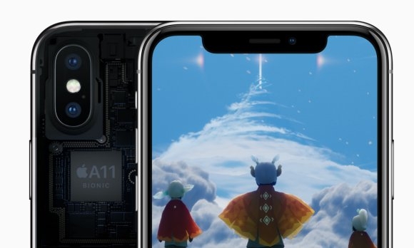
Think about it, apps that use that top portion of the smartphone’s screen (like games in landscape mode, for example) will either have to design around the iPhone X or have to settle with using black bars (thus not using all the screen on your all-screen phone) to fill in that space. And even if they do design around the notch, what happens when users who are not on the iPhone X use those apps? Will they have to live with weirdly positioned UI elements too?
In fact, taking into account the designated dead zones for stuff like the new swipe home button and the notches at the corner, the iPhone X’s 5.85” screen is actually smaller than the iPhone 8 Plus. Don’t believe us? Well, PhoneArena did the math and they reckon it’s 2.6% smaller than the 5.5-inch iPhone 8 Plus.
3. The iPhone X’s gesture controls
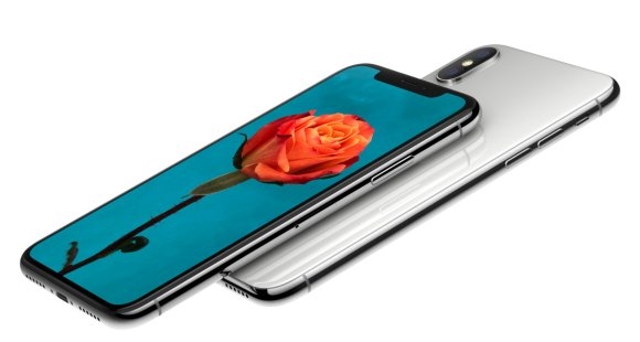
I don’t think anyone would disagree that one of the iPhone’s biggest strengths is its simplicity. There are no complicated buttons or gestures that one needs to memories beyond a simple double tap of the home button, a swipe up for control centre and a swipe down for notifications. It’s elegant simplicity at its best. Often times it’s the kind of phone for a crowd of people who find having a back and recents key too complicated.
All they want is a single home button and that’s what Apple gave them. Well, until the iPhone X, that is. With this new all-screen smartphone, the company had nowhere to put their iconic home button, so they ditched it altogether.
Right away, in one fell swoop, Apple fundamentally changed the way users interacted with an iPhone. Gone, is the convenience of having the home button. Gone is the reassuring feeling of always having a fixed “get me out” button. Just like that, ripped from the hands of consumers.
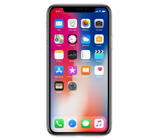
In its place, you have a series of gestures that I had to look up because I completely forgot what each of them did. To go home, you have to swipe up from the bottom (there will be a small bar), to go to the previous app you swipe left on the bottom, to bring up your control centre, you swipe down from the right corner and to bring down notifications, you swipe down from the middle.
Maybe it’s not that hard to get used to? But it’s a pretty big jump from what Apple used to do with the home button and I think it goes against Apple’s mantra of keeping powerful technology simple.
4. No fast-charging bundled with a >RM5,000 smartphone
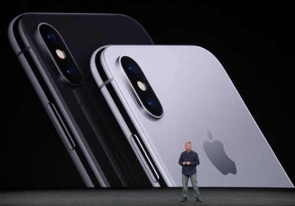
Speaking of things that changed, Apple finally introduced support for fast-charging on the new iPhones. But, while they do support fast-charging, Apple doesn’t bundle a fast-charging brick with any of their iPhones, not even the most expensive iPhone X.
Instead, you need to splurge on a USB Type-C power adapter that costs at least RM229. On top of that, you also have to buy a USB Type-C to Lightning cable that costs RM119 too. I’m sorry, but was spending RM5,000 on a smartphone not enough? I would have thought that it would at least net me a fast-charging brick.
5. No headphone jack
I mean, you totally saw this coming right. Despite Apple’s big push towards a headphone-jack-less smartphone world, the inconvenience of not having a headphone jack has not gone away.
Personally, I’ve spent more money than I am willing to admit on headphones and do you know what all of them have in common? Yep, a 3.5mm headphone jack. And I’m pretty sure this problem isn’t unique to me.
I absolutely loathe the exclusion of a headphone jack on any smartphone, especially when their solution is an adapter that adds no value to the smartphone’s ability to output music. Also, did you know that Apple’s 3.5mm to Lightning adapter only has a 1.5 star rating in their store? If I saw a restaurant/device/movie with that rating, I’d avoid it like the plague…because it probably has the plague.
Other little niggles
Besides these 5 big things, there are also a couple of smaller issues that we don’t like about the iPhone X. The first of which is Apple’s continued refusal to support dual SIM. It’s 2017, for crying out loud, a lot of people have more than one SIM card! Besides, even if you only have one SIM card, I’m sure you’d appreciate having a secondary SIM slot on your expensive flagship smartphone when you travel abroad and purchase a local SIM in that particular country.
Or, at the very least, include an eSIM in the new iPhone like they did with the iPad.
The second niggle is the price. Remember how everyone made a big hoo-haa about how the Samsung Galaxy Note8 was super expensive? Well, the iPhone X is even more expensive. Honestly, is anyone really surprised? We aren’t, but that doesn’t mean we have to like it. By our calculations, the iPhone would have prices starting from RM4,999 and top out at RM5,699.
iPhone X may be Apple’s most exciting product in years, but it isn’t without its flaws — to treat any product like that is probably the worst thing you could do to it. Either way, good or bad, we’re looking forward to get our hands on the iPhone X.
What do you guys want us to test out when we eventually review the smartphone? Let us know in the comments below!

