ASUS dug deep with their ZenFone 3 lineup and came up with three truly different smartphones compared to the old ZenFone 2. Take the ZenFone 3, for example. On paper, it seems to tick a lot of the right boxes when it comes to a quality device, but is that really the case in the real world?
Well, I’ll say this: Performance is definitely not an issue. The handset is buttery with daily tasks and doesn’t let up even when you’re gaming. It’s also built out of solid materials so you probably won’t be left wanting in the feel department either.
The ZenFone 3 also gets an updated camera that outperforms its predecessor by a noticeable margin. From a practical standpoint, this smartphone is rock solid.
But, to me, there’s just one thing that would stop me from buying one.
[nextpage title=”Can ASUS make an exciting device?”]
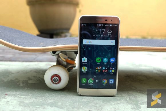
ASUS’s smartphones have never really excited me. I’m not quite sure what it was but they’ve never really been able to set fire to my loins the way some smartphones can. The OnePlus 3, for example, was a fundamentally flawed smartphone but I fell in love with it because it was an exciting device.
Then all of a sudden ASUS decided that they were done making dreary smartphones and completely revamped their entire lineup of devices with the ZenFone 3 and its siblings. Has it worked? Well, that’s what I’ve been trying to find out.
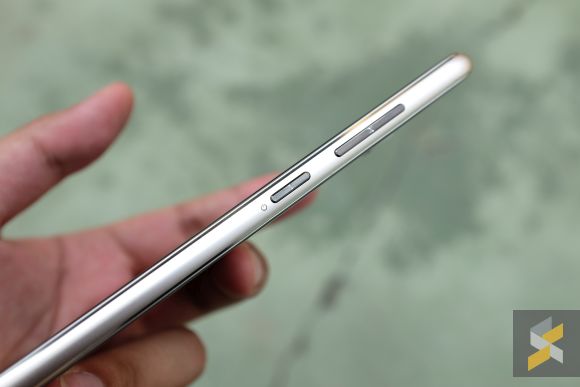
Right off the bat, things look like they’re off to a promising start. The ZenFone 3 is made out of quality materials, things you usually find on more expensive devices. As a result, the phone feels really quite premium. When you pick it up, it does have the heft and presence of a much more expensive smartphone.
ZenFone fans will undoubtedly notice the absence of the rear-mounted volume rockers, but if you think about it, neither did the ZenFone Zoom. It personally didn’t affect me that much because all the buttons were on one side so I could still rest the device in landscape without accidentally pressing any buttons.
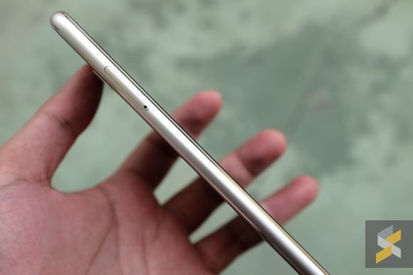
Instead, at the back, you’ll find a rectangular fingerprint scanner. The shape is rather nice because it covers more of your finger and is rather accurate but it does accidentally trigger in my pocket if I place it sensor-side down. Sort of like what the Nexus 6P used to do.
ASUS’s new smartphone also packs some respectable internals. It comes with a Qualcomm Snapdragon 625 processor that’s built on a 14nm process. In the world of processors, smaller is better and a 14nm process usually translates to better performance and a more frugal power consumption.

Pair that with a generous 4GB of RAM and 64GB of (expandable) internal storage and you’ve got a really solid performer. And I mean solid because, throughout my usage, this smartphone never choked or slowed down. It was reliable and buttery through everyday activities, even when playing fairly intensive games.
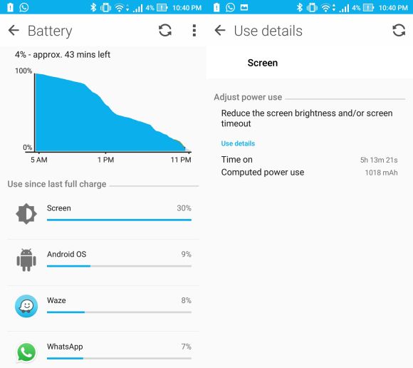
And the reliability doesn’t stop there. Perhaps the most impressive thing about the ZenFone 3 is its incredible battery life. I’m thoroughly impressed with the ZenFone 3’s 3,000 mAh cell. On my heavy usage days, I can get about 5 hours of screen on time with more than 12 hours on battery.
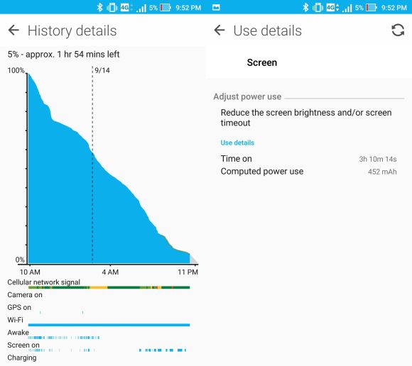
On my lighter days, I actually manage to eek out two days on a single charge with about 3 hours of screen on time. Battery life is definitely an A+ here for the new ZenFone.
But the battery is also where you see the first chink in the smartphone’s armour — it charges really slowly via its USB Type-C port. From 0% on the standard charger, it will hit 18% after 30 minutes and 33% after one hour. A full charge took more than three hours.
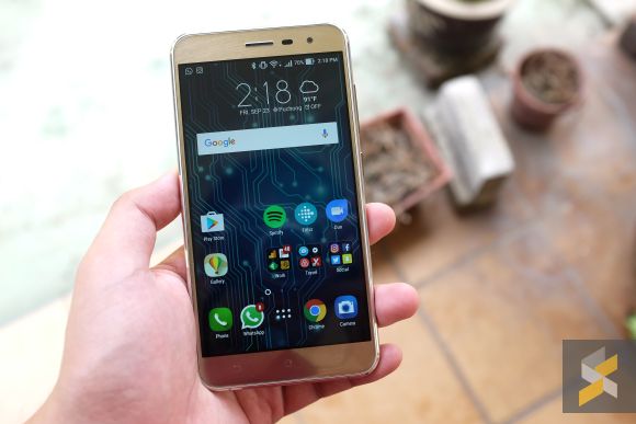
The second chink lies in its UI. Despite the fact that the device has a nice 5.5-inch Full HD display (a potent cocktail, I might add) it just doesn’t look particularly attractive. At first, I thought it was the display itself, but web pages look good, and viewing angles are solid. What’s more, you can adjust the colour temperature too, which is something I like.
Then, I realised that it was actually ZenUI. I know that I said in my initial impressions that this version of ZenUI looks much better than the previous ones, but, like Samsung’s TouchWiz, it’s just an incremental improvement. In the grand scheme of things, it still isn’t a look I’m down with. To make matters worse, it still comes with tons of bloatware that you can’t uninstall.
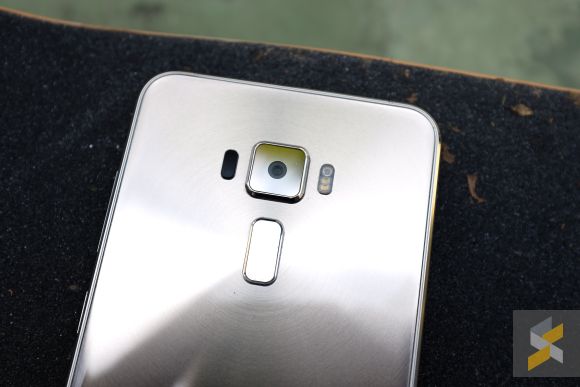
ASUS also improved the ZenFone 3’s camera. Now, it’s a 16-megapixel Sony IMX298 camera with an f/2.0 aperture lens that occupies the back of the smartphone. Is it significantly better than their last camera-centric flagship ZenFone Zoom?

Well, image quality looks pretty good when the lighting is favourable. It can bring out some nice details and exposes rather accurately with little effort. However, I don’t only look at image quality when testing a smartphone’s camera, because a smartphone camera’s usability (the entire package) is far more important.

And when to that, the ZenFone 3 falters. In anything but the brightest of days, the ZenFone 3’s shooter feels sluggish. Low-light shots also lose a lot of detail in the shadow (and in the light) which is a shame when you’re trying to get that nice sunset photo.
Is this an A+ smartphone camera? No, I definitely wouldn’t say so. In fact, I think it’s the least reliable thing about the ZenFone 3 and that’s a shame because the rest of the smartphone is rock solid.
This, then, brings us appropriately into the conclusion. If I had to describe the ZenFone 3 in a single word, it would be reliable. The smartphone does smartphone things really well, so well that I can even forgive the sluggish camera (keep that in mind when you take a photo and you should be OK) and ugly UI.
Logically, there are really no big drawbacks with this handset, especially when you take what this RM1,699 smartphone does brilliantly into consideration. There’s even a smaller 5.2-inch version priced at RM1,499 for those with smaller hands. In a practical situation, ASUS has made a great smartphone and you probably wouldn’t regret buying one.

That said, here are my issues with the device. On paper, the metal and glass build should mean a good looking smartphone, but it just doesn’t appeal to me. The handset’s footprint is a little too wide, the capacitive keys are not backlit, it slides off nearly every surface I put it on and I really dislike the CD-pattern design — also known as the concentric circles — on the front and back of this gold version.
The biggest strength of the old ZenFones was that they were very affordable and very reliable devices — you get a lot of smartphone for your money. The ZenFone 3, on the other hand, comes with a hefty RM1,699 price tag. Sure, you are getting an arguably better phone made from better materials, but if you’re spending this much money on a device, it needs to go beyond being just reliable and good. It also needs to make you feel special. And that’s something the ZenFone 3 just doesn’t do.
[nextpage title=”Gallery”]
I was very impressed with the camera’s ability to take this motorcycle picture. It was just a quick lift and snap, yet the photo turned out very nicely. Unfortunately, this only happens when the lighting is good.
Bonus selfie:

