With Android 7.0 Nougat, a pair of Nexus smartphones, and even a rumoured Google-made smartphone arriving later this year, there are a lot of good things coming the Android fan’s way. Now, the folks over at Android Police have been given some juicy insight into what the new Nexus devices might look like on the UI side of things.
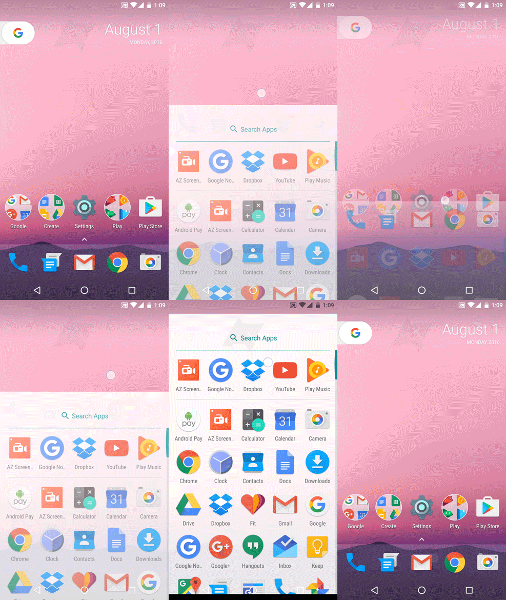
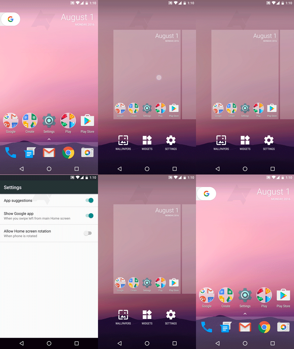
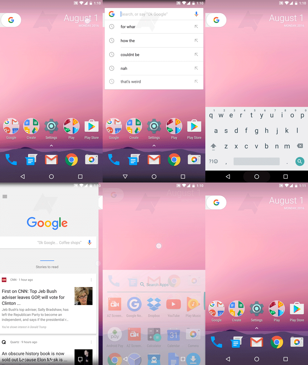
Android Police has released a set of GIFs that should give you some insight into how the new Nexus Launcher (exclusive to the new upcoming Nexus Marlin and Sailfish) will work and look like.

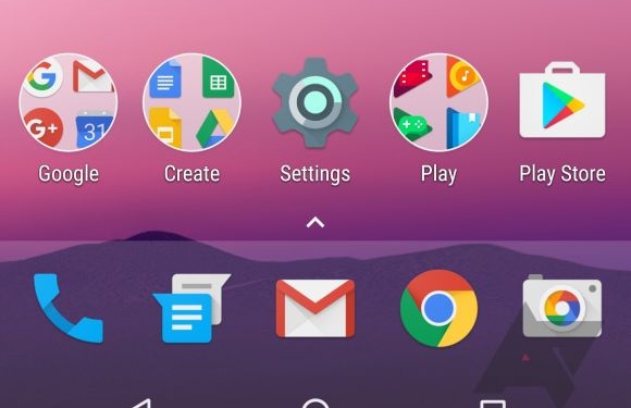
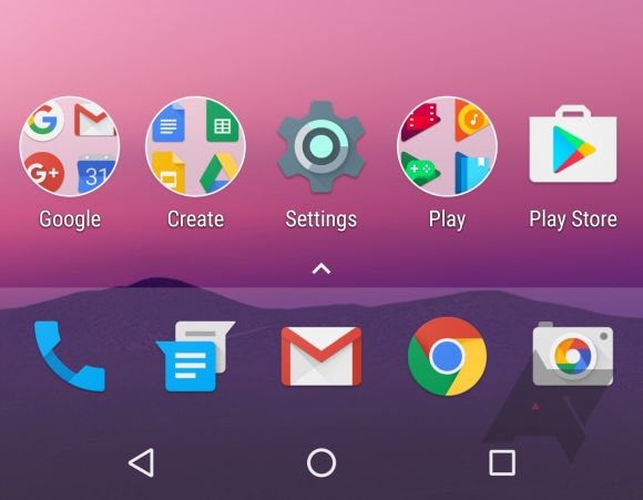
The first and most apparent change is the absence of an app drawer icon, but that doesn’t mean you lose the app drawer. Instead, you get five static icons (compared to the old four) located at the bottom of the screen with a small “frosted glass” section. Swipe up (or tap the arrow) on the frosted glass section and the app drawer with a redesigned Search Apps slides into view.

Beyond the app drawer, you will also notice that the Google Search bar is gone and in its place is a new calendar widget that you can’t remove. There’s also a little G tab. Despite looking like a pull-out tab, pulling it does nothing. If you tap on it, the Search bar reappears.

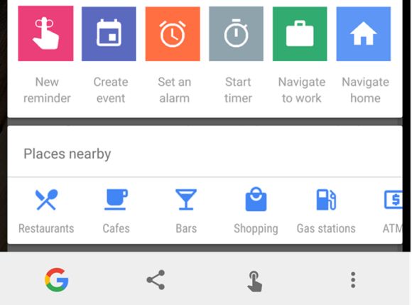
Android Police notes that this G tab’s behaviour and animations “may change substantially” in the future. They also note that the navigation buttons will probably also change to be more in line with Android Nougat’s new redesigned navigation buttons including some form of “flower” home button. Android Police also expects a new Now on Tap bar layout to show itself in the new Google Nexus Launcher.

Keep in mind, as always, that these are still unconfirmed and unofficial designs. Google has been known to axe software designs at the last moment, so whether these end up to be true or not remains to be seen. Still, Android Police is really confident in this, what do you guys think of the new Nexus Launcher? Does it tickle your fancy?
[SOURCE]
