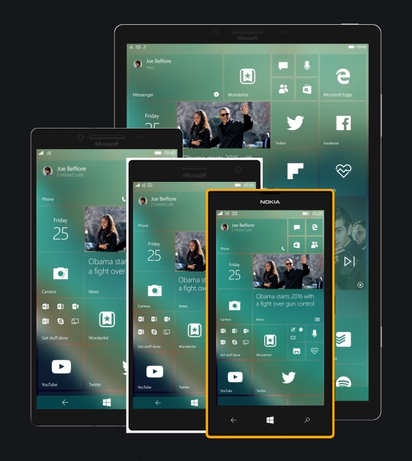
Whenever designing is concerned, you’ll always have people who simply don’t understand your “art”. Thus lies the subjectivity of it all but when you have a majority of people who feel that your attempt is a half-hearted one, prepare for the worse – especially when a fan releases a concept and it makes your (in this case Microsoft/Windows) UI look silly.
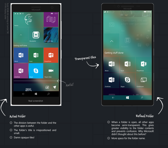
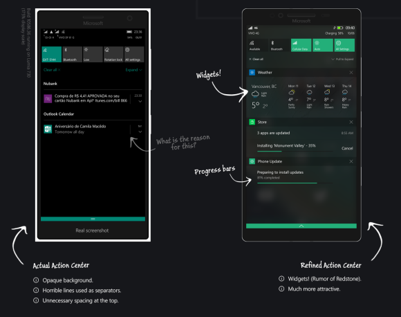
Refining Windows 10 Mobile by tackling its flaws, the concept takes a full swipe at what Microsoft outed. Redesigning the action centre, start screen and Windows 10 Store, designer Jobs Robson makes Windows look nice again.

Changing out those bland coloured tiles for a more uniformed frosted glass effect to the operating system, Robson uses familiar elements that were found much earlier on Windows 7 and now seen again on desktop-based Windows systems.
Utilising spacing better on Windows 10 Mobile devices, he makes some apps freely transform based on unallocated space on screens.
People in the comment sections have gone off on Microsoft, saying that it’s shameful that their own designers aren’t capable of putting something like this out. Adding that Jobson should be hired and allowed to actually put this concept to work.
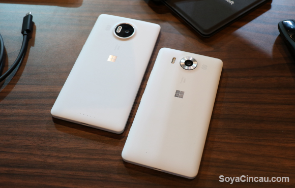
While their Surface line has been relatively successful, their mobile division has lacked some gusto. We felt that the latest Lumia 950s, were boring and there was a high drop in quality in terms of the polycarbonate case. Apps were slow and the OS was buggy when switching between apps and menus.
Our full rundown of the Lumia 950 and 950 XL can be found here.
Microsoft has even delayed Windows 10 Mobile on older devices, pointing us to think that they’ve dropped the ball on the operating system. This concept could offer a lending hand but only in terms of looks, they still have a lot to do in terms of optimisation and functionality.
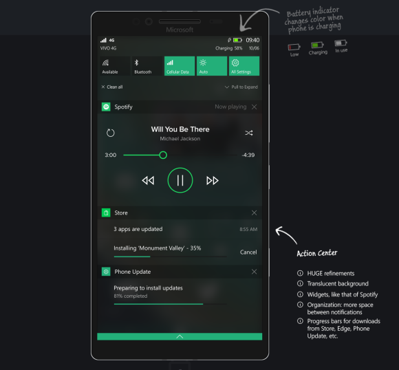
I for one think that (this) Jobs deserves a cookie. There would be a high possibility that a Windows phone would be in my pocket if the UI looked like this. You can check out his other work here.
What looks good is subjective but do you think that the concept looks better than what Microsoft originally put out? Let us know in the comments below.

