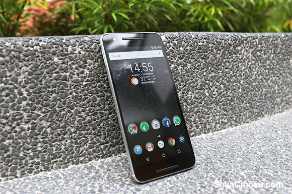
With the launch of the Nexus 6P, everyone has been digging up old nostalgic Nexus feelings from their feel-vault and making sweeping declarations that vanilla Android is the only way Android should be experienced. There are some of us at SoyaCincau.com who feel the same way and then there are those who simply cannot comprehend how paying so much for a device that comes with, what essentially is the “outline” of the Android OS, could be justified.
We don’t like letting those without a voice go unheard, so we had an extensive discussion and compiled a list of reasons why vanilla Android is the only Android you DON’T want to have.
Do keep in mind that this list is tailored to the average, inexperienced consumer who wouldn’t root their brand new Nexus device and play around with custom ROMs lest it becomes a two and a half thousand ringgit aluminium brick. We do like a near stock experience, but we also can’t deny that there are many luxuries that come with the Android skin on most devices these days that we almost couldn’t live without.
Of course, this list isn’t for everyone, so fanatical purists, turn away! Everyone else, allons-y!
[nextpage title=”No bling”]

[nextpage title=”Barebones”]
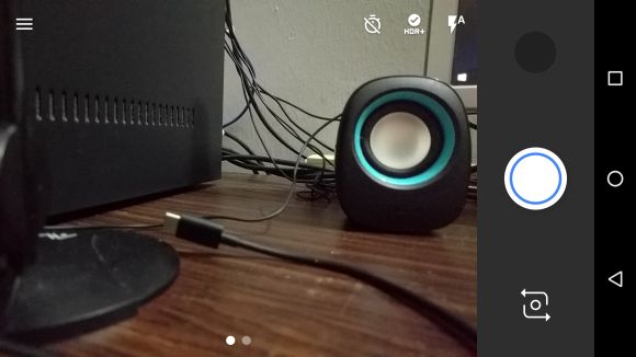
Most modern smartphone camera applications come with a host features that can turn even the worst photographer into a “pro-tographer” (or at least, Instagram pro) in under 60 seconds. Others have full manual controls built into their camera application. The Nexus 6P has neither. Well, almost neither. Sure, you get some barebones features like HDR and a timer, but all that fancy beautification and manual modes found in other devices are missing.
[nextpage title=”Crouching tiger, hidden UI”]
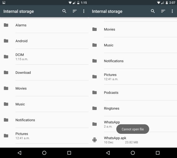
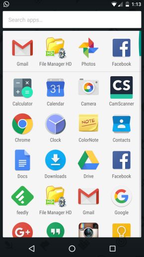
We like to keep things tidy in our devices, that means keeping tabs on what we copy in and out of our devices via some kind of file manager app. Though that’s kind of hard to do in the Nexus 6P because there is no native/preinstalled dedicated app for such controls, instead it’s hidden in the “Storage and USB” setting. To make things worse, the “file manager” doesn’t seem to allow the installation of APKs which was rather annoying. Oh, and did we mention that the battery percentage indicator can only be viewed if you pull down the notifications panel? The only other way around this is to embed it within the battery icon, which makes it almost impossible to see at a glance.
[nextpage title=”Close ALL tabs!”]
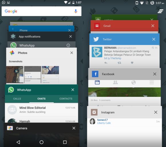
Even before Android switched to the triangle-circle-square layout it became almost instinctual for users to hit the menu key (square) which brings up a list of recent/background apps and hit the little trashcan/leaning-burger icon to close all opened apps. The ability to close all background applications have become incredibly common in most Android devices, but apparently stock Android didn’t get the memo because we had to go all fruit ninja on the recent apps to close them all.
[nextpage title=”Stock stays stock”]
[nextpage title=”Tap, tap, tap”]

This is why manufacturers have incorporated some kind of “tap-to-wake” function into their devices. Most of them have the classic double-tap to wake, Huawei’s Mate S has the knuckle sense (and double-tap) and even Samsung has one, albeit a little primitive because we actually have to press a button. C’mon Samsung, a button? Regardless, all of these functions are absent on the Nexus 6P because, once again, stock Android doesn’t believe in such “silly” features.[nextpage title=”Other oddities”]
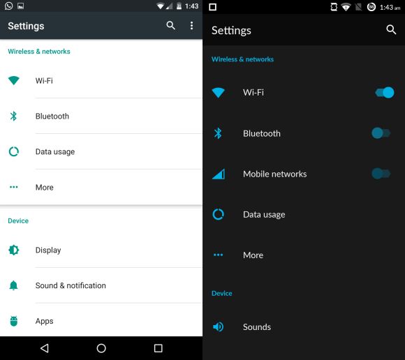
You can make the argument that CyanogenMod does a pretty good job of emulating a stock experience, but even they have realised that pure stock isn’t the best way to go. It’s the little things that you really don’t notice until you’re using a purely stock device. For example, the single finger swipe (which can be done with one hand) down from the right side of the status bar in your CM skin rolls the entire status bar down, versus the need for a 2 finger swipe (almost too difficult for one hand) on the Nexus device.
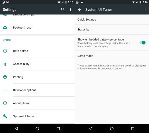
Other little things like the toggles in the settings menu for WiFi, Bluetooth and mobile data, are also absent in stock Android. Even customisation of the drop-down status bar can only be done via a hidden System UI option. After spending some time with the stock experience, some of us really wonder why people are raving about the pure Android experience when it just looks like a whole lot of inconvenience for the average consumer.

As the Android OS continues to grow, manufacturers are getting better and better at making Android skins. A classic example is Samsung, whose TouchWiz once was famed for being preloaded with way, way too much bloatware. But now, with their latest flagships, the skin has considerably toned down on the bloatware and has become a much nicer, cleaner Android experience. Then there are people like CyanogenMod who develop fantastic stock-like Android experiences that are preloaded with nifty features and quality-of-life improvements that simply make the overall experience more enjoyable for most.
There are ways around most of these limitations which we will be covering in another post, so stay tuned as we try to add some caramel drizzle over your existing vanilla Nexus 6P in the hopes that it will give it some pizazz. Vanilla was never that exciting a flavour to begin with.

