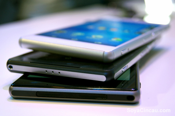
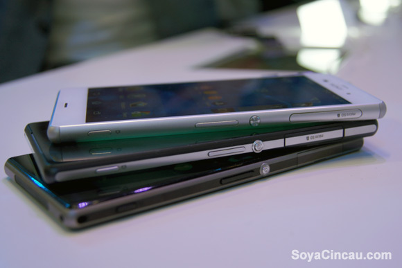
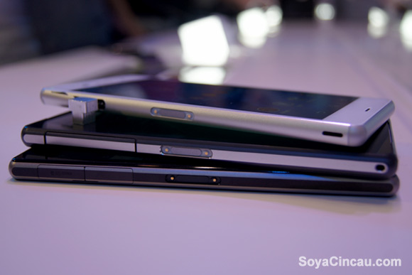
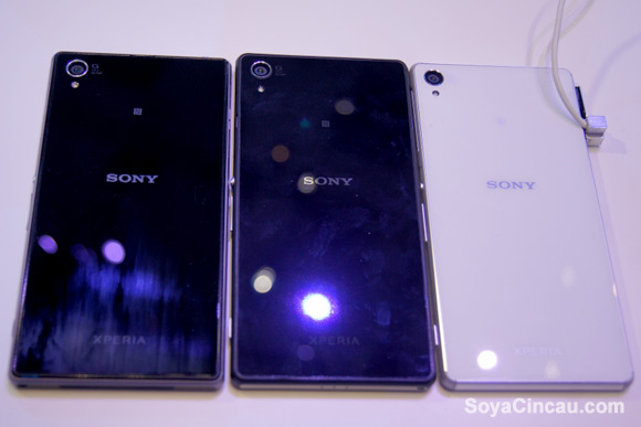
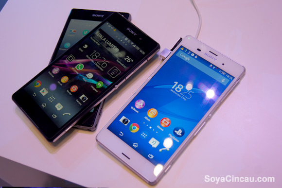
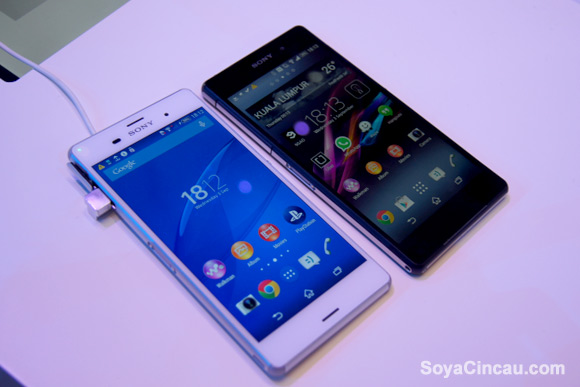
We managed to get a hands on with the newly announced Sony Xperia Z3. To see how much different, or how much similar it is with its previous models, we have compared the Xperia Z3 with the Xperia Z2 and the Xperia Z1.
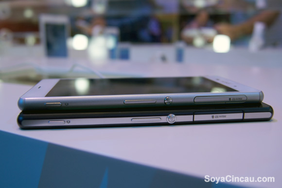
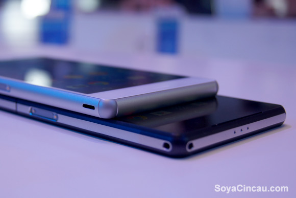
One of the biggest change is the edges on the Xperia Z3. It is more rounded now which makes it more comfortable to hold but somehow we felt that the flat edges on the Xperia Z2/Z1 gives it a more elegant feel to it. With its boxy flat edges, the former flagships kinda demands more attention and care when holding it in the hands. The new one just feels quite alright without dramas, and then you realised that the new Xperia Z3 is actually thinner by almost a millimetre than its former model.
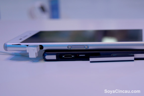
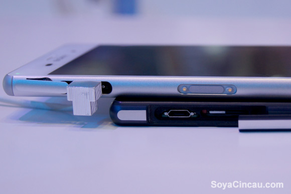
Another welcome change is the flap. On the Xperia Z2, the microUSB and microSIM cards share the same single flap cover, which is quite annoying with its long dangling cover. On the Xperia Z3, they have moved the nano-SIM and microSD card under a single flap, which you’ll hardly mess around. And this leaves a microUSB port having its own tiny little flap cover, which is much easier to manage especially when you’re charging with a power bank while on the go.
Check out the side by side hands-on comparisons between the Xperia Z3, Xperia Z2 and Xperia Z1 after the break.
Sony Xperia Z3 vs Xperia Z2
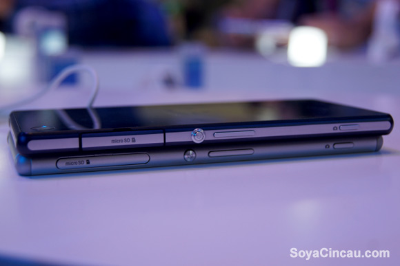
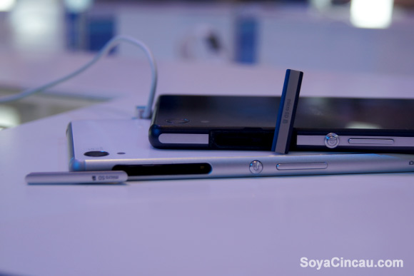
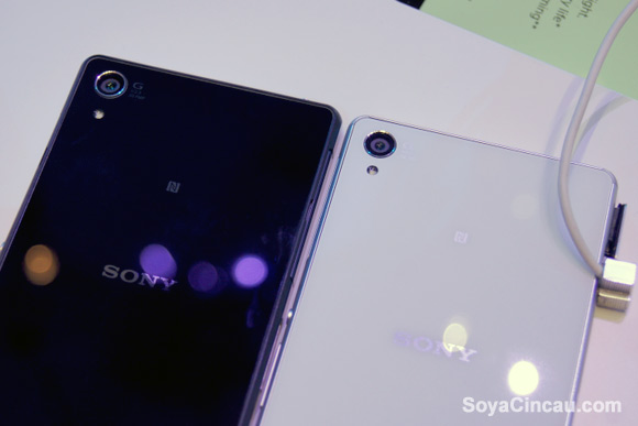
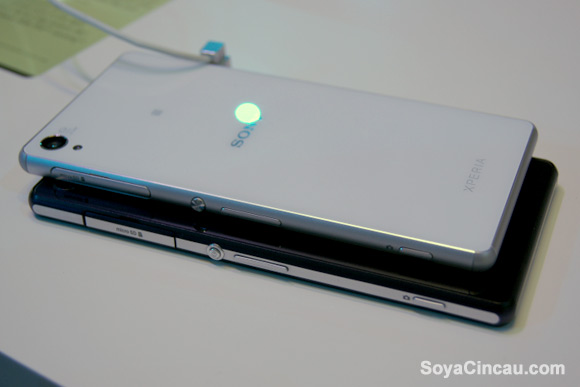
Sony Xperia Z3 vs Xperia Z2 vs Xperia Z1
