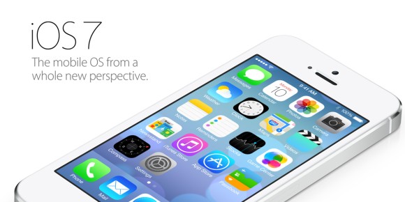
Apple is giving its iPhone and iPads a new breath of life with its latest iOS 7 operating system. After launching several mobile devices since 2007, the iOS platform has been pretty much the same with minute changes here and there. With the competition stepping up from the Android, BlackBerry and even Windows Phone camp, a change is needed by Apple to keep its mobile devices on par with today’s growing need.
Without a doubt, the iOS platform is one of the easiest to use mobile OS out there. Simplicity has always been a key which allows users from either young or old to pick up an iPhone or iPad and start using it with rather minimal learning curve.
For power users particularly those who have been comfortable with other flexible mobile platforms, would be harder to please on iOS. Biggest challenge is how could Apple offer more control and features but yet maintain the simplicity that it is has been famous for?
Introducing the new iOS 7 which it calls a mobile OS from a new perspective. Firstly you’ll notice a much cleaner look which makes it feel like a completely new device. There’s more usage of skinny fonts and the icons have been redesigned for a more symmetrical look and feel.
Waking up the screen reveals an all new lock screen which uncannily looked familiar. There’s also new floating bubble live wallpaper and translucent UI effects to make it more aesthetically refreshing than before.
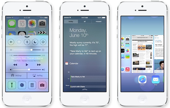
One of the major things we liked is the revamped Control Centre which is accessible by swiping from the bottom. It gives you control for your music and various toggle settings such as WiFi and Bluetooth from anywhere on the phone. Now iPhone/iPad users can toggle crucial settings without fumbling through the Settings menu.
Notification centres have been revamped as well to give more information without opening the specific apps. Plus, you can read your notifications from the lock screen for a quick glance.
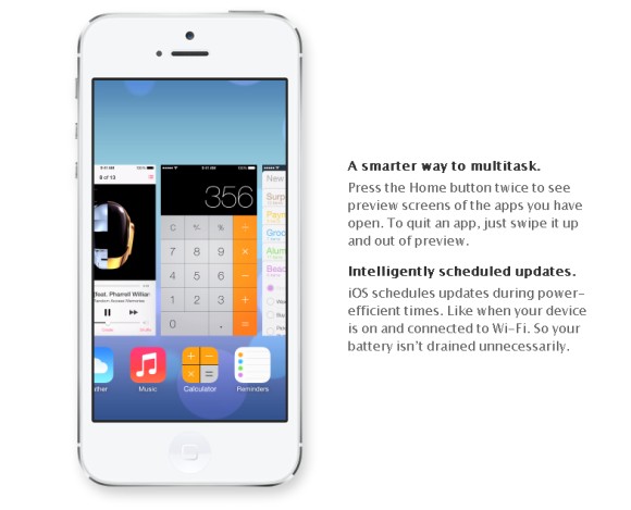
Multi-tasking has been revamped as well with this horizontal carousel look. It looks similar to the Multi-tasking UI found on previous HTC Sense UI, which we are not a fan of. Although this gives user a clearer view of the apps running in the background, power users might find this a chore as you’re only able to see one app in view while scrolling. Personally we would prefer a grid layout for multi-tasking like the ones found on HTC One and BlackBerry Z10.
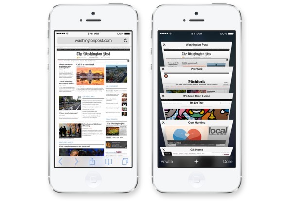
The Safari web browser has been revamped as well with a unified tool bar for a simplified look. For those that browses multiple pages at one time, the new Safari comes with a newer tabbed interface which is familiar to those that have used Chrome browser.
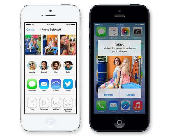
While Apple has yet to adopt NFC, sharing of files among devices is still possible with Air Drop. This is done through WiFi and you can easily share content among your contacts or any devices in the area closely.
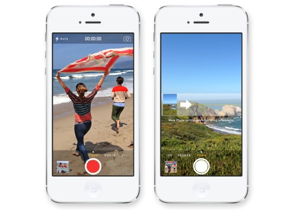
In the imaging department, the Camera UI has revamped with use of swipe gestures. Now toggling between photo, camera and panorama is as easy as swiping from left to right. Since instagram and filters are a trend now, the new camera interface also comes with built-in filters as well.
iOS 7 will be available in Fall 2013 which is sometime in Q3 this year. In terms of device compatibility, it will be coming to iPhone 4, 4S and iPhone 5. For tablet users, iPad 2 and above including the iPad mini will be receiving the updated OS as well.
Overall iOS 7 is interesting and we’re curious. The redesign and the enhancements it brings are welcomed but is it enough to put Apple back on top? We’ll have to wait till September to find out.
Head to Apple’s iOS 7 page for the full details. You can watch the full keynote here.

