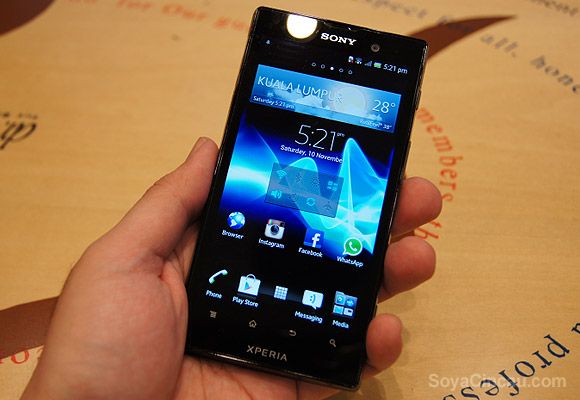
Sony has started 2012 with a bang with its line up of Sony NXT series. The Sony Xperia S which was first announced in January broke new grounds with its 4.3” display that pushes a high 1280×720 resolution. That’s a massive 342 ppi (pixels per inch) which was the highest pixel density at that time. It also marks Sony’s foray into dual-core processors and its refreshed mobile brand that dropped the “Ericsson” name.
When the Xperia S was launched, its other cousin the Xperia ion which is Sony’s first LTE device was only available at selected markets. Fast forward 8 months later, the Xperia ion is finally available for Malaysia that now comes in international HSPA+ variant. Read on to find out more of this Xperia S’s bigger brother.
Hardware
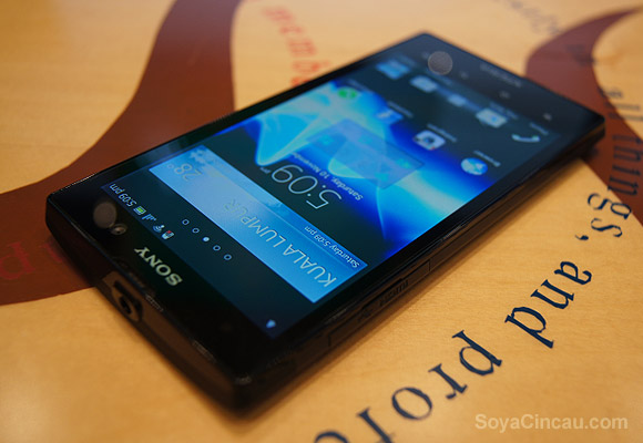
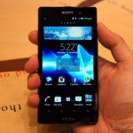
To recap on the specs, the Xperia ion shares a lot of similarities with its Xperia S. It is powered with the same dual-core 1.5GHz Qualcomm MSM8260 S3 processor, 1GB of RAM and a 12MP camera. What sets it apart is its larger 4.6” display (4.55” to be exact) that also does a 1280×720 pixels resolution. Obviously the pixel density is lower than the Xperia S at 323 ppi but in reality, it is rather hard to tell the difference as text and images appear just as sharp.
Internally, it comes with 16GB of storage but thankfully it comes with an expandable slot which accepts up to 32GB of microSD. Battery is slightly generous too at 1,900mAh, which is 150mAh more than the Xperia S. When we got our review unit, the Xperia ion is already running on Android 4.0.4 Ice Cream Sandwich.
Design
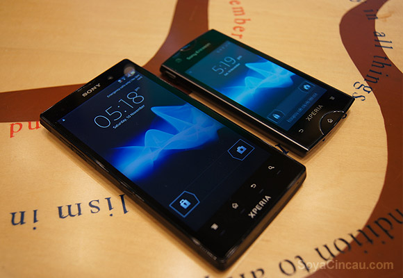
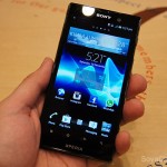
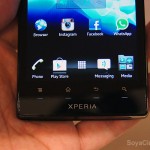
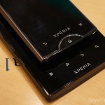
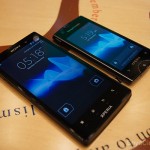
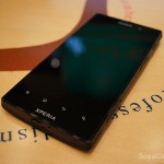
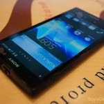
On first glance, the Xperia ion looks more like a serious business phone compared to the trendy looking Xperia S. There’s no fancy transparent belt and it features an all black front where the display panel is unnoticeable when the screen is off. Over at the top, there’s a prominent Sony logo with the front facing 1.3MP camera on the right and at the bottom you get the 4 capacitive buttons along with the Xperia branding. If we have to pick a similar model, the Xperia ion looks very much like a grown up version of the Xperia ray due to its clean square-ish looks.
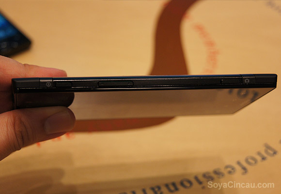
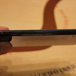
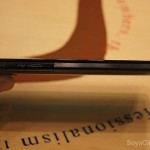
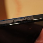
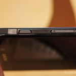
We are happy to report that the Xperia ion side button placement is a big improvement over the Xperia S. With a larger device in the hand, the power button is now moved towards the right side while the volume rocker is now placed at a higher position which is more natural to reach. Towards the bottom, there’s also a dedicated camera button with Fast Capture that lets you take a picture from sleep to snap under 2 seconds. For better clarity, you can check out our comparison of Fast Capture and other various burst modes.
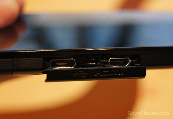
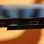
Looking at the left side, there’s a HDMI and micro USB port which is covered by a single flush cover flap. On the Xperia S, many would find the flush covers to be annoying and unfortunately on the Xperia ion, this is a bigger annoyance. While the cover keeps the design clean, it tends to get in the way while charging. The rubber that holds the cover doesn’t offer much room for flexibility which in the long run you might risk breaking and losing it. At least on the Xperia S, the micro USB cover is rotatable.
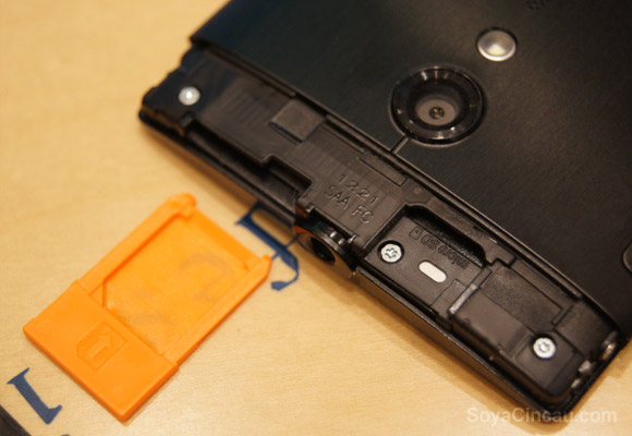
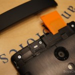
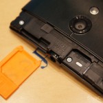
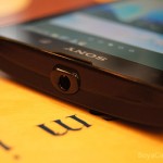
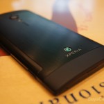
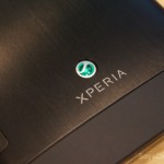
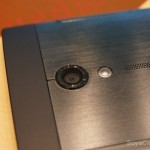
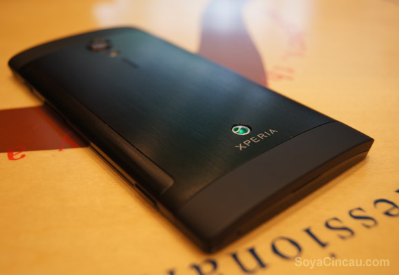
The back is where the Xperia ion sets itself apart from the Xperia S. While the Xperia S comes with a nice matte finish, the removable cover is quite a dust trap. On the Xperia ion it comes with a nice metal finish that gives it a touch of elegance. The 12MP camera, assisted LED flash and loud speaker is placed right smacked in the middle like the Xperia S. The top cover is removable and it houses the micro-SIM and micro SD slot, which is a better design. Both top and bottom are made with rubberised texture plastic which is a nice touch. The headphone jack is placed at the top, right in the middle with a slight protrusion.
Usability
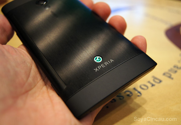
Being an early 2012 model, the hardware specs looks dated compared to its latest quad core rivals. Having said that, it is still a decent device and the large 4.55” screen offers great visuals thanks to its high pixel density. Sony does a great job with the new Android 4.0.4 Ice Cream Sandwich enhancements and the new photo gallery is a nice improvement over the previous Android 2.3.7.
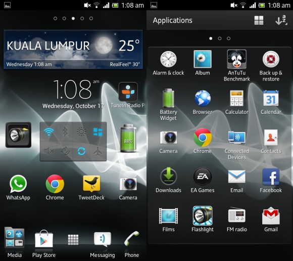
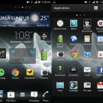
Just like other Sony Xperia devices, the skinned UI is rather nice and aesthetically pleasing with a variety of sleek looking widgets. For average casual use, it is still smooth and does its job rather snappy. One thing we’ve noticed is that Sony has removed the live “Cosmic Flow” wallpaper from its default themes. When switching themes, it uses a static image instead which could be done in the name of performance and power conservation. If you do want that Cosmic Flow, you could still enable it under Live Wallpapers manually.
When being pushed to the limit juggling between several apps extensively, the Xperia ion starts to show its performance shortfalls. There are some occasions when returning to the home screen; it took some time for the icons and widgets to appear. When that happens, even the apps listing arrangement tends to get reset from alphabetical order to custom.
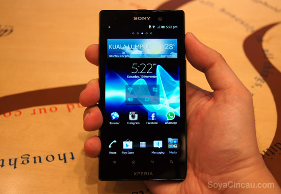
In terms of one handed usage, the Xperia ion is really pushing it. It is usable in one hand albeit some stretching needed. We find 4.3” is the comfortable size where one handed use is concern but despite its larger 4.55” dimensions, it is only slightly wider at 4mm than the Xperia S. It is also interesting to point out that the Xperia ion also weighs the same 144grams as the Xperia S despite having a bigger screen and battery capacity.
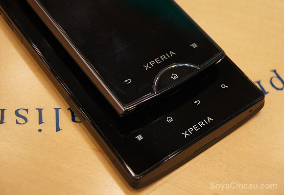
Now let’s talk more on the usability downsides of the Xperia ion. The biggest gripe that we had is the 4 capacitive buttons on the front which doesn’t light up when pressed. Yes, you read that right. In total darkness, the only guiding light is the ultra-thin lines that illuminate about 5mm below each icon. We simply can’t comprehend why Sony doesn’t stick to the tried and tested illuminated icon approach. The previous Xperia ray too doesn’t come with back-lit icons but it wasn’t an issue since there’s only 3 buttons and the home button is nicely designed with a notification light surrounding it.
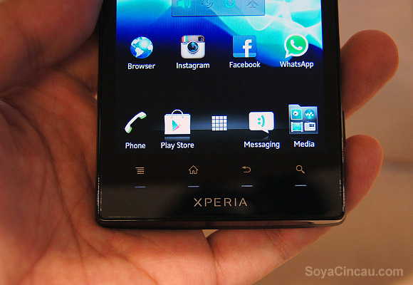
To make matters worse, the Xperia ion too suffers the hit and miss capacitive button sensor like the Xperia S. Initially, we have a hard time getting our presses detected as the sweet spot is actually between the icon and the screen. Combine that with a dimly lit guiding light placed way below, you would be fumbling in the dark with frustration especially for first time users. Naturally one would expect the icons and even the lighted lines as the button sweet spot. In the long run, it should be fine after getting used to it. Since the ion is introduced at the same time as the Xperia S, it is no wonder it inherited the same capacitive sensor issue but we would have expected Sony to rework this for its HSPA+ version.
Sample Photos & Video
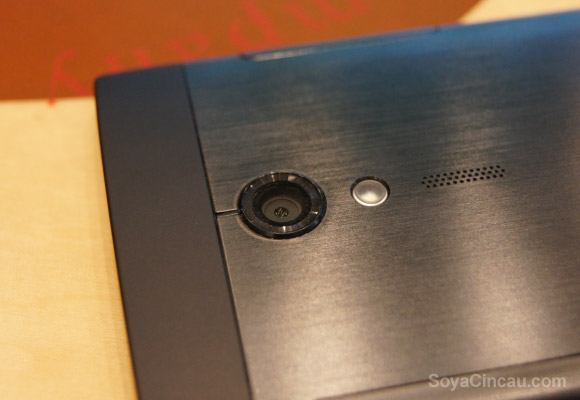
Just like the Xperia S, the Xperia ion works rather well with excellent pictures even in low light visibility. There’s no fancy fast burst mode feature but the Xperia ion is able to take a picture from sleep instantly by press and holding the dedicated camera button in 1.5 seconds. For those enjoying taking self shots, there’s the usual smile detection mode which automatically snaps a picture according to the intensity of your smile.
Performance & Battery Life
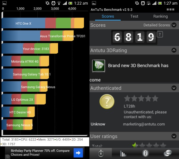
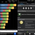
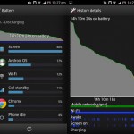
In terms of benchmark numbers, the Xperia ion scores a moderate 3183 on Quadrant Standard benchmark and 6819 points on AnTuTu. As expected, it is a notch lower than the HTC One S which runs on a similar Qualcomm S3 processor that’s clocked at a higher 1.7GHz. In our daily average usage, the 1,900mAh managed to deliver about 13-14 hours of usage which is somewhat similar to the Xperia S.
Conclusion
The Xperia ion is a nice addition for those wanting a larger screen phone without a mammoth screen dimensions. At 4.55”, it is just a notch lower than the HTC One X and Galaxy S III in terms of screen size but in return delivers a much higher pixel density.
For power users, the Xperia ion is starting to show its age but for the average user on the street, it should be sufficient for those that crave a bigger screen with decent looks and performance. While it offers improvement over the Xperia S in terms of design, button placements and materials, the only show stopper is the iffy front capacitive buttons.
The Xperia ion still offers something that many other don’t. It’s 12MP camera is still one of best cameras out there and the dedicated camera button is a deal breaker for those want quicker access to take photo instead of taking multiple photos fast. Initially priced at RM1,788, the Xperia ion is available in both black and red colours. Currently, it can be found selling at RM1400-RM1600 range.

