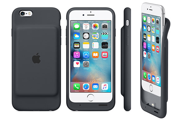
Form and function. These are synonymous with Apple. People may disagree with a lot of things but many will agree that when it comes to making something as ubiquitous as a smartphone look like a work of art, Apple does it best.
But sometimes, even the best get it wrong.
This is the Apple Smart Battery Case. It’s the company’s first ever battery pack and it’s decidedly un-Apple. More on that later but first, let’s go into the specs.
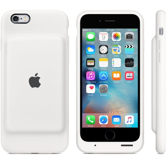
The Smart Battery Case is a battery pack that fits the iPhone 6 and iPhone 6s. It packs a 1,877mAh battery and Apple says it’s good for 18 hours of internet browsing time on LTE or 20 hours of video playback time. The battery case has a soft touch silicone exterior with a microfibre inner lining to protect your iPhone. There are two colours to choose from (white and charcoal gray) currently and it’s the only battery case that comes with a lighting connector.
So why is the Smart Battery Case un-Apple?
It’s the design. Next to the slim, sleek and slender iPhone 6, the Smart Battery Case, with its unsightly bulge, looks like an afterthought, like the designers at Apple didn’t even bother to make this thing look good.
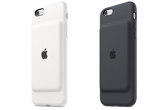
It’s not that great as a battery case either. There’s no separate switch to activate or deactivate the battery case and the lack of an external battery indicator makes it difficult to know how much power you have left without turning on your iPhone.
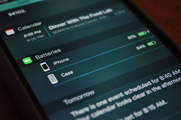
You do however get an integrated battery status built into iOS when the battery case is plugged into your iPhone but that means you will have to turn on your phone every time you want check the power status of the battery case.
And for the RM469 asking price, you’re not getting a lot. A popular battery case alternative like the Mophie Juice Pack Air with a 2,750mAh battery pack, a dedicated on/off switch and external LED indicators costs about the same.
So if you’re an iPhone 6 or 6S user that’s constantly looking for a power point because your iPhone is out of battery, you might want to stay away from the Apple Battery Pack. It’s ugly, it’s expensive and for something that’s designed for the iPhone by the makers of the iPhone itself, it’s decidedly un-Apple.
Maybe Apple took some inspiration from the device below. What do you guys think?
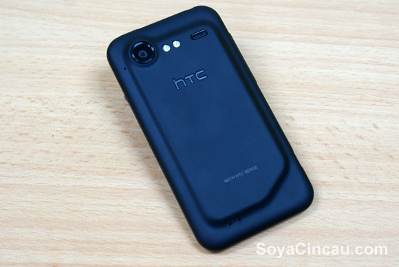
*This is the HTC Incredible S that was launched way back in 2011*
[ SOURCE, VIA, IMAGE SOURCE ]

