Curved displays: Is it just a fad or an innovation with substance? Back in 2013, both Samsung and LG have been playing around with flexible displays with the Galaxy Round and the G Flex. These experimental devices are not really a big deal apart from having a quirky form factor that claims to offer better ergonomics.
During CES 2013, Samsung had demonstrated its YOUM prototype device that comes with a sloping curved screen. When the Galaxy Note 4 was announced, Samsung has taken this concept into production and the end result is the Galaxy Note Edge.
Initially launched with limited availability, the Galaxy Note Edge is finally here in Malaysia with the retail price of RM2,999. So is the Galaxy Note Edge worth the extra RM500 over the normal Galaxy Note 4? Read on to find out.
Hardware
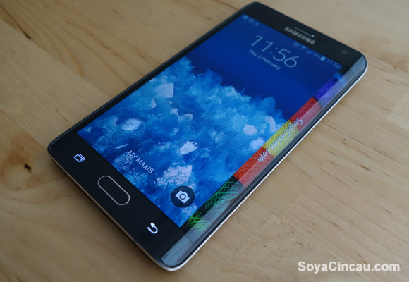
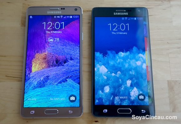
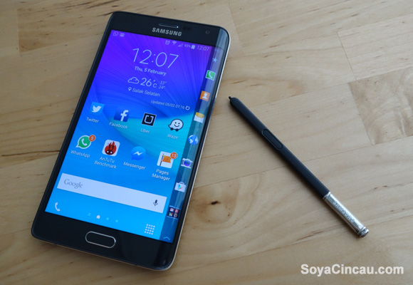
Let’s go through the specs first. The Galaxy Note Edge is positioned as a more exclusive and premium model over the current Galaxy Note 4, so you can expect pretty much the same hardware underneath. At first glance, you’ll notice that the Galaxy Note Edge is slightly wider but it is overall shorter due to its slightly smaller display. It gets a 5.6″ screen instead of 5.7″ size that’s found on the Galaxy Note 4. The display is still using Super AMOLED which produces rich colours with great viewing angles but the Galaxy Note Edge does a slightly higher Quad HD resolution of 2560×1600, which is 160 pixels extra for the edge. As comparison, the Galaxy Note 4 like any other Quad HD/2K smart phones is pushing 2560×1440 resolution.
Under the hood, the Galaxy Note Edge runs on a 2.7GHz Quad Core Snapdragon 805 processor. Meanwhile, the current Galaxy Note 4 for Malaysia is running on Samsung’s very own Exynos 5433 Octa-Core processor which appears to be better on benchmarks and battery life. We’ll talk about the performance a bit later. Despite being a more premium device, the Galaxy Note Edge surprisingly comes with a 3,000mAh capacity battery, that’s slightly smaller than the Note 4’s 3,220mAh unit.
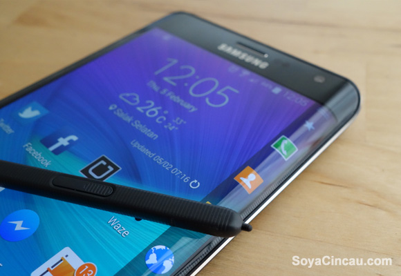
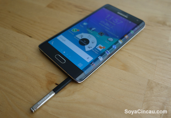
The rest of the device is pretty much unchanged, with 3GB of RAM, 32GB of storage which is expandable with microSD, a 16MP main camera with OIS and a front facing 3.7MP shooter that supports wide selfie. At the front, the physical home button has a fingerprint scanner while the back comes with a UV/heart rate sensor which can be used to trigger selfie shots at a single tap. Being a Note category device, it also gets the latest S-Pen feature with enhanced sensitivity and a host of multi-tasking software features.
Design
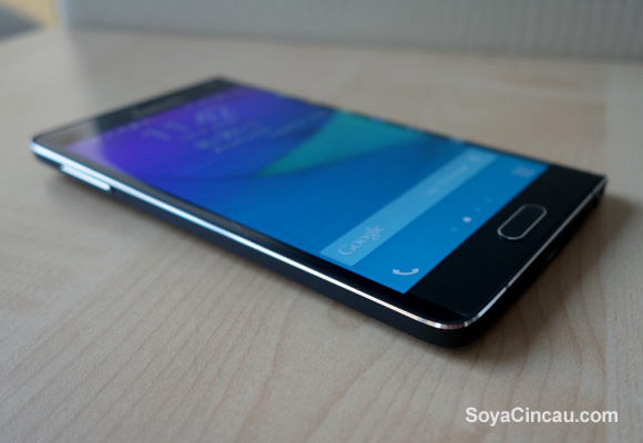
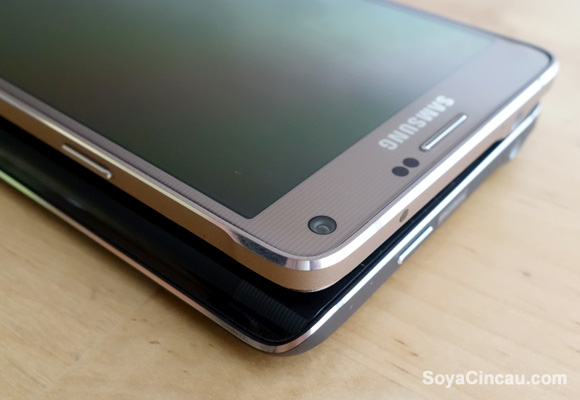
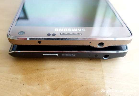
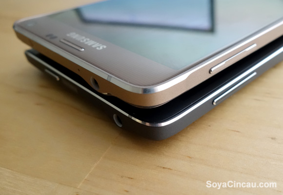
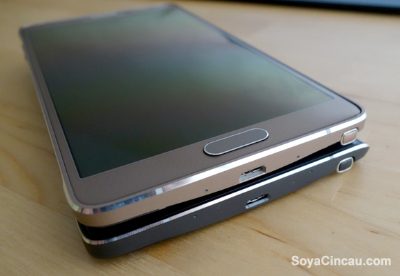
In most angles, the Galaxy Note Edge isn’t dramatically different from the Note 4 that it is based on. You get what appears to be an aluminium frame but the coating of it somehow feels like plastic. The rest of its ports and physical buttons are unchanged but upon closer inspection, the Galaxy Note Edge side profile appears to be more streamlined without the extra protruding bumps for its volume rocker button and corners. The major difference would be its power button which is now shifted to the top on the Galaxy Note Edge. For us, we don’t have much issues with this but those with smaller hands might struggle to switch off the device with a single hand.
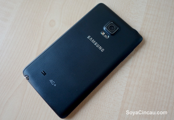
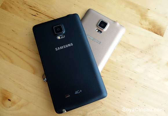
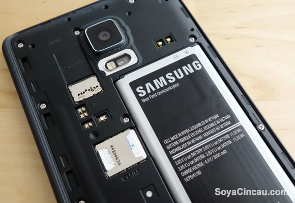
Over at the back, it features the same faux leather removable back cover that feels more upmarket with a rubber-like texture. Similar to the Note 4, the loud speaker is placed at the back, which isn’t our favourite placement but the audio playback is loud enough for most scenarios.
Usability
Internally, the Galaxy Note Edge is essentially the same as what you’ll get from the Galaxy Note 4 with a more current Android 4.4.4 KitKat and the latest TouchWiz UI. Some of our favourite features include its resizable pop-up windows and the ability to minimise and to split apps in multiview with a simple flick.
For fitness buffs, it gets the same S-Health features and measurement tools to track your steps, heart rate, blood oxygen saturation level and UV rays from the sun. Another feature which we find quite interesting is its multi-directional audio recording. This lets you record a boardroom meeting and you can selectively play or mute audio from each respective direction.
While some might dislike TouchWiz for being bloaty, but the new interface feels much more refined than the Samsung Galaxy devices of old. After all, it is their multi-window and S-Pen features that made the Note series more productive than your average large screen phablet.
Edge Display
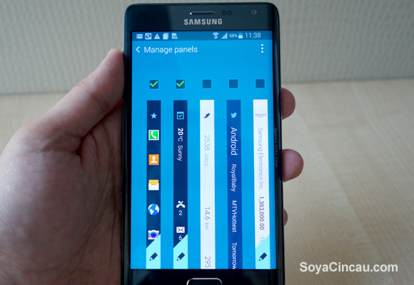
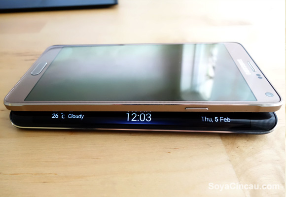
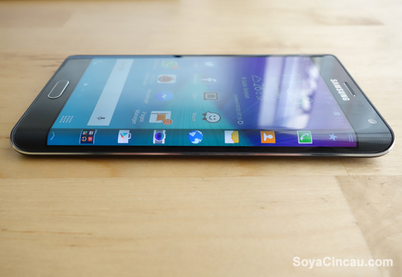
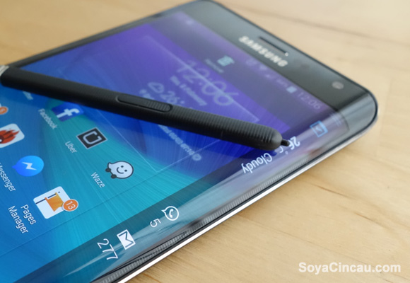
Now lets go deeper with the curve screen and its advantages. The edge screen, which is what Samsung would like to call it, isn’t a separate piece and it is a continuous flow from its main display. By default, it functions as a shortcut toolbar which is capable of displaying up to 7 icons simultaneously. When the device is locked, the edge will display a decorate panel which can be customised to your preference with its built-in Express Me panel.
Each time there’s a notification, it will automatically display as a scrolling ticker, instead of traditional placement at the notification bar. At first it looks cool and it takes us a while to get used to reading a vertical scrolling text. To read the full details or message, you’ll have to quickly tap on the alert before it disappears.
Beyond the usual notification and shortcuts, you can add additional panels which are free to download. Some of the useful ones include a mobile data tracker, twitter trends, S-Health status bar and Yahoo News. For a little bit of fun, there are games for the edge panel like Tiny Burger and Memory Match. The edge screen is smart enough to change its display orientation depending on usage for example while lying flat on a table versus being held.
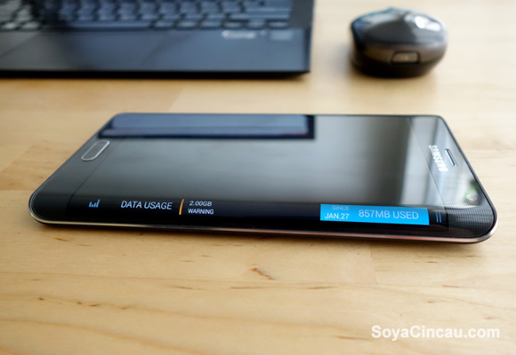
When the panel is active, you can pull up a couple of tricks by swiping from the top most portion. This brings down some tools like ruler which works in both cm and inches, a torch light, stop watch, timer and a sound recorder. To access the edge display settings, just swipe from the bottom end to reveal the settings icon.
If you’re in a meeting, you can discreetly switch on the edge display only by simply swiping from left to right repeatedly. This will activate a night clock, which you can swipe vertically to bring up other panels. At night, the edge can also be used as a bedside clock and you can set what time of the day for it to be activated. Since this is a Super AMOLED display, each pixels are lighted individually which probably takes a minimal toll on its battery life.
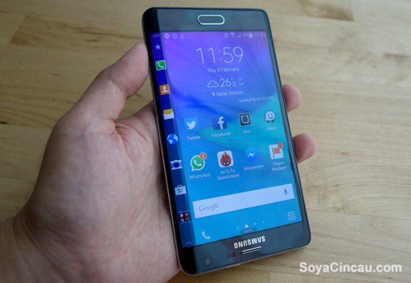
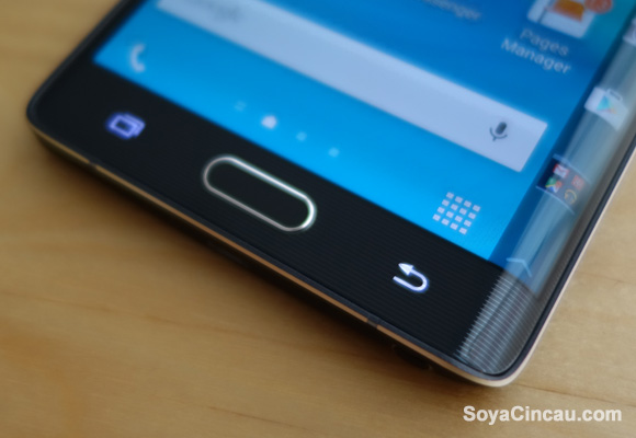
Before this, we had our perception that the edge display can intrusive while using normal apps. However Samsung has made it smart enough to minimise itself when the edge isn’t in use. The edge panel only appears when you’re in the home screen or if you trigger the panel by swiping it outwards. By default, the edge display on the right makes it more practical for right handed users. If you’re left handed, you’ll be happy to know there’s the option to rotate the screen 180 degrees, which brings the edge experience to the left. Then again, this would look pretty awkward as you’ll need to rotate back to the other end when making a call and if you need to access the home and back buttons.
Edge supported Apps
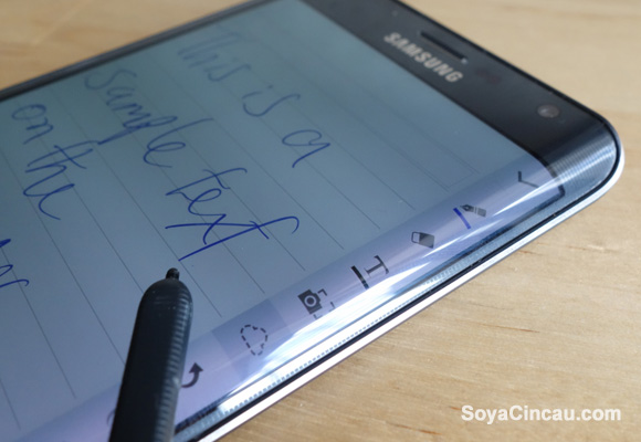
For the edge to be truly useful, it needs supported apps to make use of its extra 160 pixels. With the S-Pen being its vital tool, the S-Note app has been redesigned slightly to display its pen tools and settings on the edge, instead of floating at the top. Meanwhile for video playback, the native player has its timeline and playback controls moved towards the edge for an unobstructed view.
We particularly liked the way it handle phone calls when the Note Edge is in use. Instead of a floating pop-up, the incoming call alert appears on the edge display and you can choose to answer or reject by swiping the icons up or down. This is useful while driving as you don’t want any incoming calls to block your waze navigation.
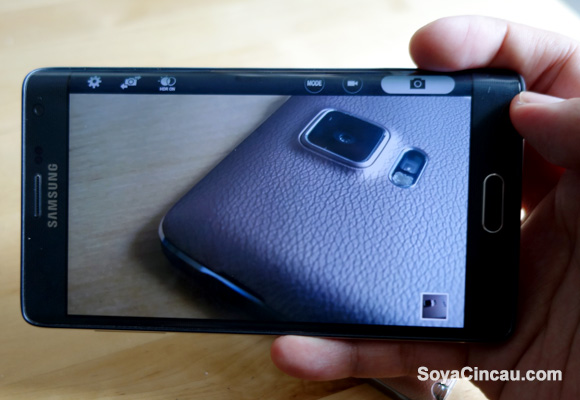
So far, these are quite nice touches but the camera app is where its implementation has gone wrong. Instead of the usual on-screen button layout, the Galaxy Note Edge has its shutter button and camera options lined up on the edge display. While this sounds like a good idea, it isn’t really practical in real life. Usually on a normal phone, you’ll rest the phone in between your pinky and second finger, with the thumb hovering on the shutter button that’s positioned towards the middle.
However for the Note Edge, it is quite a challenge since the top edge is lacking space to grip while the shutter button is on a slopping position at the top. For portrait shots, it is slightly better and if you’re taking a selfie, it is easier to take the shot by tapping on the heart rate sensor at the back.
Performance
The Galaxy Note Edge is high-end performer and that’s what you would expect from a flagship phablet. However after having tried out the Galaxy Note 4, we do notice that the Note Edge is a little bit laggy and it could be more processing power required for the edge or Samsung’s Exynos processor on the Note 4 is simply better.
In terms of battery life, we get an average of 15-17 hours on a single charge, which is identical with the Galaxy Note 4, but on-screen time is slightly less at about 3.5 hours, versus 5 hours on the Galaxy Note 4. This shouldn’t come as a surprise since the Galaxy Note Edge comes with a smaller battery capacity but it should be more than enough for most people. For heavy usage, you’ll probably need a charge before the day gets dark and the Note Edge also supports Adaptive Fast Charging that does 0 to 50% in 30 minutes.
Conclusion
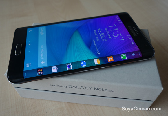
The Galaxy Note Edge is a testament that Samsung is capable of making a curve display device that’s not for the sake of doing it. The unique usability of the edge display is commendable but it looks like there’s still a lot of work to be done to get it right. We can see a lot of potential of the edge display in isolation, and we reckon this could be an substitute for a smart watch display. For example, it would be great if we can read incoming messages in full which is quite useful in the cinema or during meetings.
With its upcoming Android 5.0 Lollipop update on the way, Samsung could still improve this further especially its camera interface. If cutting edge gadgets is what you seek and if you don’t mind spending the extra RM500 over the Note 4, the Galaxy Note Edge is an experiment worth trying out. With limited quantities to go around, the Galaxy Note Edge is more exclusive than your run of the mill Galaxy Note 4.
Samsung Galaxy Note Edge Hands-on Video
Samsung Galaxy Note Edge Photo Gallery
Samsung Galaxy Note Edge vs. Galaxy Note 4
