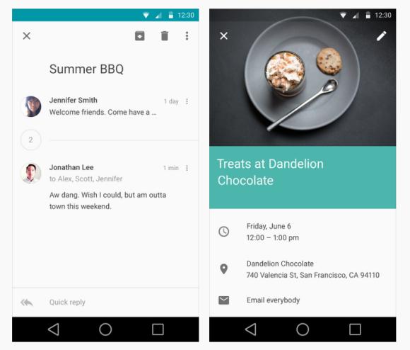
At Google I/O 2014, they didn’t announce the name of the upcoming Android OS that comes after KitKat. Tentatively called as Android L, it offers a new design approach that’s called Material Design. Following the current trend of flat designs, the upcoming Android interface is focused at having a seamless experience whether you are on a smart phone, tablet or even desktop. One of the major change is the on-screen Android icons has been refreshed with a simpler look.
It is not just the looks but the way the interface responds to touches. The consistency of colours, fonts, layout and interaction has been thought out properly which is somewhat similar to the recent flat UI approach including the latest LG G3. Before Android L gets out, they have released a design guide which outlines the design specification for developers.
Watch the Material Design video after the break.


