Samsung Galaxy smart phones usually comes with its popular TouchWiz interface that you’ll either love or hate. With every new refresh of its Galaxy models, Samsung has continued to packed as much customisation and features making it a challenge to balance usability & ease of use.
When the Galaxy S4 was launched last year, its TouchWiz interface was so bloated that it feels rather cluttered and takes up almost half of its entire 16GB of on-board storage. After much criticism, Samsung has taken a number of steps to trim the fat to improve efficiency and user experience. The Galaxy Note 3 offers a much refined experience despite packing more features with its new enhanced S-Pen stylus.
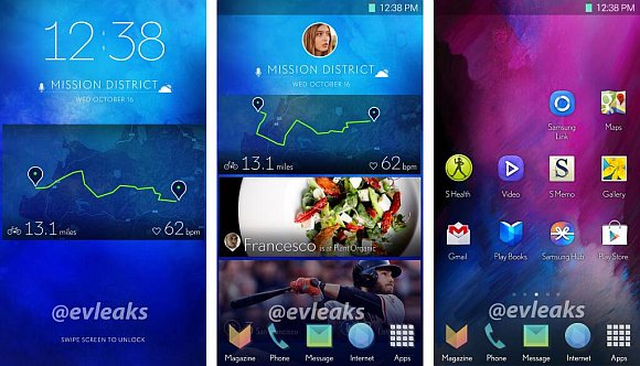
Now moving into 2014, it appears that Samsung is experimenting with a new approach for its interface. @evleaks, popular with its pre-launch info has released a screenshot of what appears to be Samsung’s new TouchWiz interface. With Android 4.4 KitKat taking the lead, Samsung is seen to be having a minimalist approach with a cleaner look, flatter icon designs and large skinny fonts.
So far this is just a purported leak and it might just be one of its design concepts for now. Among all the smart phone players, Samsung has one of the most extensive list of features such as Multi-Window, smart scroll, smart pause and etc. It would be interesting to see what would Samsung reveal next and how its new interface would keep things simple and intuitive to use.
[ SOURCE ]


