In the past 2 years, the Android smart phone players are getting obsessed with having the biggest screen, the most core processor and the thinnest dimensions. We are seeing more brands jumping onto the dual-core bandwagon with screens being upsized beyond the standard 4.3”, which was considered huge back then.
Sony which is formerly known as Sony Ericsson in particular hasn’t been keeping up with such trend with the former flagship the Xperia arc S running on a single core 1.4 Ghz processor and still having a moderate sized 4.2” display. Despite that, there’s still one thing that stands out from Sony, and it is the design of their phones.
Early this year, Sony has revealed its new Sony Xperia NXT series of handsets with the Xperia S. It was also the first Android smart phone under the new Sony Mobile branding, after Sony has acquired full ownership over Sony Ericsson. It is interesting to note that Sony retains its familiar “s & e” slimeball logo with the new brand.
After our early preview in Shanghai, we had the privilege of using the Sony Xperia S for a long term review. Read on to discover our findings.
Design
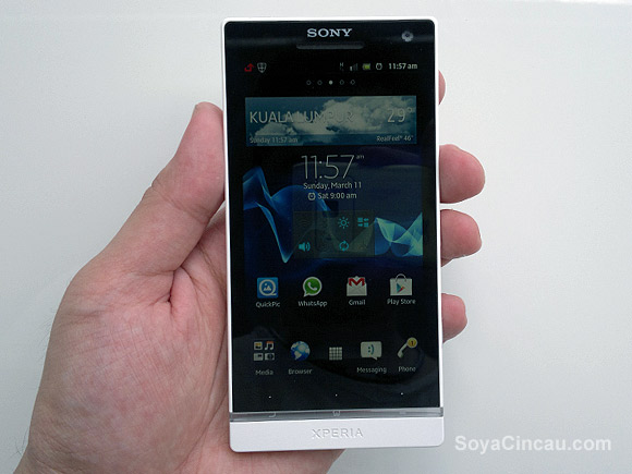
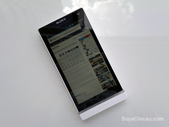
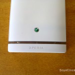
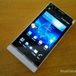
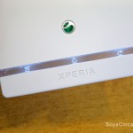
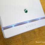
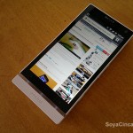
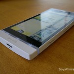
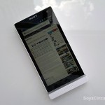
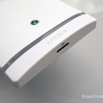
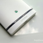
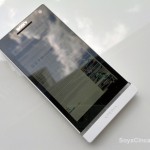
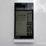
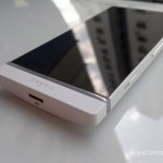
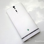
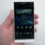
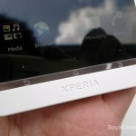
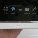
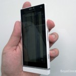
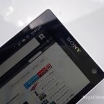
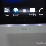
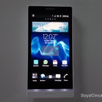
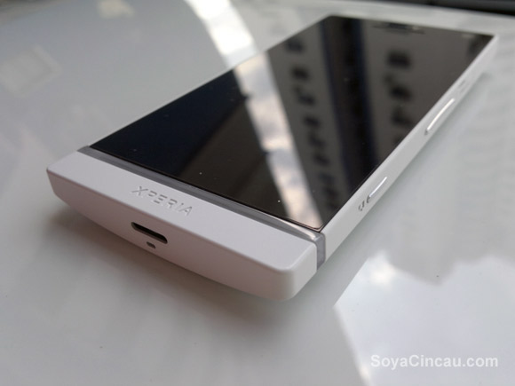
For the Sony Xperia NXT series, they have incorporated a clean boxy design for the Xperia S, P and U. Among the 3, the Xperia S is the flagship model with the biggest screen at 4.3” and a dual-core 1.5GHz processor. The front of the Xperia S is almost 90% glass which appears all black when the screen is off. The contrasting bottom stands out with its transparent bar and a body coloured piece with XPERIA inscripted on top.
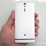
This design approach is what Sony described as “Iconic Identity”, which is a simple and strong look that’s easily recognizable as a Sony Xperia. The design itself stands out from the usual rectangular design with rounded corners that’s too common these days. Even with its 4.3” screen, the Xperia S feels like a smaller 4.0” phone thanks to its thin bezel and flat edges.
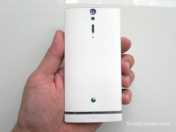
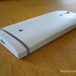
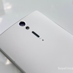
In the hands, the Xperia S is nice to touch with its soft matte finish. While it is nice to hold, the body isn’t rugged enough to withstand drops or dents. In our review unit, we had a couple of minor “bruises” at the corners which is noticeable especially on the white version.
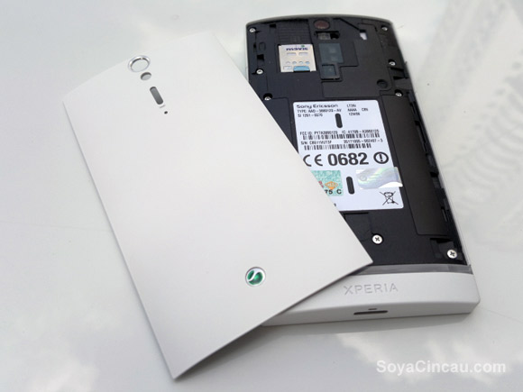
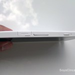
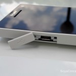
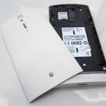
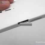
The Xperia S comes with a removable back which is rather unnecessary as it only gives you access to the the micro SIM slot. We felt that it could have been better if it had a unibody design with the micro SIM slot placed at the sides like its micro USB slot and a HDMI port with flush covers.
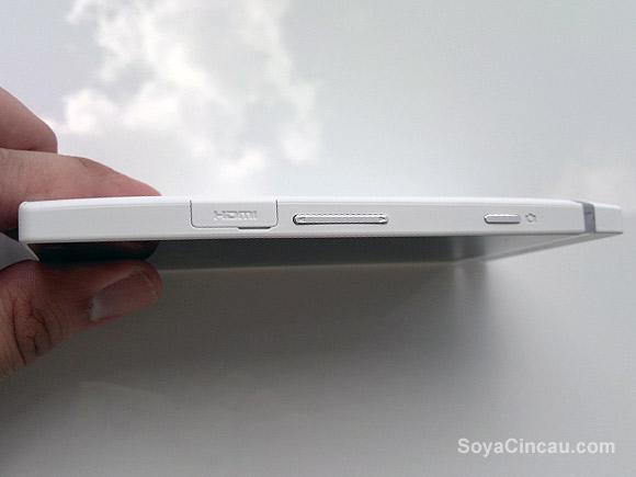
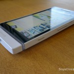
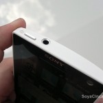
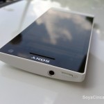
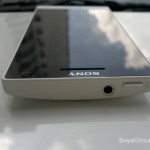
The metallic physical buttons on the Xperia S is rather nice to press and it matches the well designed 3.5mm audio jack with metallic ring finish. A little gripe is the volume rocker which is placed smack in the middle at the sides. The placement is a little awkward which we find it better placed higher towards the top for a comfortable reach.
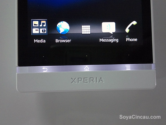
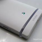
The main highlight of the design is the transparent belt which doubles up as a component for antenna reception. It lights up for about 7 seconds whenever a button is pressed and it flashes during an incoming call. The transparent belt isn’t really a notification light and there’s no option to change colours or to adjust the duration of the light to stay on. It is worth pointing out that the Xperia U’s transparent belt comes with multiple LED colours that dynamically changes according to the dominant colour of the screen.
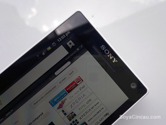
For notifications, there’s a multi colour LED at the top left which flashes in white, orange, red, green or blue. The only complaint is that the blue light illuminated for missed calls is hardly noticeable.
For the first timers, most people would expect the transparent bar to be touch sensitive as the standard Android buttons icons are printed inside. On the contrary, the capacitive buttons are located above the transparent belt which is indicated by 3 dots. However we noticed that the 3 dots aren’t really the sweet spot and getting the buttons to work is a rather hit and miss affair. Later, we discovered that the actual sensors are actually between the dots and the display itself. It was quite an annoying at first which we soon gotten used to eventually.
Display & Audio
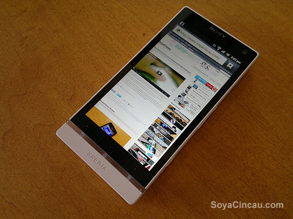
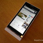
The Xperia S features a 4.3” TFT Reality Display that pushes a high resolution of 1280×720. Despite not being a Super LCD or AMOLED variety, the display is undoubtedly sharp on the Xperia S, thanks to its rather high pixel density of 342ppi. As comparison, the iPhone 4/4S does 326ppi. Text appears sharp and it is readable even at full width view of web pages, albeit some squinting required.
Watching HD videos on the Xperia S is great as well with sharp details and vivid colour. While viewing photos and videos, the Xperia S also comes with Mobile Bravia Engine which is a post processing engine that enhances the colours and sharpness dynamically.
For audio, the Xperia S comes with X-Loud feature which boosts the loud speaker a notch higher. It increases the volume without cracking too much which is rather good for sharing videos among your friends in the outdoors. While it performs great as a media playback device, we noticed that the speakerphone is just too soft for phone calls. When mounted in the car, we can hardly hear the other person when making a call while driving. Hopefully this can be fixed with an software upgrade as the speaker is really capable in normal video playback.
For normal voice calls, the audio pick up is great and the secondary mic acts as an active noise cancellation mic to reduce excessive background noise from your conversation.
Usability & UI
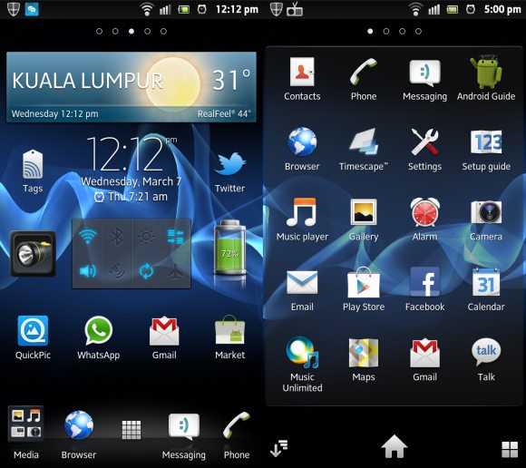
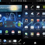
With a 720p HD screen, Sony has gone and extra mile to bring out the best out of it. The core built-in app icons such as browser, camera, email & music have been redesigned with more depth and detail. It is very noticeable when compared side by side with your standard Android app icons. If you haven’t, you can check out our Xperia S UI overview video.
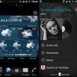
Out of the box, the Xperia S runs on Android 2.3.7 Gingerbread with its own custom skin. While the Android 4.0 ICS upgrade is on the way, we have nothing to complain about the existing OS. It feels snappy and it just works without any problems to report. Just like other devices, Sony included some nicely design widgets that compliments its well designed home screen such as weather, social feeds via Timescape & quick settings. This goes to show that it really isn’t a bad thing if the phone is not the latest but having said that, Sony should be proactive in bringing its current line up to the latest Android version.
Like most new smart phones, the Xperia S comes with NFC capability which is accessible through its Tags app. Unlike the Galaxy Nexus with its ICS Android Beam, the Xperia S requires you to define tags before sharing. With Android Beam, NFC sharing is more seamless by just tap and hold to push contents/links to the next phone. Hopefully Sony will offer Android Beam when it rolls out ICS update for the Xperia S.
Unfortunately we didn’t manage to try out the SmartTags as it didn’t come with our loaner unit. What SmartTag does is it allows you to switch your phone profile with a simple NFC tap, for example car mode in the car or meeting mode in the office.
GPS Navigation
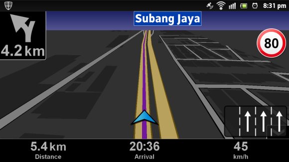
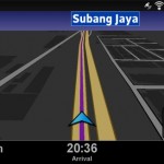
Included with the Xperia S is Wisepilot, which is a pretty good navigation software that works in Malaysia. It even came with lane assist which is rather useful especially on roads with confusing exits. Unfortunately we can’t seem to get the usual GPS lady voice to talk but this could be a limitation for the trial period.
Camera
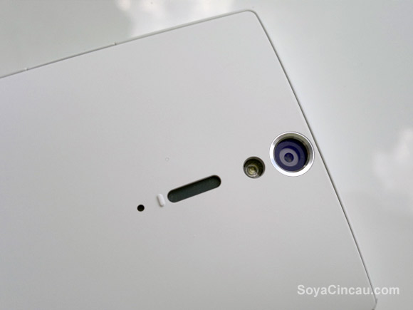
One of the biggest highlight is the 12MP camera. With its Fast Capture feature, it allows you to take a photo instantly from sleep mode in just 1.5 seconds. All you need to do is just press and hold the dedicated shutter button while the screen is off. Strangely though, Fast Capture doesn’t work when the phone is active and long pressing the button only launches the camera app without snapping any pictures. With an active screen, it is faster to launch the camera by tapping the camera icon.
The image quality is rather good but there’s still some visible noise which is still within acceptable levels. The colours and contrast are top notch and this probably is the best camera you can get on an Android right now. The camera UI is straight forward and it comes with extra bells and whistles like smile detection that automatically snaps a picture according to the “intensity” of your smile.
Earlier on during our unboxing, we reported that there was a rendering issue with the default Android Gallery. When we previewed our photos, it looked very clear but upon tapping to zoom, the photo turned out pixilated very badly. After a software update over the air (OTA), this bug was resolved and the photos still turn out clear when zooming in. For full photo rendering, you can install the QuickPic app which lets you view photos at 100% crop.
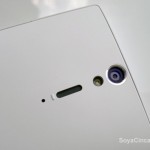
The only complaint if we’re forced to pick would be the placement of the microphone. In landscape mode, the dedicated button is located at the top right which makes it natural to hold the Xperia S like a regular point and shoot camera. However if you’re shooting a video in this position, you would actually block the mic which results low or no audio recording at all. The Xperia S has 2 microphones, the primary at the bottom of the transparent belt and a secondary mic at the back. Initially we figured probably there’s an option to switch recording microphone but unfortunately there’s no way to do so. So if you’re shooting a video, do take note of this and we recommend holding it by the corners instead.
Sample photos and videos below:

Battery Life & Reception
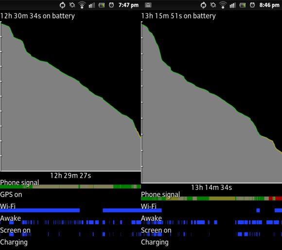
Coming out from basements or from lifts, we noticed that the Xperia S took longer than usual to switch from EDGE to HSDPA. We suspect this could be done intentionally to reduce erratic switching between 2G to 3G networks for the battery savings but it can be annoying at times when you need faster internet immediately. The battery on the Xperia S is non user removable but the 1,750mAh battery is rather sufficient with up to 12-13 hours of average usage.
Conclusion
The Xperia S isn’t the fastest phone on paper, neither does it have the biggest screen size in the market. However in the sea of smart phones shouting latest specs, the Xperia S performed up to expectation while being a good looker at the same time.
If you plan to get one, we strongly advise you to get a case as soon as possible. The Xperia S body and its matte finish looks elegant but any minor dings and dents would be very obvious especially with the white version. Should you get one? If you’re looking for something different, this is definitely a phone to get with its iconic and recognisable transparent belt. It’s hard to not notice especially at night.
The camera is a fast performer from sleep mode but obviously isn’t as snappy as the recent HTC One X. Our initial impression is while the One X is a fast snapper, the Xperia S is likely to produce better quality but we will reserve our comments for our full shoot out coming out soon.
At RM1,899, the Xperia S is reasonably priced and it is available for purchase on contract with all major telcos in Malaysia. With new quad core rivals like the HTC One X and upcoming Samsung Galaxy S III, the Xperia S will have an uphill battle in the next few months. As the first Android smart phone model to launch in 2012, things are looking good for Sony and the Xperia S is currently one of our top smart phone picks. We can’t wait to see what Sony will unveil next.
Related Links
Unboxed: Sony Xperia S
Sony Xperia S UI Overview
Sony Xperia NXT Series Compared
Sony Xperia S First Impressions
Sony offers to rectify Xperia S yellow tint issue
Photo Gallery

