One of the marks of a good operating system is consistency. What makes the iPhone so stupidly easy to use is the fact that where ever you are in the OS, no matter how many layers deep you’re in the settings menu, all the buttons — be it soft or hardware buttons — do the same thing and they are all at the same place.
With Android however, things get a little bit tricky, the open source nature of the OS means that manufacturers can essentially customise the platform — with layers of UI skins atop the original Android OS — to virtually any shape and form making maintaining consistency across the board a bit of a challenge to say the least.
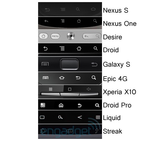
This inconsistency, or fragmentation as it is more widely known, becomes very evident when you compare the buttons on some of the more popular Android device side by side. You’ll see the numerous permutations of the number of buttons a device has, its general location and its function.
Head on over to after the jump to see what we mean.

As you can see, even with devices co-developed with Google — the Nexus One and the Nexus S — you can see the difference between the locations of the buttons, albeit slightly.
But is fragmentation an issue? Already we’re seeing Android climbing to the top of the mobile OS charts at a blistering pace and from our own experience, jumping from one manufacturer’s Android device to another is never an issue for us.
What about you? Do you think that the fragmentation of the Android OS is a big issue? Comment us.


