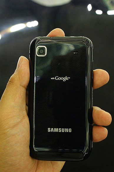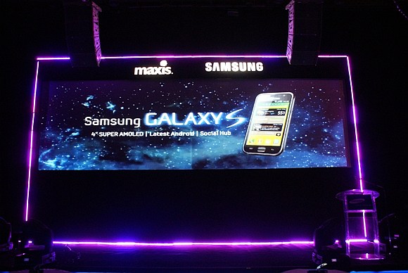
We had some playtime with the Samsung Galaxy S at the Malaysian launch last Friday and while we wait for the uncertain availability of a review unit from Samsung, we thought we’d give you a quick first impressions on the latest Android smartphone to hit the market.
Display, Design and Built-quality
The screen of a touchscreen smartphone is always the centerpiece of its device, so we’ll start off our observations from there.
There’s an intense debate between the two of us here at SoyaCincau.com as to what would be the perfect screen size for a smartphone. How big should and could a screen go before it inadvertently makes a device bulky and cumbersome to hold and fit in your shirt or back pocket. Our discussions have always ended in the agreement that the 3.5in screen on the iPhone is the best size for a smartphone.
So how does the 4in Super-AMOLED 800x480px screen on the Galaxy S fair against the ideal 3.5in screen size? Very well actually, making the device nice to hold but not too bulky that you feel you’re going to drop it due of its girth. The additional screen real-estate is definitely noticeable making the Galaxy S a joy to use and Samsung’s super AMOLED technology delivers bright and clear renditions of icons, text and video. In terms of display, we feel the Galaxy S trumps the Nexus One, Desire and iPhone 3GS. We like it a lot.
The screen is definitely a plus point but we can’t say the same about the built of the Galaxy S. Overall, the Galaxy S feels too plasticky to live up to its flagship device claim. Comparing the Galaxy S against its natural rival, the HTC Desire, we’d say the Desire with its velvety plastic chassis feels more premium and better built than the Galaxy S.
Dimensions wise, there’s really not much to separate the Galaxy S with the Desire, the Nexus One or even the iPhone. There’s literally very little in it. They all feel very nice in the hand except for the Nexus One, which is the only device that we feel we can’t confidently hold due to its overly curvy design.
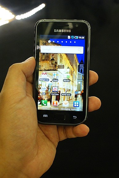
Despite the cheap built-quality, the Galaxy S features a well thought-out industrial design with bulges and recesses at all the right places to make it very comfortable to hold. A whisker under 10mm in thickness, the Galaxy S is probably one of the thinnest Android smartphones out there, but it doesn’t feel flimsy. In terms of thickness, the Galaxy S will definitely give the iPhone 4 a run for its money with the Apple device being a negligible .6mm thinner. In comparison, the Nexus One is 11.5mm thick, the Desire is 11.9mm and the fat 3GS is a whooping 12.3mm thick.
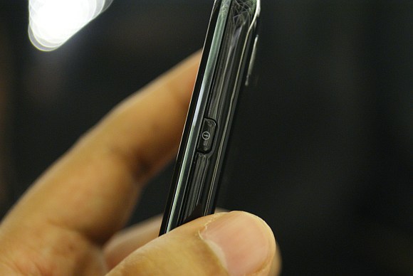
We like how the power button is placed on the right hand side of the Galaxy S. It’s the best position for a power button allowing you to switch the device on and off without changing the orientation of your hand – as opposed to the current crop of touchscreen smartphones with the power button located on top of the device. This is convenience we can get use to.
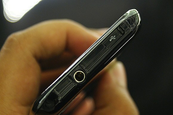
At the top of the Galaxy S you get a standard 3.5mm headphone jack and also a microUSB port that is covered with a slide cover. The slide cover for the microUSB port is a nice touch but we’re not too sure if it’ll still feel as solid after the 100th time you open it to charge the device. Also, we’d prefer the microUSB port to be at the bottom of the device rather than on the top. At the current location, we can imagine the charging cable getting in your way when using the phone while charging.
Internals and User Interface
There’s no denying that the Galaxy S packs quite a punch with is 1GHz processor backed by a powerful SGX540 GPU capable of processing 90 MPolys/sec (vs. iPhone 3GS/iPhone 4: 28 MPolys/sec vs. Snapdragon-only: 22 MPolys/sec) with 512MB RAM. This means you’re going to get slick UI transitions and 3D games will look butter smooth. We can’t vouch for the gaming experience but using the Galaxy S during the launch revealed a very smooth UI and snappy feel. In our eyes, the Galaxy S UI looks marginally smoother compared to the Desire.
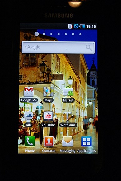
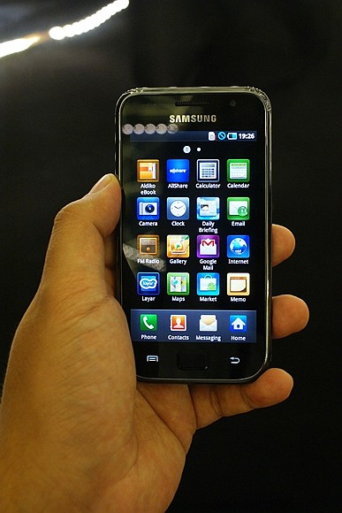
The Galaxy S runs Android 2.1 (update 1) similar to the Desire. Samsung has added its own TouchWhiz 3.0 skin on top of the Android OS which results in an iPhone OS-ish interface. This means the Galaxy S can do away with the standard “home”, “menu”, “return” and “search” buttons you normally see on Android devices. In its place you get three main buttons on the front panel of the Galaxy S – a central “home” button and flanking that button is the “menu” button on the left and a “return” button on the right.
Unlike the Desire, there’s no optical tracker on the Galaxy. You cycle through home screens using the touch screen just like on the iPhone. Overall, the interface feels very similar but different, it feels like an iPhone but with additional integration that enhances the user experience considerably. TouchWhiz 3.0 offers a different user experience compared to the HTC Sense and MotoBlur that we’re familiar with. We like it, it offers a great combination of iPhone style interface with the flexibility of Android – awesome stuff.
Another thing that we didn’t like with the current crop of Android devices is that we can’t use the trackball/optical tracker to switch on the device. With the Galaxy S, you can do this just like you would on the iPhone. We like this because having the option to power on your device using the centre button adds that much more usability, something we think all Android phones should implement.
The Galaxy S packs two cameras, a 5MP camera on the back and a 1.3MP forward facing camera for video calls. Yes, you read that right, the Galaxy S is one of the very few (if not the only) Android devices that support video calling. Unfortunately, we didn’t get to try this during at the launch.
We also didn’t get to try the camera performance, so we can’t really comment on its performance but other tech sites have been saying that it’s pretty good – we can’t vouch for this and will reserve our judgment once and if we get a review unit. Though we’d like to point out that there’s no LED flash.
On board memory is a generous 16GB with expansion for up to 32GB via MicroSD. Wireless connectivity includes WiFi b/g/n along with Bluetooth 3.0 with A2DP, you also get HSPA with 7.2Mbps download and 5.76Mbps upload.
Plans and Pricing
Currently the Galaxy S is exclusive from Maxis and is priced at RM2,599 outright or a very attractive RM1,699 with 12 months contract on any Maxis Value Plus plan together with a data plan of your choice added on. It’s a very good deal and is really a no brainer for customers who are not tied to any contracts.
For those of you who’s on a contract and not looking to sign up for a new plan, you’re out of luck, you gotta pay the outright price to get the Galaxy S.
At the end of the day
The question right now is, is the Samsung Galaxy S the right phone for you? We don’t know about you, but if we’re in the market for a top of the line Android device, our first pick would be the Galaxy S. There’s a lot to like with Samsung’s flagship Android device, the screen is a joy to view in any condition and the TouchWiz 3.0 skin integrates very well with the Android OS giving you a very good user experience.
The Galaxy S is a powerhouse when it comes to processing and graphics power. In addition to the whole gamut of standard smartphone features like AGPS, WiFi b/g/n etc., the Galaxy S is the only smartphone currently with DiVX HD support, it can read and write Office documents, it records and views 720p HD videos, and it can potentially store more data than the iPhone 4.
Did we mention that the Swype input interface is spectacularly ingenious and easy to use? It’s not unique to the Galaxy S but it comes pre-installed. It is however unique to Android and if you’re using an Android device, install it on your phone right now.
There’s no denying, the Samsung Galaxy S is a feature packed smartphone and there’s a lot to like about it. We’re willing to forgo the plasticky built quality for everything else the Galaxy S has to offer. If we had to choose, we’d get the Samsung Galaxy S.
How does the Galaxy S compares to the iPhone 4? Well if you ask us, in terms of hardware there’s really nothing in it at the moment. Put head to head, we have a feeling that both will be able to deliver similar levels of performance. Right now it all bores down to the software and the experience both the devices can offer; and at this moment, nothing can touch Apple in terms of software integration and the sheer number of choices you have in the App Store.
Even before we’ve tried the iPhone 4 we can safely say that the Android ecosystem is still a long way away from the experience the Apple offers with its App Store and that’s something Google must overcome.
But if you’re in the market for something different, take a look the Samsung. The Android market may not have as many apps as the App Store, but there sure are some pretty cools one in there. On top of that the Galaxy S does really hold its own when it comes to features and performance.
